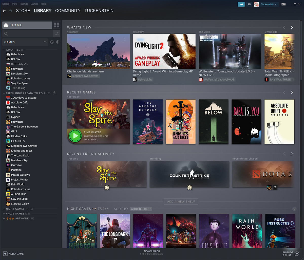
Valve released a big update for Steam tonight. One of his key innovations is the redesign of the Library section.
As stated in the Steam blog, when developing the new concept of the “Library”, Valve started from the idea that it should not resemble a closet with dusty shelves. On the contrary, the library “should be an interesting place for research and search.”
The essence of the changes is the new design of the section itself, as well as the pages of the purchased games. Now, when a user enters his library, he sees not only his collection of games, as it was before.

New design of the Library section
In addition to the list of games, the user from the library:
- receives information about the latest updates to the games that were previously purchased by him;
- sees the games he has recently launched;
- sees projects where friends spend time.
Roughly speaking, now this section also works on the involvement and retention of players. Before that, the library was solely a list of the products available to the player.
The changes affecting the pages of purchased games are less significant. The pages have become more convenient and modern. In addition, when entering the page, the user immediately sees what events are currently taking place in the game, as well as a list of all updates to it.
The public testing of the library started back in September. Then we wrote in detail about all the innovations.
Also on the topic:
