The world’s largest digital game store has significantly changed its design. It is stated that thanks to the innovations, the user “will get even more control over the content of his page.”

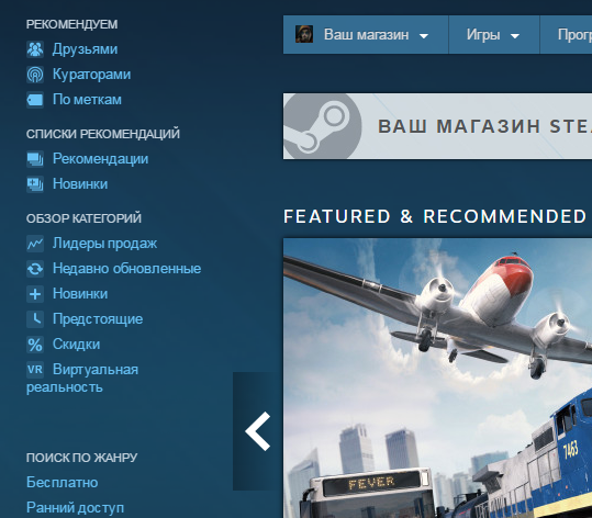
The main changes affected the Steam homepage. The first thing that catches your eye is the appearance of the left column “Quick Access”, which allows you to immediately go to such sections as “New items”, “Sales Leaders”, “Discounts” or choose the genre you are interested in.
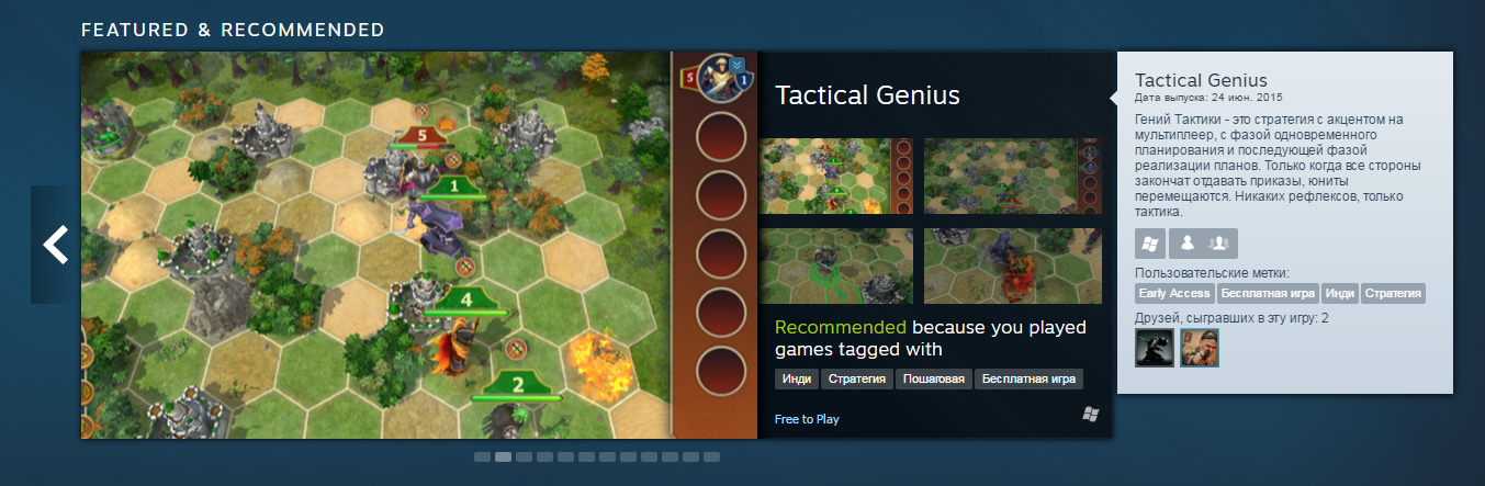
The main banner has also undergone significant changes. Now, without going to the profile of the promoted game, you can see its screenshots. It immediately shows why a particular game is being shown to you (for example, I am shown the game “Genius of Tactics”, since I play games tagged as “indie”, “strategy”, “turn-based” and “free game”).
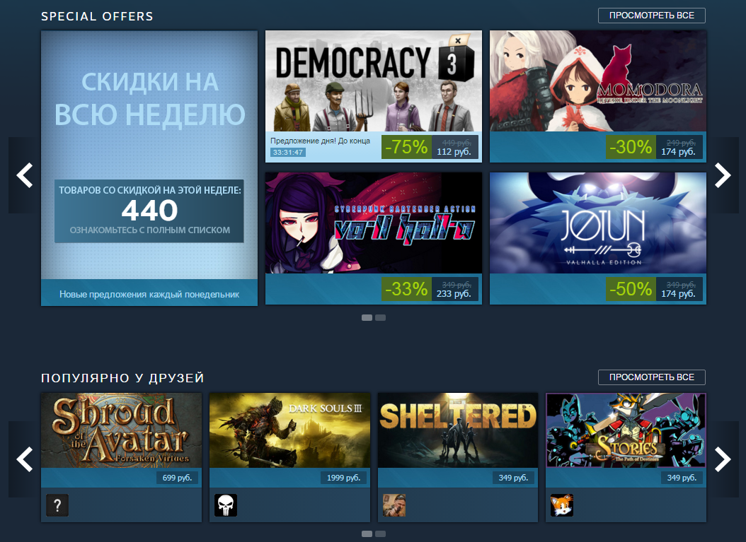
The main stocks of the day, which used to spin as a slider to the side of the feature, are now displayed under the feature. It became much clearer. A little lower down, the games that friends visit are displayed with small banners.
The full list of innovations can be found here, but we want to note the appearance of the opportunity to get acquainted with the list of games that have recently been viewed, as well as a feature under the new expanded curators section – recent updates. Plus, the tops (“popular novelties”, “sales leaders” and so on) you can also view screenshots without logging into the project profile.
The design of the game pages has not changed.
You can see how the new Steam design looks and works here. After taking a look, be sure to come back to us and tell us what you think about the new design.