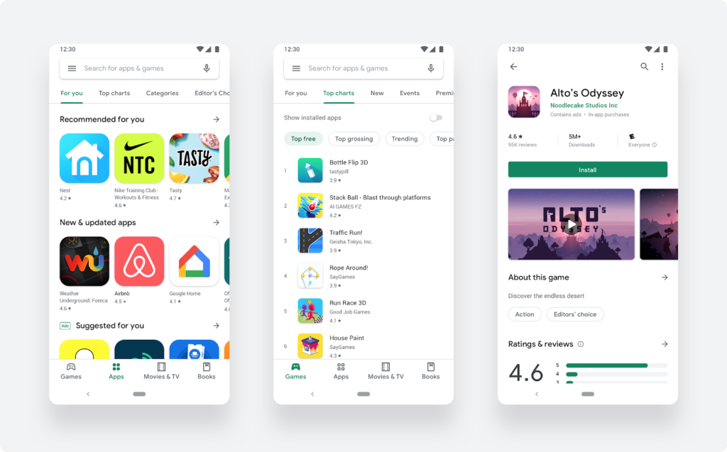
The Google Play store tried on a new design. With it, the findability of games and applications is simplified.
The new appearance of the store is reported in the Android Developers Blog.
List of changes:
- new navigation bar at the bottom of the store on smartphones (on tablets and Chrome it is on the left);
- the updated page layout accommodates more information about the selected game, and the download button has become more noticeable;
- a new icon shape that helps games stand out from the interface background.
Developers of Android games are recommended to update the old icons taking into account the new parameters. And let’s add: in order to correctly select all the elements of the page in Google Play, you can use this guide.
Also on the topic:


