How experiments with Emojination game banners helped to reduce the download price by a record, – App2Top.ru Egor Karpov, CEO of the agency for the promotion of mobile applications AppBrain, told.
The game is more than 4 years old. To date, she has earned more than $1 million.
Despite the lack of support and updates, the project is still earning. Accordingly, developers continue to spend little money on its traffic and optimization.
The problem is that in all countries where traffic comes from, developers have already “burned” the audience several times. It seemed that there were no options to advance in the plus.
We experimented a lot with banners and came to the conclusion that the best option is to depict riddles from the game directly on the banner, and write variations on the theme “can you guess all this?”and “check how smart you are.”
Previously, we used similar banners, but with a large number of words and objects.
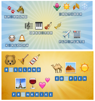
At the start, with such banners, the CTR ranged from 0.7% to 1.5%. The installation price, accordingly, came out decent. Compared to the average market, it may be cheap, but it did not suit us.
By the way, the conversion from going to the game page to directly downloading has always ranged from 60% to 95%, depending on the country and the freshness of the audience. And according to our observations, it was weakly dependent on the banner itself: people immediately understand what the game is about if they paid attention to the banner. When they were already moving to the store, their opinion changed slightly.
The new version began to go better.
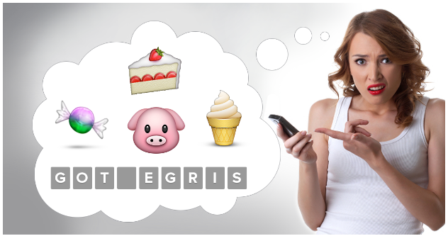
CTR was about 2.2%, sometimes (in the case of a previously unaffected audience) it reached 4-5%.
Naturally, over time, these banners began to irritate the eye and their CTR quickly fell.
Another reason for the drop in CTR was that lookalike was burned out (in about 1-2 months in each country).
Naturally, we regularly reassembled all advertising, made new lookalike from new sources, charged the same banners, then everything rose to the previous level again, but with each such iteration it got worse and worse.
And three years later, when Emojiantion earned its million dollars, we no longer had any hope to re-launch something with a good return.
Then we released Emojination 2 and decided to make new banners for it to somehow let users know that we have a new game, the second part.
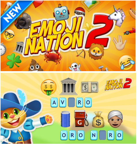
It went well, but not as well as I would like. And then, by chance, an idea came to mind: to make a banner in the form of a correspondence with emoji.
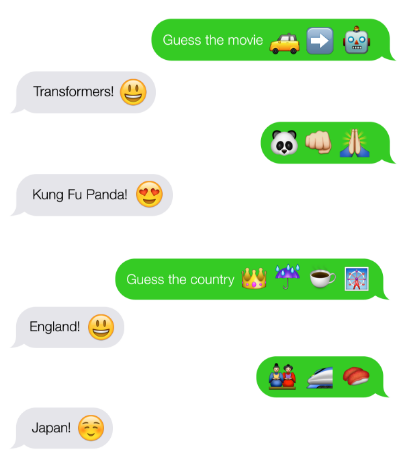
This approach has gone perfectly. The average cost of installation has fallen to 5 rubles.

On this wave, we took the same banners in the same countries and began to twist for the first part. We got the best result of all time. And this is after 3 years of the game’s existence. At first they tried not to cross the audience, then they scored on it – it was still going well.
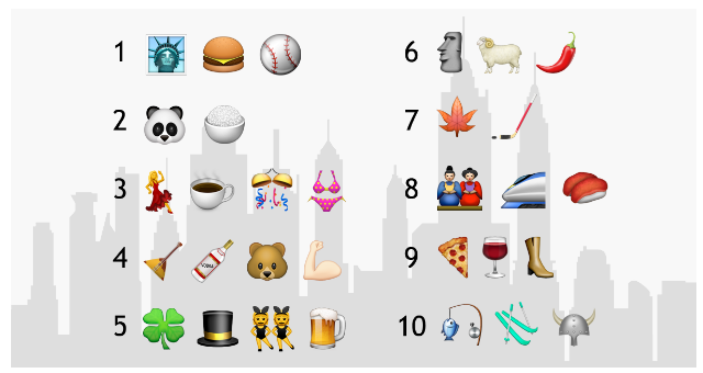
Also, such banners went well: a list of countries, movies, and so on with the text: “guess all 10.”
As for the text.
Facebook still allows caps, so the text can also have a big impact if you write something very catchy in the style: OMG! This game is ABSOLUTELY awesome!
Well, the use of emoji emoticons in the text also helps well.
The conclusion we made is the following: displaying the real gameplay of the game (a screenshot in fact) is the most correct way. The conversion rate does not suffer, and the CTR is usually higher. Moreover, the simpler the display, the better.
But there is one thing with the simplicity of display: if you get into your audience, you just get installations at a good price. In order to jump over your head, you need to apply a creative approach: try to grab the user’s attention with something non-standard, but at the same time completely not divorced from the real game. In our case, it was a fictional correspondence between two friends using emoji.
Our conclusion was confirmed when we experimented with banners for another game.
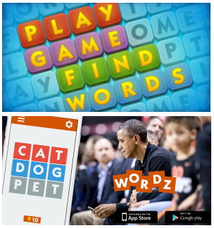
So it was before:
So we changed them:
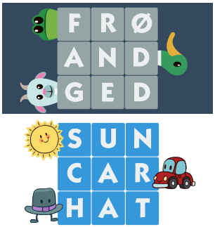
As a result, CTR increased 2-2.5 times, and this solved all the problems.
The general conclusion: to break away from reality and draw beautiful, but irrelevant banners – it does not work at all. On the contrary, it is necessary to make art as close as possible to the essence of the project, but at the same time, of course, unexpected and non-standard.
