We often talk about advertising and promotion, bypassing such a significant topic as banners. At the same time, they are the ones that stimulate clicks and installations today. The Moscow company UNILEAD shared with us its memo on how to approach their development correctly.
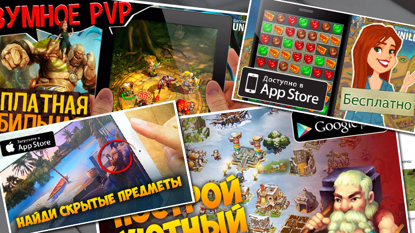
A banner is the face of your campaign, the underlying image that represents your application and attracts users. Hundreds, if not thousands of banners pass through our hands, and we have developed certain rules for working with them.
BASIC PROVISIONS
1. Deliberately false information harms everyone
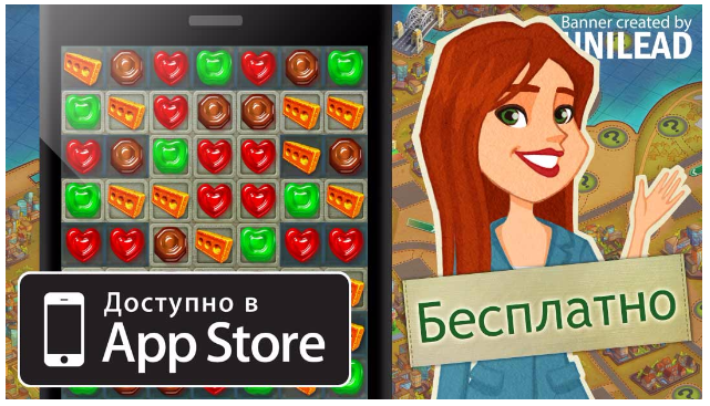
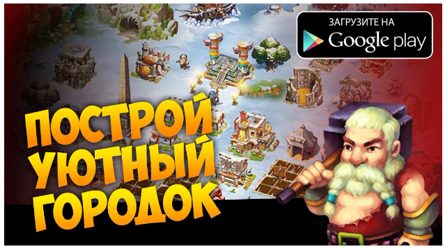
To date, one of the most popular genres of mobile games is a builder with the ability to attack the cities of other players [we are talking about projects in the spirit of Game of War, Clash of Kings, Kingdoms of Camelot and so on, – approx.editorial offices]. Such projects have one significant drawback: it is difficult to attract new players in them. This is due to both great competition in the market and a high entry threshold. Plus, visually, these games lack stars from the sky. Having launched almost any similar project, you will see a depressing urban landscape, as well as encounter dozens of small menus.
Even if at first people click on banners with real screenshots, then over time they stop responding to familiar visual images, and then lies come to the rescue. Advertisers are starting to use screen shots of completely different video games as banners, similar only in the setting.
For example, for a game about the Middle Ages, screenshots of the legendary “Heroes of Might and Magic III”, “The Elder Scrolls V: Skyrim” and “Age of Empires II: The Age of Kings” will “go well”, since many gamers would like to launch such projects on their gadgets.
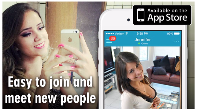
The same applies to sexually explicit banners used in advertising any mobile applications. Human physiology has not been canceled: a man will want to click on a woman promising sex, but when he launches the application and does not find what he promised, he will become another “mislid” for the “offer” – a paid installation of the application that did not bring a new regular user.
Bringing additional income to individual projects, such frauds cause huge damage to the entire mobile advertising market, undermining the authority of the already annoying banners. People stop believing what is depicted in the picture, and gaming companies are outraged by low-quality traffic and terminate relations with dishonest advertising agencies.
Therefore , we do not recommend working in this way . Such banners will not bring you the right users.
2. A good advertising campaign is the result of well–coordinated work of a designer and a media buying manager
No matter how good a banner is, with incorrect targeting, its advantages come to naught. This happens when, when creating a creative, the designer conceived one thing, and the media buying manager presented it in a completely different way or for a different audience.
To avoid such problems, you need to make it a rule to transmit your idea to the performer in writing or orally. It doesn’t hurt to come up with and show the text that will be displayed along with the banner in advance – then the designer will try to reflect it on the creative as well.
If the performer is given freedom in the production of banners, then he, in turn, must inform the media buying manager of his idea so that he adequately sets up the campaign and composes a text that does not conflict with the picture.
For example, imagine that we are going to promote slots in the USA and Russia. The traffic purchasing manager knows that in the USA and Russia, this genre has different audiences. Therefore, he asks the artist to draw two separate sets of banners. The first, focused on the USA, will be with grandmothers and cats. The second one is with taxi drivers and gold chains.
If the conversation between the manager and the designer did not take place, then the latter would draw a young beautiful girl with a large cleavage against the background of slots, which would lead to the fiasco of the advertising company.
3. The result of a good advertising campaign is new regular users of the application
Any mobile developer expects new regular users of their application from the advertising campaign for their further monetization. This desire is sometimes incompatible with reality when it comes to promoting frankly low-quality service, but you need to strive for a positive result.
In other words, only good games have organic content after an advertising campaign. If there are software errors, if the game has a very high entry threshold, if the tutorial is not properly configured, if the management and UI are not properly tested and “cause pain”, then no matter how much the developer has invested in advertising, organics and, as a consequence, ROI, he will not wait.
4. It is better to click on bright and contrasting banners, but not everything is so clear
Television ads are usually played at an increased volume. There is a similar story with banners for mobile applications – they are often made very light and contrasting. It is believed that such a solution helps to attract the viewer’s attention, and to some extent this is true, but you should not mindlessly twist the brightness on all creatives.
The colors of the picture carry a certain mood and evoke associations. A bright banner with a predominance of red color will help to show the game violent and dynamic, and at the same time, such a color scheme will not suit a mobile application around which you want to create a sense of calm and security.
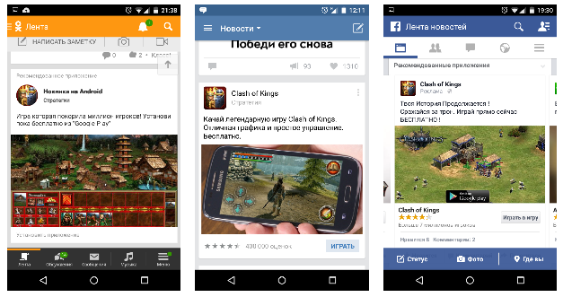
The brightness and colors form the impression of the banner, but how well it catches the eye depends more on the surrounding entries in the news feed. Therefore, not only a bright creative has a chance to stand out, but also, for example, an advertising image with a white background.
5. The success of the banner is determined by the idea, not the quality of execution
Practice shows that neatly cut pictures, harmoniously matched colors, beautiful buttons, etc. things have a positive effect on the user’s attitude to the banner, but the quality of the idea is much more important than the implementation.
When creating a creative, it is important to ensure good readability of the text, but the human brain extracts information even from such images:

Therefore, to bring beauty or not, it is necessary to decide based on the time allotted for the production of the banner. Moreover, sometimes unsightiness can have a positive effect on attracting the viewer’s attention to an advertisement due to the fact that it will stand out against the background of pleasant-looking creatives.
6. The idea of the banner should be clear to the viewer
Sometimes the message of a picture in an advertisement hardly reaches the reader. For example, if you just use a photo of a beautiful girl for a perfume store banner without applying any information elements, only from the description of the ad will it become clear what is being advertised at all. Even if in the given example the goal is to draw attention to the accompanying text by means of a picture, it should be borne in mind that not everyone is ready to spend time reading 90 characters.
In advertising non-gaming mobile applications, straightforwardness is often the best solution, and instead of conveying a sense of beauty and fragrance, you can put a photo of a perfume bottle with a price tag and an explanatory call to action like “Order discounted perfumes through the app” on the banner.
The same applies to games. The lack of gameplay on banners raises questions, not desires.
Straight-line banner
7. The image of a mobile device has a positive effect on the viewer’s perception
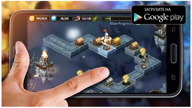
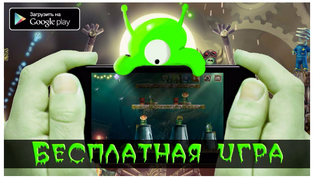
The display of a mobile device helps the banner to be informative. The image of a smartphone or tablet informs the viewer that it is not a website or a group on a social network that is being advertised, but a potentially convenient mobile application tailored for certain tasks.
A screenshot of the application should be displayed directly on the screen of the gadget, which will give a person an idea of how the advertised product will look in his hands.
Using a photo of a mobile device with a hand helps the viewer to better feel the dimensions of the screenshot elements and reinforces the information that an application for a touch-screen device is advertised. You can also take a separate gadget and put on it a photo of a hand with an outstretched finger touching the desired area of the screen.
Gadgets, of course, should not be used anyhow, but corresponding to the platform for which the application is advertised – do not be lazy to make different creatives for different stores. In the case of iOS, this is the latest iPhone or iPad model in a color contrasting with the background (important: there should be no Apple symbols on the device, the company will remove applications for this).
In the case of Android, it is better to use flagship models of mobile devices on this platform, and if you are not going to advertise their manufacturers, then it is better to cover up the logo.
When placing a vertical screenshot in a phone, it is not necessary to use a photo of a mobile device – sometimes it is faster and more efficient to simulate the frame of a smartphone, for which you only need to add a black or white rectangle and, accordingly, lighten or darken its edges to create a sense of volume. For added realism, you can add an improvised speaker and glare.
Also, a banner with a phone can be made by taking photos directly. This method has a number of advantages: it allows you to create unique and inimitable creatives, most naturally reflects the type of mobile application in the device, reduces the designer’s work time in a graphic editor. Among the disadvantages: for a high-quality photo shoot, the services of a photographer or at least a good camera are required, you need to find a suitable background and props; in addition, the colors of the gadget screen in the photo are usually distorted.
Despite the tangible disadvantages of this method of creating creatives, photographing a mobile device certainly expands the boundaries of creativity. For example, for the banner of a game about the Middle Ages, you can shoot a phone in your hand with rings on your fingers and against a stone wall. For the application to search for fellow travelers, you can photograph colleagues in the car with leaflets in their hands. If you can’t find the right image on the Internet, there is always an option to make it yourself.
Banner based on a mobile device photo
For an advertising campaign on tablets, it is necessary to prepare separate banners with devices corresponding to the platform. There are much fewer tablet owners among the active population than smartphone users, but this minority is also more paying, since they often buy a mobile device with a large screen specifically for games.
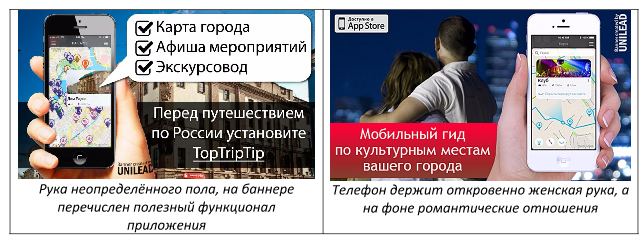
8. Reflect the gender of the target audience on the banner
When a mobile application created specifically for women is being promoted, it is recommended to use a photo of a woman’s hand for the banner. In this scenario, the girl will respond more favorably to annoying advertising, believing that this offer was made specifically for her.
In other cases, it is customary to use a man’s hand, because it is universal, but still we must remember that banners sharpened for a specific gender will definitely work better than universal ones. This approach is implemented not only by choosing the appropriate hand, but also by applying different inscriptions and execution in different styles.
POPULAR BANNER TEMPLATES
9. Screenshots from the store – we work with what we have
Imagine a situation in which only images from the store are allowed to be used to create a banner. The only way to give them originality is to apply the text that best matches their contents. To do this, you need to carefully look at the promo screenshot provided, try to identify its strengths and emphasize them with a short but understandable text.
In the example below, the designer noted a pleasant artistic style in which the buildings are executed, which was written about. The result exceeded any expectations: the boring urban-planning gameplay appeared attractive due to the feeling of comfort created by combining a screenshot with text, and the banner came out positive.
10. Embellished screenshots save the situation
At all times, girls have emphasized their beauty with cosmetics. In the same way, the beauty of the screenshot on the banner can be emphasized with alluvial elements or even subjected to “plastic surgery”.
The “painted” elements can perform several functions: to clearly show what kind of actions are available in the game and / or to depict the gameplay more colorful than it actually is. If an interested user sees after going to the store that the screenshots are similar to what was depicted on the banner, even if not completely, he is more likely to install the game.
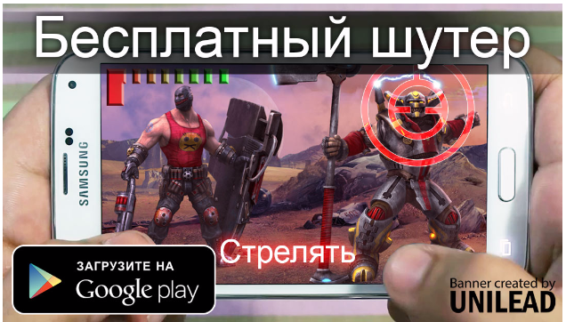
The interface of the shooting game has been applied to the official art of the game
“Plastic surgery” means cropping a screenshot, replacing the background with another color or texture, mashing unnecessary elements or changing their sizes. There is nothing criminal in removing everything superfluous from the screenshot and making it as easy as possible for the viewer to perceive it.
11. Sometimes it’s better not to show the gameplay, but to use the official art
When it comes to promoting the next clone of Clash of Clans, neither straightforwardness nor embellishment of screenshots in most cases will help to interest the player. In advertising such applications, specially drawn promo-arts with epic battles are often used, because they look much more profitable.
This banner does not carry information that the game is actually a card game
12. You can present secondary gameplay as the main one
If no one “bites” on the key features of the game anymore, you can try to focus on other game mechanics that really exist in it. For example, the selling gameplay of the “Fury of the Seven Seas” application is battles on pirate ships, but it also has a mini-game in the form of a slot machine, which can be presented as an important gameplay component.
However, it should be borne in mind that if a potential user does not find confirmation of the information from the banner on the store page, he will consider himself deceived and will not install the application.
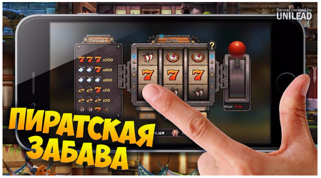
The game is about battles on pirate ships, but the banner presents it as gambling
13. Promise character customization
Players really like to choose the appearance and outfit of the character. With the development of the mobile games market, this knowledge was used in banners depicting the equipment and inventory of a hypothetical hero.
Such a format of creatives is very effective, because it promises the possibility of self-expression and boasts of a variety of game items. It is not surprising that such banners are made even for games that do not have a customizable character in their mechanics, which undermines users’ faith in the reliability of such advertisements.
If your application still has such a gameplay element, then you definitely need to beat it. However, it is rare that a screenshot of the inventory from a mobile game is suitable for a banner in its natural form — usually such creatives are “collected” from real inventory objects so that all the elements are large, and there is nothing superfluous besides them.
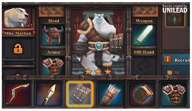
The inventory banner for the Age of Warriors – Warlords of Elantra game was assembled from two real screenshots
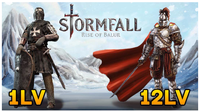
14. Promise to change the appearance of the character as his level increases
Again, this applies only to those mobile games in which there really is a free-standing character whose level increases and has any significance.
This advertising format is very attractive to users for a number of reasons: firstly, it shows that the game has “pumping”, secondly, the banner promises that the player will have his own cool hero that can be controlled, thirdly, gamers like character development to manifest itself not only in strength, but also in appearance, and developers often save on varieties of the latter.
15. Copy the design of another art product
The gaming and film industries have a lot in common: for example, a high level of importance of the visual component. You can use this and make a mobile application banner in the style of another popular game, movie or TV series. This decision will inevitably cause an associative reaction in a person, and consciously or not, he will want to click. However, if the copied design is specific and not designed for a wide audience, it is necessary to make sure that it is seen only by those who care about the original source of stylistics.
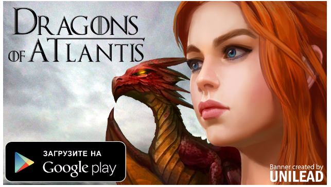
We are not to blame – initially the creators of Dragons of Atlantis copied the image of the character of the series “Game of Thrones”, and we developed this idea
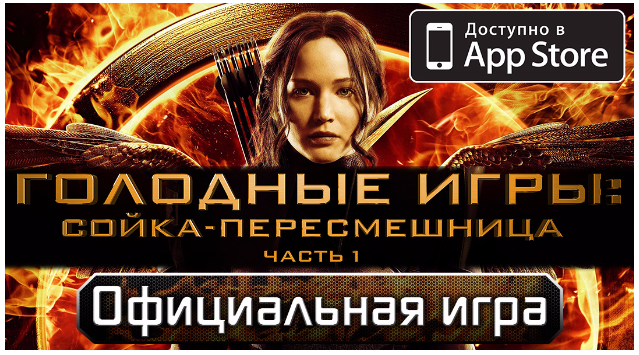
16. Posters and excerpts from the film can be used to play the movie
It is much easier to promote mobile applications launched for the release of a famous movie for a number of reasons: people have already seen trailers, are waiting for the premiere, and when they see an advertisement for the game of the same name, they apply their knowledge and expectations to the proposed product.
In addition, when creating banners for a movie game, the designer has in his arsenal not only screenshots of the mobile application, but also posters and stills from the movie, unless, of course, the advertiser has prohibited their use.
ALLUVIAL ELEMENTS OF BANNERS
17. Important banner elements should be large
When creating banners for mobile devices, it is important to remember that the screens of gadgets (especially smartphones) are very small, so do not be afraid to make such important elements as an inscription and a screenshot large. Visually impaired people will thank you by clicking on the ad.
You can not exploit phone photos at all, but place a screenshot of the application in the full width of the banner. This is most often applicable to games running in the horizontal orientation of the screen. This allows you to create a creative faster, as well as show a screenshot or art larger.
When advertising dating services, a photo of a person is usually used as a screenshot, reducing the demonstration of the interface to a minimum
18. The logo is usually not needed, but it can be useful
Any decent mobile application has its own logo, but it is very rare to see such an element on banners. First of all, because the developer does not always provide it at least in some form, and it is often not possible to find it on the Internet either. Then the only way to get the coveted image on a transparent background is to manually cut it out of a promo art or a screenshot of the loading screen, but this is a painstaking and time–consuming activity, so it’s easier to abandon this idea.
The logo is made from scratch in such a way as to evoke associations with the game Diablo 3
Moreover, often the logo does not matter at all, especially if we are talking about a new game by a new developer. In the banners of such projects, the emphasis is on enticing text and an interesting picture, and not on a well-known name. Although sometimes the logo of a new mobile application is recognizable if copied from another well–known project – then with proper targeting it increases the effectiveness of advertising.
An example of a selling logo is “Yandex.Taxi”, where the first word refers to a popular Internet service in Russia, and already by default causes trust. The application of the publisher’s logo will also have a positive effect if it is as well-known and respected as, for example, Electronic Arts.
And sometimes you just need something to fill an empty space on the banner, and then the logo can come to the rescue. Also, sometimes the placement of this element is the advertiser’s requirement, and all questions disappear by themselves.
19. The word “free” is not always useful
At first glance, the magic word “free” will adorn any banner of a free mobile application. The reason is obvious – a person is more likely to try the game if you don’t need to pay money for it.
At the same time, the business model of the advertised product is usually obvious to the user, and by clicking on the banner of a mobile game, he is usually sure that he will be able to download it just like that. Therefore, if the word “free” does not fit into the composition or covers an attractive part of the image, it is better to abandon it. Moreover, it can always be added to the description of the ad.
Any free application needs as many paying users as possible, but the dominance of users who do not want to part with money is inevitable, and even carries a certain benefit – it fills the community of players with life and serves as cannon fodder for those who pay. This applies to MMO-type mobile games (with the possibility of attacking other users) or single ones, but earning money from advertising other applications.
However, it happens that the application only needs paying users – the rest are useless. This may be, for example, an online cinema that earns exclusively on a subscription, the monthly cost of which exceeds the combined price of several paid mobile games. In this example, paying to attract fans of freebies will not bring financial benefits to the advertiser and placing the word “free” on the banner will only worsen the quality of traffic.
20. Store icon – good, but not necessarily
As an alternative to the homemade “Download for free” button, you can use a store icon that already has a similar meaning to the word “download”, which will reduce the time to create a creative and help compositionally fill the empty space.
The positive effect of applying this element is similar to placing a gadget on a banner – it informs that a mobile application is being advertised, and that a click will take you to the appropriate store.
To some extent, the presence of Google Play, App Store and others is an unwritten standard for the design of creatives, so if this element is missing, the viewer may experience anxiety from the fact that something is missing. Although the store icon can also introduce disharmony into the composition of the banner, cover a beautiful background image of an already self-sufficient creative, and then you can safely refuse it.
21. Call for help with the assessment and comments from the app page in the store
You can add additional attractiveness to the banner by adding profitable user comments and a summary evaluation of the application. Just don’t forget to take a screenshot of the source of information to use it for successful moderation.
22. Do not forget that some elements of the banner can be drawn
If you have a graphic tablet, you can draw simple elements to a collaged banner that would take more time to find – this is another way to create absolutely unique creatives.
You can even completely draw a banner from scratch, but it will take a lot of time, so first you need to be sure that it’s worth it.
The brain slug is drawn on a tablet by the banner designer
FINAL MOMENTS
23. Test different versions of the same banner
Despite the presence of proven formats, it is impossible to predict the audience’s reaction to a particular creative with absolute accuracy, therefore, when launching an advertising campaign, it is customary to first test a banner with a small budget, and if it behaves well, launch it in a big way.
The effectiveness of testing can be increased if you include variations of the same image with minor changes in the trial advertising campaign: a different text or its absence, a different background color or buttons, a different gadget, etc. The results of such tests will not only give interesting statistics, but also help you choose the most successful creative.
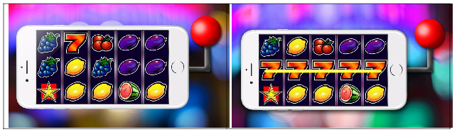
24. Details matter
We found out that without a test, it is difficult to say for sure which inscription or even the color of the button on the creative will excite the desire to click on the banner and install the application more than others. However, this does not mean that you can sort out the options at random – a thoughtful approach to the selection of elements of an advertising image will bear fruit.
In the example below, there are two almost identical slot machine application banners. On the first one, a screenshot was inserted into the smartphone screen without changes. In the second one, this screenshot was redesigned in such a way as to show a winning combination. The first banner came out “unprofitable”, and the second, on the contrary, very successful, although the difference would seem insignificant.
25. Where to look for new images for creatives?
When creating banners for a new mobile application, it is permissible to go the most direct way – to take screenshots and promo art directly from the page in the store. Many others do the same, which leads to the same picture being displayed in the news feed in a short period of time, after which the user either gives up and clicks on the banner, or stops responding to it altogether, and then you have to look for a new picture.
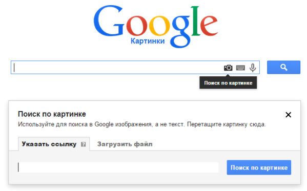
The easiest way is to request the source code of creatives directly from the developer, but this is not always possible, and the response process may take a long time. Finding yourself in a situation where you have to rely only on yourself, go to Google Pictures or another similar service to search for interesting art and screenshots of the application. If the desired image was found only in poor quality, use the image search.
Of the more time-consuming ways: you can take screenshots from official trailers or snag graphics from the app’s website, or install it on your mobile device and take screenshots yourself.
It will cost money to subscribe to stock photo services. This is relevant for offers that allow the use of third-party images. For example, any beautiful photo of the corresponding car will be suitable for the application banner for ordering a taxi.
However, designers usually download images from the Internet for free, using popular search services. The only advice when working with them: enter queries not only in Russian, but also in English – with a high probability different results will be output.
26. Check how the banner looks on the screen of your mobile device
If you doubt how well the important elements of the creative are read, the right way to check is to test the banner on the maximum number of mobile devices.
To automate this process, you can work on creatives in folders that sync with the cloud. If there is an application of the same cloud service provider on your mobile device, then the newly minted banner will be available for viewing on a smartphone or tablet in a matter of seconds.
Is there no way to test the creative on a mobile device? Then, as an option, before transferring the finished banner to the customer, you can reduce it directly in the window of the graphic editor so that the area occupied by it corresponds to the screen size of the selected gadget.
The second method has one big drawback – it implies hiding pixels that will be visible on the screen of a mobile device, so such a solution gives only an approximate idea of how the creative will behave on a small screen.
27. When launching a banner, the result is often unpredictable
In this article, many tips were voiced on creating working mobile application banners without using outright lies in them. It is important to remember that even proven formats often refuse to work with individual offers or audiences.
Do not despair – try to approach the promotion of the application from different sides. Remember that the main thing is the informational message of the banner and that any detail can have an unexpected effect on the perception of the creative by the audience. Testing of the advertising campaign will show whether this effect is positive or negative.