Not everyone was happy about the App Store changes in the sixth version of iOS 6. According to Chris Newman, executive director of Lightwood Games, for independent companies, updates in the Apple app store are a real disaster.
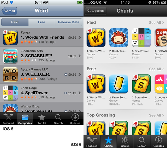
The biggest problem is the lack in the new version of the store of the ability to sort applications by release date. Now you can view only Paid, Free and Top Grossing categories. Newman wonders who cares about the box office top, in which the same apps hang as in other charts, only in a slightly different order?
The New Releases category was very important for anyone interested in new products (which means almost everyone who regularly downloads applications). Previously, it was possible to find something new in a certain niche without any problems. It was enough to select the category of interest, and then click on the New Releases button. Now the user does not have such an opportunity.

For small developers, this, Newman emphasizes, is terrible news. Getting – even for a very short time – into the list of new products was a very important event for a small project. So any application got a chance to light up. Now there is no such chance. The system shows only those projects that are already on the chart.
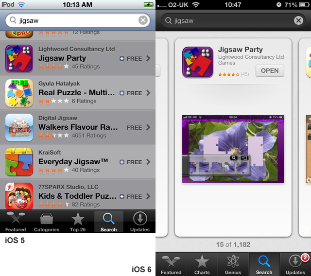
The second big problem of the updated store is the new search. More precisely, the search results display screen. For some reason, Apple decided to abandon the list, which simultaneously displayed up to five search results. Instead, when answering a search query, a card of just one application appears on the device screen. So in order to scroll through the list of the first 25 applications, you need to make not four swipes, as before, but as many as twenty-five.
Considering that more popular applications are likely to get to the top positions in the search results, this innovation is another blow to independent teams. Moreover, if the user still wants to find something original in the search results, he will have to make serious efforts (fingers will rub quickly).
Yes, despite the fact that each application was allocated an entire screen in the output, there was almost no space left for the name. So if suddenly the name of your application consists of two big words, the second one is unlikely to ever be read by anyone.

The disadvantages of the new App Store, Newman also noted the lack of a horizontal version of the app store. It wasn’t there before, but screenshots in it could at least be put, as they say, in landscape. Now only vertically. Because of this, the screenshots of programs running horizontally look very small.
Although all this seems to be minor flaws against the background of the worsening situation with search suggestions. The search engine can no longer display results either in the case of entering the name of the application category into the query window, or in the case of entering the company name. In response to Newman’s query “word puzzle”, the search engine suggested that Chris was looking for “bird puzzle”, and in response to the query “Lightwood Games” – “Clintwood games”.
Also, according to Newman, direct links with the transition to iOS 6 have changed. If earlier the user, logging in from his iPhone to lightwoodgames.com , could, at will, either get to the company’s web page optimized for the device, or directly to the App Store with a list of Lightwood Games games, now the latter option gives an error.
In conclusion to his post, Chris calls on all developers who are also concerned about innovations to write a letter to Apple with constructive criticism.
Newman’s original post can be found here.
