The icon also sells. Depending on what is on it and how it is drawn, the user decides whether to click on it or not, to see if the application is worthy of him. The question is, are there 100% working rules regarding icons?
That is, is it possible to guarantee that with a high-quality display of the n-object, it will be clicked on?
In order to solve this problem, we decided to look at the icons of top iOS games in the markets of the USA, China and Germany. We made this choice based on the following prerequisites:
- The USA is the litmus test of the mobile games market. Most of the players in the market are guided by it.
- China is the near future of the mobile market. Now this market is at the stage of formation.
- Germany is one of the central markets of Europe. It is generally believed that German retail was seriously different from the world. Is this fair for the mobile market?
Icons – USA
GrossingThe Candy Crush Saga icon from King is hardly ideal.
However, it stands out not only in the top, but also in the store: unusual edging (white with purple), scary candy on a blue background. By the way, the same background is present in Pet Rescue Saga. Only in the latter case, King decided to place an image of one of the game characters on the icon after all.
About the Clash of Clans icon. We may be confused, but it was Supercell that launched the trend for men screaming on the icon. In the Russian box office top, sometimes the situation reached the point that the top 5 completely retreated to games with similar icons.
The War of Heroes icon is also not ideal. It’s ugly, but it’s designed for a strictly defined audience, Marvel fans and heroes of this universe.
Paid chartIt is very difficult to find common things in paid icons here.
Each of them addresses its audience. Rovio considered it necessary to write only “Star Wars” on the Angry Birds Star Wars II icon; Plague Inc. has two symbols drawn – biological infection and DNA; Minecraft has a pixelated texture; Heads Up! displays how the game is going, and on the NFL icon is an American football player.
Free chartHere, too, there is, if I may say, a game with symbols.
Already looking at the icons, you can understand what the game is about. The exception is Deer Hunter 2014, in which you don’t have to play for a deer, but hunt it.
Icons – China
GrossingMost of the games presented in the Chinese top have amazing cartoon art.
I will not give the names of the games (they are all in Chinese), but here the situation is a bit reversed for the American market. Icons, as a rule, do not tell the user anything (among those presented above are runner, butler, card game and MMO). But there is a serious emphasis on the faces that occupy most of the screen. Their task is to send the user not information about the game, but the mood.
Paid chartThe first application (部落守卫战) is a mobile version of the popular MMO tower defense in China (yes, it seems that this happens).
So it is quite understandable that the developers want to place the original logo on the icon. In the case of the application number four (狂斩三国) this was done because of the talking name – “Three cut” (thanks, Google). Quite a good name for a slasher.
Free chartIn the free chart, everything is clear: there are applications whose icon is a symbol, there are those that are “about the mood”.
Icons – Germany
GrossingIn four cases out of five, there are characters who broadcast a certain mood.
Paid chartEven if we had not written what markets we are considering, thanks to the leadership of Construction Simulator 2014 in the paid chart, it would be easy to guess:
this is Germany. Do you want to rise in the German top? Make a simulator of civil engineering (combine harvester, tractor, tram, construction crane or something similar).
Free chartThe biggest secret for us is the first two icons.
They don’t tell us anything. What the games are about, for someone it’s a secret behind seven seals. But they do not regret the traffic on them.
Summing up
We will not discover America if we say the following about game icons: when creating them, you can proceed from two two prerequisites.
1. Focus on content (if the game is about birds, draw birds, if about racing – draw cars). This approach is actively used in Western markets.
2. Focus on the mood (we want to please the user, so why not please him with a smile of a game character or, if the game is a horror, on the contrary, do not try to scare him).
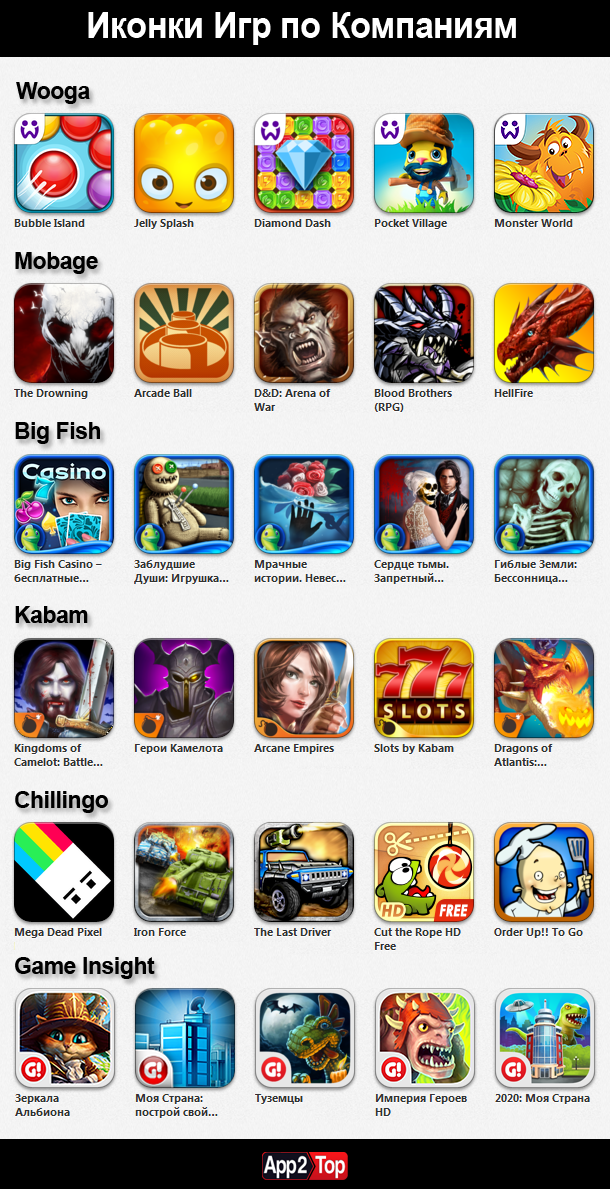
We have also prepared an infographic on how various publishers approach the creation of icons. Enjoy your viewing.


