Google has launched a new version of its Google Play mobile app store for desktop users.
Until today, the PC version of the mobile store looked, to put it mildly, unpresentable. To change something in it was not the primary task of the company. It was functioning properly – and, most likely, at a certain stage it was enough.
But in May, at Google I/O, the search giant announced that following the design change of the mobile version of the store, a full reskin of the PC version will follow. And now, two months later, a new design appears.
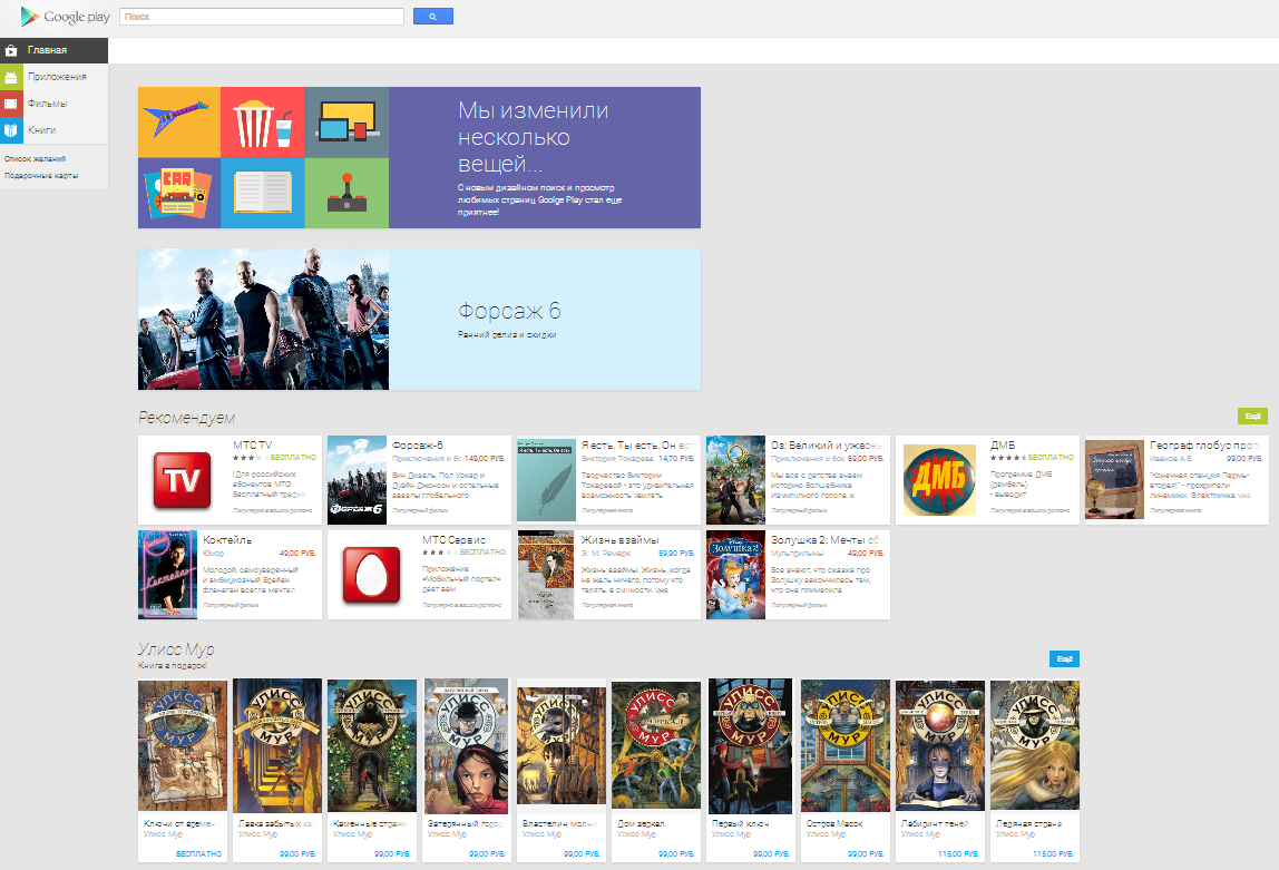
It differs little from the mobile version of Google Play in terms of style (the same card minimalism) and almost does not differ in structure, if we talk about the main page.
However, something immediately catches the eye. Firstly, the “games” category was hidden.
That is, if in the mobile version one tap separates the user from the tops of game projects, then first you need to click on the “application” button, then again on the “games” button. Moreover, curiously, the promotion of applications (columns “Select Play” and “Recommend”) are relatively unobtrusive.
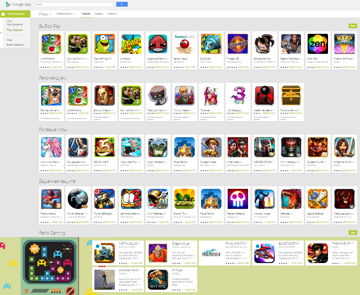
More aggressive feathering occurs only when scrolling by, for example, categories.
In any case, we still have to get to the games. First of all, Google is currently trying to promote its paid services – movies and books.
From the entertaining: the page of the application itself has changed significantly externally. The place under art disappeared. Now the focus is on the application icon itself and its screenshots. The description is immediately below them.
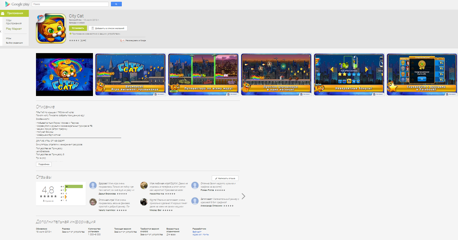
And, yes, there are large screenshots.