What do high fashion and the world of mobile apps have in common? Stupid question? Not at all. They have a lot in common. Read below about the new Google Play summer collection and the reasons why it’s worth a look.
Mobile app design is a sore point for the market as a whole. And this is quite understandable – the sphere is young, its own fashion idols, mobile Dolce & Gabbana has not yet appeared, except for Quince, each design of which bearded geeks are ready to discuss with more zeal than the new Giorgio Armani collection of girls from the world of bright flashes and fashion shows.

Johnny Ive, Mobile GoochiIn the context of the PC, fashion has never been treated so painfully.
At first, a personal computer was too rare an item associated with a certain social group, then it began to be perceived as a working tool. Only geeks who cared more about the functional side of things than about the color of the case could treat it as something very personal.
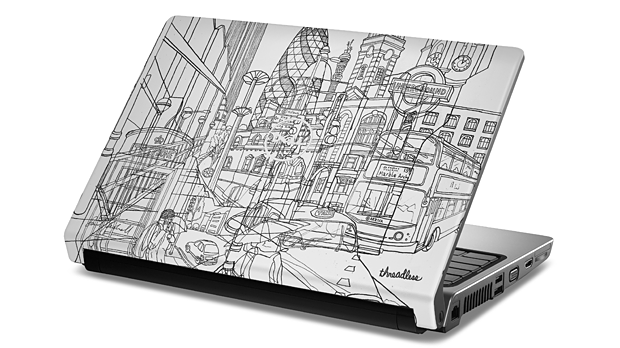
With the spread of laptops, the situation began to change, but this did not concern the software, not the operating system, but how the “lid” looks, whether there are many rhinestones on it and how many shades of pink you can see on it.

Fashionable laptopNow that the struggle for consumers’ wallets has moved to the screens of mobile devices, when applications have become part of social life, there is a need for it to correspond to certain fashion trends.
But if in the fashion world the defining values are the leading brands that arrange shows several times a year, at which the “most squeak” is demonstrated, then in the mobile world, the holders of stores act as houses.
Based on their visual solutions (not only in terms of icons, but also following some general logic of the structure), designers can, in theory, provide their projects with an organic look for a particular store, thereby attracting more users to themselves.

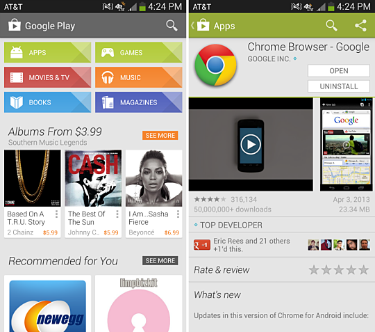
Google PlayBut, as I said, this is just a theory.
And the question is, will following their visual solutions really benefit?
In the case of Google Play recently, we can say for sure: yes.
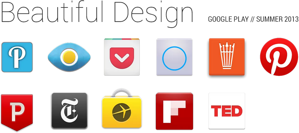
The Android Design Team presented a collection of applications The Beautiful Design Summer 2013, in which they collected the most beautiful programs. It is clear that getting into it is one of the possible types of feature.

The fashion collection includes a total of 11 applications. Among them: Pocket, Pinterest, Flipboard and many others. The full list can be found at the link.
They promise to update the collection regularly.
P.S.
The only question is how applicable this approach (following the OS style) is to games where the rules are dictated by the setting. On the other hand, there are beautiful Dots on the “apple” devices, there are visually magical Mini-U: ZOO Abracadabra and Wide Sky, which do not really correlate with the skewomorphism of old iOS versions, but are very close to the minimalism of Google Play. So following is possible.
UPDATE
A colleague reminded us here that Apple has been trying to influence mobile fashion for a long time by arranging Apple Design Awards. This is all true, if not for one “BUT”. Google has shown, as it seems to us, exactly those applications that look good within its ecosystem, and not abstractly “cool”.
In any case, it’s interesting, our colleague wonders, will the approach to choosing Apple Design Awards change much after the arrival of iOS 7?
Photo on the icon: mbkievfashiondays.com
