What is the difference between UI and UX; how locations are prototyped; who is to blame if the player does not orient himself at the level – this and much more can be found in our transcript of the third issue of the podcast “Underground Game Design“.
First, a few words about the podcast itself. It is led by a game designer (and previously a game journalist) Svyatoslav Torik. The podcast has been released more or less regularly since June last year. We have already published the transcript of the first issue of the podcast. The transcript of the second issue will be available at the end of this month. And this time we decided to continue with the third. The audio version of the podcast is at the very bottom of the publication.
Svyatoslav Torik: Hello, dear listeners, and welcome to the podcast about gem design in Russia and not only in Russia, because we have guests from different regions with us now. We can say they are scattered all over the globe. Today we will talk about those game designers who are engaged in UI/UX, and those who are level designers. Alexey Rekhlov is helping me today…

Svyatoslav Torik – Product Vision Expert in Wargaming.net
Alexey Rekhlov: Hello everyone!

Alexey Rekhlov – producer of Creative Mobile external projects
Svyatoslav Torik: …and Sergey Gimelreich.
Sergey Gimelreich: Hello everyone!

Sergey Gimelreich – producer of ORC WORK
Svyatoslav Torik: The level design is represented by Yaroslav Kravtsov.
Yaroslav Kravtsov: Hello everyone!

Yaroslav Kravtsov – producer Mail.Ru Group
Svyatoslav Torik: Sergey Smorodin from Plarium is responsible for UI/UX.
Sergey Smorodin: Hi.

Sergey Smorodin – Senior UI/UX Designer at Plarium
Svyatoslav Torik: We’re going to talk about roles that don’t seem to have anything in common, because where is the level design and where is the interface? The player sees the interface separately, and the level in front of him separately. Sometimes they come together, but we’ll talk about that later. Actually, maybe someone – a level designer or a UI designer – will tell you what these two roles have in common?
Yaroslav Kravtsov: Let me probably start. UI design is also important for level designers, because it is one of the tools for navigating the level, getting feedback. These are all sorts of mini-maps, tasks, hints where to go – interface ones. And if the level designer does not work with the UI designer about all these elements, then fakaps begin. Yes, first the designers came up with the mechanics, agreed with the programmers, they did it, then the level designer sat down, pushed this mechanics to locations. Then they sit, play and such – something is missing! Ah, the interface is missing! And at the last moment, running, running…
Sergey Smorodin: Those notorious stripes over the character.
Sergey Gimelreich: Listen, is it right? To be honest, in my last project – and I have a very complex project from the point of view of the interface – I am just promoting a slightly different practice. We try to make so-called “fake shots” even before programmers make levels, program mechanics, and so on. That is, we try to make the user interface in advance.
Sergey Smorodin: I did my penultimate project based on screenshots from similar games. I took the tablet in my hands, took the requirements from the document, which told me what actions would be with the character, what information should be brought to the player. And I just took screenshots, twisted, did, tried how my fingers lay. This is for a mobile app.
Svyatoslav Torik: Sergey, can you name any games that are absolutely unambiguously a reference when you have a task in front of you and you don’t know which side to approach it from?
Sergey Smorodin: I love shooters, so Battlefield, Dead Space are good. Very nice interface. He is a bit illogical because there is a problem with how to see your life on your back…
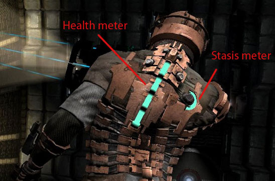
Dead Space
Svyatoslav Torik: That’s exactly such a diegetic interface – is it always appropriate?
Sergey Smorodin: I think it’s just fine. And I think it’s even necessary to sacrifice logic in order to convey this as an element of the game world, and not some kind of plane hanging between us and the game avatar.
Sergey Gimelreich: The interlayer.
Sergey Smorodin: Yes, some kind of glass.
Sergey Gimelreich: You remember, there was some very old game, almost the firstborn of this wonderful idea, where some kind of tattoo in the form of life was displayed on the arm.
Svyatoslav Torik: Look, there was a tattoo on the heroine’s chest in Jurassic Park: Trespasser. You could turn your head, and when you lowered your head down, you saw the tattoo. And it was either full, or, accordingly, not very. There was a heart there.
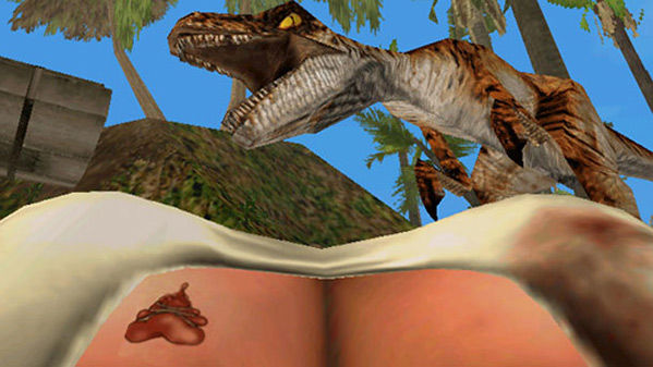
Jurassic Park: Trespasser
Alexey Rekhlov: Sergey, what do you say, how is the user interface perceived in your company? Is this directly what the player sees, or is it a broader concept that includes, among other things, control and elements of augmented reality, as mentioned just now? Maybe something else?
Sergey Smorodin: We have not yet directly approached projects of this class. So far, this is just a standard set of windows. I want to transfer part of [the interface] from this layer, as I call it, from this glass that stands between us and the world, into the world itself. To notify about some events not by flashing icons, but by something happening in the world. For example, symbols light up above the houses, which tell the player that it would be nice to go into this house, there will be something there. I do not know if this applies to the user interface or to the game mechanics, but I think it is better to put this indicator in the world itself than to output, again …
Alexey Rekhlov: Well, according to the classics, user interface is a way for a user to interact with the game world. That is, he receives information through him and transmits information through him.
Svyatoslav Torik: Aren’t you swearing, Yaroslav, about the need to hang colored lights over the right houses?
Yaroslav Kravtsov: No, usually, if we are talking about some systemic things, then it is necessary to stuff, relatively speaking, mechanics into the house… In fact, it is difficult to answer this. The answer is – it depends on the project. Sometimes I have come across the fact that a level designer, or a designer in general, thinks about some mechanics, about some things, makes [a level] based on them, and then a UI designer comes and says that this cannot be done. That’s just corny impossible. Let’s say you need to output a lot of information to the player, and the player does not have time to get acquainted with this information, relatively speaking. And here we need to think.
Sergey Gimelreich: I generally had an idea that UI/UX designers do not meet with level designers at all.
Sergey Smorodin: No, they are dating.
Alexey Rekhlov: In the smoking room?
Svyatoslav Torik: To smoke or at lunch.
Yaroslav Kravtsov: The most interesting thing here is that UI designers sometimes call themselves UX designers. That is, when they talk about the interface not as a set of buttons, text, but as a kind of experience of interaction with mechanics. The level designer also works with mechanics from some side, and therefore there are points of intersection.
Alexey Rekhlov: What is common and what is the difference between UI-, level- and UX-designer?
Sergey Smorodin: Let me try to separate these two concepts. It is difficult to separate them. In most companies, as UI and UX design vacancies go through a slash, so it continues to move forward. But a UX designer, I would say, is a person who tries not just windows and lights, but tries to somehow convey… I don’t know, it’s probably aerobatics… He tries to convey emotions, to convey the game situation itself without using windows, that you have little life, that some assistant has died.
I’m going to move a little away from mobile interfaces now. Probably, everyone played cars and pistols in childhood. In slot machines. These are the ones where they give you an ultrasound, and you take down monsters with two friends. This is also an interface so close to reality that when you shoot, there is a recoil. And it transmits the game state itself at this moment.
I have heard about such an example. This is a game, in my opinion, on the PlayStation. The story of two brothers, where we control two brothers on the gamepad at once. Now, apparently, the spoiler will be…
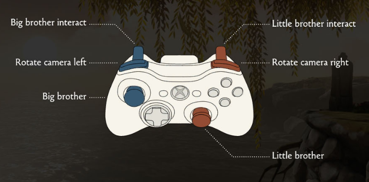
Control Scheme in Brothers: A Tale of Two Sons
Alexey Rekhlov: Yes, it’s Brothers: A Tale of Two Sons, and yes, it will be a spoiler.
Sergey Smorodin: This is a perfect example of how a player is shown his loss, his limitations in actions. Not letters, not flashing pictures on the screen, but the way he now communicates with the game using a joystick.
Svyatoslav Torik: I think you’re retelling the App2Top note to all of us right now.
Sergey Gimelreich: Yes, Sergey has an open page, apparently. (Laughs). In a separate window.
Sergey Smorodin: No, when we went to DevGAMM last, we talked about it in the report “Interface as a metaphor“. It was a very wonderful report that sunk into my soul, and I came all full of emotions, how to do it all. But everything broke again about the routine, about the windows and so on …
Sergey Gimelreich: Yes, we understand you, Sergey. Let’s listen to Yaroslav for a bit, switch from this wonderful topic to level design and from the point of view of level design we will then discuss the interaction between these three sides. Yaroslav, have you had any experience where level design had to be built in cooperation with a UI/UX designer?
Yaroslav Kravtsov: There are not many situations to interact closely. Let’s just say the most intense interactions were when I was working on SkyForge. Banal examples: when a location should be not just a picture, but a sufficiently functional element that tells the player where he is, where he needs to go, how it will be useful to him, and so on. There is quite a lot of logic there, because of which it was necessary to negotiate with the level designer. Because the level designer says what he wants to show, and the UI designer explains how it can and cannot be done. These are the arrangements.
SkyForge
Sergey Gimelreich: Yaroslav, I wonder, when you plan a level design, do you take into account how it will look on the mini-map? Beautiful-ugly.
Yaroslav Kravtsov: Yes, with experience comes the understanding that you need to think about how it will look on the mini-map. Because there are literally one or two mistakes when ugly boogers or just garbage turn out on the mini-map… Let’s say the quest execution area is marked, and several quests are performed in approximately the same area. It turns out porridge from the layering of several areas. The player looks at the mini-map and does not understand anything.
Sergey Gimelreich: Yes, I had such a story with Total Annihilation, when at one of the levels I open the general map of the level and realize that it consists of a huge number of small islands, and it looks like a large set of evenly distributed spots. This, of course, greatly spoils the navigation experience. And this, it seems to me, intersects well with UX.
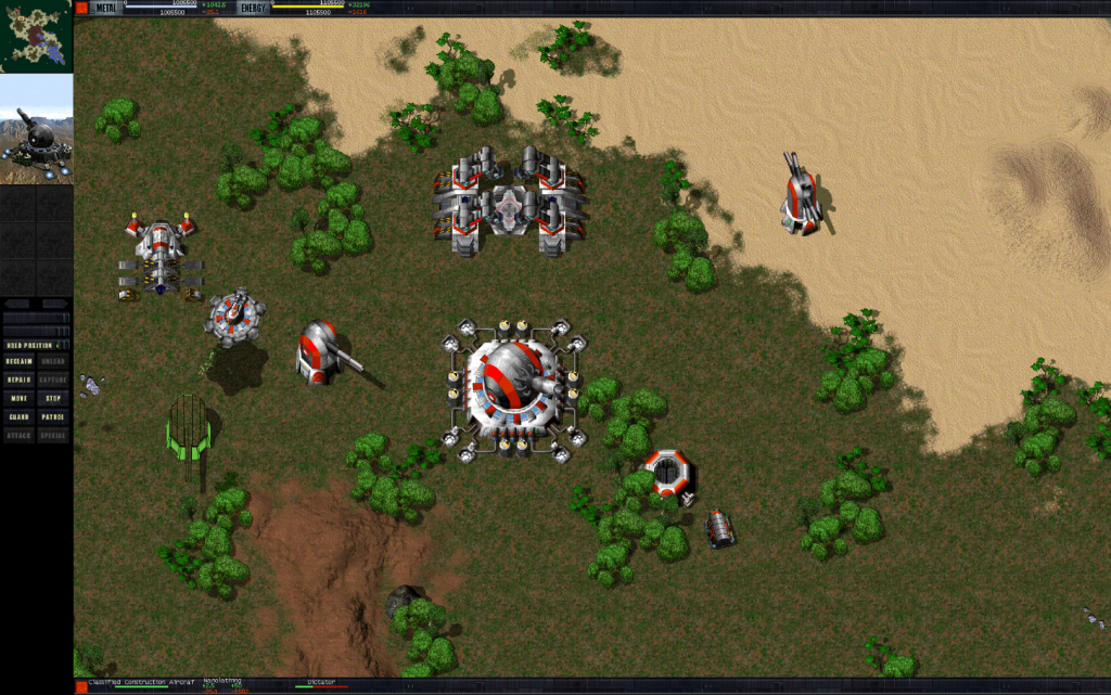
Total Annihilation
Yaroslav Kravtsov: When we were still talking about diegetic interfaces, we found out that this is a matter of immersion in the game. Naturally, it happens that there is an element that pushes out of the game. For example, if you see patterns. You can see that the quests are packed in a uniform layer at an equal distance from each other. And you realize that this is a game, a game convention, you’re playing a game, it’s not a real world. And you fall off as a player.
Alexey Rekhlov: Yaroslav, what do you think about during the level design? Do you think directly only about how objects, tasks, and so on will be placed there? Or do you think, among other things, what names will the quests have, what goals will relate to them, how will the complexity grow? Or are these not your tasks?
Yaroslav Kravtsov: Let’s just say that if we are talking about the experience of creating locations with quests, and this includes my experience with SkyForge and Allods Online, then there are, of course, a million things to think about. But the titles are, rather, a question that flies away in the direction of the screenwriters.
Alexey Rekhlov: You know at least that the name will be like this. And then the name turns out, for example, “Battle in some puddle”, and you are actually on the peak of the mountain.
Yaroslav Kravtsov: Ah, well, this, of course, should be discussed. Here, rather, there is such a topic that there is a screenwriter who, in theory, should be at the origins. And he says that we will have a location about this and that, and there will be such and such and such subzones. And the designer makes them, and the screenwriter, knowing that there are such and such subzones, paints what quests will be there and gives them appropriate descriptions.
Alexey Rekhlov: So you have to do it all in this form. Or do you do something first, and then…
Yaroslav Kravtsov: I would say that this is the so-called best practice. That is, if they do that, everything is fine. But it is possible that the opposite happens: a level designer comes and says that he has done everything.
Sergey Gimelreich: Yaroslav, do I understand correctly that the level designer in this case performs purely mechanical work? That is, his creativity lies solely in the beautiful arrangement of objects by location?
Yaroslav Kravtsov: Depends on. If this is the twentieth location in the game, where the guide lines have already been worked out and it is clear how to collect it, then, in principle, yes. You take a disciplined person, show the guide lines and check from time to time.
Sergey Gimelreich: So, what about the user experience? What about the new sensations? What about the discoveries in the process?
Yaroslav Kravtsov: This happens when the work is not on the first location, when these are the first locations. This is all, in fact, being worked out, rediscovered.
Sergey Gimelreich: Yaroslav, you are, in fact, condemning the unfortunate player to the fact that after he gets a beautiful, pleasant and good experience at the very beginning, somewhere in the course of the game he will simply get bored, because there will be uninteresting and boring locations further on.
Yaroslav Kravtsov: Why is that? If there are rules for creating interesting locations, then the locations will continue to be interesting. After all, these are not just rules on how to do it, but how to make it interesting. It’s just that it also needs to be formulated if we are talking about the production of a large amount of content. Because if we say that every designer makes a location the way he wants, and every time he tries to invent something new, then we have a great chance of getting chaos out of completely different locations that don’t look like part of the same game.
Alexey Rekhlov: By the way, there is a question about this. Do you have any practices for prototyping the original locations? An empty world is being created, where everything is being added initially, or is it being extensively developed?
Yaroslav Kravtsov: This again depends on the project. The usual practice that I know is when there is a prototype of some small part of the location. We are not talking about the entire amount of content that is planned in the game. On this small volume, the basic mechanics are worked out, and then replication is already underway. Because it’s a big risk when you haven’t checked anything yet, and you’re already doing not five, but fifty locations, relatively speaking.
Svyatoslav Torik: But tell me, Yaroslav. Do you think you use fantasy or logic to a greater extent? You think through everything, you know exactly in advance what you will have where, and then you go along with it?
Yaroslav Kravtsov: I’m probably a logician after all. Therefore, I try to formulate everything by certain rules. But I also have rules on how to achieve emotions. In fact, this is a simple but working hint: emotions arise where expectations differ from the result. It’s enough for you to hint to the player that there will be one thing next, but in fact there will be another. Only one thing, it has to be something better. Then he will have positive emotions. If you give something worse, then there will be negative ones. For example, here is a negative emotion: the player runs, runs, sees a beautiful view. Thinks: “I want to go there.” He tries to run there, and there – bang! – an invisible wall does not let him. The end of the location. The player immediately has a negative emotion, because he was not allowed in. Sadly.
Sergey Gimelreich: By the way, yes, these are the limitations, when you face an invisible wall, they are terribly frustrating. I would say that in the vaunted Half-Life 2 there was a lot of this.
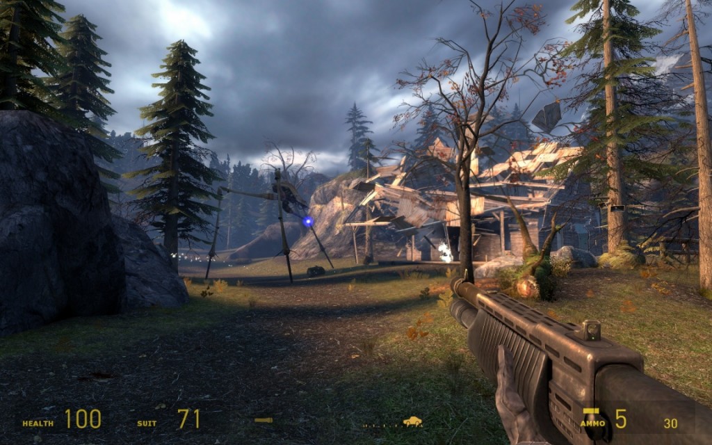
Half-Life 2: Episode Two
Yaroslav Kravtsov: This is unavoidable, because the player cannot be allowed over the edge of the level. Then he will reach the edge of the level, see that this is not the real world. It will also fall off. The question here is rather how to serve it, how to create a feeling that the player cannot go there. I really like how it’s all done in Uncharted 3, where there is a mission in which the character walks around the city, but it’s beautifully played everywhere, why the player can’t go there or here.
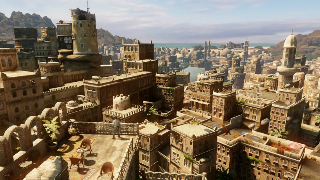
Uncharted 3
Alexey Rekhlov: And here’s the question right away, to push level designers and UI/UX designers together again. And if the player does not understand where to go next and what to do, who is to blame for this? Level designer or UI designer? And how to solve this conflict? Because usually everyone does this: everyone points at the other.
Yaroslav Kravtsov: I don’t know. The level designer is always to blame. (Laughs).
Sergey Gimelreich: And how to resolve the situation when the UI designer made a very crappy compass, for example? By the way, I’ve come across this quite often. In the same Skyrim, for example, at the very beginning of the game, I spent quite a long time figuring out how their compass works.
Skyrim Compass
Alexey Rekhlov: … or a very crappy mini-map on which everything merges into a pile.
Yaroslav Kravtsov: Let me start answering this question after all. In my opinion, here is a compass, a mini-map – these are all elements that help in navigation, but are not its basis. The basis is what you see in the game world. That is, you see an interesting tower and go there. Or you see the road, you go there. If a player is lost and does not know where to go, then this is, first of all, the theme that the world itself is poorly built, that there are places from where orientation is not available to the player.
Sergey Gimelreich: A hook to the right of Yaroslav Kravtsov in the direction of UI.
Sergey Smorodin: I absolutely agree that the world should be a chain of points, locations, places that interest the player and lead him around this world. And when he wanders, the UI designer can always put a big red arrow showing “go there”. Although I understand that this is a “crutch” solution.
Svyatoslav Torik: I have such a question for both of you. Here I am now playing Might and Magic X. It is made according to the patterns of the games of the first trilogy, which were hiking. The story is this: I leave the city and go to the forest, for example. I walk through the forest, then the beach begins, then the jungle, then the mountains and so on. When I walk for the first time, I mostly look in front of me, in the main viewport. When I’m already starting to “backtrack” – well, there, to return to the city, to go back and forth – I’m already guided by the mini-map. Since this is a hiking game and you walk through the cells there, then, roughly speaking, I almost count the number of cells through which I pass. It’s more convenient this way. I’m not looking at the central viewport anymore. How would you, from the level design side or from the interface side, help me make this back track more interesting? To entertain, to introduce some dynamics? Let’s start with Yaroslav.
Might and Magic X
Yaroslav Kravtsov: As a player, I also have terms for myself for such situations. This is what they call “playing by instruments” – when you have enough mini-cards to play. But somehow it doesn’t sound fun, it sounds like some kind of boredom has gone. We have to deal with this somehow. Of course, this could be solved if the player did not have to run along the same routes ten times. Immediately the question is, why is he running, what was such a task? Maybe it’s lengthening the game. Then let’s extend the game in a different way, so that you need to run not ten times, but three times. But you’ll be fighting someone along the way. It’s a way to have fun on the way.
Alexey Rekhlov: By the way, about the instrument game. It’s not always so bad. Let’s say EVE Online is entirely built on this principle.
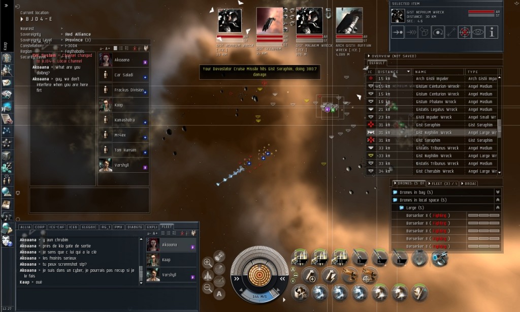
EVE Online
Yaroslav Kravtsov: It’s good if you come to the game by instruments and play. That is, the experience you came for is preserved. And when you came to be a cool adventurer, and began to play the interface …
Svyatoslav Torik: Well, yes, it’s true. The Eve game is an Excel game. I am now talking about a specific case where there is a need to renounce. Yaroslav suggests reducing the number and diluting enemies with spawn, for example. Well, what will the UI designer tell us about this topic?
Sergey Smorodin: I would suggest, if the return journey is somehow not loaded and just wastes the player’s time, to give him some part of the narrative at the same time. Some kind of story, so that he, passing through familiar locations, moves through time and through history further.
Sergey Gimelreich: It reminds me of The Oregon Trail.
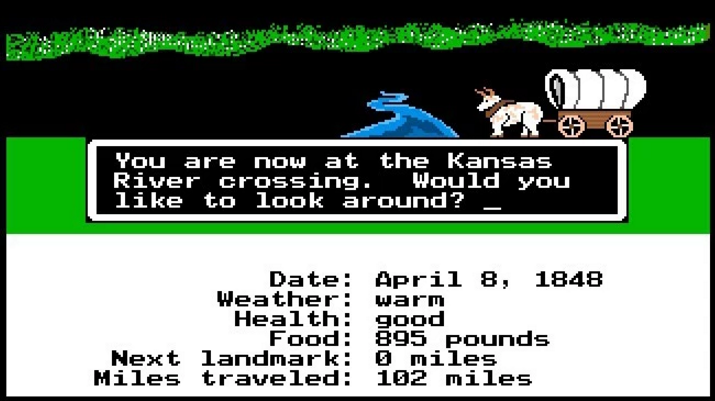
The Oregon Trail
Svyatoslav Torik: In The Oregon Trail, the movement is only forward.
Alexey Rekhlov: By the way, another solution from the UI area is if you have a route that has been traveled many times, then you say: “I want to come here!”, you open the map, and you will be teleported.
Sergey Smorodin: By the way, about EVE Online. It’s really a game based entirely on the interface. A little beauty and space and a bunch, a huge bunch of windows, in which, in fact, this game takes place.
Svyatoslav Torik: Well, you know, the first raids in Warcraft for forty people, especially at healers or debafers, where everything is just littered, and you only see a small game window – you really play there by instruments. It’s cool in its own way, but, damn…
World of Warcraft
Sergey Gimelreich: There are, there are people who like it.
Sergey Smorodin: Yes, about two or three hundred thousand constantly playing EVE Online.
Sergey Gimelreich: It’s not the first year!
Svyatoslav Torik: Okay, let’s go back to the basics. Tell me, Yaroslav, how would you formulate a level design in general? What applies to it, and what does not apply?
Yaroslav Kravtsov: Good question! Because level design, like a bunch of other terms from game design, they do not have any very legalized academic definitions. For me, this is a game design in space.
Sergey Gimelreich: A good definition, Yaroslav.
Svyatoslav Torik: Yes, excellent.
Yaroslav Kravtsov: I like succinct definitions simply.
Sergey Gimelreich: A minute of glory from Yaroslav Kravtsov! (Laughs).
Svyatoslav Torik: I have a follow-up question to your answer. Yaroslav, it is clear that level design is a game design in space. And what kind of mindset should he have? Geometric?
Yaroslav Kravtsov: And what is a “geometric mindset”?
Alexey Rekhlov: Spatial thinking.
Yaroslav Kravtsov: Yes, spatial thinking is useful here, and I don’t even know if a level designer can do without it. Usually, it is easier for level designers to navigate the terrain, find how and where to go, and remember it. I won’t say for everyone, but those level designers I know have such a feature.
Alexey Rekhlov: People who have geographical cretinism will never become level designers.
Yaroslav Kravtsov: I would not swear, but there is a suspicion that it is somehow connected. Level design is also a discipline at the intersection of technical and humanitarian sciences. On the one hand, artists give you a pack of Christmas trees and some pebbles, and say: “Sit and arrange it so that it’s beautiful.” And on the other hand, the game designer and programmers are stirring up their own things – a million digits, a million mechanics. Plus, you just need to walk around, rub all sorts of things with programmers on the topic of optimization and so on. Therefore, it is necessary to be able to communicate with both. It is unlikely that a level designer can become a person who is too turned on only numbers or only on art. It may turn out to be some good decorator, or some person who collects quests well. But like this, in order to make an experience in total, you need to be able to do both.
Sergey Gimelreich: Yaroslav, do I understand correctly that an architect by education could become quite a good level designer?
Yaroslav Kravtsov: Yes, I even know examples of those who had such an education and became a good level designer. And I myself regret that I do not have such an education, because I am inspired by architecture. This is also a level design that stretches from antiquity, which is also about its own experience, navigation and usability. Plus, there is still much more money in this industry than in game development! (Laughs).
Svyatoslav Torik: Yaroslav, have you tried to get an appropriate education?
Yaroslav Kravtsov: To be honest, all I’ve tried now is I recently got a book about the architectural approach to level design. About how architecture can be useful to level design. I’m just studying it. While I have just started reading it, there is not much I can tell you yet.
Alexey Rekhlov: Yaroslav, what other skills can be useful for a level designer?
Yaroslav Kravtsov: For technical things, it helps to know the same programming at some basic level. For other things – something artistic, for example, to be able to sketch some location yourself. It helps me that I have a hobby – photography, once upon a time I was very serious about it. And the composition questions that came from photography help me in level design.
Svyatoslav Torik: Good. Let’s stop torturing Yaroslav and get back to Sergei. And, by the way, let’s start with the same question. Tell me, Sergey, can a UI designer not be able to draw? And what do you need to be able to do, what skills do you have to become a good, such a high-quality UI designer?
Sergey Smorodin: It seems to me that it is necessary to be able to at least sketch a sketch at a minimum, which can then be given to art and explained. It’s trite to do it with a pencil, under a ruler or without. I think we all studied drawing or drawing at school. That’s quite enough.
Svyatoslav Torik: But, say, knowledge of art history and the golden section will help me become a good UI designer?
Sergey Smorodin: In my opinion, all designers use the golden ratio to sell something to a client. It’s just a beautiful phrase. Perhaps it is used in compositions, in beautiful paintings. Mathematicians find it. But it is no more than one of the tools.
Yaroslav Kravtsov: Can I add? The golden ratio is a thing that level designers use. Because these are points that are located on about one-third of the screen when viewed from above-from the side. And if the UI designer adds something there, then the level designer will be offended by it.
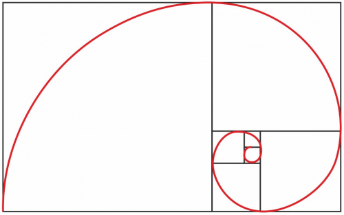
The Golden Ratio is a harmonic proportion in which one part relates to another, as the whole relates to the first part (Wikipedia)
Sergey Gimelreich: In my opinion, UI design and UX design in the gaming industry are very tightly combined with each other. And, in fact, I have such a question: who is more UI designer, artist or mathematician-engineer?
Sergey Smorodin: In my current role as a UI/UX designer, I am rather more of a logician. I am given information that needs to be provided to the player. I place it on a layout, on a piece of paper, in some kind of tool…
Sergey Gimelreich: An element of psychology?
Sergey Smorodin: Yes, absolutely right. It’s more psychology. This is UX. Will [the player] notice, will he understand correctly. And then there is the work of the UI designer, who, while maintaining all the thrown proportions, does it all in the style of the game.
Sergey Gimelreich: Do I understand correctly that this is still a divided role? The person who draws the elements, and the person who thinks through what, how, where? Or is the role of the one who thinks over what, how, where and what sizes should have and how the user will click – is it rather a game designer? Here I have a confusion.
Sergey Smorodin: How to click where, what to expect from it and what to transfer to the game – it’s still UX. UI, I think it’s more decoration.
Svyatoslav Torik: Look, Sergey, for example, I’m doing some kind of feature. I know for sure that this feature will have two buttons, such and such an algorithmization and such and such an effect. If I give it to you in the dock, without a sketch, without everything, with a sign or a list, will you build an interface out of it yourself, or do you need to at least understand something else?
Sergey Smorodin: I’ll do it myself. Moreover, I will come and say: “Maybe we will do it again? I don’t think it’s clear.” And there will be, maybe, a fight, or maybe an agreement.
Svyatoslav Torik: This is how programmers like to come to game designers and teach them how to work. (Laughs).
Sergey Smorodin: I think all teams have it. There are always people who think that this should be done right, and there are people who think that this is how it should be done right.
Sergey Gimelreich: The worst thing about all this is designers and artists, because their work is visible. It’s much easier for programmers.
Alexey Rekhlov: You can’t teach them to write!
Svyatoslav Torik: I’ll insert it here, as a game design. You can argue with programmers on the topic of algorithms. Even if they know their base well, even if they know perfectly well how and what works. An example from life: I wrote a doc, in the dock I indicated, relatively speaking, two options for solving the feature. Both options, in principle, are valid, it would be good to implement them all. So, I come to the programmer. He says: “Listen, this is the second option, why do you bother with it? Let’s just do the first one.” I was like, “Well, what difference does it make to you? All you need is to transfer the package to the client.” He still insists that it’s better to do the first one. I think, fuck it, we also almost don’t care how they do it. He makes the first option. Time goes by, he confers with someone, then comes and says that “here, I have unloaded the task on this programmer, communicate with him.” OK, I’m talking to the second programmer. He says to me: “Listen, why are you doing only the first option? Let’s also do the second one!”. Well, your mother! Where have you been before? Somehow, too, agree!
Sergey Smorodin: I just had a similar case. As a UX designer, I would prefer to test any of the features that I first described and based on which approximate layouts were made. Some prototypes are taken there – live ones – so that you can click on them and see how they will behave. An example of today’s solution: we had a rating table that we were making. It is divided into leagues. On the screens already given to the art department, which proposed such a solution, everything looked just gorgeous. The programmers spent time, we posted the build – and that’s it. When you go to the screen in the ratings, then the path is lost. That’s just the UX design that should have been done before the UI. The guys-artists decided that it would be “better”.
Alexey Rekhlov: Sergey, but the question is: there is such a fashionable concept now as affordance, which is used in almost all branches of human activity, be it the production of cars, cameras, interfaces for websites and so on. Has its application, including its paradigm, begun in games, or not?
Sergey Smorodin: As far as I understand, is Affordance an attraction?
Alexey Rekhlov: No, this is when a person looks at a thing, and its appearance tells what can be done with it, how to use it, and so on.
Sergey Smorodin: I understand. This is aerobatics. But I believe that yes, it is when unambiguously… That is, there are no… Step left, step right. You know exactly how a person who came to the game world, and you are a beginner, and right away you know what to do here, and you are no longer distracted by thinking about what this button is …
Alexey Rekhlov: That is, it has begun!
Sergey Smorodin: I believe that it has always been. It’s just that we are also evolving along with the evolution of games. And those children who unlock mobile devices at the age of two, they will be much more intuitive in interfaces than we are now.
Sergey Gimelreich: Yes, my child is trying to tap into a monitor in which there is no sensor at all. Guys, I have another question for Sergey, because I have quite stormy battles on this topic going on in my studio. I am interested in developing interfaces for mobile devices. Sergey, can you list the main key points that need to be observed when developing a game interface for a mobile device?
Sergey Smorodin: Should I list it directly?
Sergey Gimelreich: Well, right off the bat, yes. The most important thing to pay attention to is how to approach it and so on.
Svyatoslav Torik: For example, what should not be done in any case.
Sergey Smorodin: I have met with such port applications from the web and social networks. And transferring them to mobile devices in the same way is obviously a failure. We must always remember, firstly, that we work with our fingers on touch devices. We must remember that people have different fingers. Something like that! An interesting example is that girls have one tap on the screen a little more than men, although their fingers are more elegant. It’s because of the manicure.
Sergey Gimelreich: But, by the way, it’s curious: if a very long nail, then there should be a very minimal “spot” there?
Sergey Smorodin: No, if she has a long nail, then she can’t press the same way as on the keyboard. And therefore, the “spot” is much larger than that of a male worker who has bitten his nails.
Sergey Gimelreich: A new case, by the way. If you are making a game for girls, pay attention to manicure. (Laughs).
Alexey Rekhlov: Sergey, what do you think is the difference between the design for a large mobile platform and the design for smartphones? Are there any differences that you should always pay attention to?
Sergey Smorodin: I think the answer is in the question itself. This is the size. We have different screen sizes, and therefore, when developing applications for the big screen, we must take into account that more information can be given on the big screen and that there are more “spots” of pressing. You will have to huddle on a small screen, but it is more convenient, it has a different grip. I remember one example from a UX conference. Guys from Wargaming.net they said that they had been making an interface for the mobile version of “Tanks” for a very long time. We did it, tested it in the team. And then, when the long gaming sessions of already invited people began, it turned out that it was impossible to hold an iPad in your hands for more than 10 minutes. It’s hard. And people put them on the table, placed their fingers like spiders…
World of Tanks Blitz
Svyatoslav Torik: It is not necessary to keep the tablet on the weight. You can put your hands on your knees, for example.
Sergey Gimelreich: And there is a difference, Torik. When you have a standard tablet grip, then you have the same activity zones. And if the hands are on the table, then there are already other activity zones.
Sergey Smorodin: Absolutely right. Even in different games so. In the same “Tanks”, or slashers of some kind, we play with our thumbs, we have active buttons under them. In city builders or match-3, we usually put down a smartphone and poke with one finger. This is also a different grip, different impact on the screen.
Alexey Rekhlov: Sergey, but what to do if you need to release the game for mobile phones, and for some large devices, tablets. To make two different interfaces or to make an interface sharpened for one thing? But I would like to get an interface tailored for both audiences.
Sergey Smorodin: Well, there is a solution on the web. Adaptive websites. Ideally, we make an interface for devices that we know the physical dimensions of. And based on these sizes, we can adapt the interface. For example, for a tablet to display more buttons, icons. For mobile, it is not so important to remove information, giving more space to manage. But this is the ideal, this is how it should be. After that, they put up monuments in some game studios.
Sergey Gimelreich: Friends, we just had a good talk about the UI of mobile devices. And I wonder if the level design should take into account the screen sizes of mobile devices, some special grip? And in general, are there any special cases in level design, Yaroslav, related to mobile devices?
Yaroslav Kravtsov: Well, actually, what we were talking about just now. That is, yes, different screen sizes and aspect ratios can lead to the fact that the player may or may not see something. Let’s just say that a level designer should keep in mind that information can be lost at the edges of the screen, because with a different aspect ratio or screen expansion, it will be cut off. And what they talked about: on touch devices, the player needs to put his fingers somewhere, there should not be any important elements.
Sergey Gimelreich: Yaroslav, let’s say it’s a mobile MOBA, like Vainglory of some kind. In it, it is probably important on which device the player is playing, since some area will be more visible, some less. Different aspects of screens. Should level design take this into account?
Vainglory
Yaroslav Kravtsov: Rather, there needs to be an understanding of how much information, what distance of the game world fits on the screen. This gives the level designer an understanding of how far the player will see. A simple thing: in order for the player not to get lost, he must know what game entities are around. This means that the distance between them should be comparable to the size of the screen. So that there is no situation when the player stands and does not see anything interesting around him.
Sergey Gimelreich: I will add one more interesting question. There is an opinion that for some games on mobile devices, especially for those with session multiplayer, it is preferable to do levels in which there is no scrolling at all. That is, those that fit on one screen. Is it so?Svyatoslav Torik: Well, how do you plan to scroll if you need to tap, swipe, and everything else at the same time?
Yaroslav Kravtsov: Yes, I would say that this is a question for UX, because it is corny inconvenient to tap and swipe at the same time. You can mix up the actions. And if it’s multiplayer, where everything is emotional, where everything is decided by fractions of a second, and you accidentally tapped and lost … And from the point of view of level design, if a player is playing an online game, then it is very important for him to have complete information about what is happening at the moment in the match. And then the question is how to stuff it. And it’s probably easier to put everything on one screen than to make separate parts where you need a mini-map so that the player understands what is happening in the match. And where is the mini-map if the screen is small? There will be problems. I think it’s not suitable for all genres.
Svyatoslav Torik: On the question of genres. Creating a level in match-3. In the same Candy Crush, the levels are specially built so that you need to choose tactics, pay attention to which elements are available and which are not. Here is the very construction of levels – is it a level design? Or is it possible to get by with any person who understands that there is a 9×9 grid in front of him, and something can be set up within it?
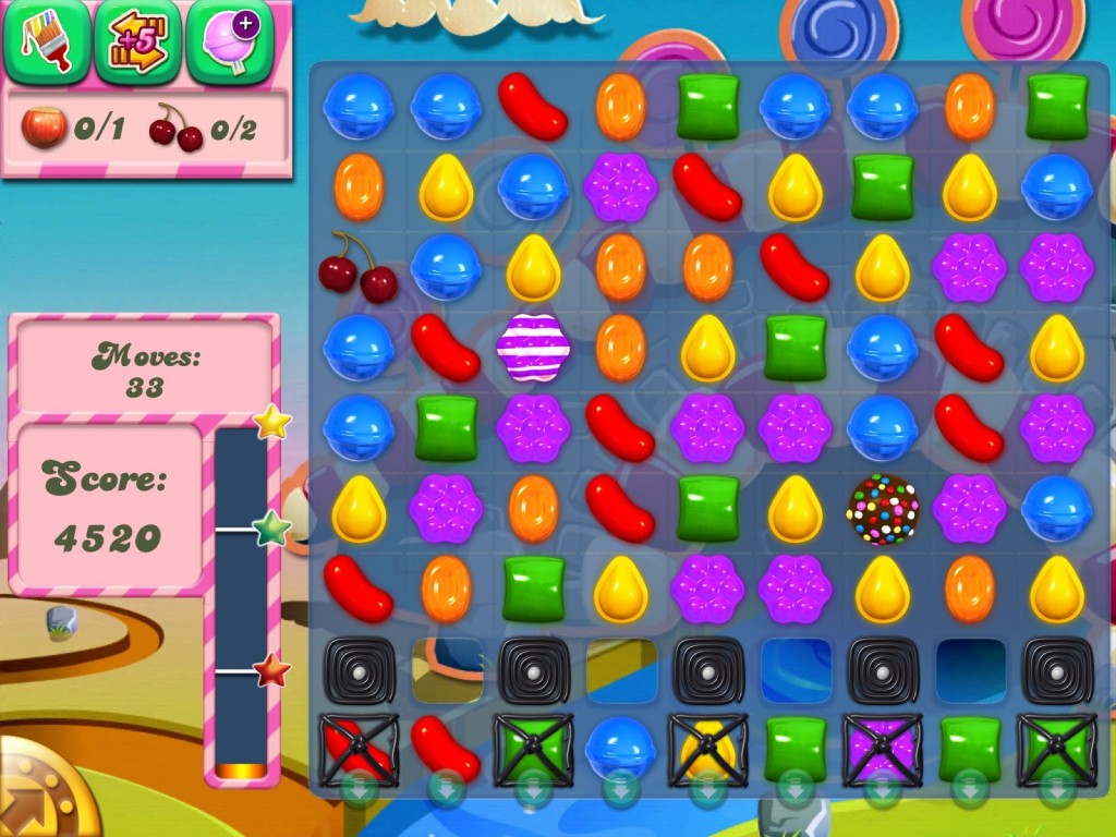
Candy Crush Saga
Yaroslav Kravtsov: That’s a good question. I began to ask them for the first time when I saw in the vacancies that they were looking for a level designer for match-3. And I began to wonder if this was a level design. Where is the line when the level design ends? Because there is an interesting topic here: in match-3, the current state of the screen, where what colored sweets lie, is a small part of the game. Most of it is how the next sweets will be randomized to you, how they will fall out so that you can or cannot pass. There’s a lot of tricky logic there, which I wouldn’t say requires a level design in the classical sense. On the other hand, it requires understanding, so to speak, flow. The one where the player will have ups and downs. This is still related to the level design.
Svyatoslav Torik: Yes. It’s even more of a UX. Continuing the question: you are engaged in a complex MMORPG. There’s a three-dimensional level design, you have a map, you have guidelines from the screenwriter, and so on. And there is match-3 – a completely different side. And somewhere between them there is a border where any game designer with some experience, who understands how and what works, could collect levels himself? Let’s say I don’t have spatial thinking, but I understand what level for match-3 I would do. I would never sit down to draw a SkyForge level in my life. What would I be enough for?
Yaroslav Kravtsov: I think it would be enough to make a location for a level in Clash of Clans. That is, where locations are another interface for providing game mechanics, but the location itself does not provide gameplay as such. That is, there is no theme that you go from one part of the location to another, you have adventures along the way. No, you just have a clearing where everything happens.
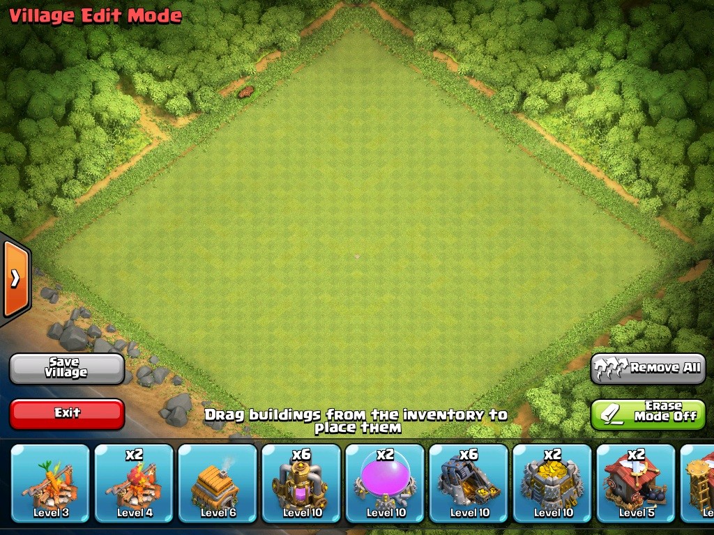
Clash of Clans
Svyatoslav Torik: That is, I can arrange objects beautifully. And this is enough for the player to create a narrative for himself.
Yaroslav Kravtsov: Relatively speaking, yes. There are games in which the game mechanics do not require interaction with space. It just requires some kind of piglet. For example, you want to make a fighting game where two characters fight. They have some kind of arena for fighting, and behind it – some beauties. You can give them to the artist and not worry that it will somehow break the gameplay.
Sergey Gimelreich: There is a very good question here about the tools or some specific techniques that are used when creating levels. Well, there are cognitive maps, molecular maps, something else. Maybe some special graphs or schemes that you use.
Svyatoslav Torik: About cognitive maps, I think Yaroslav can now retell his thesis article.
Yaroslav Kravtsov: No, I won’t retell. I’ll just briefly say that this is a tool that I use. I will not say that this is some kind of common practice. I would say that all the examples of the work of level designers that I have seen are tied to the personality of level designers. Everyone works in their own way. I know examples when a level designer launches an editor and just starts assembling a level. It would seem strange that he didn’t even think in advance what he would collect. And he has – bam! – and it turns out. But these are units. It’s easier for them to start visualizing right away, to start touching right away. I like to do planning more, to think in advance what we want. This is called “molecular design”. But I docked a cognitive map there on the side. The bottom line is that before you collect in the editor, draw a location diagram, you first need to think about what will be on the location. Describe it in a list. Then present this list already in a set of points and in connection with each other. From which point to which player can go? This will also give an understanding of future navigation. And after that you need to draw a scale diagram. And already step by step from the scheme to the prototype of the level, from the prototype to the first gameplay tests. And after that, the design and so on.
Svyatoslav Torik: On the question of prototypes: who decides what stays and what goes into release?
Yaroslav Kravtsov: This is usually decided by the producer based on what the game designer tells him. No, not necessarily a producer. Every project has someone in charge. Sometimes it’s the lead, sometimes the director, sometimes the director’s director or producer. Let’s just say that if there is some content that does not suit the quality, then it should not be allowed into the game, we need to think about what to do, whether the rest of the game will break from this.
Sergey Gimelreich: Friends, we are making a U-turn. I have a couple more interesting questions. Sergey, I have a rather complicated interface in the game. We are currently developing a card buttler, as you know, for mobile devices it is one of the most difficult genre in terms of interfaces. And there is such a difficult task there: there is a very large number of different types of maps, and there is information that should or should not be shown to the user at the same time. How, in your opinion, should the problem of interface congestion be solved? Are there any common techniques? Good examples?
Sergey Smorodin: I would do this: decompose the entire gameplay from the point of view of the customer journey map. How the player travels through it.
Svyatoslav Torik: We call it flow chart.
Sergey Smorodin: Different terms, but essentially the same thing. Continuing the conversation about the customer journey map, I would give the player only information where there is nowhere to climb in the public domain, there is nothing to open. That is, the information that is important at the moment.
Sergey Gimelreich: Contextual version of the interface.
Sergey Smorodin: How to highlight it is another question. This is solved by testing or by brainstorming. But it is not necessary to show the temperature outside the window to the player in the card buttler. He doesn’t need her.
Sergey Gimelreich: And what should be the level of nesting of information? Are there limits?
Sergey Smorodin: You can invest everything, almost to the same temperature. But in order to find it, the player must go somewhere, distract himself from the game process. Although if he went there, it means that he is not interested in the game … a difficult question.
Sergey Gimelreich: Indeed, it is not simple. And now I spend a lot of time to redo the interface. It’s about what: for example, I have basic information that is needed if a player makes a choice whether to take a combat deck with him or not. And there is additional information that is deeper. And there is another depth that is somewhere else very far away. And now we are faced with the fact that we have to do different levels of nesting. And to navigate somehow in these levels.
Sergey Smorodin: I would make this decision: if it looks like a map on the screen, then the map has two sides. To view the basic information, we flip the map…
Sergey Gimelreich: A great idea. Beautiful.
Sergey Smorodin: … and then go further – an additional button that will translate to a separate screen. And the user understands that he is in some kind of encyclopedia.
Sergey Gimelreich: And here, by the way, is a question: there is an opinion that mobile interfaces should be based on the principle of consistency. That is, now the modern UI/UX is trying to move away from Windows windows towards various sliding systems that are contextually connected to each other. Is it so?Sergey Smorodin: I think so. Indeed, one element must drag the other. Because we still use the best practices of Xerox, which was the first to make windows.
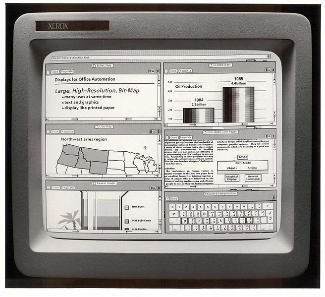
Xerox GUI
Sergey Gimelreich: By the way, yes. There was such a wonderful phrase: “Stop thinking with windows!”.
Svyatoslav Torik: That’s right, you need to think with a console.
Sergey Gimelreich: About frituplay games again. There was such an interesting question about “reverse ergonomics”, as I called it. The point is that the user is specially given such elements so that he misses. Or two buttons, a large one and a smaller one, and the larger one leads to the IAP.
Svyatoslav Torik: Yes, the Buy button is in place of the Ok button.
Sergey Gimelreich: Yes. Sergey, how do you feel about this?
Sergey Smorodin: I think it’s disgusting.
Alexey Rekhlov: Disgusting from what point of view?
Sergey Smorodin: Disgusting from the point of view of user experience, because the player does not get what he expected. And this is a very bad user experience.
Alexey Rekhlov: Returning to the user experience. In the fritupley, many things have to be added after the main interface is made. Many games turn into something terrible in a year or two. You come in, and ten pop-ups pop up for you, or twenty flashing buttons, or something else. How to deal with it?
Sergey Smorodin: I think this is the wrong approach to monetization. Monetization should go through gameplay, not through pop-ups and deceptive buttons.
Sergey Gimelreich: I agree here. It’s funny that everyone is talking about it: both game designers and producers. But most companies somehow resort to using these ugly schemes.
Alexey Rekhlov: Because it’s money.
Sergey Gimelreich: So the producer comes and beats the hands of the UX/UI designer in order for him to make the sharing button big and green, and the Cancel button small?
Svyatoslav Torik: In general, we have done a great job. A pop-up appears, in which there is an Ok button, and there is no Cancel button, but instead a Back button that hides the pop-up.
Sergey Gimelreich: Yes, or in advertising, the button with a cross is made so small that it is very difficult to hit it. And especially clever guys make it so that when you tap on the cross, this damn advertisement opens anyway.
Alexey Rekhlov: And some cunning guys make two crosses. One closes, and the second gives the transition to advertising.
Sergey Smorodin: Or crosses jump from corner to corner. In each new pop-up, the cross is located in a new place.
Sergey Gimelreich: Can you imagine how wonderful it is to monetize clickers? You click and click, and at some point a banner is simply substituted for you.
Sergey Smorodin: It seems to me that, after all, UI/UX designers do not participate in these methods of monetization. That’s where the managers come in.
Sergey Gimelreich: So the producers are to blame for poor ergonomics?
Sergey Smorodin: Well… how gracefully I relieved myself of responsibility!
Sergey Gimelreich: By the way, Yaroslav, can level design affect monetization?
Yaroslav Kravtsov: Anyone on the project can influence monetization by taking it and spoiling it. That is, he will do something that will break everything. Well, let’s just say that on a project, people are usually assigned to roles. There are those who are about money, and there are those who are about something else. At such a moment, these people will just start arguing. And this is valid. That is, it is dangerous to just make a big red button in the center of the screen, and that’s it. Maybe it will give an instant feedback, there will be a peak of sales for one or two days. But then it turns out that there are no players.
Sergey Gimelreich: Yaroslav, an example for you from real life. Hill Climb Racing – everyone knows the game of a Finnish friend who made it for a case of beer. There levels somehow play a role in monetization, right?
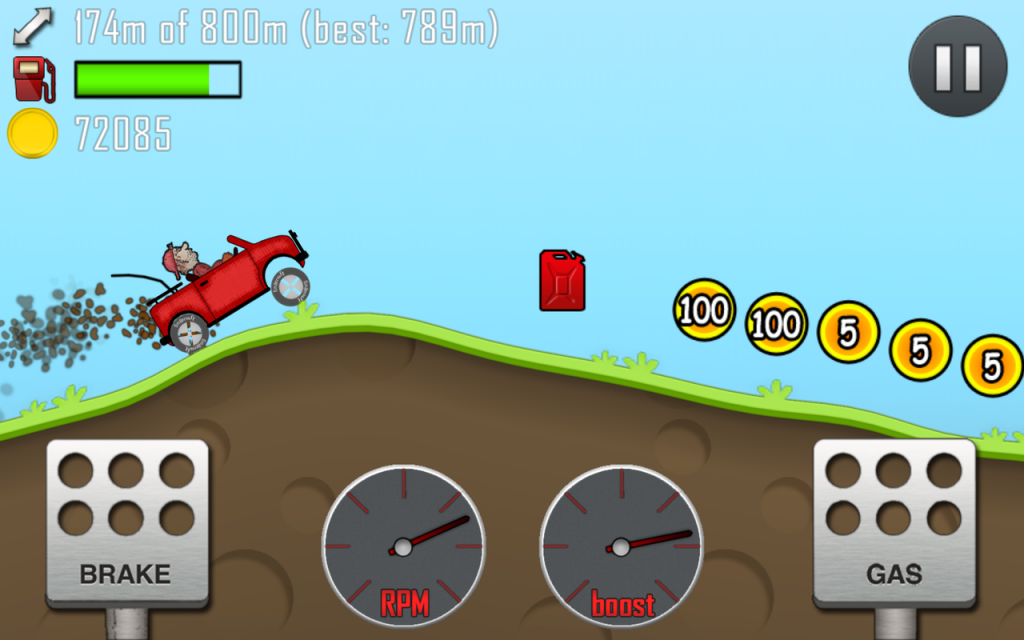
Hill Climb Racing
Yaroslav Kravtsov: This is the first time I’ve heard about this game. Now I’ll play and tell you.
Sergey Gimelreich: Torik, you’ve probably heard about this game.
Svyatoslav Torik: Sergey, you know that I don’t play frituplay. But Hill Climb Racing is in the top right now. You just open Google Play, and you see it there.
Alexey Rekhlov: Yes, three years already there.
Sergey Gimelreich: She has been hanging out in the top free games for quite a long time. The game is interesting. But there level-design rules in terms of monetization.
Yaroslav Kravtsov: Yes, I see. This is exactly the classic, when it is with the help of level design that this very “flirting” is going on. The player is first allowed to win a little, and then given an obstacle when he cannot win. But he knows that if he pays or improves something, then everything will work out. And he pays, passes, they make him feel like a boss again, and then there are problems again. The same thing happens in gambling machines.
Svyatoslav Torik: It sounds like a version of the fuu factor from Wooga. There, too, everything goes well at first, and then the peak of complexity gradually increases. And it leads to the fact that you can’t win two steps away from victory. But I understand that in Hill Climb you obviously have to pay, and Wooga still gives you a 5% chance to win. And the point is that you either pay or you go through. And then your peak difficulty goes down sharply. You are on the wings of success and happiness going on until you stumble upon the same smooth peak.
Sergey Gimelreich: In my opinion, the classic sawtooth system of increasing complexity.
Alexey Rekhlov: And not only in the fritupley.
Yaroslav Kravtsov: Pay-wall.
Sergey Gimelreich: Yes, what Torik was talking about is one of the pay-wall options, I agree.
Alexey Rekhlov: Yaroslav, the question is: have you ever been involved in product placement in level design?
Yaroslav Kravtsov: To be honest, no.
Alexey Rekhlov: Now there are a lot of people talking about doing product placement in games. But for some reason no one has seen him yet.
Yaroslav Kravtsov: I haven’t seen much games with a successful product placement.
Sergey Gimelreich: But what about the same Need for Speed?
Svyatoslav Torik: Yes, Electronic Arts uses something like that in all its games.
Sergey Gimelreich: Everywhere! Even in shooters, I saw huge posters with product placements. I can’t remember now which ones, in my opinion, in Call of Duty. Well, in GTA 5 – it’s a must.
Yaroslav Kravtsov: I don’t remember such examples in GTA and Call of Duty.
Sergey Gimelreich: Apparently, a very competent product placement!
Yaroslav Kravtsov: It’s just a very important moment here. Here you are in the game world, and you accept the rules of this game world, as in Call of Duty, where there is a war, and then – bang! – you see an element not from this game world. This instantly “knocks” you out of the game. Spoils the experience. Because you’re like, “Well, hey, I’m running around with a bazooka, and they give me some dumplings!”.
Svyatoslav Torik: Well, it’s natural that you see a poster that is in its place. It’s just a brand image.
Sergey Gimelreich: Yes, some old Coca-Cola poster does not interfere with the war in any way.
Svyatoslav Torik: I know cases when people placed their products in a realistic setting, and they looked organic there. And people came to me on the last project who offered a self-made energy drink. Just sell cans with the name and logo. We sent them, but it was funny.
Yaroslav Kravtsov: I think it’s not particularly financially profitable. You can somehow place it on the side, but it won’t pay off the project.
Sergey Gimelreich: If this is a millionaire project in terms of audience, then why not? If money is paid for it, then why not take it!
Yaroslav Kravtsov: Okay, I’m going to be about level design, and you’re about money. (Laughs).
Sergey Gimelreich: You try to insist that these things are compatible. But game designers and level designers still abstract from this.
Yaroslav Kravtsov: Well, it would be strange if a level designer came to the producer and was like, “Let’s put up an advertising poster.”
Svyatoslav Torik: Usually the opposite.
Yaroslav Kravtsov: Yes. The question is from whom the initiative comes.
Alexey Rekhlov: Why not? You can also advertise in-game products. Let’s say a player is constantly dying in this place. And in front of his face, when he falls, there is a poster of premium weapons that can be bought in the game.
Sergey Gimelreich: It’s good if it’s implemented in this form. And when, in mobile games, a pop-up falls in your face right after death, on which the offer is, then this is a nightmarish way of monetization. By the way, since we have raised this issue, surely there is also a form for submitting in-game goods in the UI, Sergey?
Sergey Smorodin: I would like to return to GTA last to talk about the organic nature of product placement. In all the stories that this game told me, fake companies, fake corporations, fake online services that have alternatives in real life were mentioned. It’s not just level design, it’s game design. When there is a story dedicated to a Facebook parody. “Tell us everything about yourself, and we will tell you about you to the whole world,” there is such a mission there.
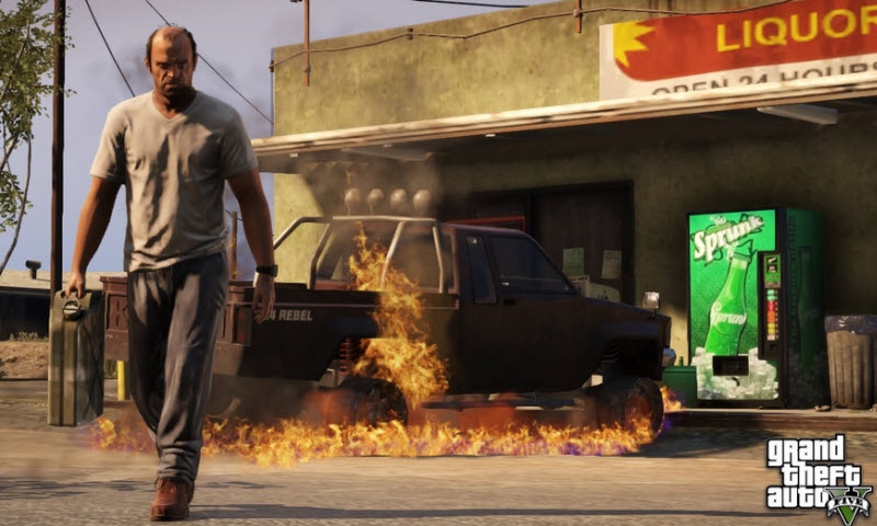
GTA V
Sergey Gimelreich: Sergey, you still haven’t answered the question about the instruments.
Sergey Smorodin: Product placement tools?
Sergey Gimelreich: Let’s say, pop-up in the face – is it good or bad? And are there ways to serve ads through the UI more beautiful, softer? But at the same time effective?
Sergey Smorodin: Via UI – hardly. It seems to me that this should be done more through the game mechanics itself, because in all mobile games where we encounter a pay-wall, we are shown a banner with advertising. Buy it and skip it.
Sergey Gimelreich: It’s pay-to-win, I get it. Is there any way to make it softer? In the same match-3, you are running out of moves, and you are offered to buy more. And, in my opinion, there are no other options.
Svyatoslav Torik: Actually, there is. Firstly, you may be offered not to pay directly, but to buy some kind of item, a bonus. If you have it, it’s easier for you to part with it. If not, then you weigh your chances, your risks, and buy more.
Sergey Gimelreich: Well, yes. This option is also quite viable.
Sergey Smorodin: Yes. And it’s still not UI. The UI here acts as a way of presenting information, namely solving a certain problem.
Sergey Gimelreich: Well, then the question is about UI and frituplay. Are there any interface features for free-play games?
Sergey Smorodin: This is also most likely not a clean UI. There is a system of triggers, after which you begin to show and display certain elements. Triggers that are triggered at the moment when “it’s time for you, man, to pay.”
Sergey Gimelreich: A stern man with a bat appears…
Sergey Smorodin: Or the green button.
Sergey Gimelreich: “Either you pay, or we come to you.”
Sergey Smorodin: And then there is a big button with the inscription “Great!”. Fireworks, congratulations. And you realize that for 19.99 you got a new beautiful world.
Svyatoslav Torik: Yes, 5 mg of endorphins. Let’s wrap it up. And I would like to ask Yaroslav and Sergey to finally ask for something good, kind, bright about their role in game design to tell.
Yaroslav Kravtsov: A simple tip for those who want to level-design. Guys, fuck more! The question is not what to read and which forum to get into. The question is to work hard, to play a lot, to see what happens. Try not just to complete the task, but to exceed it. Jump over some quality bar. It sounds generic, but this is the path of growth that I know.
Sergey Smorodin: I would say this: do not put your experience at the forefront of solving some problems. Because the people we make games for don’t care where we studied, how much we worked and how many podcasts we participated in. Do interfaces like this and test on live people. For those who will play the game.
Sergey Gimelreich: Show it to your loved ones.
Sergey Smorodin: It’s more about UX.
Yaroslav Kravtsov: I will add that with Message Quest we just realized what it leads to if you show the game and the interface is not CA. This can have a harmful effect. It’s important to look at who you work with, whether the audience is the right one. Listen carefully to everyone, but filter.
Sergey Smorodin: To make a discount on who these people are. But a bunch of books on testing, UI/UX from bearded uncles who have been making interfaces for 20-30 years have been written about this.
Svyatoslav Torik: Good. Thank you, dear guests, dear presenters. That’s the end of it!