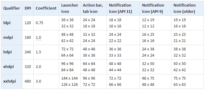
Not all graphic designers are programmers and, unfortunately, not everyone reads the official documentation on UI design. It is for such that a GitHub employee posted a memo on the design of Android applications.
Here, in one place, information is collected on what size icons and alerts should be made for screens with different resolutions and different densities of dots per square inch. There are separate signs on the form in which screenshots should be taken, what ratios the application screen should be, fonts and themes.

For the most curiousThat is, if you are an independent developer and want to release an application yourself, this is a real must read.
On the other hand, if, suddenly, you have a publisher, then you can no longer think about half of the plates in the material. As a rule, they (publishers) either do it themselves or help with it.
Yes, the employee who posted all this information in one place is called Peter Nahale (Petr Nohejl), he is Czech and works as a programmer at GitHub.
