Mark Brown, an indie developer and editor of the Pocket Gamer resource, told about what the correct navigation in level design looks like as part of the Game Maker’s Toolkit video cycle. With the author’s permission, we have prepared a text version of the material in Russian. We share.
At the beginning of Uncharted 3, there is a cool moment – when you play as Nathan Drake as a child and run away from enemies on the roofs of Cartagena. In most other games, there would just be a cut scene instead. Designers usually find it difficult to make the player move in a given direction and jump in the right direction, and not just constantly fall off the roof or get caught by villains.
Many developers can not normally guide the player even through a static scene, not to mention a tense chase. They come up with various clumsy ways – landmarks, compasses, arrows floating in space, super-flair or golden snake-like stuff floating in the air.
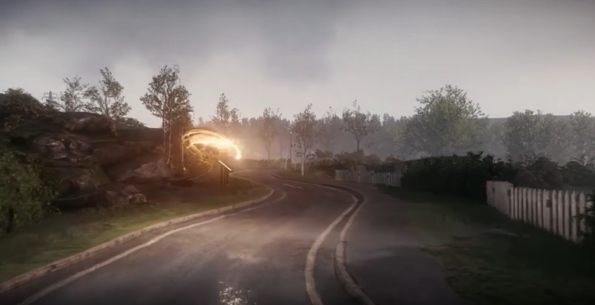
How does Naughty Dog manage it? How is it possible to guide a player through the entire Uncharted or The Last of Us without a map, when other linear games explain where to go at every step?
The secret is that Naughty Dog and other developers like Valve and That Game Company also explain exactly where to go, but they do it with the help of imperceptible hints at the level of level design. A set of certain techniques helps to attract the player’s attention and control the direction of his gaze. Some of these techniques are borrowed from painting. And some were used by Disney when he created Disney World.
“In many ways, it all comes down to psychology,” says Emilia Schatz, Naughty Dog game designer — You need to understand exactly what the game world tells the player. And figure out how to make sure that the user gets as much information as possible.”
So let’s take another look at the chase scene in Uncharted 3 and try to understand what the surrounding world is telling the player.
The first thing that catches your eye is the light that streams from the open window. Light is one of the most common and, perhaps, effective ways to direct the player in the right direction. Light attracts the eye like a flame attracts a moth. If the environment is dark enough, then light sources – lamps, car headlights, bonfires or sun rays – will always attract the player’s attention.
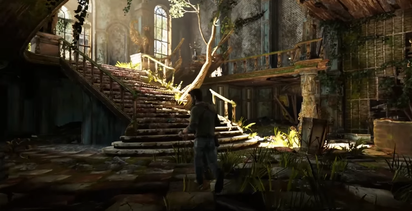
And here the principles of composition are used. The columns and the wall create a frame that draws the player’s gaze to what is inside. In the middle of the composition is a line that marks the center of the roof.
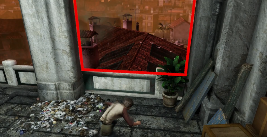
Guide lines are often used in painting or photography to set the direction of the viewer’s gaze or draw attention to a particular point. It is more difficult for a level designer to use this technique because the viewer is constantly on the move. However, this way you can show where you need to move.
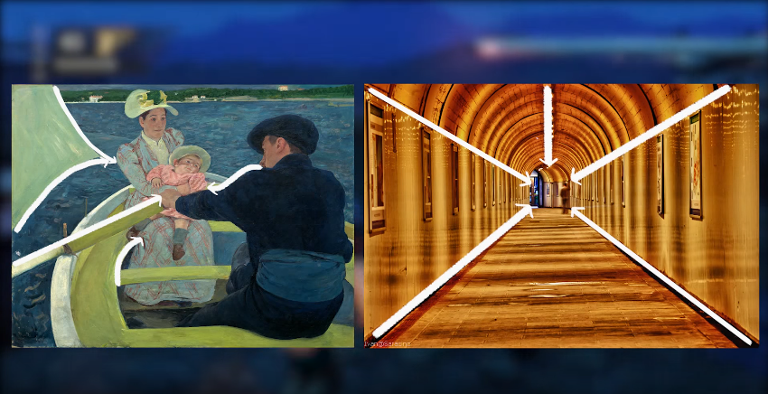
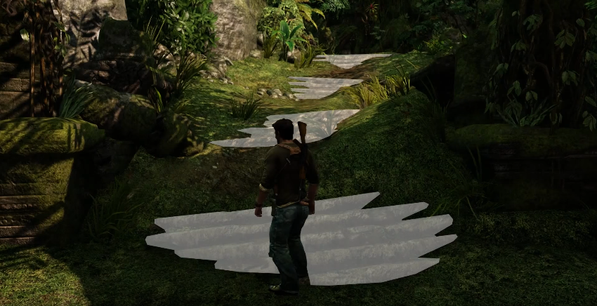
In a speech at GDC in 2010, Naughty Dog art director Eric Pangilinan said that “it is very important to clearly explain where to go; we pay great attention to this.” And he added that if the development schedule is too stressful, then the game world can easily turn out to be confusing and incomprehensible. To prevent this from happening, Pangilinan advises to clearly identify the surface on which you can move and mark the boundaries of the level.
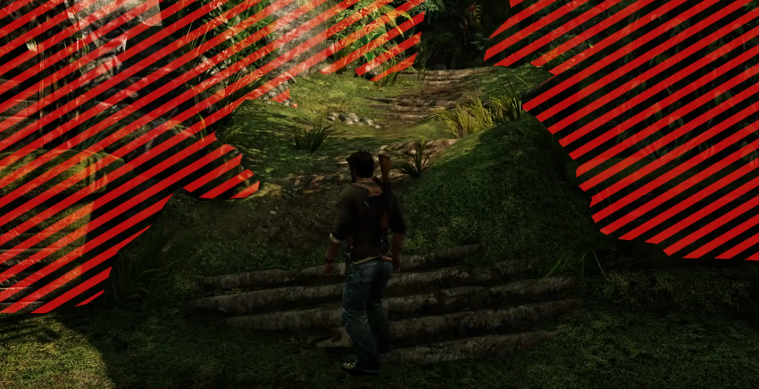
He notes that “if you put something resembling steps on the path, it will set the right direction for the view.”
When Drake jumps over the edge of the roof, birds take off nearby. Most of the rest of the scene remains stationary, so movement inevitably attracts attention.
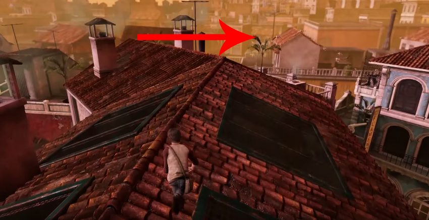
Falling sparks, flashing lights, slamming doors are difficult to ignore, at the sight of them you want to get closer. Birds in Uncharted 3 not only force the player to get closer – they also fly in the direction where Drake needs to go. They stealthily steer to the right, although the most logical thing in such circumstances is to go forward.
Of course, if you don’t turn right, the enemy will force you. It should be noted here that limitations and mechanics allow you to control the player’s behavior very effectively. For example, if you run from enemies, then you won’t be able to fight in the process, but you can easily collect items.
Here is another example of an intuitive level design. The side is clearly needed in order to jump over it – which the player readily does.
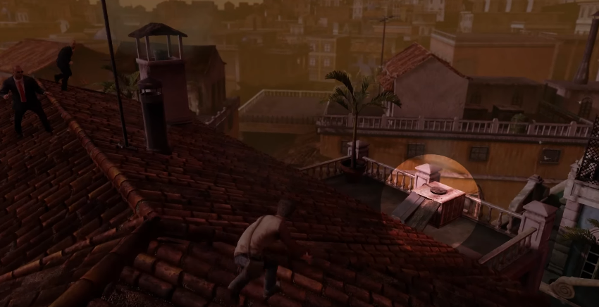
The camera can’t be discounted either. She moves all the time so that the center of the frame seems to indicate the direction. However, the player can look the other way if desired – the game rarely takes full control of the camera on itself.
In this scene, all the guide lines point upwards.
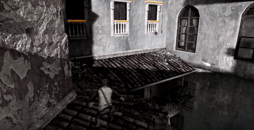
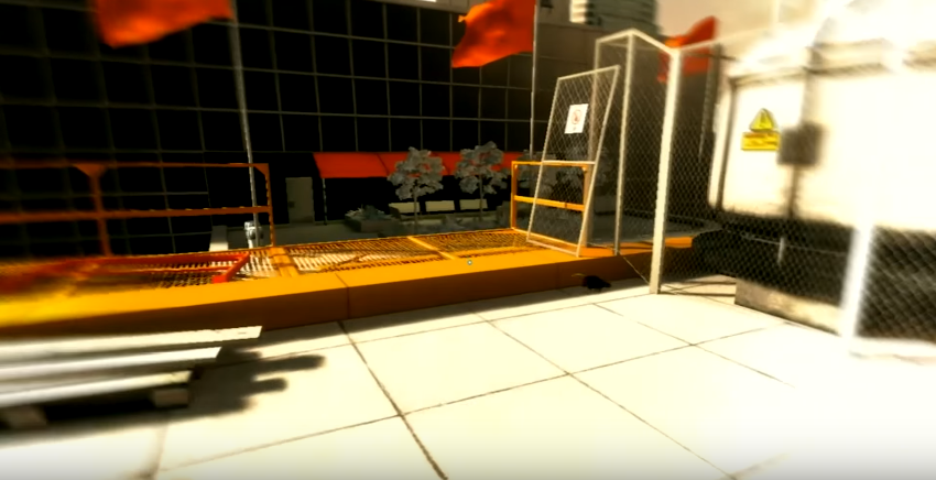
Only the window frames stand out – including the color. This is another common technique in level design. If the overall color palette of the scene is carefully thought out, bright and contrasting colors are sure to attract attention. For this purpose, Mirror’s Edge actively uses red, and Uncharted 3 and The Last of Us – yellow. And in Tomb Raider, all the important elements are painted white.
All these techniques are used to guide the player through the scene unnoticed and not let him stray from the right path. Such visual cues are found everywhere in the game.
There are other techniques. For example, negative space is used in this scene (this is how the space between or around the object of the drawing is called in painting, – approx. editorial offices) to draw attention to the passage between the houses.
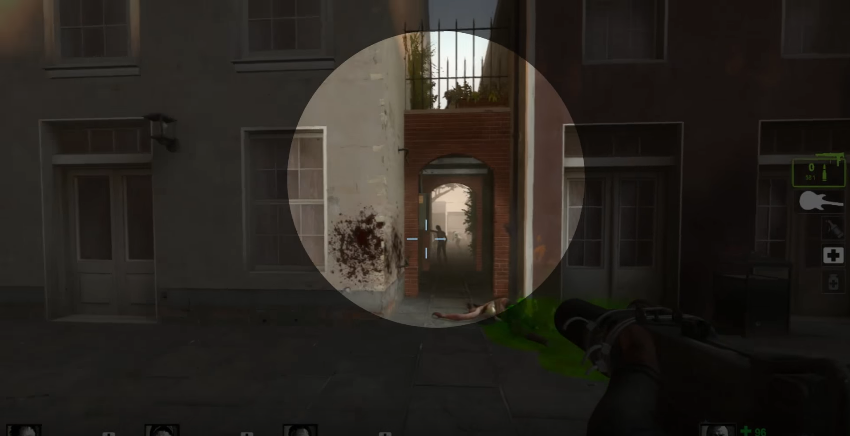
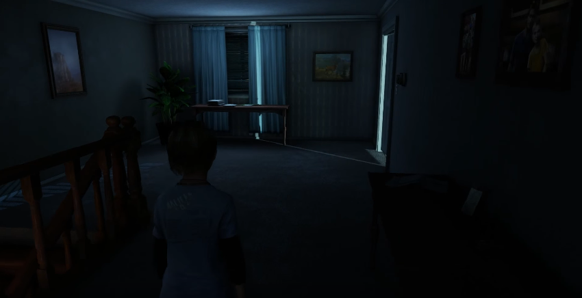
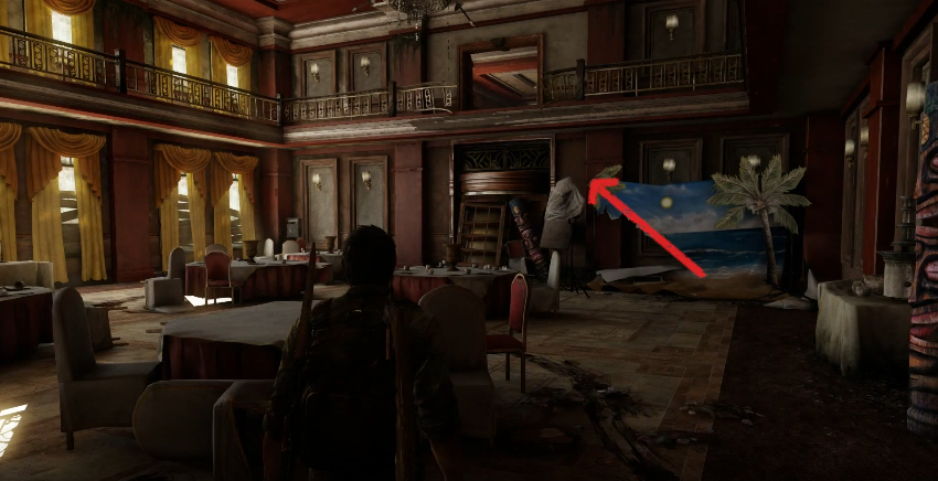
Audio effects are also used for the same purpose. For example, at the very beginning of The Last of Us, everyone goes to this room not only because they see the light, but also because of the barely audible sounds of the TV program.
And there are also “sausages”. Yes, that’s right – “sausages”. This technique was invented by Walt Disney (The authorship of the name also belongs to Disney. When he got home, the first thing he did was go to the kitchen and grab a hot dog to have a quick snack. He gave part of it to the dog. After some time, Disney noticed that wherever he went, the dog follows him everywhere, or rather, the sausage. So later, describing the Disneyland navigation system to the designers, he named the landmarks that were supposed to lead park visitors to certain points, – approx. editorial offices). He put a huge castle in the middle of Disneyland to attract visitors there. The same castle helped to navigate the terrain.
That’s why the characters of Uncharted 3 and The Last of Us poke their finger at some distant object half the game. This is the “sausage”. Later, this object is always clearly visible against the background of the sky – so the player always has some fixed landmark in front of his eyes, to which he needs to go.
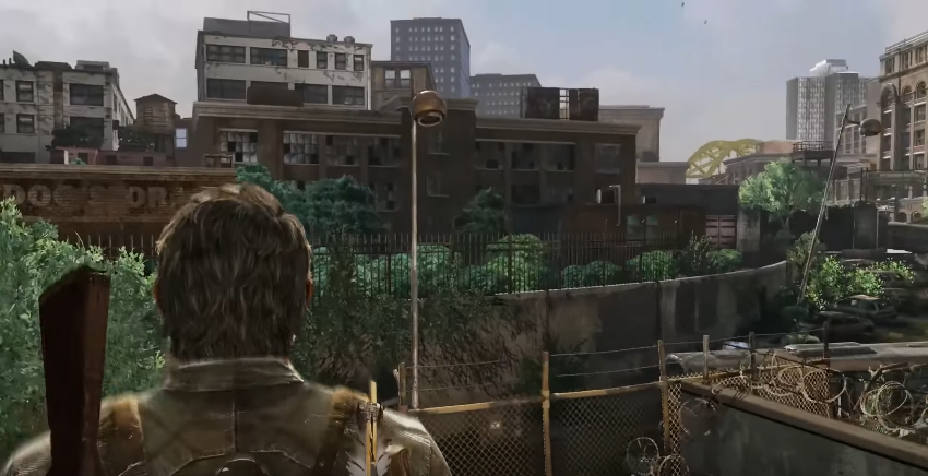
The Citadel in Half-Life 2, the buildings in Mirror’s Edge and the mountain in Journey have the same functions.
And then there are the arrows. Sometimes they are disguised as angles or random markings, and sometimes they are literally arrows on road signs or on the ground. These arrows lead the player in the right direction. That’s what they’re for, right?
All of these techniques can be used in your own design. You can limit yourself to just light or color to highlight interactive areas. But in any case, we will have to check whether the techniques worked or not. To do this, you will need to observe how the players pass the level.
Well, or you can borrow one tricky trick from Naughty Dog.
When the company made Crash Bandicoot, it conducted a “blur test” (squint test). One of the level designers strained his eyes so that the picture blurred, and looked to see if the main path through the level would remain the most noticeable part of the overall picture.
You may wonder why a game like Crash Bandicoot or Uncharted should specifically direct a player somewhere, when they are already linear? After all, if you do not follow the path that the game leads you, then you will come to a dead end.
But that’s the thing: in theory, the game still allows you to move in different directions. This gives the player the feeling that he can explore any of them. And since the player does not know that he is being led along a strictly defined road to a single door, it seems to him that there are other spaces behind other doors and roads. This makes the world look less linear than it actually is. And besides, such techniques help to regulate the pace of the game. Uncharted was conceived as a mind-blowing adventure game, and it would simply fall apart if the player searched for a way out of each room for a long time.
All of these techniques work. You can test them yourself: try playing Mirror’s Edge with the “runner’s vision” turned off, and you will feel how hard it is to pass the game without visual prompts. For example, I lost my way again and again.
In addition, the techniques that I have listed help to improve the level design in general: they can be used not only for navigation. The correct color scheme will not only help you navigate, but also set the mood for the scene. Movement can be used to make sure that the player is looking in a given direction. And the frames will help make sure that the player sees the key scenes from the most favorable angle.
Source: Game Maker’s Toolkit
Translated by Irina Smirnova
