During the analysis of one hundred projects from the American gaming box office top, ASOdesk found out which practices of designing pages of mobile games are most popular among developers of top projects.
Methodology
The company’s specialists analyzed only 100 games. For the analysis, the 50 most downloaded games in the American App Store and 50 in the American Google Play were taken.
Composition of screenshots
ASOdesk distinguishes two types of composition — conventional and panoramic. In the latter case, we are talking about a scenario where the illustrations seem to form a single visual panel.
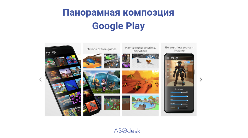
One of two types of screenshot compositions
In both the App Store and Google Play, the usual format is most common, when each screenshot is independent.
The share of games with panoramic design on iOS does not exceed 4%, and on Android — 2%.
Screenshot format
Here analysts distinguish two classic formats — horizontal and vertical. Recall that both leading mobile stores support loading and displaying screenshots in both formats.
Despite this, in the App Store, the majority (92.2%) of teams prefer to display screenshots in vertical form, and on Google Play both formats are distributed approximately equally (the proportion of vertical ones is 54%).
Captions on screenshots
It was also decided to find out how common the practice of using inscriptions on screenshots is. Here the situation is also very different depending on the store.
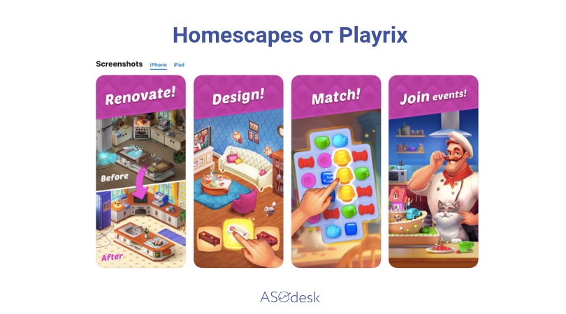
This is how Playrix designs its screenshots
In the App Store, in 82% of cases, labels are not used in the design.
The situation on Google Play is noticeably different. Here they are resorted to in 52% of cases.
Number of screenshots
Despite the fact that both stores allow you to upload a large number of screenshots (up to 10 in the App Store and up to eight in Google Play), developers do not use this for the most part. On both sites, in about 40% of cases, only five screenshots are prepared.
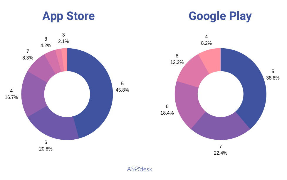
The number of screenshots used in the design of the most popular games
However, it turns out that the scenario where seven screenshots are uploaded is now becoming increasingly popular on Google Play.
Video review
Most of the top games, regardless of the platform, have a video review. On iOS, some projects even have several of them.
Among the 50 highest—grossing games on the App Store, 67% of projects have videos, and 64% of titles on Google Play.
Icon Elements
As part of the study, ASOdesk paid attention to icons. The company found out that their logos are very rarely placed on the icons of games. As a rule, we are talking about either a character or a game element.
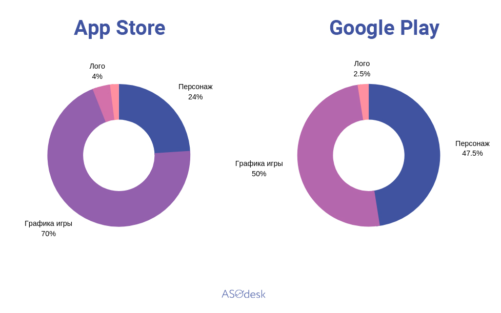
What is located on the icons of the leading mobile games
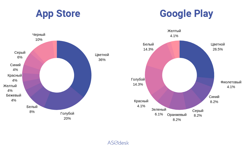
Out of curiosity: in most cases, there is no one dominant color on the icons, but if it is traced, it is blue or white.
What color dominates the icons of popular mobile games Also on the topic:
