Leading UX designer of ComboApp company Vadim Shcherbakov told App2Top.ru about typical mistakes made when creating a user interface.

The mobile application market is oversaturated with various products – from small “underapplications” to successful “whales”. Usually well-known applications “with money” have a large team of developers and designers who are constantly improving the product both technically and in terms of usability.
But most applications that have potential lack a good interface, are designed inconveniently for the user. It is interface problems that create a barrier that prevents applications from recruiting new users efficiently and quickly. The latter, as you know, do not like to “get used to and figure it out.” This is because many applications are created by small companies of developers who do not have a good design team with UX specialists.
Interestingly, most application interfaces contain typical errors.
1. Ill-conceived architecture and navigation

Or, in other words, the absence of a design stage. Programming immediately according to the client’s TOR and /or “skins” from the graphic designer is what will make you redo EVERYTHING later.
Just as you can’t build a house without a drawing, you can’t create a good UX design without sketches and prototypes.
You can redraw interface elements, screens a hundred times and force programmers to rewrite the code just because you did not initially think through and fix the application logic, navigation and scripts that users will perform.
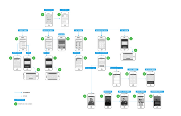
It doesn’t have to be a clickable prototype, but you should see the entire path of the user inside your application and the scheme of his interaction with the application as completely as possible.
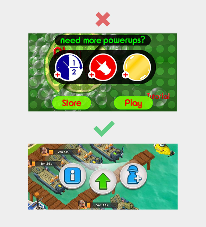
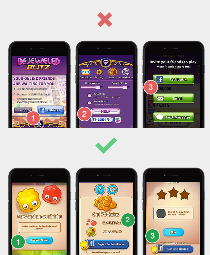
2. Poor onboarding or lack thereof

The concept of “onboarding” (from the English ‘on board’) means the process of immersing the user in the application. In other words, it is a step-by-step training of a new user. A lot of developers just turn a blind eye to this and throw the user one-on-one with the program after installing it – use it!
The most important user experience is the experience of the first use of the application.
In the vast majority of cases, it is within its framework that the user decides whether he will use the application or not. It is very important to sort everything out for him at the very beginning – literally take his hand and hold it in all places in the application, step by step. So that, God forbid, he would not have questions in his head “Where?“ “Where to?”, and most importantly – “Why?”
Onboarding is a system in which a sequence of screens is thought out, which should be shown to the user at the first acquaintance with the application, with appropriate interface hints.
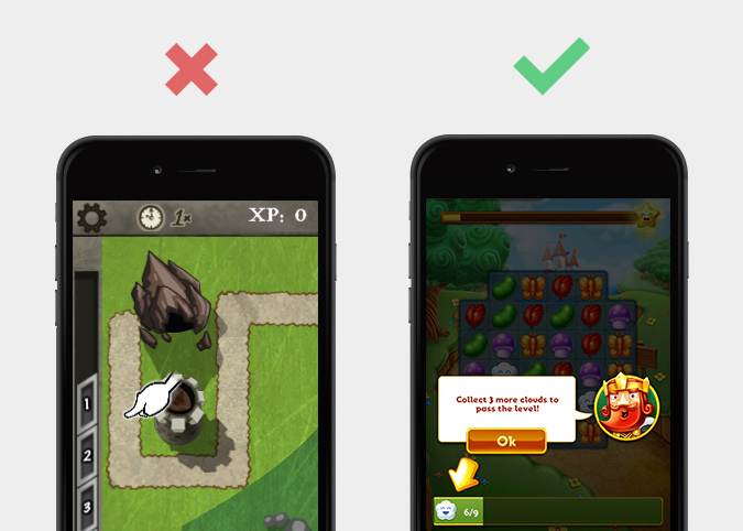
By the way, this is why many modern and well-designed applications do not have a HELP section. There is simply no need for it – and instead there is the possibility of RESTART TUTORIAL.
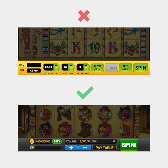
3. Too much “design”

Going into creativity and creativity – but not into solving the problem. Something unique, your own style and handwriting is undoubtedly good. But often designers act like bad actors – and very much “overplay”. A bunch of objects, color schemes, shadows, incompatibility of styles, turning an ordinary icon or button into something surreal (and sometimes simply scary), or even completely returning us to the dashing 90s, when “we created the design as best we could.”
One American designer said:
“A good design is immediately visible, a great design is invisible.”
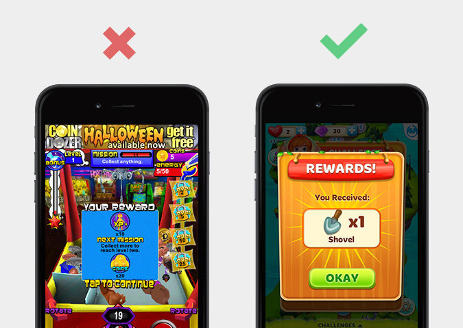
And it’s true. When creating graphics, many forget about its purpose – to help transmit information, but not to distract or confuse. If you want to create a user-friendly interface, be simpler.
4. Non-intuitive interface
Oddly enough, the most common mistake is when the designer thinks that everything is simple and clear, and the user is perplexed and upset.
The consequence of Murphy’s law for mobile applications sounds something like this: “If the user can understand something wrong, he will do it.”
If the designer thinks, “Oh, it’s obvious!”, then for the user it may be difficult or completely different. The best service or product is truly intuitive.
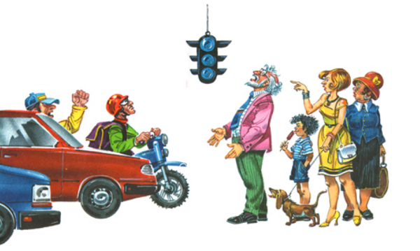
To avoid this error, you need to use recognizable and well-established symbols in the interface that will have an unambiguous association. For example, we all associate green with “YES”, “forward”, “allow”, and red with “NO”, “stop”, “prohibit”; the “+” icon with “add”, “-” – take away, etc. Try to avoid insufficiently obvious symbols on the interface elements and make the most effective use of already known patterns of user perception.
5. P – Sequence
A very common mistake is to use many different fonts, color schemes and “design solutions” within the same style.

Advertising legend Leo Burnett once said:
“If you want to be original for the sake of originality, then you can come to work every morning with a sock in your mouth.”
Agree, well said! Any creative solves certain tasks. But the user interface is absolutely not what the application should stand out for.
There is no need to come up with different styles for interface elements that solve the same tasks. It is much easier for the user to remember one style, and then use it to identify the same buttons in other places of the application.
6. Unspecified priorities
When creating any design, it is always important to understand what is most important to the user, and what is something secondary, and does not require his special attention. Unfortunately, many people do not understand this, and as a result, the user sees a “mess” of different information that visually has the same power.
Visual hierarchy is an important principle, resorting to which you make more important information visible, and the second-placed information less vivid.
Decide which objects the user will interact with most often, and highlight them against the background of others. Using such an interface will be much more comfortable.
7. Lack of analysis and error correction
Everyone makes mistakes. You can not think that once you have created a prototype, the job is done and you can already draw up papers. And it doesn’t matter whether you are a big developer or an independent one – the rule is very simple: the more testing and analytics, the better the result.

It is important to understand that only those who do nothing are not mistaken. If you want to create a good interface, you must at least once analyze your developments in UX design with the best practices on the market and any data on user behavior. So you will definitely find and correct possible errors.
The most convenient interfaces are created for a long time and are constantly being redone. Any interface can be made even more convenient, and then even more convenient. Avoiding the above mistakes is the key and the basis for creating a high-quality and good UX. Any high-quality work requires considerable effort; if you do it “faster”, then the period of use of your application may be “shorter”.
You will be able to learn about the latest trends in the gaming industry first-hand, personally meet and discuss working issues with leading companies in the game development and publishing market at White Nights Helsinki 2016, which will be held on February 11-12.