On the pages of Gamesindustry, the author of the first part of Deus Ex and the Epic Mickey series, Warren Spector, shared ten rules from which he starts when creating his own games. We, in turn, have selected illustrative examples of these rules.
By the way, the list was compiled during the development of Deus Ex more than 16 years ago.
1. Always show the goal
Players must see the goal before they can reach it.
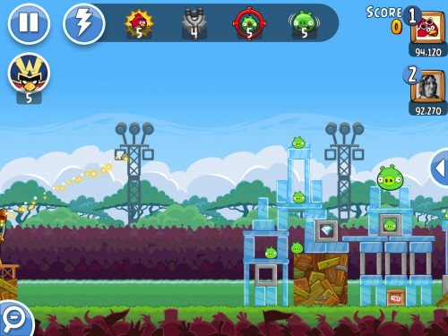
Example: The most obvious one is Angry Birds.
The player immediately sees pigs in fortresses when loading each new level. As a rule, it is not necessary to explain what to do next.
2. Pose a problem, do not force to solve the puzzle
Game situations should be resolved with the help of logic (common sense). Their decisions should not depend on how the designer sees this world.
Example:In Terraria, whole logical chains can be traced.
For example, he cut down a tree, got the opportunity to make a workbench, with which he made a door that does not allow monsters to enter the dwelling.

3. Multiple solutions
Each task should have several solutions. Always. “And here the player is obliged to do so-and-so” is a bad approach.
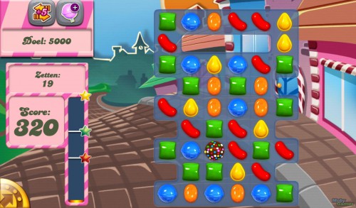
Example: An infinite number of solutions for each level – in Candy Crush Saga.
4. Don’t make me lose
A situation in which a player cannot influence the development of events within the game in any way is far from the best approach to design.
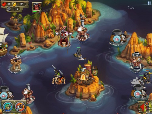
Example:In free-to-play, this approach is resorted to in order to hint: make an IAP.
For example, in Pirates Legends TD, it is impossible for a player to defeat some bosses without spending on in-game currency. The problem is this: players are very annoyed by this approach.
5. These are characters!
Interaction with characters /objects in the game should not be limited only to battles. How to behave with them should be decided by the player, not the designer.
Example:In War of the Fallen (or any other card collectible game) – how to dispose of the cards (sell / strengthen another card with them / merge them with similar ones, and so on), the player decides, the designer only provides opportunities.
In fact, it’s not a very good example, but, in fact, Spector’s fifth “commandment” repeats the third: offer several solutions to the problem.

6. Players do, and non-players watch
It’s boring to watch an NPC do something cool. It’s much more interesting to let the player do the same.
Example: In mobile games, this is almost not found.
But here it is quite possible to draw a parallel with screensavers for mobile projects. As a rule, they are skipped: the user can’t wait to try the game itself. And only then, if she suddenly catches him, he will be more attentive to the content that goes with her.
7. The game is getting harder, the player is getting smarter
The further into the forest, the angrier the woodpeckers. As you progress, the game should become more difficult. The dynamics of this process must correlate with the player’s progress (at first he just settles into the project, then develops skills, then gets delicious buns for completed tasks, learns to handle them, gets new buns, and so on).
Important: the game must be passable.
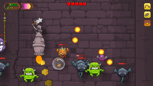
Example: In Knightmare Tower, for the first few sessions, the user deals with non-standard gameplay, earns the first in-game currency, with which he buys various pushs and improvements.
With their help, he flies a longer distance in the game. But the higher, the more difficult.
8. Reward the player
Achievements, rewards stimulate the user. But it is also important that the player understands what exactly he is being encouraged for. And with the player’s progress, they should grow.
Example:Now such mechanics can be found in almost every mobile game.
Reaching the level – a medal / n is the amount of game currency, you visit the game every day – that’s another bonus.
9. Think in 3D
Three-dimensional levels should be three-dimensional, not a flat maze, one-in-one coinciding with the original sketch on paper.
This means that it is necessary to take into account the possibility of movement/interaction not within the same plane, but in 3D. In addition, it must be remembered: in such projects, the player can look at what is happening from different perspectives.
Example:Navigating in three-dimensional space on touch devices is not very convenient.
So, most likely, this is not the most relevant advice for mobile developers.
10. Think about relationships
Three-dimensional maps should be full of objects connected to each other. Putting two points on a plane and connecting them with a pipe is boring. To arrange a dozen objects, connect them with dozens of paths, labyrinths, underground passages with each other is a completely different matter.
Example:In fact, the pipe between point A and point B is not the worst option for a mobile game, although, of course, a complex map is much more interesting.
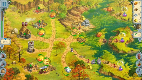
A good example here seems to be the game “Druid Kingdom”. Actually, in it, the ability to logistics decides everything.
A source: gamesindustry.bizPhoto source:
