Last Friday, the third meeting of the St. Petersburg Applications Club took place, which we attended. About how it was – in our brief report.
The meeting was devoted to the creation of interfaces for a mobile application. There was no direct link to the topic of mobile games as such, but it seems to us that general laws work here. Actually, that’s why we went to the “light” of the Club.
There were only two reports.
The first one is from the producer of First Line Software Anton Shelonaev. He analyzed the projects he worked on at the Yord studio.

Anton ShelonaevYou may have read about it on our pages before.
We published a large series of articles by one of its founders Denis Wittman about “How to become a millionaire in the App Store”.
Returning to the report. In the main thesis of his speech, Anton starts from Murphy’s playful law, according to which “if there is a possibility that some kind of trouble may happen, then it will definitely happen.” According to Anton, “if there is a chance that the user will do something wrong, then it will definitely happen.”
In other words, if you decide to make a runner without a tutorial (they say, there are so many of them already out – everyone knows how to play them), then most likely most of the users will not understand the game. Or, another example from my head, if there are twenty missions in the game, ten on one screen, ten on the second, but there is not even a hint that there are two screens (or the page symbol is too small) – do not be surprised that users will start scolding the developer for the fact that there are only 10 stages in the game.
Another important thesis of Anton: “no one reads the text.” For this reason, it is not necessary to sign especially for the training mode. The main thing is that the user can do something himself in it.
According to Anton, you should also not be afraid to make advertising in the application visible to the user. If she is hiding somewhere, then there is a high probability that you will not get anything from her.
We will add on our own: a compromise is necessary. It is clear that advertising should be visible, but also intrusive, literally preventing the user from playing – it is also not worth doing. It would seem to be a truism, but some people forget about it.
Another important thing that independent developers can forget about is a reminder that you can and should buy something in the game. If the user likes the content, the game, he should be able to easily spend money on it. And here the task of the designer is to make sure that the user does not need to look in which menu to do it.
The second report “Mobile application design: interfaces are non-refundable and non-exchangeable” was read by Pavel Alexandrov, who participated in the creation of the TopFace social network, the development of MeetingGuide, and now works for the Behemoth-Behemoth company.

Pavel AlexandrovPavel’s main thesis is that the interface, in fact, sells content.
The best seller is the one who helps as unobtrusively as possible in the store. The ideal interface, based on this logic, is the one that exists, but it is not noticeable because it is intuitive.
So it turns out that, for example, a bicycle is one of the best interfaces. When you eat on it, do you notice the steering wheel, wheels, frame? No, you don’t pay any attention to them, you are absorbed in the “content” – the landscape, dear.
How to make such an interface?
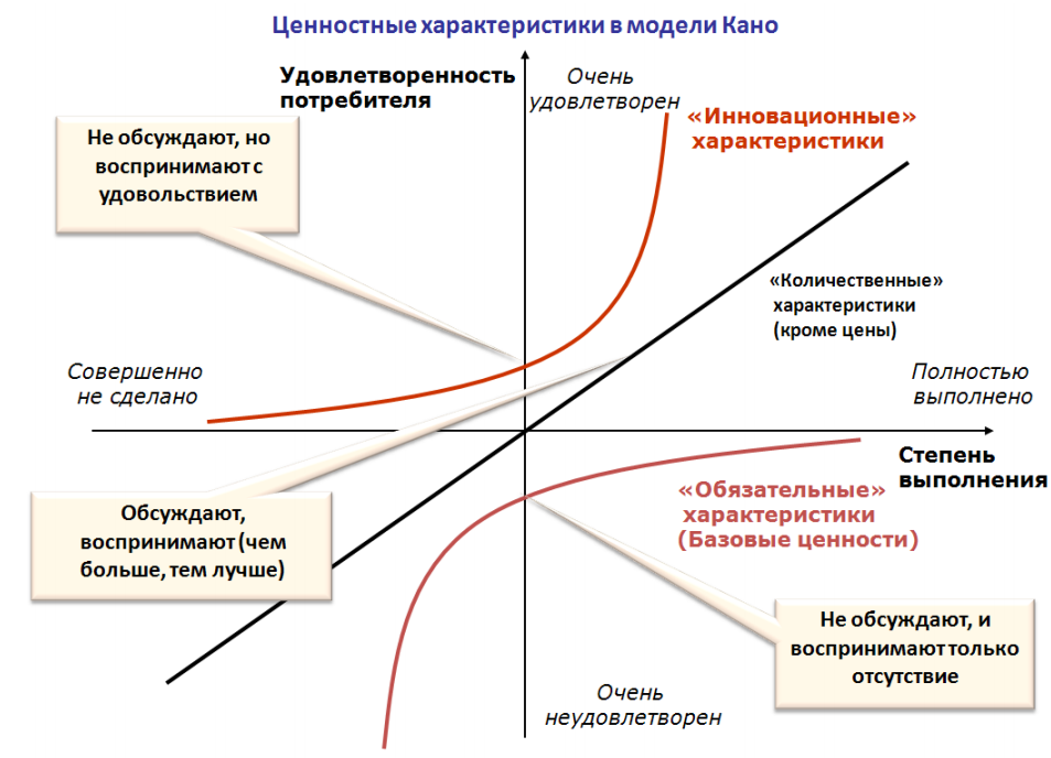
Pavel suggests using the Kano model. This is a classic method for measuring and managing the quality of a product.
In a nutshell, the quality of any product can be measured graphically, where the abscissa axis is the degree of quality assurance (whether all the features necessary for a particular product are met, whether there are special features, and so on), the ordinate axis is the level of customer satisfaction (satisfied, not satisfied, and so on).
If you take a prototype of the application and show it to your colleagues, and then ask them to answer questions, each of which will correspond to some digital value on your Kano model, then after testing it will be possible to build a curve reflecting the quality of your project. Ideally, this curve should be in the upper right part of the graph.

Actually, everything.
You can get acquainted with the full version of the reports on the website of the St. Petersburg Applications Club.
