A few days ago, a presentation of the analytical tool devtodev was held in Moscow. Just below is the text version of the report, which was read at the event by Maria Paskevich, an analyst of the service.
The report itself is based on examples. Each slide is one or another standard situation that may arise in the process of working on a mobile game.
But first let’s recall about devtodev itself. This is a tool that provides statistics on 6 app stores, as well as analyzes user behavior and outputs this data. In other words, the service helps to collect and analyze data with which developers make decisions about the further development of their product.
At every stage of life, the application generates a huge amount of data. This is information about user behavior, transactions, and data from marketing channels. And the value of all this information is precisely that on its basis you can get answers to your questions and extract really useful solutions.
While working on a project, a developer has a lot of questions that cannot be answered without getting deeper into the structure of his project.
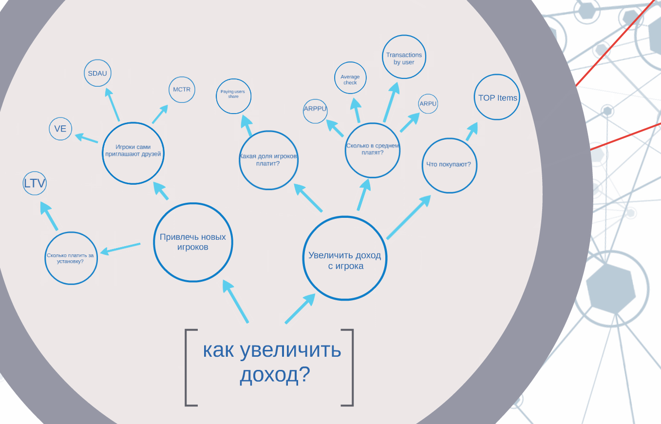
For example, if the main goal is to increase revenue, then it can be achieved in different ways: you can attract new users, you can increase revenue from existing ones. And certain metrics will allow you to quantify the effectiveness of these actions of yours.
For example, you have decided to conduct a marketing campaign inside the game and want to see how successful it is.
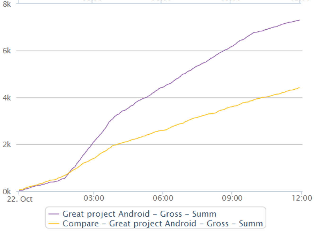
The easiest way to assess quality is by whether income is growing. Devtodev allows you to track data on the amount of income in almost real time with aggregation in 5 minutes. Just above, you can see two graphs — this is the growth of income for the current and past days. As we can see, the income increased compared to the previous day. It means that the action was successful.
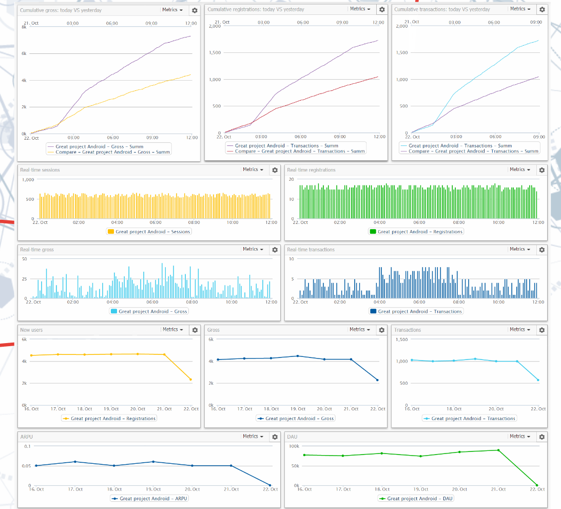
All operational information is available on the standard dashboard of the application.
But let’s go back a bit and talk about what types of metrics there are in general and why they are needed.
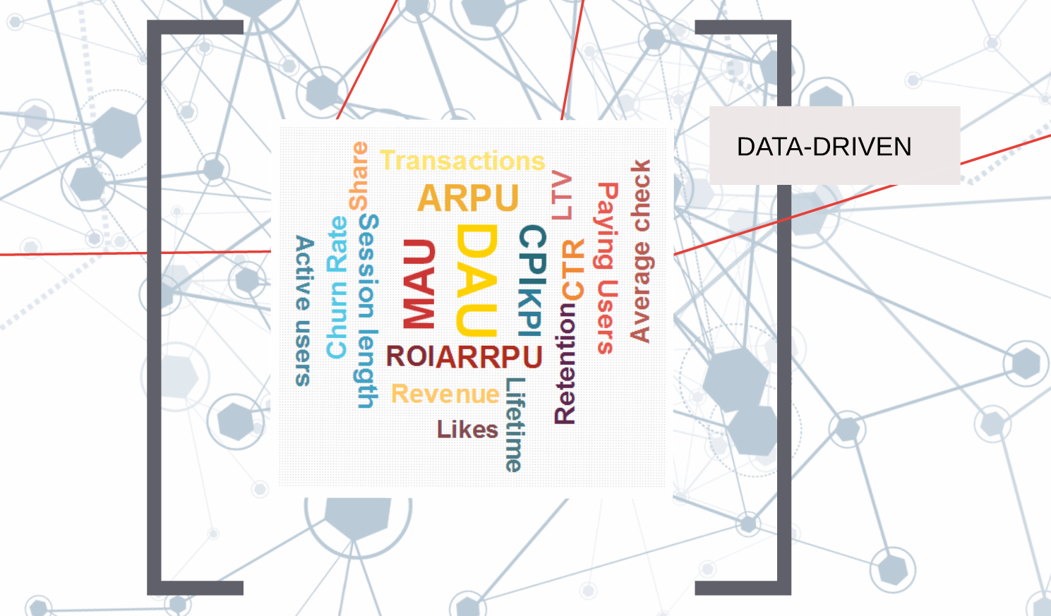
We say right away: there are no universal key metrics, because applications can differ markedly from each other, so it is important to focus on those that make up the KPIs specifically in your case. But, of course, there are metrics that interest the vast majority of developers.
One of them is income.
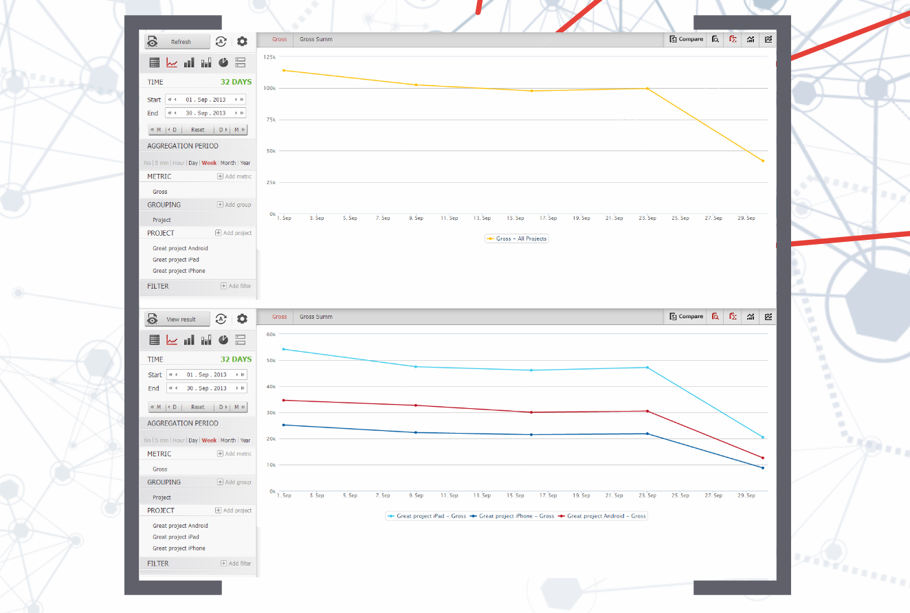
Let’s imagine that you have three applications (for example, for iphone, ipad, android), and you want to estimate your income. You can display the total income on one graph, or you can detail it to understand which application brings the most.
But income is the final result of your efforts, its monitoring does not help much in making decisions about any specific improvements.
It was already mentioned above that there are two ways to increase revenue: by attracting users and increasing the average income from each.
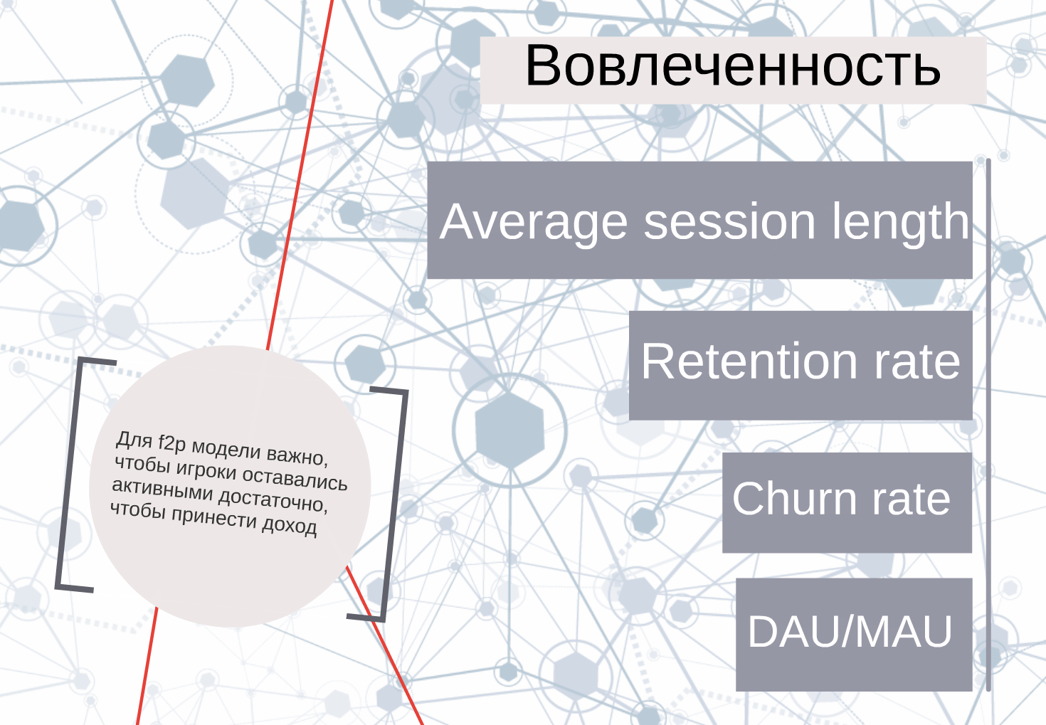
Before you start spending money on attracting users, it is important to know how much your audience is paying off, and this means understanding whether your players remain active enough to bring you a certain income.
At the initial stage, session length, user returns and churn rates, as well as DAU/MAU are used as engagement metrics.
It is logical that these metrics themselves will tell you a little — you need to compare with something. If you already have similar games, then you can simply compare the data on them and see the difference.
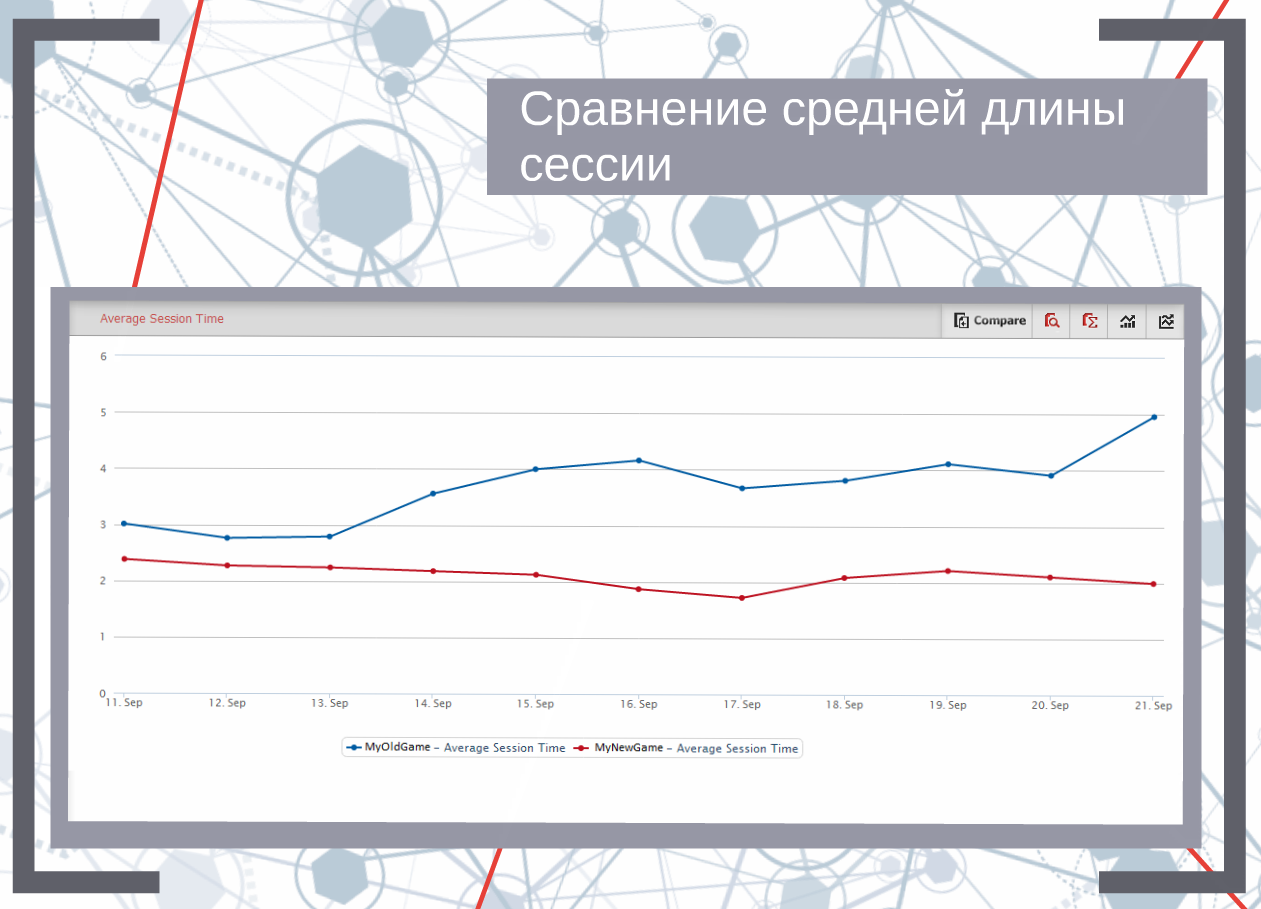
For example, to display data on the average session length for two applications on one graph: here, for example, it is immediately clear that the new game has a lower session length, which means there is something to work on.
Or, for example, we have changed something and now we want to find out if it has affected the involvement of our players. You can build a comparative graph for one application over two time periods.
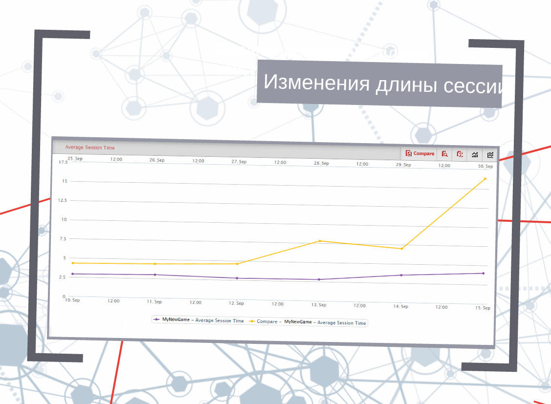
Judging by the schedule, our update has increased the average session length. Great!
But the session time is only one indicator, and it does not mean that the player will return.
The percentage of returns shows how interesting the game is to our users, so special attention is paid to it at the project launch stage.
In addition, it is used to assess the quality of the traffic caught up, evaluating returns during an advertising campaign in order to calculate low-quality traffic.
The very concept of returns is closely related to cohort analysis. We define retention as the percentage of users who started playing at time A and continued playing at time B.
As an example, I will give data on one application. This is a city-builder game. The bottom line is this: we bought traffic in our favorite advertising grid. 14 days have passed and we decided to see how high-quality the installations turned out to be. It will look something like the graph below:
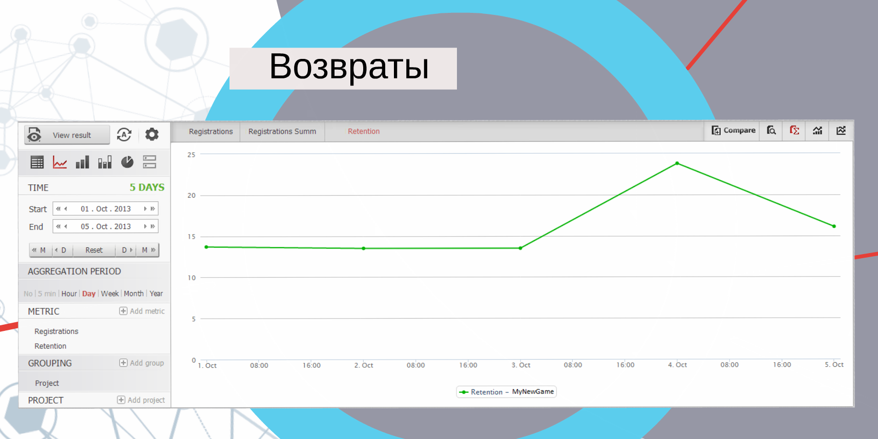
Apparently, the advertising campaign was very successful: 24% of users continue to play after 2 weeks. Surprisingly, this is even more than usual, which means that the traffic was really high-quality.
If we want to increase the average lifetime of a player’s player, then let’s first see how many levels our users go through and at which they most often quit the game. To do this, we plot the number of users on each of the levels for the entire existence of the game. Based on this data, you can calculate the levels at which the largest number of users are stuck, and already try to figure out why this is happening.
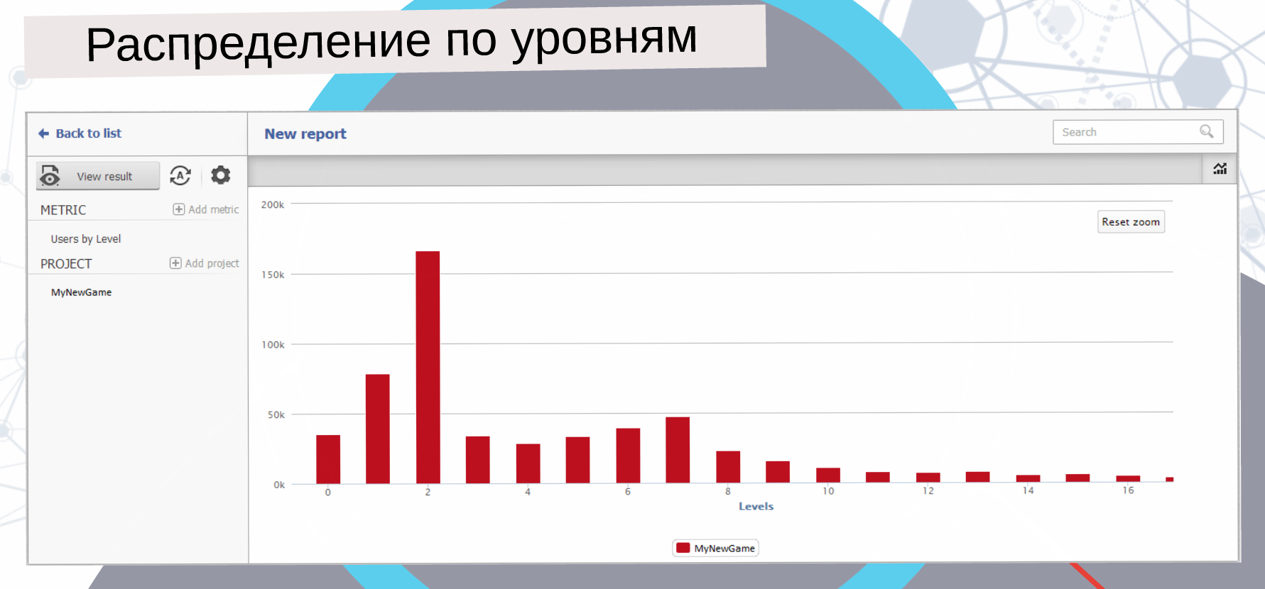
For example, the second level holds the most players. Maybe something is wrong here…we need to look at the outflow of users from this level in order to draw any conclusions. Let’s go back to our game and see at which levels the players stop playing.
Usually, users massively fall off first at the very first steps if their expectations from the game are not met. For example, he was waiting for a cool RPG, and got a farm with space pigs. Then they will run when you start asking for money. And finally, at high levels, the game can just get boring: it’s not interesting enough, there is no development. On such a graph, the whole story can be tracked and based on this, something can be corrected in the game balance.
If you remember, in the previous chart we had a big peak at the second level, i.e. the largest number of our players stayed there.
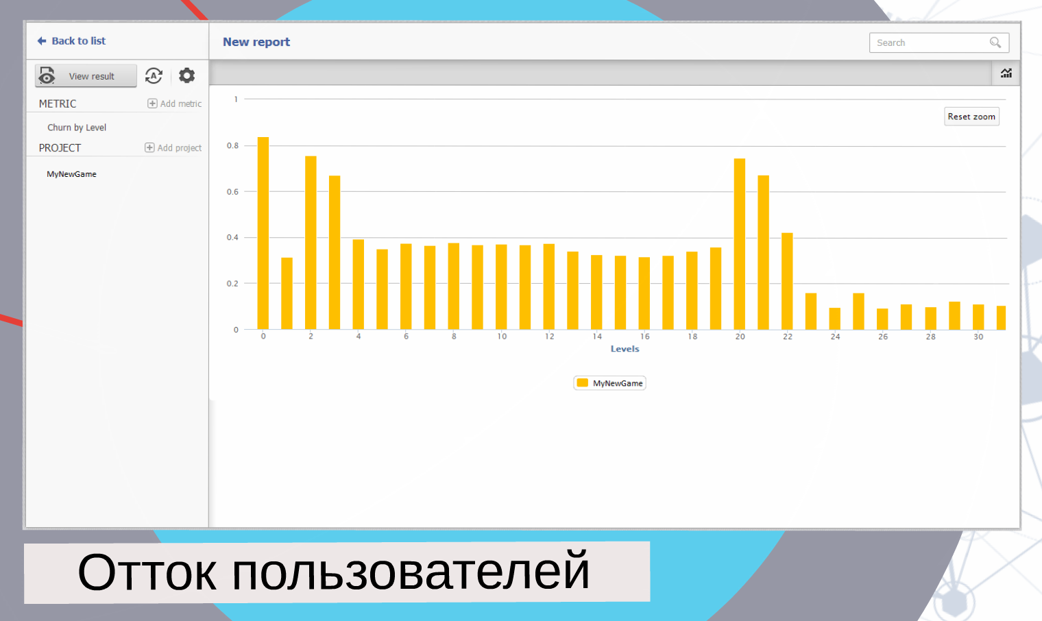
And here we see that at this level the outflow is more than 80%. If at the same time we know that there is no monetization here yet, then obviously such a large bounce rate is associated with deceived expectations. Or the tutorial is over, and what to do next is not obvious.
All the described metrics essentially detail one of the most important indicators of engagement — the average lifetime of a player. It is measured in days and shows how many days a user’s activity lasts on average.
Of course, engagement alone is not enough to assess the structure of your audience. And since the ultimate goal is still income, and not world peace, it would be good to understand where you get it from.
There is a group of monetization metrics for this.
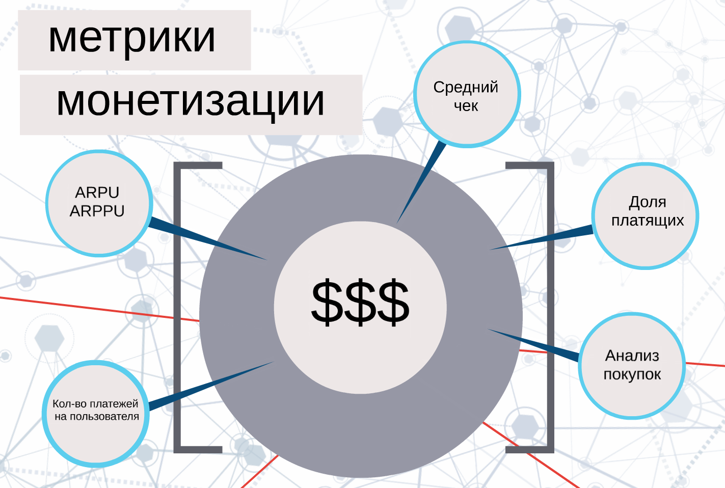
ARPU and ARPPU show how much one user and one paying user brings on average.
In addition, it is useful to calculate the percentage of payers, the number of payments per user and the average receipt.
But in order to better understand how and why users pay, it is necessary to analyze by levels.
You can analyze, for example, the number of transactions at each of the levels — so you will understand where the best indicators for monetization are. In addition to transactions, you can measure the amount of game currency spent by levels.
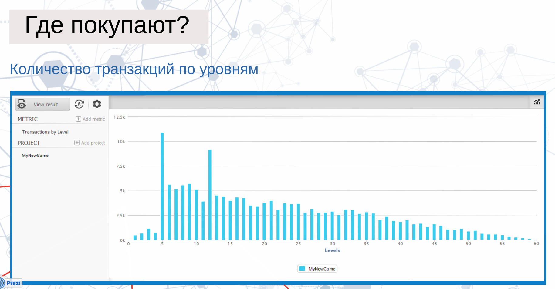
On the slide we have the distribution of transactions by levels. It is logical that at the first levels their number is minimal, then we get a big jump at the fifth level. Apparently, monetization was turned on at this moment. Then another jump at level 12 — most likely this level is difficult or impossible to pass without buying some specific items.
Any metrics related to payments lose their meaning if you cannot separate real payments from fictitious ones. Especially for this purpose, the system has a built-in functionality that detects such false payments and all further calculations are carried out without their participation. You can view them in the list of project transactions.
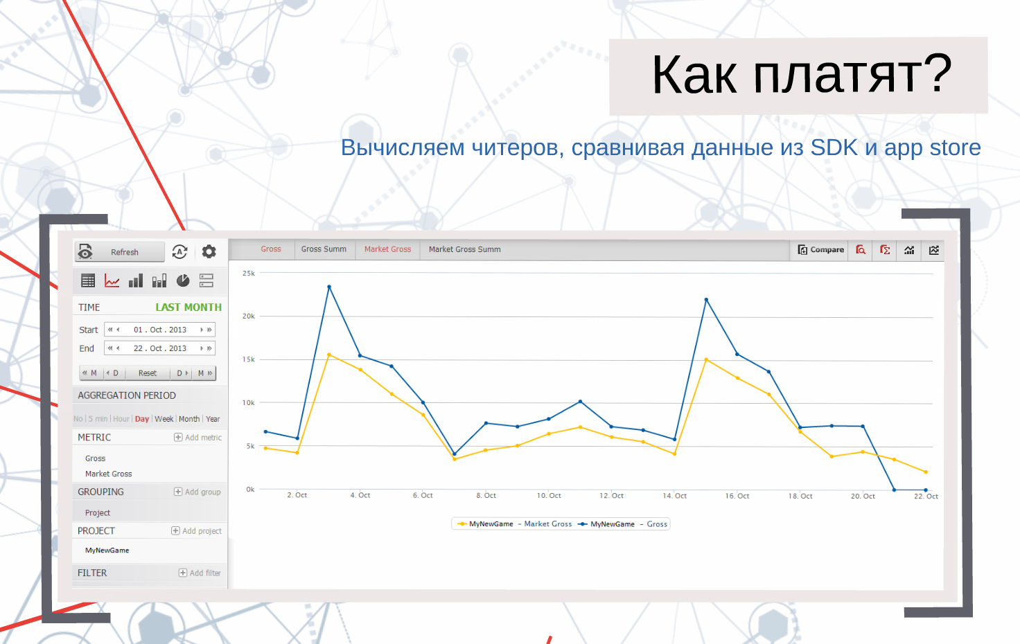
A transaction report is issued for each connected application, in which real and fictitious payments are separated. It looks something like on the slide just above.
But this is only part of the capabilities of devtodev. The service also provides statistics on six app stores: you can follow certain charts, or the positions of certain apps in the charts.
When developing the interface, special attention was paid to the possibilities of working on a large number of projects, so you can view data on all metrics for one project, compare projects with each other, or get summary data for a group of applications. The data comes from two sources: the SDK and the developer account in iTunes Connect or Google Play.
The original presentation can be found here.