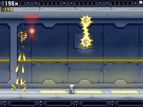
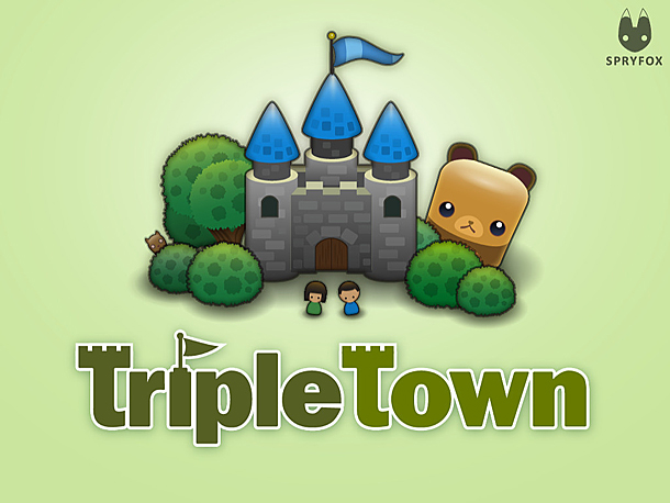
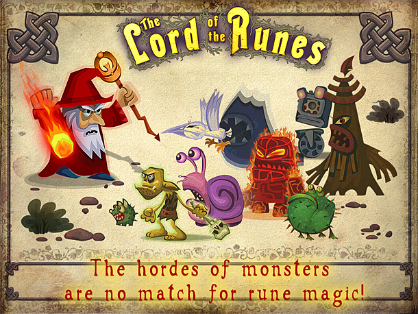
 A few tips for those who do not want to lose a player who has already downloaded an F2P application, as well as for all those who dream of getting him hooked on their game. As examples, we consider games such as Jetpack Joyride, Triple Town and The Lord of the Runes.
This is the second material in a series of articles about F2P. The first part can be read here.
The faster, the better
Do you think that once a user downloads an F2P application, money will immediately flow to you? No matter how it is, after that it is still necessary to hold it, to carry it through the menus to the gameplay. Surprisingly, even this is not possible for everyone.
If in large F2P games, the stumbling block often becomes a long registration, the unaffordable size of the distribution, as well as the need to download a driver, then in mobile applications, an excessive fascination with menus, icons, as well as numerous screens that do not make much sense, which the user is forced to scroll through to get directly to games. So remember: the more a player steams with menus, the higher the chance that you won’t get this player.
Jetpack Joyride and Triple Town are perfect examples of how to make users instantly “hooked” on the game. You click on the icon and immediately find yourself in the game.
Questions about functionality
Game designer Pascal Luban (Pascal Luban) argues that it is not necessary to scare the player with a wide functionality. It is better to restrict access to most of the game features at the first stages, leaving only the basic ones. So the user will not get lost in the game among a huge number of options, as often happens in various social projects. In addition, the player will not face the need to read tons of “educational” messages describing the gameplay: this can also alienate the user from the game.
The creators of The Lord of the Runes played on the limitation of functionality, providing access to the full list of spells only at the moment when the player got used to the basic spells.
So the limited number of actions available in the game at first does not make it less attractive, because more complex options are still available, but not immediately. The task of the designer, according to Pascal, is for the player to think something like this during the game:
1. I understand what I have to do
2. I can easily do this
3. I managed to do it
4. I got a reward for it
5. I have a short-term goal and I understand how it can be achieved
If you want the user to be motivated to learn the game, the player should not lose. At least for the first time.
Pascal also recommends using the progress bar for training the player, which gradually fills up as the tutorial progresses. This will not only arouse the user’s curiosity, but also stimulate him to search for all game features.


