While Microsoft surprises the gaming community with exclusives and shows bright projects, Apple demonstrates a new design of its axis.
Apple’s main announcement at the WWDC currently taking place is a new version of the iOS 7 mobile system. There are only two main chips:
1. Complete iOS design changeNow its design is visually very similar to the latest version of Google Play: minimalism, predominance of white color.
Only if Android has a white background used to, let’s say, highlight bright icons, then everything is cardinally white with a blue tint.
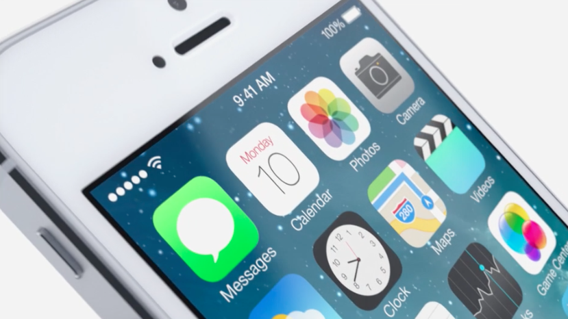
Animated backdrops also appeared (yes, as on Android), animated weather (flipping between cities with weather is very similar to Metro-style). Game Center got an icon with soap bubbles.
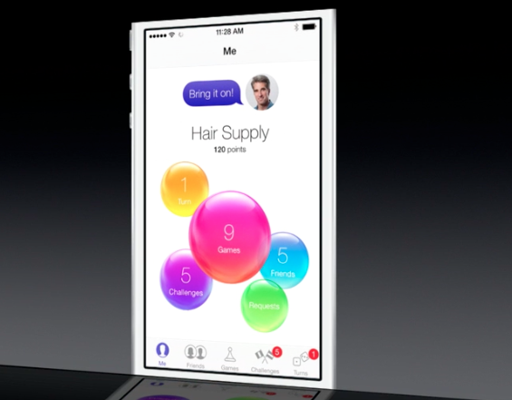
By the way, the list of friends in the game service is also very similar to the Windows Phone interface.
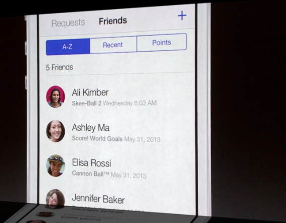
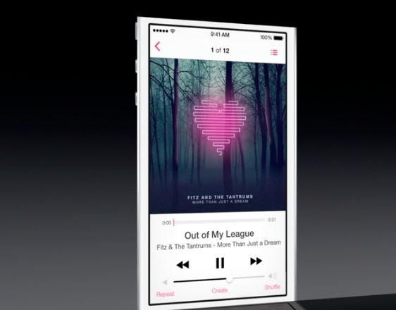
Accordingly, the design of iTunes will also be updated.
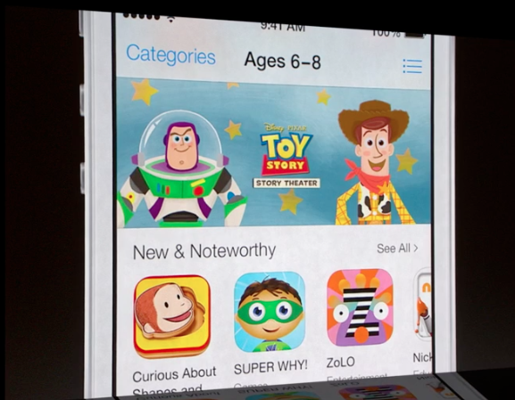
And the design of the player, too.
2. Full multitasking for all applications. This is clearly seen in one of the fragments of the video in which Jonathan Ive talks about the design of iOS 7.
Now you can not just switch between applications, but see in what state they are running.
Also available is a male voice from Siri, iTunes Radio, FaceTime audio and notification synchronization.
Only the latest generation of Apple devices (iPad 4, iPhone 5, iPod touch 5 and iPad mini) will support iOS 7. SDK for iOS 7 is available from today. The release of the system itself is scheduled for autumn.
Photo: The Verge
