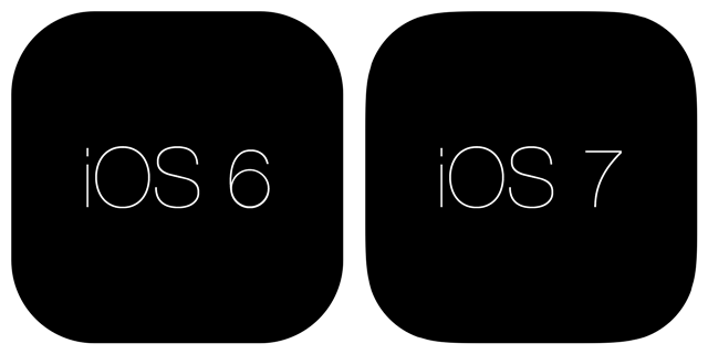
New axis, new icons. The first information appeared on the web about what exactly designers should pay attention to when developing icons for iOS 7.
For the first time in six years of the existence of the “apple” platform, its design is radically changing. Instead of glittering with glass surfaces and chrome frames, skewomorphism comes minimalism. And these are new icon sizes and new fonts.
Fonts
Actually, with the change of the latter, many developers may well have a new headache. The fact is that the number of characters displayed at the same time under the icon has changed. If earlier 13 characters were crazy on the screen, now the maximum is within 12 characters (this does not apply to official Apple applications, in addition, the limit on the iPad is greater than on the iPhone). In a two-word application in the name, the problem is solved by replacing the standard space with a small space in the Character Viewer.
There is also another subtlety. Previously, new applications that have never been opened were marked with a New stripe on the icon, in iOS 7, a blue dot is placed before the name instead. This, too, may lead to the reduction of long titles.
The conclusion is this: the shorter the application name, the better.
Icons
Firstly, the shape of the icons itself has changed. It has become more rounded (the radius of the bevels of the corners has increased).

Secondly, their resolution.

In fact, if you want to release apps for iOS, now you have to make at least seven versions of icons: four for iOS 6, which will be on most devices for at least a couple of months, three for iOS 7.
Thirdly, on iOS 7, icons will be displayed without the reflection effect (gloss effect).

Fourth, remember: the visual component of the platform has changed a lot, you should now draw new icons with an eye to minimalism.
More on this topic can be found on the Manbolo company blog and mani.de .
A source: http://blog.manbolo.com
