Ben Sipe from the marketing company NativX (formerly W3i) told on the pages of his blog what needs to be done to increase retention and improve monetization in a mobile free-to-play project.
1. Do not tire the player with a wide choice
There are many studies according to which a large choice leads to a lower income. Perhaps one of the most famous studies on this topic is about the grocery store and jams. According to him, when customers were offered to try 24 types of jam, 60% of buyers were interested in the promotion, but only 3% of them purchased something based on its results. After that, another experiment was conducted. Customers were offered only 6 types of jam for tasting. 40% of buyers were interested in this promotion, of which 30% bought themselves a jar.
What’s the point?
It is not necessary to show all the content to users in virtual stores. Show up to six pieces, close and lock up the rest until time.
Why exactly six objects is the maximum?
Firstly, it is often so many objects that are placed on the screen at once. Also, there is no confusion, the eyes do not run away from the diversity. There is another important point here: processing new information is also a job that can be tiring. The need to deal with 10 items in the store at once can discourage any desire to play at all.
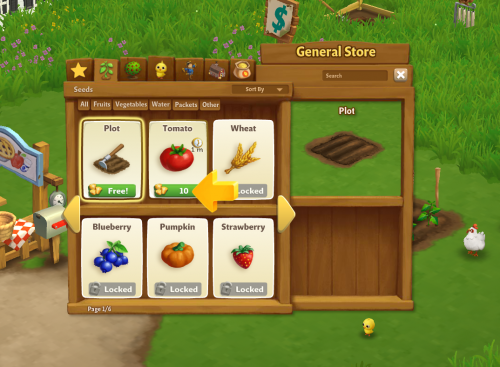
Farmville 22. There should be no questions in the app store
The fact that the in-game store should be understandable to users and easy to navigate seems self-evident. But it’s one thing to say, another to do. Especially if you have hundreds of items in your store. According to Ben, Gameloft is a great example to follow.
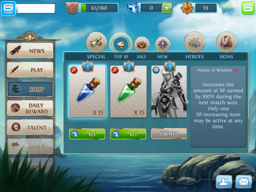
Heroes of Order & Chaos3. There should be a lot of virtual items
We are talking about hundreds and even thousands of titles. Why so many? To cover the entire range of prices and types of players. Someone just loves beautiful things, someone wants to gain experience faster, for example, someone to gain an advantage in PvP and so on.
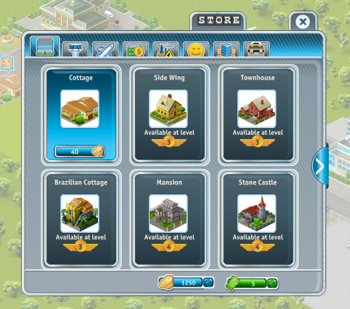
Airport City4. Bring players to your store
If the game has levels, battles or rounds, do not be afraid to bring users to the store so that they can spend the newly earned game currency in it. It is important not to overdo it here: it is necessary not to force users to enter it, but to make it easy to enter and easy to exit, so that the store is part of the game.
As Ben points out: there is a fine line between the urge to buy and compulsion. The difference between the first and second players feel great.
5. Make the first purchase very profitable for the player
It is difficult to make a free-to-play player pay. But it is believed that anyone who has ever changed his buck or two for in–game currency will continue to pay. The only question is how to stimulate the user, how to seduce him?
Here are two possible scenarios:
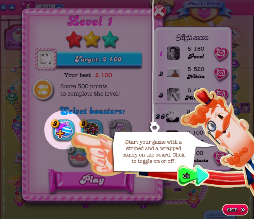
– demonstration “in the first couple” of how cool, for example, a consumable works (explodes the entire playing field, is a multiplier of points, accelerates running, and so on)
– offer of an n-object at a small price with a loud banner “this offer is valid only for n-time”
In both cases, the player will face a great temptation. And that’s exactly what we need.
Candy Crush SagaA source:


