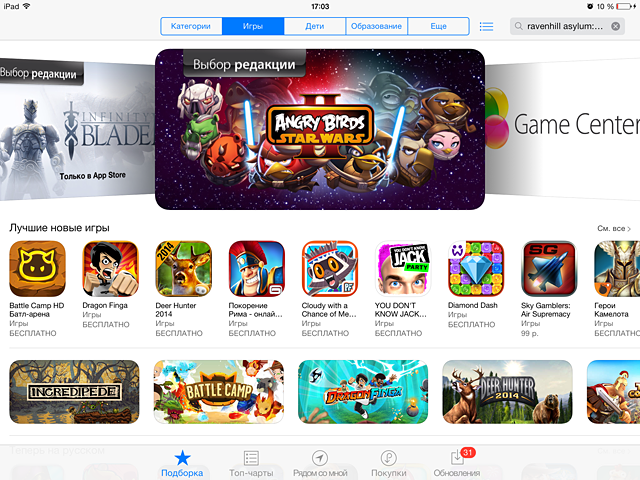
Screenshots sell. The way the game looks in the pictures in the description of the application is of decisive importance for most users today. The only question is how to make the screenshots attractive?
George Osborn, a Pocket Gamer journalist, believes that it’s enough to follow five simple rules.
1. It is necessary to know the rules that need to be followed (and which ones to ignore)
Everything is simple here. Each store has its own rules. And you need to know them. In the same App Store, for example, you need at least one screenshot with a real gameplay.
As a rule, such rules are always collected in one place. In the case of Apple, you need to memorize the iTunes Connect Developer Guide.
However, you need to understand that there are undocumented rules, such as a ban on placing an image of an iOS device or marketing “messages” on screenshots. Such “recommendations” are often forgotten. And the big players get away with it.
So the conclusion here is: follow the technical regulations, but at the same time leave room for your imagination. The main thing is that the screen reader sells, and if he does this, they will turn a blind eye to your little “pranks”.
2. Polish your “message” to users
It is necessary to understand what you want to tell the user about the application.
Why is this necessary?
Because screenshots are something like a small trailer that helps to tell the story of the game and emphasize its features, those features that you have been working on for months.
In order to formulate your “message”, you need to think about two things. Firstly, what users will like about your game the most, why they will play it. Secondly, what are the distinctive features of your game.
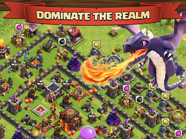
As a good example, Osborne cites the Clash of Clans screenshots, according to which you can perfectly understand what the game is about and what you can do in it.
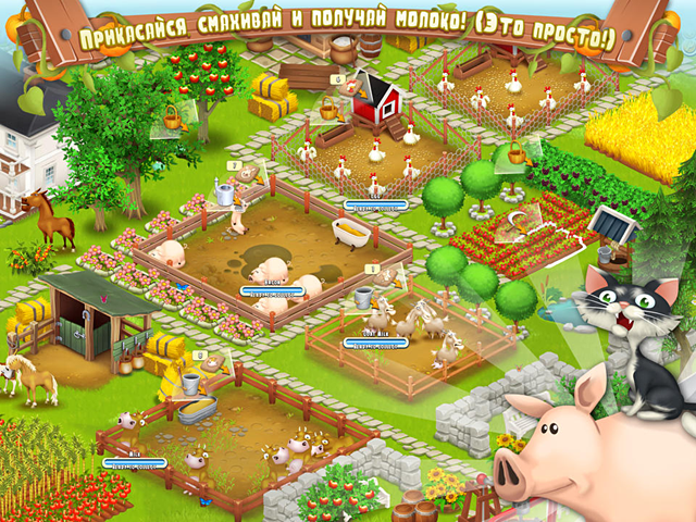
We also really like some of the slogans for Hay Day: “buy and sell fresh food“, “get cute and kind pets“. Although in places the translation leaves much to be desired. How do you like the phrase “touch, swipe and get milk“?
3. Pictures are worth a thousand words
The text is important, but you should not forget about the visual side of the matter. You should get the player interested in a couple of seconds. And here the main violin is played by the picture.
We want to repeat ourselves and again emphasize the extremely simple statement:
It depends on how the screenshots look, whether your application will be bought / downloaded or not (here, of course, you can make a lot of reservations, but for a project of an unknown team using the original IP, this is exactly the case).
Screenshots allow developers to demonstrate that their project is worth the user’s attention. Only after the user is hooked on one or another screen, he pays attention to the text.
Catches his eye, surprise, good graphics.
At the same time, an important task of the developer is to demonstrate the diversity of the game.
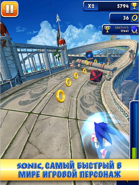
As an excellent example, Oliver cites Sonic Dash screenshots.
They are bright, juicy, diverse, and as clear as possible. The user, stroking them, understands what awaits him in the game.
4. First impression matters
People are usually met by their clothes. So it is with applications. The first screenshot in the selection is of critical importance. If, after seeing it, users have not closed the game page, the chances of downloading it increase significantly.
It is logical that developers should work on it especially.
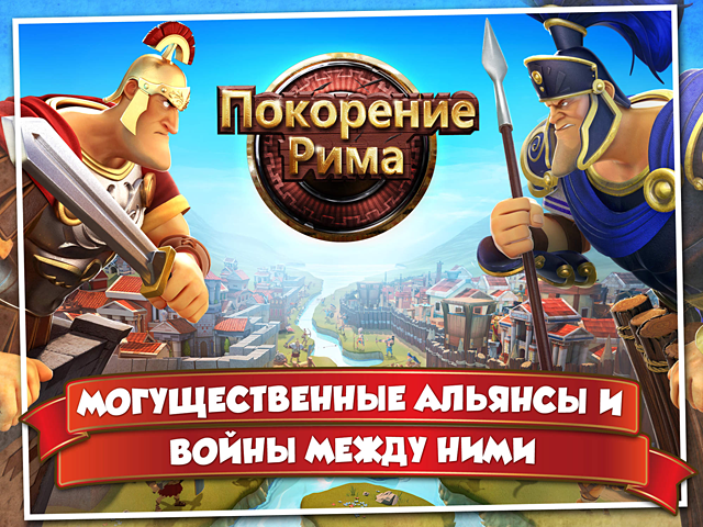
There are no special recipes. But many publishers, like Gameloft, make the screen a kind of cover: in the background – a beautiful picture with the characters of the project, in the foreground – the name of the game (the original font, a large logo), optionally – a very brief description.
5. Testing, testing and testing again
How do I understand that screenshots work? Test them!
There are several ways. This is also a classic A/B testing, which can be carried out inside your own company. However, you can’t get a full picture like that. And Apple and Google, unfortunately, do not allow this to be carried out within their stores (however, for such a test, you can use a “soft launch”).
A kind of way out is offered by mobile application development consultant Stefan Bielau.
“Create several mobile pages/insert mobile banners (aka interstitial banner – a full-screen banner in a mobile game that appears between the menu pages), on which there will be an icon of your application, a description, a screenshot, as well as an install button. A screenshot from the banner that will demonstrate the highest CTR – and do it first.”
This approach seems superfluous to us, but perhaps it really works.
After reviewing Oliver’s material, we had a question: how do you take screenshots for your projects, do you test them?
Источник:pocketgamer.biz

