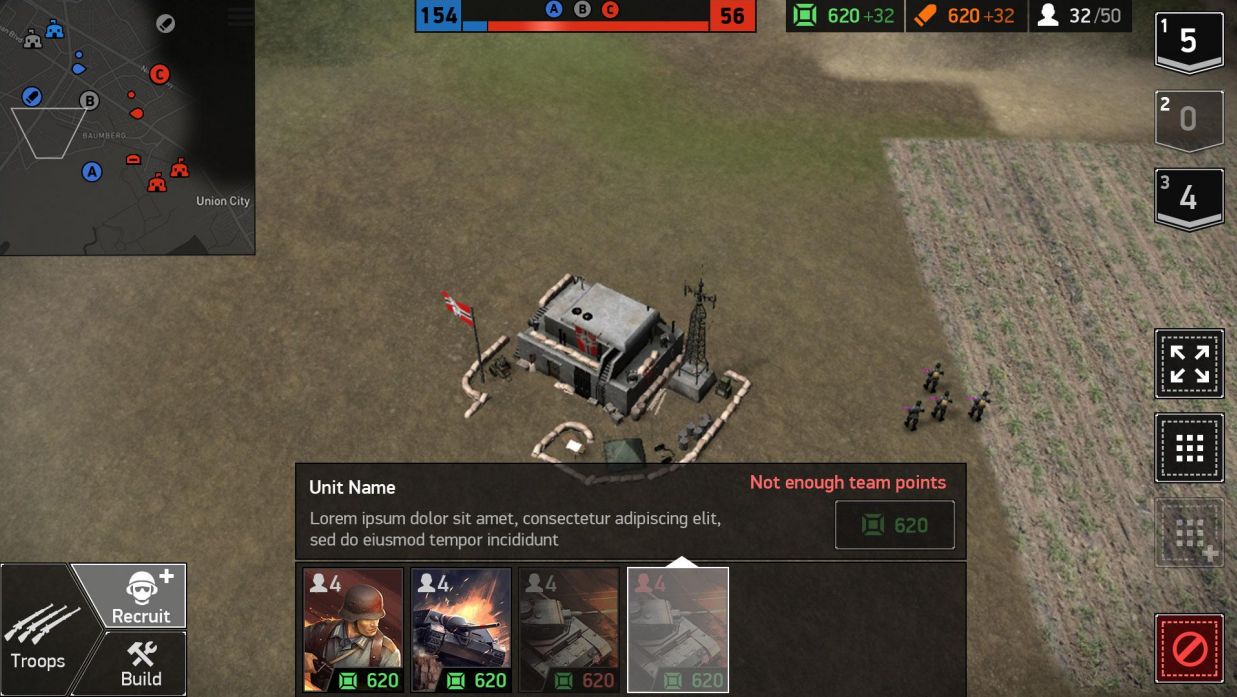
Hypemasters studio has been working on the mobile strategy of World War Armies for two years. One of the main challenges for her was to create an interface. It was necessary to find a compromise between classic PC strategy management and convenience. What compromises had to be made for this, — said Boris Kiselyov, director of the studio for UX.
Boris Kiselyov
In this article, I will share with you the experience of creating an interface for real-time mobile strategy (RTS). This is a rather unusual combination of genre and platform, the analogues of which in the mobile games market can be counted on the fingers of one hand. I will tell you what difficulties we encountered in the production process, what rakes we went through and what we realized in the end.
Strategy? And what is this “strategy” of yours?
Let’s dot the “i” from the very beginning.
For PC players, RTS are projects like Starcraft, Company of Heroes, Age of Empires, Blitzkrieg, Warhammer 40,000 Dawn of War, etc.
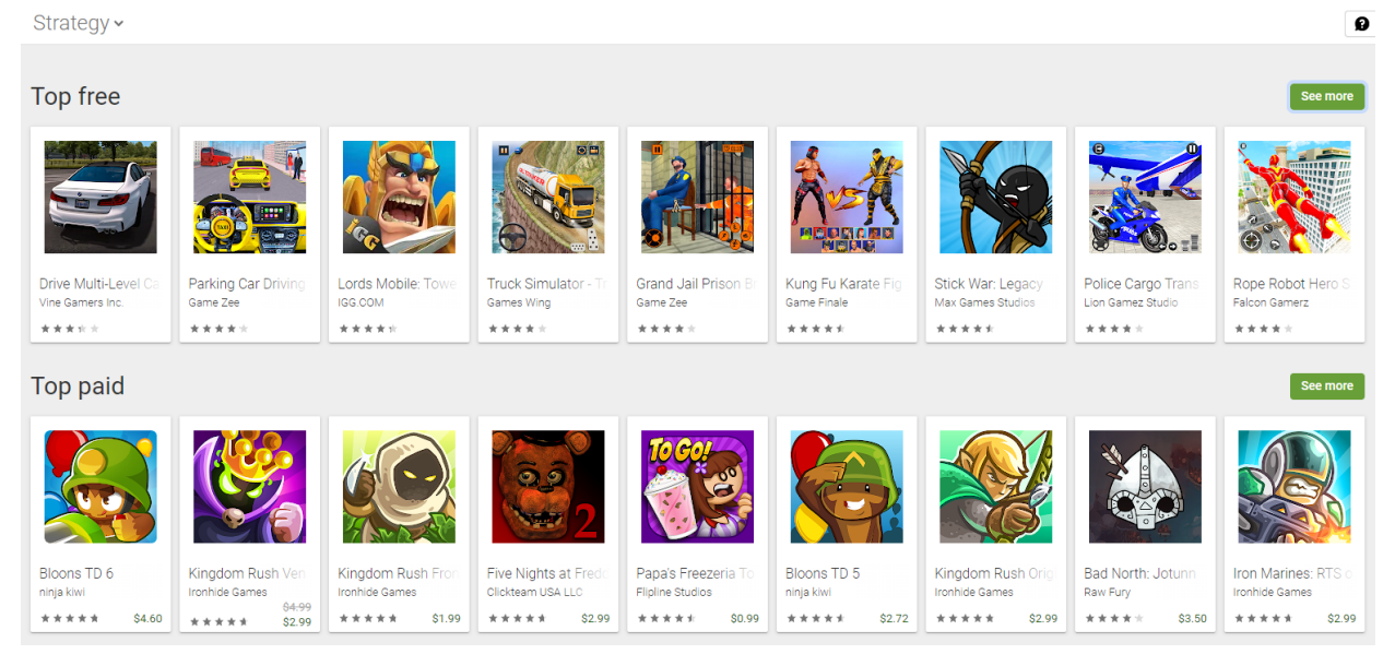
On mobile devices, a strategy can be called … well, almost anything. Look at the Google Play tops in the Strategy category:
The edges of the genre here have long been irrevocably blurred. In general, in mobile “strategies” the gameplay is usually concentrated around the development of the base, pumping units and their selection. In combat (if it exists at all as a separate activity), after construction, units usually act independently, without the participation of the player. Direct command of troops, as a rule, is absent.
We at Hypemasters have been working for the last two years to revive the genre of “real RTS” in a mobile format. By this we mean games in which there are
- real-time combat against real opponents;
- large map;
- a relatively large number of units simultaneously participating in the battle;
- direct control of units with free movement;
- the tactical component.
The mission is (not)feasible
Agree, “to revive the genre” — it sounds loud.
But there are a couple of nuances here…
RTS is one of the most hardcore genres. It implies a huge information load on the player and requires a large number of actions in response. You have to control several groups of units operating simultaneously at different ends of the map, while not forgetting about the construction of new troops, the development of your own economy and monitoring the movements of the enemy.
As an illustration: the average APM (number of clicks per minute) for professional players in Starcraft is kept at 350, and for amateurs — about 70. Imagine if you had to perform the same number of actions, but not by clicking the mouse, but by tapping on the screen.
This implies the main difficulty in transferring RTS control from PCs to smartphones: strategies as a genre maximize the capabilities of input devices that mobile devices do not have.
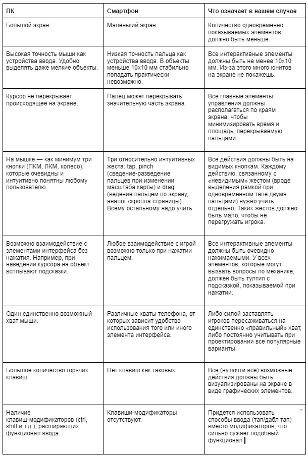
When comparing the functionality of a mouse + keyboard bundle with what phones can offer, it’s easy to get discouraged. Judge for yourself:
Such a list casts doubt on the very possibility of transferring control from computer RTS to a mobile format without losing its depth and flexibility.
Therefore, after crying, from the very beginning of work we were morally ready to put part of the PC legacy under the knife in order to squeeze into the mobile format.
At the same time, it was fundamentally important for us to preserve the spirit of classic RTS, to walk the fine line between “simplified, but still RTS” and “not at all like a PC strategy”.
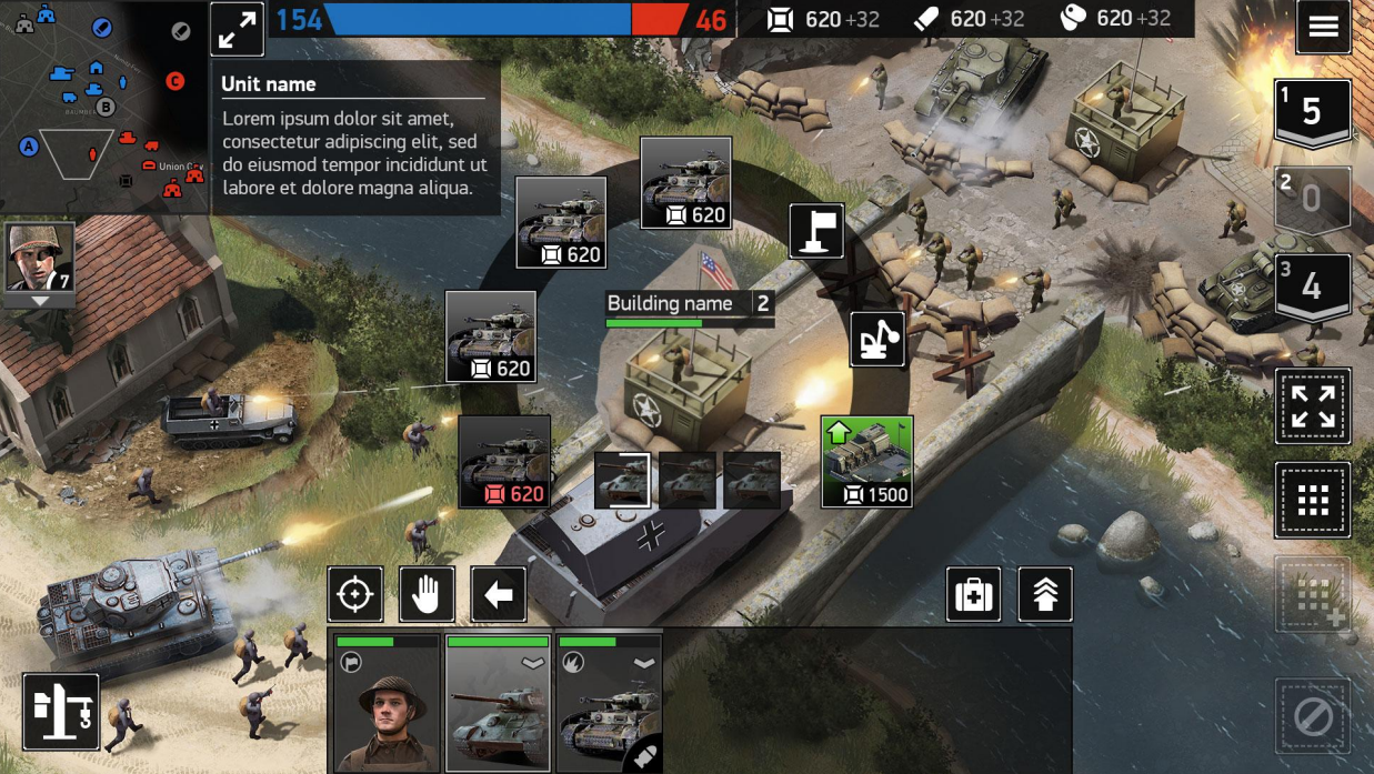
They say you can find anything on Google Play, and PC-shaped strategies for phones are no exception. The market, though small, still exists. When developing, we focused on Art of War 3 and Acies: Battle Runes. In both cases, the developers took the path of maximum copying of PC strategy gameplay. In our opinion, this approach is not optimal, because it does not take into account the features of mobile platforms.
In our opinion, in order to successfully port RTS to phones, you will need:
- reduce the duration of the session from several hours to 15 minutes maximum;
- reduce the number of items that need to be monitored at the same time;
- limit the maximum possible number of units participating in the battle at the same time to 15 on each side.
Then, using the example of several problems, I will try to show how much the end result in our case differed from the original idea and how quickly everything went wrong.
Unit Management
At the dawn of development, we proceeded from the fact that our game must necessarily have direct control of units. The selection of individual units was supposed to take place by a simple tap on the model, and group selection — with the help of frames and a separate button (spoiler: as a result, players almost universally use only the selection and management of units individually). We also wanted to keep the screen clean to show the maximum of the game and the minimum of the interface.
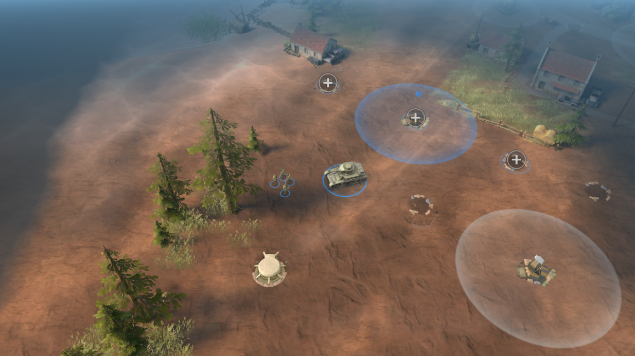
Alas, it turned out almost immediately that the unit models on the phone screen were too small to get into them with a finger, and bringing the camera closer in our case is not an option.:
Moreover, during the development process, new layers of information about the unit were added, which we wanted to display in battle, in addition to the standard XP.
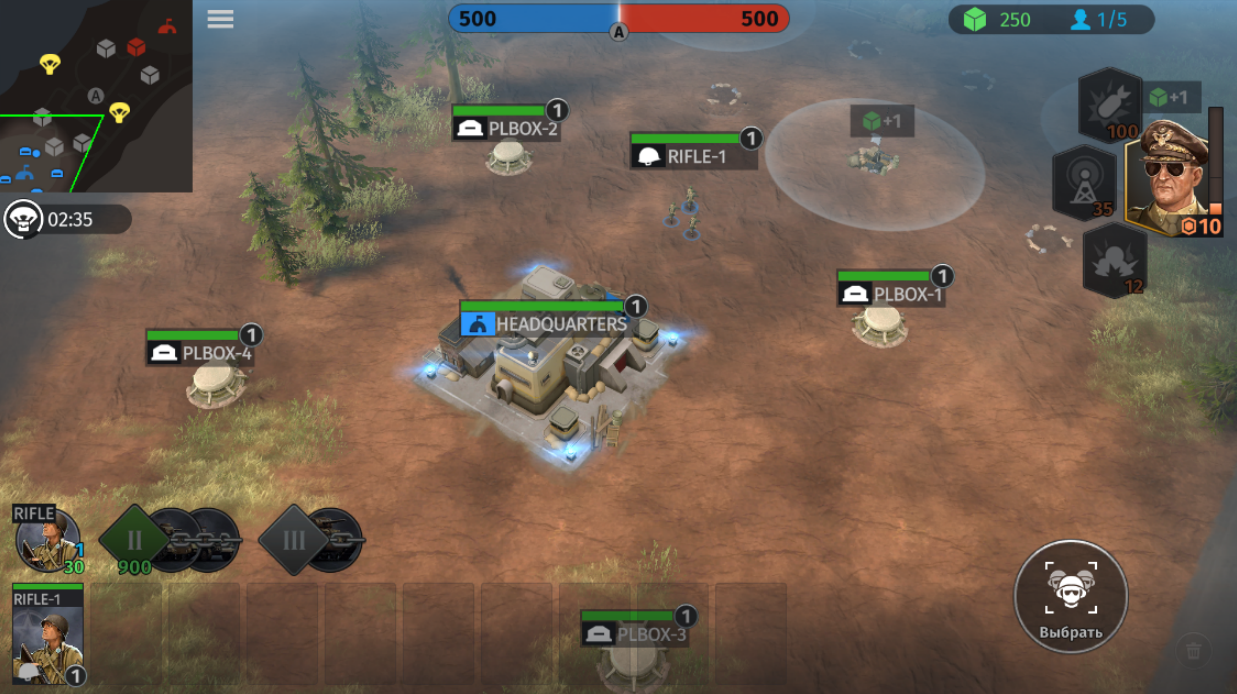
At the beginning of development , the UI of the units looked like this:
Later, we added portraits to each unit, combined with XP bars (the portrait was filled in red as damage was received):
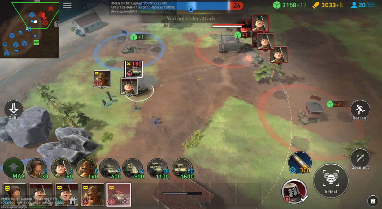
The amount of information about the unit that we wanted to show in battle grew with each version, and as a result, the nameplate on the release included:
- the unit’s call sign (it is by it that players can distinguish one tank from another, but about this a little below);
- serial number (the first unit of the same type will be NAME-1, the second NAME-2, etc.; in theory, the number should help distinguish the same type of units from each other in the lower panel);
- class icon (knowing what kind of unit is in front of you is not enough, you also need to imagine how to use this unit. Against whom it is good, and against whom it is not
very much? And what to do if you met some unit for the first time in battle with the enemy and have no idea how to play against him? The icon will help); - the rest of the little things (HP, recharge progress, veteran badge and unit level [units can be pumped outside of battle, and the one who is above the level will be stronger in 1-on-1 combat]).
In addition to the nameplates, all information about the unit is duplicated on its portrait in the lower panel, which helps players monitor the status of units without even seeing them on the screen at the moment.
Live it looks like this:
As a result, players receive comprehensive information about the state of their army and have no difficulty in allocating and dispatching units. But we still have to work with group allocations, few people use them now.
Identification of units
The setting we have chosen implies the use of models of real-life technology. It ties hands a lot in terms of visual design. When you have the opportunity to create units from scratch, you can reflect their functionality through the appearance. A pumped—up warrior with a huge tower shield is definitely read as slow and tenacious, and a thin elf with a huge bow is like a painfully striking, but physically frail, etc.
In our case, such an approach is impossible: any deviations from historicity cause burning heartache for experts and a little less burning for others. The more significant the discrepancies, the more negative they cause. We still receive comments from players that the shape of the barrel of a particular tank model does not correspond to the real prototype or that the caliber of the machine gun belt on the infantryman does not correspond to his weapon. Historicity is a rather rigid limiter.
Fortunately, most of our players are not military experts and, to put it mildly, are poorly oriented in the technology of the Second World War. In the playtests, it got ridiculous: the player took the M18 Hellcat (artillery) into the deck instead of the M6 Heavy (heavy tank) with the words “Well, eighteen is clearly cooler than six should be!”.
Naturally, in the first battle, the opponent punished him for this approach to the choice of units.
At the same time, an identification error (for example, sending infantry to attack an anti—personnel unit) for the player will be fraught with the probable loss of the unit, and for us – the probable loss of the player.
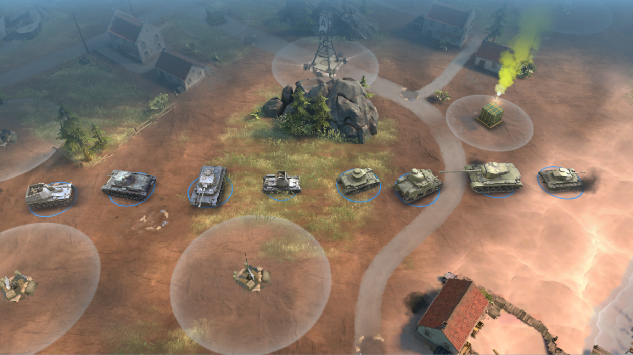
At first, we tried to make it easier for players to navigate who is who, using the same portraits. It worked well with infantry, but equipment of the same type (for example, tanks) was still similar to each other like identical twins. In the studio we called it the problem of “boxes on wheels”.
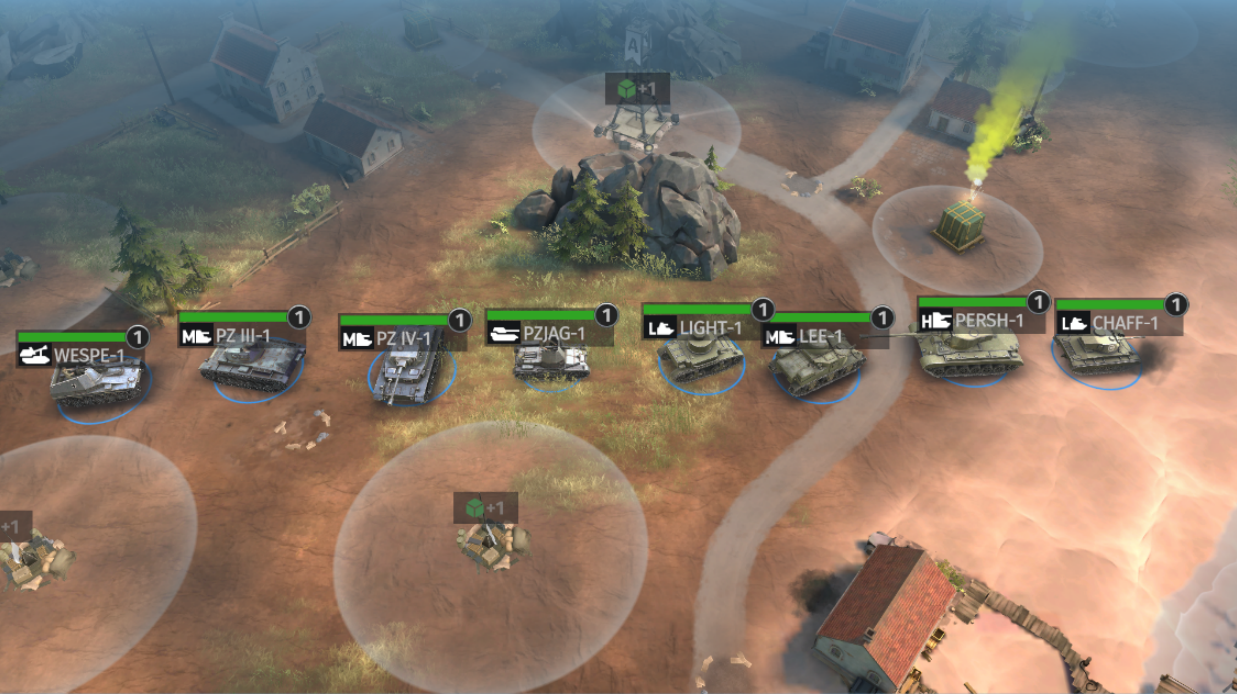
Then we added short names-call signs that the player could navigate, in addition to the unit model.
Finally, after some time, class icons joined the call signs. Now, instead of memorizing each unit individually, it was enough to figure out how the class system works once. As a result, I think we have greatly simplified the players’ lives.
It was:
Become:
Base and construction of units
Another good example of how the initial ideas change during the development process will be the story about the database. Initially, we assumed that the base and the construction of buildings on it are an integral part of the experience of “true RTS” (by the way, implemented by competitors). We tried to transfer this mechanics to the mobile format directly, with a minimum of changes.
Therefore, in early versions of the game, the player had to build specialized buildings according to the classics, each with its own function. Barracks for the release of soldiers, a factory for tanks, a storage for resources, etc. To interact with the building, you had to tap on it, after which a circular menu opened with the possibility of choosing an action:
This option turned out to be unviable. Hiring units is a super—fast action that requires the player to constantly move the camera from the battlefield to the base and back, which was very annoying and distracting.
In the next iteration, we added a panel with three switchable modes: command of troops, hiring units, construction. We saw it in Acies: Battle Runes. For the construction of buildings, it was still necessary to transfer the camera to the base (since most buildings can only be built in a small radius from the main building), but it was now possible to hire units at any time:
It got better, but operating the base still seemed too laborious and distracting. As a result, we have once again taken the path of simplification. Instead of giving the opportunity to build all units in different buildings in any battle, now, before the start of the battle, the player collects a deck of 8 units, which he can use in battle. We have simplified the base to a single headquarters building, the improvement of which opens access to more expensive and cool units from the deck, while at the same time increasing the increase in resources.
Instead of the total
We tried to follow an ambitious goal: to walk the fine line between casualization and hardcore, making RTS accessible to mobile players, while preserving the feeling of playing canonical strategies from a PC. During the development process, we constantly had to be flexible, each element was iterated many times. Something turned out to be done well, something – not very well.
Obviously, we still have a lot of work to do, and we are only at the beginning of the road.
Non—standard mobile projects like ours are always a challenge of increased complexity for the whole team. There is nowhere to take ready-made solutions, because they simply do not exist, and we have to move along the thorny path of trial, error and experimentation. However, it is only in such conditions that you can catch the very feeling of a pioneer walking a path that the foot of a mobile developer has not set foot on. I wish you to experience it more often in your work.
For those who want to evaluate the results of our work and decisions made live, look for World War Armies on Google Play and the App Store.
If you have any questions or want to continue communicating, look for me on LinkedIn.
That’s it, thank you for your attention!


