At the White Nights St.Petersburg 2016 conference Olga Lysenko from My.com she told me what mistakes should not be made when creating mobile game interfaces.
When people ask me what is the secret of designing mobile games, I always answer one thing – just forget everything that was before mobile games. All your old experience is not relevant here.
The most common mistake of game designers and game designers is an attempt to solve familiar problems using familiar methods.
It is worth putting everything in one window that, in theory, can be useful to the player: primary information, secondary, another beautiful cap, monograms and some art – and you will realize that the screen of your mobile device has ended at the first point.
Your main task is to make the information in this space as simple, understandable and convenient as possible.
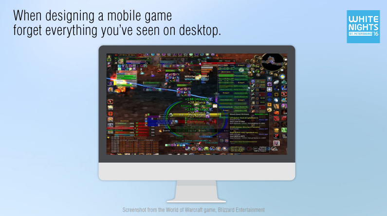
Among other things, small detailed pictures do not work here at all. You can’t just take a picture from a big browser game, squeeze it and put it in a mobile device.
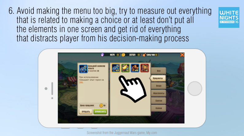
I am often told: “to solve a problem 100%, I need all this information, all these actions, so they need to be crammed into one window.”
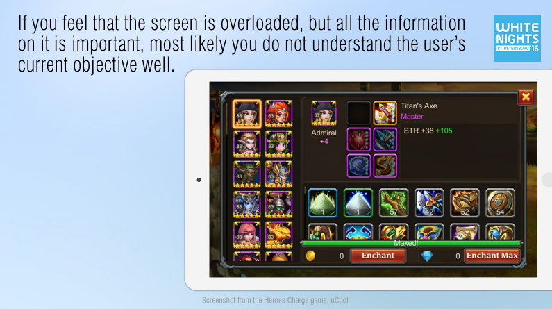
And here it is not! If this happens, then most likely you misunderstand the key task of the user, and then incorrectly break it down into subtasks. And he, working with your interface, will have to do it every time on his own in his mind – and, believe me, he will. This is how his brain works, it has been repeatedly tested and proven.
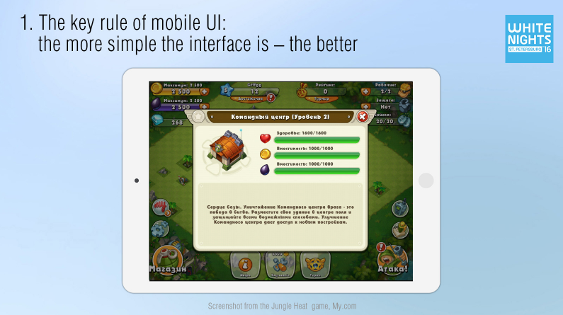
On the slide just below is a screenshot from the game Heroes Charge. It is implied that here the player chooses which hero he will swing, which particular of his things, and which resources.
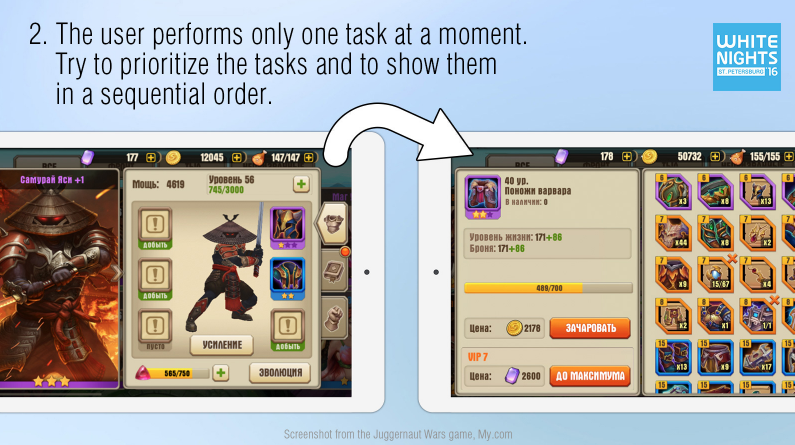
And even below is a slide with a functionally similar window from the game Juggernaut Wars. The player has already chosen a hero, examined his things in the window that opened and decided what he would do next. Only after that, his attention focuses on one single task – pumping things. And as part of this task, he is offered the most convenient tool.
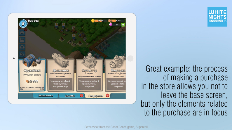
Another great example is Boom Beach. Although the user continues to see his base when making a purchase in the store, at this moment his attention is focused only on what is related to this purchase, and everything else is put into the background.
When your game has a certain information architecture, and you have broken down the key functions into specific steps, pay maximum attention to each window individually. Here it is important not just to submit information, but also to work on its perception. Break the content into logical blocks united by a single task.
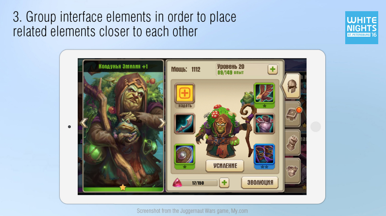
For example, in Juggernaut Wars it is clearly shown that the level can be raised using the “+” button. It is also clear that collecting things is directly related to “strengthening”, and the progress bar at the very bottom obviously somehow affects evolution. When all this has already been done, it seems as if everything is logical and obvious. But there are many examples when interconnected interface elements are scattered all over the window in a complete mess or arranged in such a way that it is inconvenient to interact with them.
If you do all this work when designing, the user will not have to think about the laws of your game world. There will be no obstacles in his gameplay that make him tense up.
The quality of the final product is woven from these “little things”, at the output you get a loyal user, or not. And even the user himself will not be able to tell you why.
Looking ahead, I want to dispel the myth about the text. I often hear from developers: “I took the risk to make a complex window, but there are rules here and they will explain everything.” The user doesn’t want to read the rules, he doesn’t really want to read at all, he came to you to have fun. Therefore, do not try to solve all your problems with text explanations.
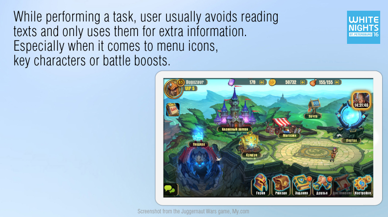
Contextual hints are good, but the player uses them only as additional information. At least, this applies to those games where the plot is not part of the root gameplay. So, while working on the interface, do not forget about the images that will allow the player to quickly identify your objects and remember them.
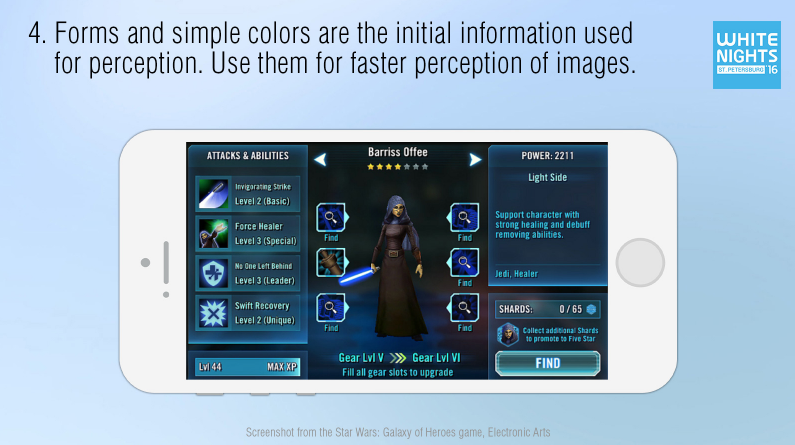
In general, the primary information involved in perception are shapes and simple colors – red, blue, yellow and green. Therefore, if you want the menu items to be easily located, processed and remembered, make them different. A good menu is when it has, for example, a brown backpack, a green book, a yellow gear – obviously different and easily recognizable objects.
In the game Star Wars: Galaxy of Heroes, almost all interface elements are the same color. Everything is blue there – from substrates and fonts to icons of things, skills and key buttons. This somewhat complicates the information processing process.
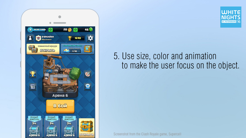
The size, color and animation of objects are important not only for quick search and perception of information, but also help to prioritize inside your window. Obviously, a large bright or flickering button is something important, forcing you to focus and calling for action. But don’t overdo it: leading the player to a button that is currently irrelevant or unavailable at all is a big mistake. Let the window elements light up sequentially, leading the player by the hand along the flow of your game. It really helps to facilitate routine activities.
A common mistake of mobile developers is the maximum use of the device screen. On the one hand, this is good. But on the other hand, when we are talking about a lot of small objects that are thrown in even rows and fill the entire screen, the picture turns into a pock-marked grid, and the eyes begin to scatter across the screen in search of the desired object.
By the way, pay attention to the screenshot below.
The most frequently used elements in it are located on the right. This should not be forgotten, because in the opposite case, right-handed users (and most of them) are forced to reach out to the left side of the screen, then remove their hand to see what has changed on the right, then reach out again, and so on. Oddly enough, even some popular developers forget about it.
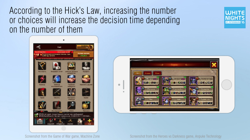
So, back to the big lists. According to Hick’s law (William Edward Hick (1912 – 1975) – English psychotherapist, worked at the University of Cambridge on the problems of experimental psychology), the more items in the list, the more time a person will spend to make a choice. The more buttons the menu has, the more difficult it is for the player to navigate it. The more information there is in one window, the longer the task of processing it will take.
In the screenshot on the right, the list seems to be small globally, but there is another small sublist in each block. Trying to analyze all this information, the player will spend a lot of time, although this could definitely be avoided.
The next thing I want to tell you about: This is Fitts’ law (Paul Maurice Fitts (1912 – 1965), an American psychologist, worked at the University of Rochester, including on experimental psychology).
Fitts’ law states that the time required to position on an element is a function of the distance to that element and its size. This means that the closer and larger the target object, the faster the user will process it.
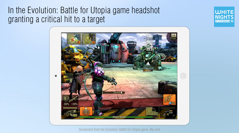
For example, in the game “Evolution” this law has a very specific game meaning. There is a special sight mode here, where for hitting the enemy’s small head, the player deals critical damage, piercing armor, and is rewarded with a fountain of enemy blood (i.e., the player is rewarded for aiming and hitting a less noticeable point).
The interface should always give feedback to the user. If the user has contacted him, it means that he is waiting for a response. By pressing the button, the player must very clearly understand what happened as a result. If the event did not happen, then he should know for what reason, and how he should behave further. If the button is locked and you don’t write exactly why, you make the user guess about it. Or simply force you to click on this button in the hope of getting a hint. The worst thing is when, even in this case, he does not receive a hint. It turns out that it is simply impossible to perform an action, period.
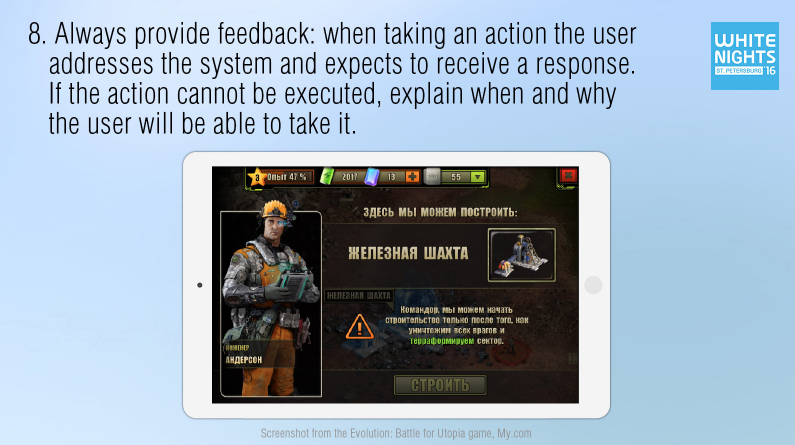
I often come across games that allow absolutely empty windows. Areas where there could potentially be letters, items, or anything else, but which are currently empty. In this case, it is also better to explain what is happening, write something like “There are no new letters today.”
The last thing I want to talk about: contextual hints. This is something that is especially appreciated by a lazy user who is gradually getting used to comfort.
The idea of comparing things in an RPG is as old as the world. Everyone understands to what extent this function can be important for an active user. And watching your players, you can find hundreds of places where you could facilitate the gameplay with simple hints or reminders.
Here, for example, is the game Juggernaut Wars.
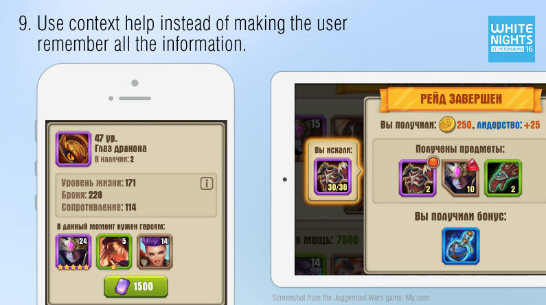
On the left is a familiar situation, a list of item characteristics. I have come across dozens of versions of such a list, almost everywhere it is difficult to remember words like “Enlightenment”. What kind of enlightenment, what it affects – you are unlikely to remember. Especially when there are two dozen more such characteristics, and you are a new player. Some still manage to shorten it to abbreviations so that everything fits.
In this case, we have written one brief but understandable cheat sheet about what game stats are. With the help of the “i” icon, we allow you to use this cheat sheet right on the spot, wherever the characteristics are mentioned.
Another vivid example of a reminder is a red indicator that tells you that you need this particular thing right now. If you tap on this thing, they will also tell you who exactly needs it.
On the right you can see a widget that is designed to remind you why you came into battle and how many resources you need to collect.
This widget, by the way, was born thanks to the following story. Once I happened to watch our colleagues playing in the dining room. They periodically moved their lips and counted something out loud. It turned out that they count resources that sometimes fall, sometimes not – and it was absolutely impossible to keep their current number in mind.
By the way, the players highly appreciated the introduction of this simple solution.
That’s it. But I want to point out that all this, of course, is the tip of the iceberg. There are a lot of approaches, and there are more and more opportunities to study user behavior every day. And the more attention you pay to the degree of convenience of the product at all stages of its development, the better it will be at the output.
I will be glad to respond to the comments under the publication.