The growth of competencies in the team is a sore subject. It is considered that it is expensive. And it’s not always obvious how to approach it. Anton Danko, the lead artist of the Belka Games Solitaire Cruise project, shares his successful experience in this matter.
Anton DankoWhy did we even think about improving competencies?
As a rule, UI specialists are well versed in user flow and in the formation of UX features, but not in the artistic component of interfaces. As for artists, usually their weak side is just UX and UI.
This is normal — each specialty has its own specifics and its own background.
However, at a certain stage, we realized that building mutual competencies between artists and interface specialists could be an excellent growth point for the company.
This will not only simplify their communication with each other. If artists understand UI/UX better, and interface designers understand styles and colors, then work and, in general, processes will accelerate, and the quality of work performed will become better.
Based on this hypothesis, we introduced regular art-mitts inside the Solitaire Cruise project. For four months we have held lectures on color, materials, perspective and many other topics. As a result, in a relatively short time, the guys began to draw better and more pleasing to the eye art and interfaces.
In this article I will tell you how the training was organized and what results we achieved.
The material will be especially interesting:
- leaders who are thinking about how to help the team grow without interrupting the workflow:
- interface designers who want to get into game dev;
- game designers who want to better understand how to work with artists and UI specialists.
How did we start looking for growth points?
Any optional activity should start with a study of the value for the employee himself. It is important to help develop, not impose training. Simply put, it is important to go from what requests the employees themselves have, what topics they would like to tighten up.
That’s where we started.
Once every few months, I started conducting surveys in art and UI teams.
The survey, as a rule, boiled down to a simple question: “In what area within your area of responsibility would you like to improve your knowledge?“.
I checked the answers I received with what could be improved in our project (what growth points on the graph it had).
Ideally, when the desires of the team coincided with the points of growth of the project. If not, no problem. Within the framework of one or another lecture, we still highlighted the desired topic, analyzed a couple of cases.
What did we teach at art meetings?
When we started the art mit practice, we formed the following pool of topics:
- environment concept;
- perspective;
- rendering of materials;
- light and shadows;
- quick conceptualization;
- working with the emotions of the characters.
But we did not limit ourselves to them. As a result, we also conducted mitas on such topics as:
- colour;
- stylistics in games;
- delicious UI;
- UX basics;
- tricks of working in Photoshop.
What was the order of lectures?
At first, all attention was focused on UI artists. In other words, we started with the artistic basics — lectures on the properties of materials, light and shadow, and composition.
The reason was that knowledge of the database would immediately allow UI artists to prepare better concepts and visual for features and promotions.
Later we delved into more specific topics for artists: conceptualization, tools, character creation.
Who prepared the lectures?
Lectures are good, but the question immediately arose: who will prepare them? As a rule, there are three ways:
- prepare reports yourself;
- involve third-party specialists;
- delegate the preparation of lectures to the team.
I settled on the latter option. Thus , he killed several birds with one stone:
- the team was getting the necessary lesson;
- the very process of preparation allowed to increase the expertise of the speaker;
- the specialist who prepared the lecture gained experience in public speaking (a great way to realize his teaching potential).
Another question is how to motivate artists to prepare lectures?
We had no problems with this, because everyone chose the topic that he liked best. Some chose the topic that was close and familiar to them, others, on the contrary, challenged themselves and took the one in which they did not feel confident.
Those who were not eager to speak turned out to be just listeners. However, there were few such guys in our team, everyone wanted to share their knowledge.
What should the lectures be like?
Often useful material is served dry and boring. It’s bad.
Also, an unsuccessful lecture can be called the one after which it is unclear how to implement the tips from it in practice.
I asked the speakers to take these two points into account when preparing their reports.
The following three requirements were also formed:
- The lecture should not last more than an hour. After all, we spend them within the working day, and we need to leave time and effort for project tasks. I also didn’t want to overload the guys with information.
- The lecture should be easy to understand, the presentation of the material should be accessible.
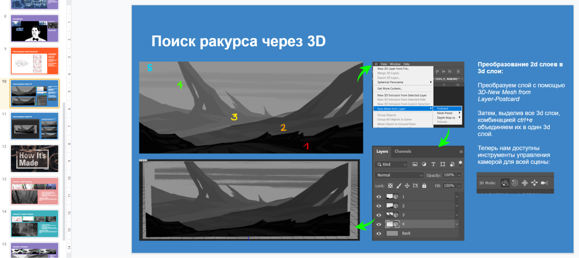
- The lecture material should be structured and further used as a guide with a checklist.
As a result, we came to the format of the report with a presentation and a small Q&A session at the end.
From observations:
- as a rule, they always fit in an hour;
- allow me to use the presentation as a synopsis;
- in the future, when giving feedback, leads simply began to leave a link to the desired material.
It is also worth noting that the quality of presentations can be significantly improved using the feedback form. We put it into use, and it helped to make the lectures more effective and useful.
Some lectures were accompanied by optional homework. Often we did not resort to this method, because not everyone had the opportunity to study outside of working hours.
How often to spend?
The frequency of such lectures depends on the number of questions in the team.
We started with weekly meetings, and after two or three months we reduced the number of meetings to twice a month.
Now we have put the lectures on pause, because we have achieved the necessary goals in terms of quality and knowledge.
What results have you achieved?
In a relatively short period of time, we managed to raise the level of graphics quality both in the UI team and in the art team.
Result:
- materials can be distinguished not only by the texture pattern, but also by the nature of the shape, light reflection, tone;
- objects located nearby affect each other (light, shadow, reflex);
- the emotions of the characters have become more lively and honest;
- art does not “argue” with interfaces in importance.
In addition, the guys have acquired important skills for us. Now they:
- they use perspective grids depending on the task at hand. Not just single-point;
- they quickly conceptualize and get more control points in the process, which made the result more predictable.
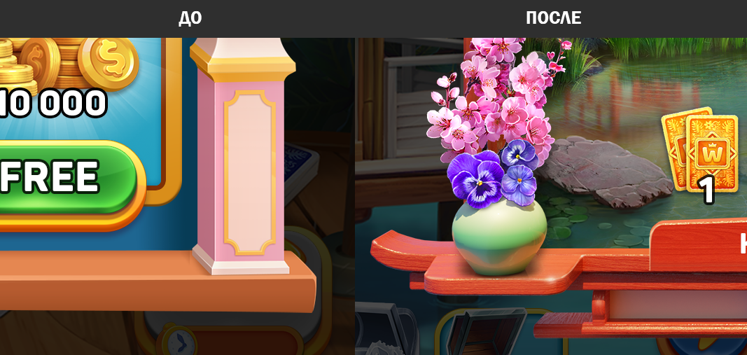
Here are a couple of examples of how the graphics in the game changed after the lectures:
Before and after
The physics of objects appeared in the renderings on the right: materiality, volume, reflexes, etc. The color has become more complex.
There was a tonal contrast, planning in the composition is better perceived. In general, it should be noted that the graphics have become more mature, more conscious.
Also important: in-team training gives not the most obvious bonuses. For example, the guys in the team get to know each other better, they are not afraid to consult or give their own assessment of the visual features.

