Petroglyph Games and Lemon Sky studios are preparing a remaster of the classic RTS Command & Conquer: Siberian Dawn. Yesterday they showed an updated user interface of the game. And they told us how and for what its elements were redone.
Jim Vessella, the producer of the project, told about the work on the C&C Remastered user interface on Reddit.

Jim Wessella”We have completed the pre-production phase and officially started production.
Overall, this transition is an important milestone for any project.In this post we want to share our approach to the game interface and provide a brief overview of the current iteration.
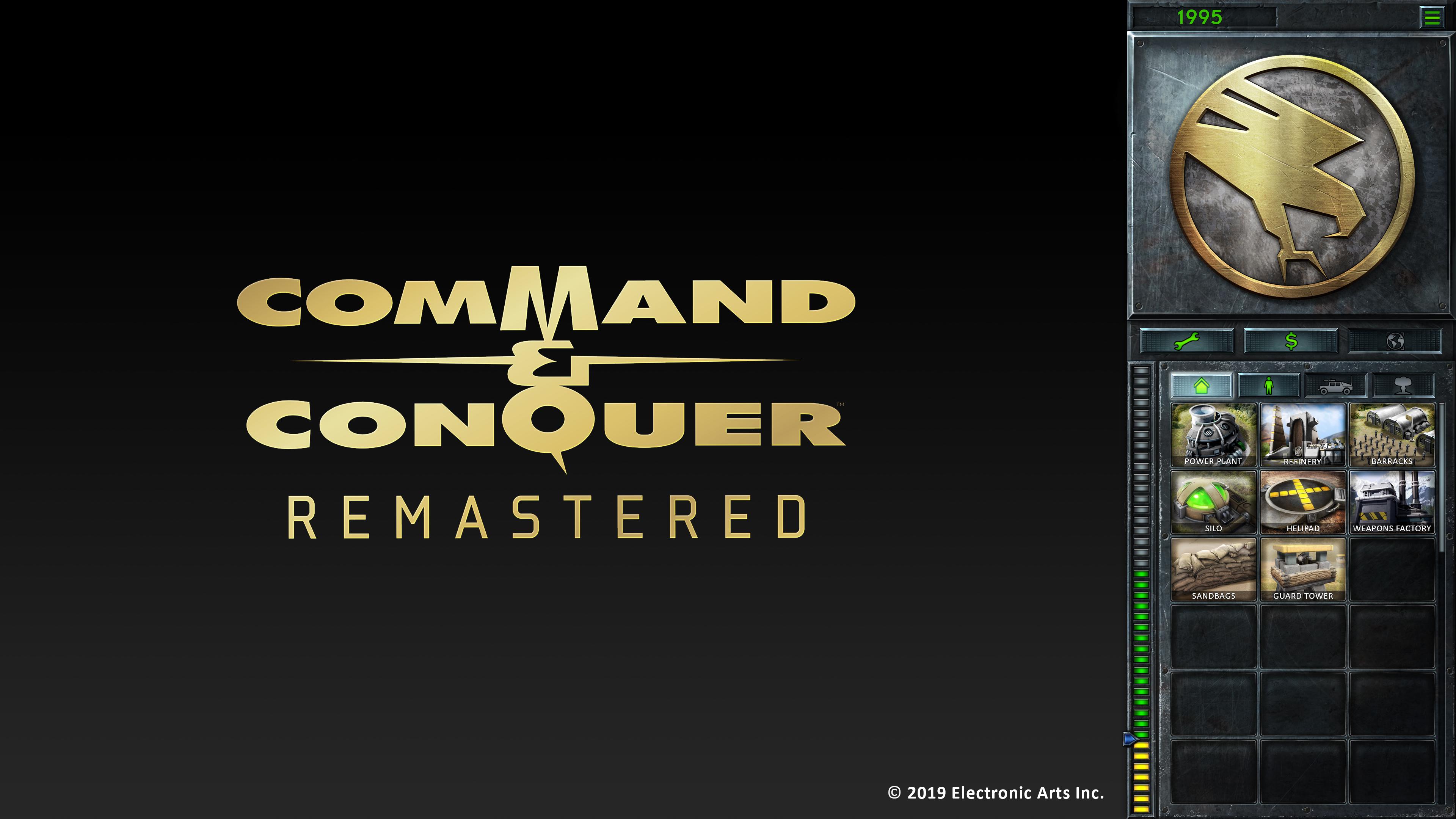
When we announced the game in November, the user interface was one of the most discussed topics in the community. We watched your video messages, read your comments and brainstormed with the Community Council. Most often we have heard that you still want the classic side interface “like in C&C”, but at the same time updated and more convenient.The interface in the remaster of Command & Conquer: Tiberian Dawn
With this in mind, most of all we were asked to scroll through the sidebar as little as possible.
And to achieve this, it was proposed to introduce a tab system from Red Alert 2 and Tiberium Wars into the classic interface. We decided to accept this offer, so you can see the tabs in the screenshot. However, keeping in mind the order of construction in the original games, we decided to place all the buildings in different tabs: “for infantry”, “for vehicles” (ground, air, sea), “for support forces”. And to further reduce the need for scrolling, we have developed a sidebar with 18 button slots.About cosmetic design: We wanted the user interface to reflect the overall direction of the project and for all elements to look authentic.
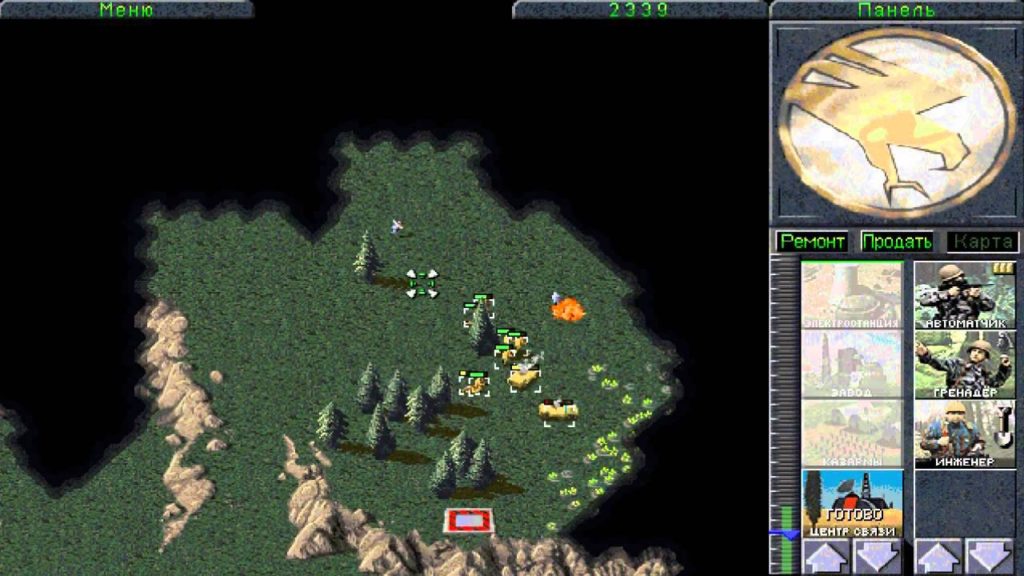
We have done everything possible to preserve the Tiberian Dawn visual. Of course, we would use exactly the same approach when updating Red Alert. We are recreating the construction buttons in the same style as they were in the Gold Edition, and we want to combine their most authentic design with modern 4K technologies.Interface in Classic C&C

Other updates include replacing the “Repair”, “Sell” and “Map” buttons with icons to facilitate localization.
In addition, we have placed the “Money” and “Options” menu sections above the minimap so that they do not interfere with watching what is happening on the main screen.All these changes are made in order to preserve the spirit of the old interface, but at the same time to adjust the gameplay to modern requirements for RTS games.”
Recall that in November, Electronic Arts announced a remaster of not only Tiberium Wars, but also Red Alert with all additions.
Several developers of the original 1995 C&C are involved in the project, among others. These people participated in the creation of Petroglyph Games after the closure of the forge of C&C studio Westwood.
The release date of the updated titles is unknown.

