Simon Newstead, CEO and game designer of the Hong Kong company Frenzoo, told how the team is testing game art and icons. We have translated the text and are sharing it.
When we work on the design of free-play games, we first give ourselves creative freedom, and then filter the results using feedback.
What does it mean?
Lots of experiments and A/B tests. And not only for features, UI and game economy – but also for art. Here are some of the techniques we use.
Icon
If you need to increase downloads, then the icon is the first thing that comes to mind.
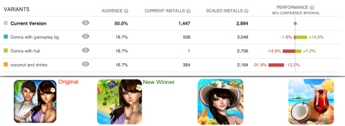
We use the “Optimization of the application page using experiments” (Store Listing Experiments), which is specifically built into the Google Play developer console for this purpose. Here, for example, is one of our 3d simulators.
Here we tested three different compositions inside the icon, trying to find an option that would be better than the previous one. One, two avatars or none at all? Elements related to the theme of the game, a screenshot of the gameplay or just a picture with a character?
After spending a couple of days on tests, we found out that the best of all is a single avatar and a background from the game. In terms of indicators, these two icons were ahead of the previous version (it is convenient that you can set the expected result directly in the charts).
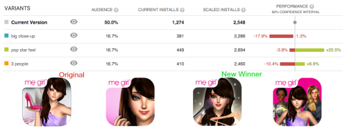
In one of our early fashion games, we found out that a glamorous icon increases the performance of the game by 10% – more than we could have imagined.
We also use the application page optimization function to test not only icons, but also screenshots, descriptions, and so on. A useful thing!
Testing art
We test game art at two stages of development:
- at the concept stage, to understand what the target audience likes;
- at the stage of finished art, to adjust the balance and distribution of content in the game.
Testing concepts
At the very beginning of the development cycle, our artists show art concepts, and we collect feedback on style/ content.
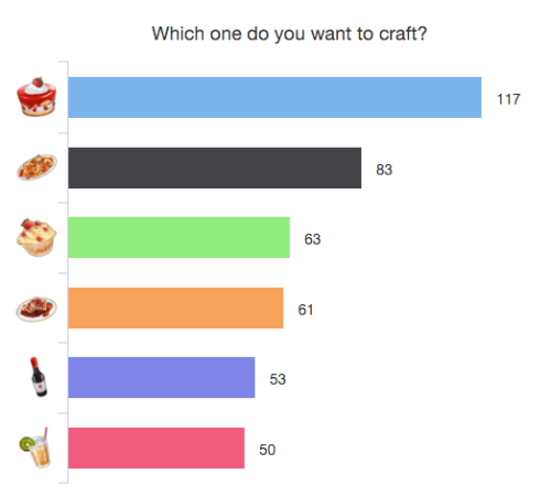
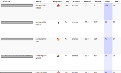
For example, there is a prototype farm where we want to add crafting. We are conducting tests to understand exactly what players will want to craft.
In this case, the players preferred cupcakes to other food and drinks.
You can sort the results by different categories – paying/non-paying users, game level, and so on.
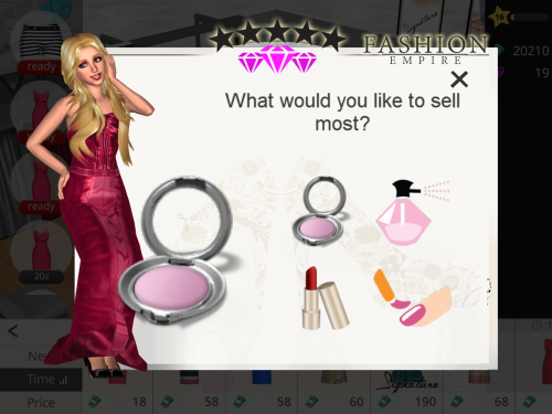
In another case, we found out that the players want to sell in a boutique simulator.
To do this, we used the polljoy plugin for Unity.
When working with pop-up notifications, it is important not to start associating with spam. So we do this:
- we ask for the consent of the study participants;
- we do not interview players who are still at the first levels of the game;
- we limit ourselves to the minimum of answers that is necessary for statistical reliability;
- setting up the system so that survey participants receive a virtual currency as a reward;
- we upload specially created graphics so that the survey does not look alien.
In case we want to poll an audience outside of our app, we use:
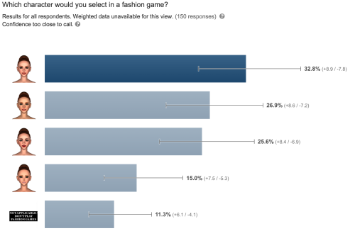
- Google Consumer Surveys (the tool is not free, but it helps at the stage of CA research);
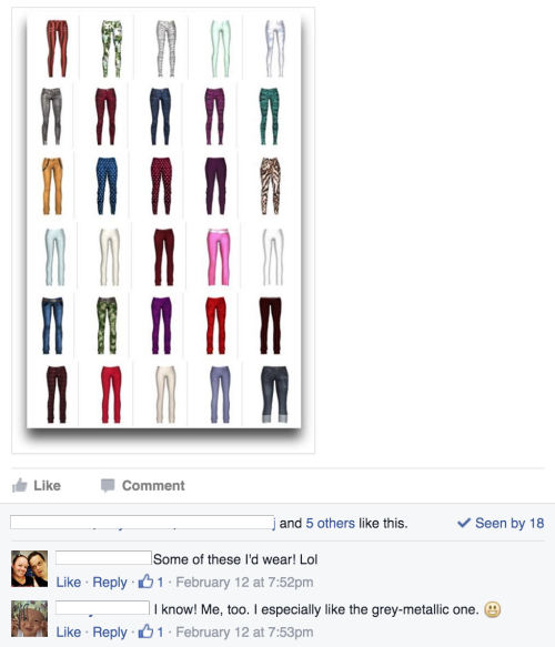
- Facebook groups (suitable for fans of the game).
Testing the finished art
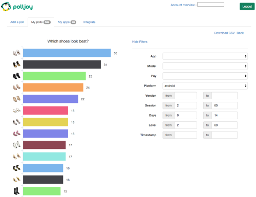
After the art is ready, we conduct a survey. For example, we ask you to choose one of several shoe options in the fashion game.
What for? Mainly to adjust the balance and distribution of content in the game.
For example, if the first impression of the game is excellent, then the retention rates for the next day are higher. Therefore, from the very beginning we show those items that have the highest rating.
A/B testing of builds
After everything is ready, we test the new build using the Staged rollouts feature in Google Play. We determine how much traffic the new version of the game will receive.
If a major update is planned (for example, before Christmas), then we usually use 20% of the traffic, and monitor the results for a week or more. This allows you to determine retention and monetization indicators at an early stage before presenting an update to 100% of the audience.
Source: Gamasutra

