It takes 10 minutes and a graphic editor to determine whether the user interface solves the tasks assigned to it,” product designer Theresa Chien is sure.
After several months of development, it’s not so easy to figure out how clear the UI is. The eye is “blurred”. Chen suggests solving this problem in three steps.
Step 1
You need to take a screenshot of the application page that you need to check. Then determine which 3 elements on this page are the most important. And write them down in descending order of importance. If there are difficulties with this point, Chen advises asking yourself – what does the user want to see on the page? What do you want him to see? The answers to these two questions may be completely different.
Step 2
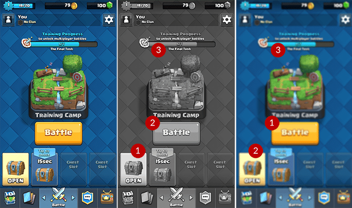
Make 2 copies of the selected screenshot. Turn one of them into black and white mode. Make the second one fuzzy using special filters (for example, the “Blur” filter in Photoshop). It is necessary to “blur” the image until the inscriptions become unreadable.
Step 3
On each of the two screenshots, mark three elements that attract attention the most. The Zoom Out (“Zoom Out”) function can help here. Number one is the most active element, number 3 is the most inconspicuous.
Now compare what happened with your list. If everything matches, then the UI copes with its tasks. If not, perhaps the interface should be improved.
These screenshots from Clash Royale show that the key menu items are the Battle, Open and Progress bar buttons.Source: Gamasutra
You will be able to learn about the latest trends in the gaming industry first-hand, personally meet and discuss working issues with leading companies in the game development and publishing market at White Nights St. Petersburg 2016, which will be held on June 28-29.


