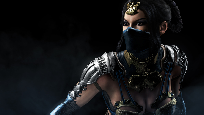
Does it make sense to sacrifice the visual quality of one aspect in favor of another in the graphic design of the game? The developers of the mobile Mortal Combat X answered this question positively, but what do you think?
Mortal Combat X
Warner Bros. two years ago, I came up with a fail-safe monetization scheme. For each release of a large console product aimed at an adult audience, the company publishes a mobile fighting game of the same name from Netherrealm. It all started with Injustice, which went no worse than its console counterpart and stayed in the box office top for a long time. Then there was Batman: Arkham Origins, and now Mortal Combat X.
In terms of gameplay, the game is no different from its predecessors: as before, within the framework of a 3-on-3 battle, the user competes with opponents by tapping on the screen as quickly as possible. The main change that affected the game compared to previous Netherrealm mobile fighting games is the positioning of the “body kit”. At first glance, it seems to be borrowed from Asian battlers: here you have cards and the opportunity to buy boosts that contain unknown fighters.

In fact, you can buy fighters in the game the old-fashioned way by selecting them from the list of those who had enough soft currency. And the fact that they are now called cards, and not otherwise (warriors, superheroes) – does not matter.
But there are support cards that increase the total parameters of the squad, that is, the deck, of course. By the way, “azitchin” was introduced into them: in the event that you have two or more identical support cards, they can be merged, having received a doubling of the card’s indicators. Such is the analog of evolution from battlers.
Graphically, the game looks uneven. The characters are stunningly detailed, but all these details, apparently, became possible only thanks to saving resources on backgrounds that turned out to be at the level of the already mentioned and far older Injustice (and shadows, where are the shadows?).
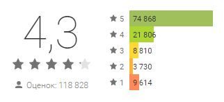
However, the players are still happy, judging by the reviews.

Monster Squad

 The new game from Nexon can be safely called Heroes Charge for fans of kawaii animals. The basic gameplay is built here according to similar principles as in the uCool game, with the difference that it seems more meaningful here. Plus, in terms of additional non-game mechanics, which I call a “body kit”, the game is very close to projects like Puzzle & Dragons: drawing up a deck of animals, their pumping and evolution, as well as a large number of daily events, sending invitations inside the game, and so on.

The project is very pleasant, but it is designed exclusively for those who calmly perceive all the moments described above.
The project has, on average, very high ratings on Google Play. The low score is mainly set by those whose game crashes or does not work.


