At the recent DevNight Dnepr, the producer of the Dnepropetrovsk studio Murka Alexander Shtachenko clearly told how to set technical tasks when developing game projects. For App2Top.ru Alexander prepared a short text version of the speech.
Photo: VIKTOR HANACEKI organized my work in such a way as to reduce the likelihood of major alterations, the waste of development time and the company’s money on correcting ready-made tasks due to careful preparation of the task and the process of transferring it to the final performer.
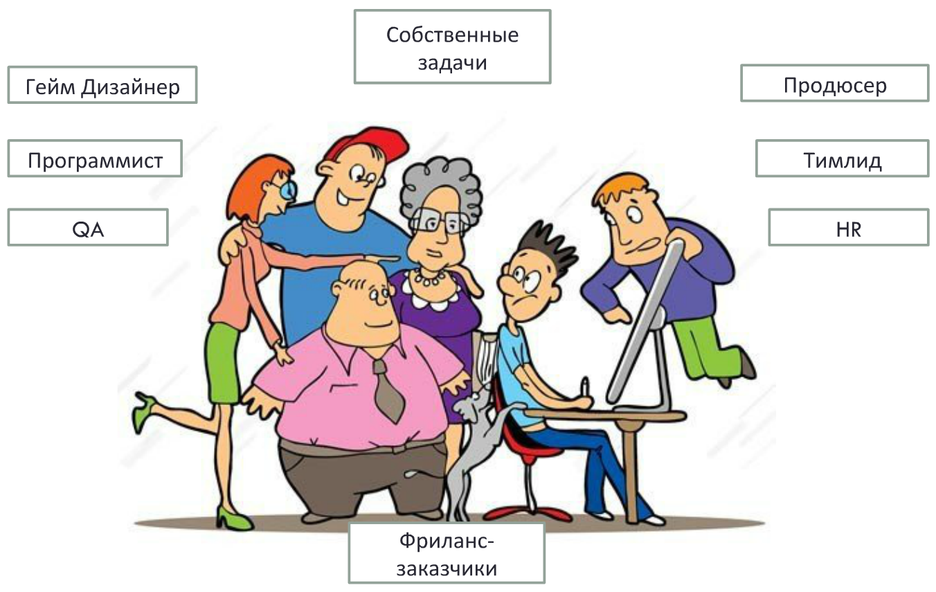
Итак, давайте для начала разберемся с перечнем постановщиков задач для дизайнера:
- The producer and the game designer set a basic pool of tasks during the application development process.
- The specialists of the technical team – the programmer and QA – set tasks to correct certain elements.
- The team leader can set the task by making a remark and pointing out the problem areas in the work.
- HR can also contact the company on current issues.
- Freelancing places orders for those who earn extra money in addition to working for the company.
- The designer himself sets his own tasks (which are born in the designer’s head and on which he works to improve his professional level or within the framework of his own project).
Which of them is the best director?
- The first place is reserved for their own tasks, since in the designer’s understanding they are harmonious and have no contradictions. If questions arise in the process of working on your own task, then they resolve themselves in the designer’s mind.
- The second place is shared by the game designer and the techlid. Both are constantly connected with tasks and already have some experience in staging.
- The third place belongs to HR, since such tasks have low acceptance criteria.
In order for all the directors to have a basic understanding of the norms of setting the task, I recommend a minimum set of requirements for TK (for example, a UI/UX task).
Minimum requirements for technical specifications for UI/UX
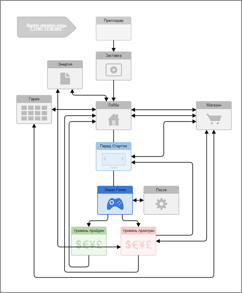
- Screen Map
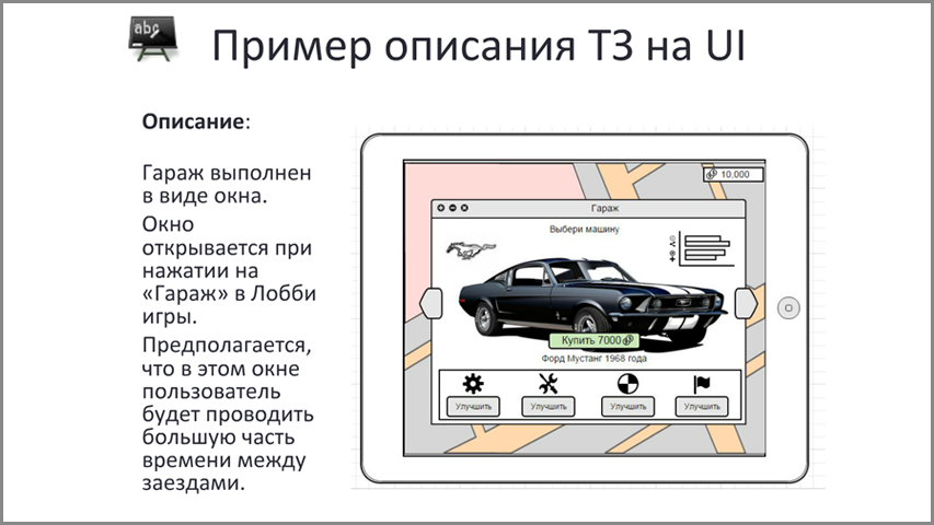
- Detailed description of each screen in the following format:
- Screen assignment
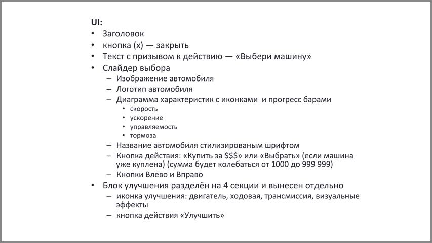
- List of interface elements and their purpose
- Recommendations for UI mechanics
- Composition suggestions
You can also include it in the description:
- Implementation examples
- Mockups
- Possible texts indicating the number of characters or the length of the text field
- Links to applications where such a task has been successfully implemented
Working with the terms of reference, tasks will be accepted more often without significant adjustments and improvements. Conflicts with managers will occur much less frequently and it will become much easier to interact in the team. These changes will have a positive impact on productivity.
The screen map helps not only the designer, but also the manager to imagine how the interface will work, how the game screens will be connected to each other. With the help of the map, the designer can imagine the total amount of work, the dependencies of UI elements and express their wishes at the concept stage. The presentation (slides 6-8) provides examples of bad and good screen maps.
A good map
To make a good map, you should remember :
- you need to make screen maps schematically, without ready-made examples and, moreover, screenshots from the prototype;
- the screen map should not contain small, incomprehensible elements during fast reading;
- the schematic representation of the links should be easy to read;
- the display format of the “Icon +” screens Signature” is a good option for perception.
The description of the task given below is already an example of a description of one of the screens functioning within the map. Each element from the mockup corresponds to at least one line of text telling what the component should be and how it works. An example of a description of the mechanics is also given.
All people are different, everyone has their own life experience and views. Therefore, most often, everyone understands the tasks in their own way. To prevent the limits, it is recommended to get a picture of the result in advance. I pay special attention to feedback in the process of setting the task.
I recommend organizing the process like this:
- The task manager gathers all the performers who will be involved in its implementation.
- The director makes a presentation of the task and tells in detail what he is waiting for at the exit.
- After the presentation of the task, the director should ask the question: “How did you understand this task?”.
But since managers often neglect this point, I strongly recommend that performers do not take responsibility for this process. The designer is recommended to clarify: “Did I understand you correctly?”. And to say how he understood each component of the task.
The second question to ask the manager is: “by what criteria will you accept this task?”. Not every manager can answer this question. Nevertheless, having found the answer to such a question, it will become clear what is most important in the implementation of this component of the game.
The main conclusions that I would like to draw attention to are:
- Specify the task description standards initially.
- The TOR should be clear, detailed, with examples and a description of the mechanics.
- A map of screens is not superfluous.
- Feedback is required.
Useful links:
moqups.com – service for mockups
cacco.com – service for mockups and building structures
gliffy.com – interfaces, structures, diagrams
balsamiq.com – to create UI/UX prototypes
The questions asked by the conference participants were devoted to the organization of the work of the team and the designer in particular. You can read the answers to them here: http://progamedev.net


