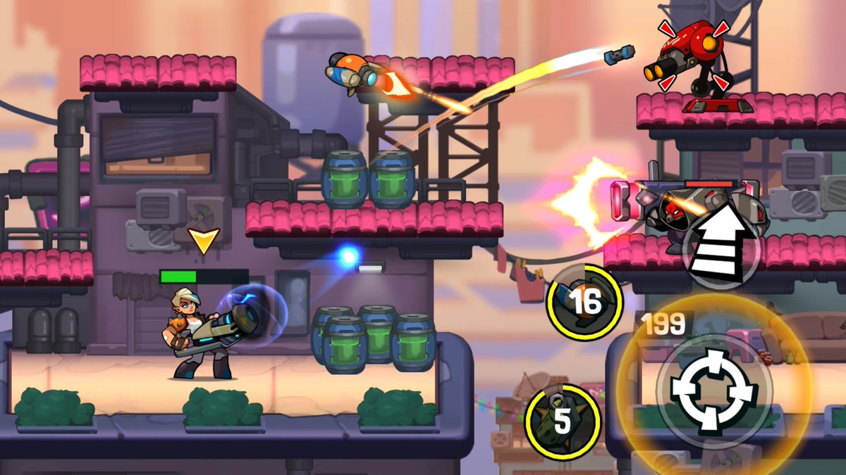
What mistakes are most often made when creating levels, — said the senior game designer Mail.ru Group Mikhail Goransky, responsible for the design of Bombastic Brothers.
Bombastic Brothers
Remark: The report was read at the HSE Graduate School of Business Informatics as part of a Lecture Evening on Game Development. On the pages App2Top.ru an edited transcript of it is given.

Mikhail Goransky, Senior Game Designer Mail.ru Group
We will discuss the errors in the aspects:
- level geometries;
- rejusa mechanic;
- level dynamics.
We will also touch separately on the topic of level congestion and focus on the difference between immersiveness and contextuality.
Level geometry
The concept
The geometry of a level is its physical space where the player interacts with the mechanics of the game. When we talk about geometry, we don’t take into account mobs, bonuses, and so on. It’s exclusively about the environment.
Level geometry
The task of geometry is to give the player the opportunity to use the available mechanics. If geometry does not encourage the use of mechanics, then it is most likely always unsuccessful.
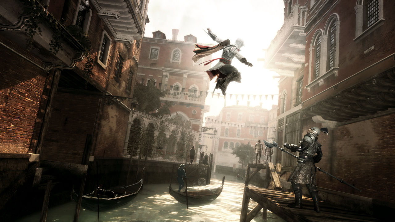
A good example of an unsuccessful use of geometry is Assassin’s Creed II. It has a lot of mechanics that are never used, or used only once. Basically, these are the mechanics of additional weapons. The game does not motivate you to resort to them all the time.
Assassin’s Creed 2 Deluxe Edition
Despite the fact that the geometry does not include mobs / potential opponents, when creating it, it is necessary to take into account their future location, as well as how the player will interact with them at the level (how he will kill them if there are available weapons).
Geometry should create situations by itself. If the geometry at the level is good, then simply moving along it should already be interesting.
Typical errors
Limiting the space used by players for the sake of wow effect
A classic example is building geometry in such a way that 90% of the space is impassable. This is usually resorted to to demonstrate a beautiful environment with which the player can not interact in any way.
You shouldn’t do that. This breaks the player’s flow.
The illusion of accessibility
A common mistake in platformers. In a prominent place, an object is placed that cannot be reached, although visually it seems that with proper skill it is possible to do this.
Blocking mechanic
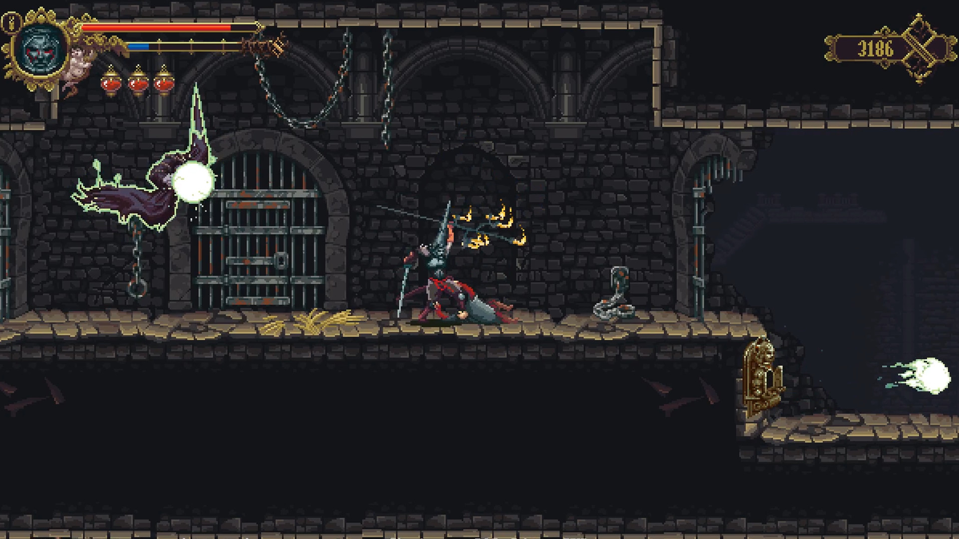
Geometry should not block the use of mechanics. This can “kill” the mechanics and even the game. For example, the environment (some bush or hanging lantern), which is a background element in the game and should not interact in any way with mechanics, suddenly turns out to be an obstacle (Blasphemous abuses this).
Blasphemous
Frequent repetition of geometry elements
He is a “copy-paste”. We are talking about regularly recurring geometry elements.
For example, you have made a path, and on it there is a rock over which you need to jump with the help of a platform. Then — again a path, a rock and a platform. Then all over again and so on ad infinitum.
Such an approach in level design will quickly discourage users from playing.
Uncontrolled level balance due to randomness of geometry
You cannot allow a procedural generator to create a level “from scratch”. In projects with such generation, whole segments of levels are usually pre-prepared and tested. Only then they get at the disposal of the “robot”, which exposes them, starting from the specified algorithms.
Thanks to such work, it is possible to analyze which of the segments works well, and which is better to change or remove from the project altogether.
Non-obviousness of paths
If a player gets lost on a level, this also indicates problems in geometry. It is usually solved either by lighting at the level or highlighting the path with one color or another.
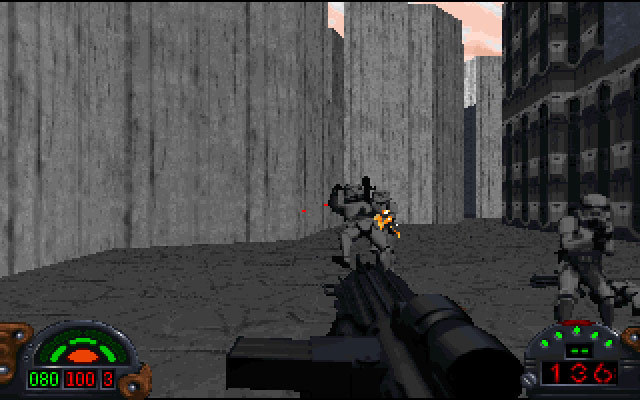
This error was very common in old games. For example, in Dark Forces there was a level in which the door could be found only by walking along one of the walls, constantly pressing the space bar button that opens the passage.
Dark Forces
Recommendations
Set a set of geometry rules and follow it
If there is a rule in your game that you can cling to platforms of a certain type, but you can’t cling to others (for example, because they collapse), then the player learns this rule. For him, it becomes a behavioral pattern.
If you change this rule inside the level, the player will feel cheated, offended and, perhaps, drop the game, because you destroy his flow.
Flow here is the style of play that you set for the player yourself: how you want the player to play your game. If you do something that gets knocked out of the flow, then the player loses pace on this segment, the levels become bad for him.
Create a set of templates
It is important that the designer always has templates of dimensions and distances at hand. Relying on them is much easier to introduce changes. At the same time, they pre-solve a number of future problems.
With it, you will always know what the maximum distance can be set between objects to jump or whether the mob can effectively fire at the player from the spawn point.
Watch out for the possibility of using mechanics
To be sure that mechanics play an important role, both the designer and the testers should make sure that mechanics can be used everywhere.
Reuse mechanic level
The concept
The reuse is usually understood as the reuse of the same game content to reduce costs.
In this case, we mean the level mechanic’s reuse (they are also game situations). The mechanics of a level can be based on the use of one given game mechanics, or on several.
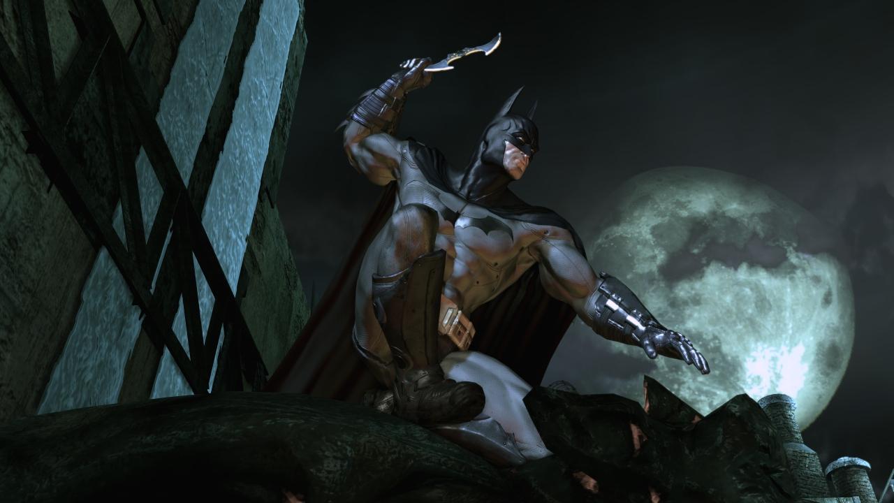
In Batman: Arkham Asylum, one of the mechanics of the level can be called gargoyles, on which the main character climbs with the help of a cat hook in order to remain invisible to mobs.
Batman: Arkham Asylum
Typical errors
Frequent repetition of level mechanics
As with the frequent repetition of geometry, the repetition of the same game situation can lead to the player getting bored with the game.
Minor changes to interesting mechanics under the guise of creating new mechanics
The solution to the frequent repetition of level mechanics is not to change the content.
Recommendations
Add new mechanics/conditions to the redesigned
For example, you are working on a platformer in the spirit of Super Mario Bros. You have added a floating panel in the air. If you have already used it, then next time it makes sense to add a floating panel, which, for example, falls under the weight of the character.
This is a reboot, but the illusion of a completely different mechanics is created.
Changing the geometry
Using the same mechanics, but in a completely different geometry.
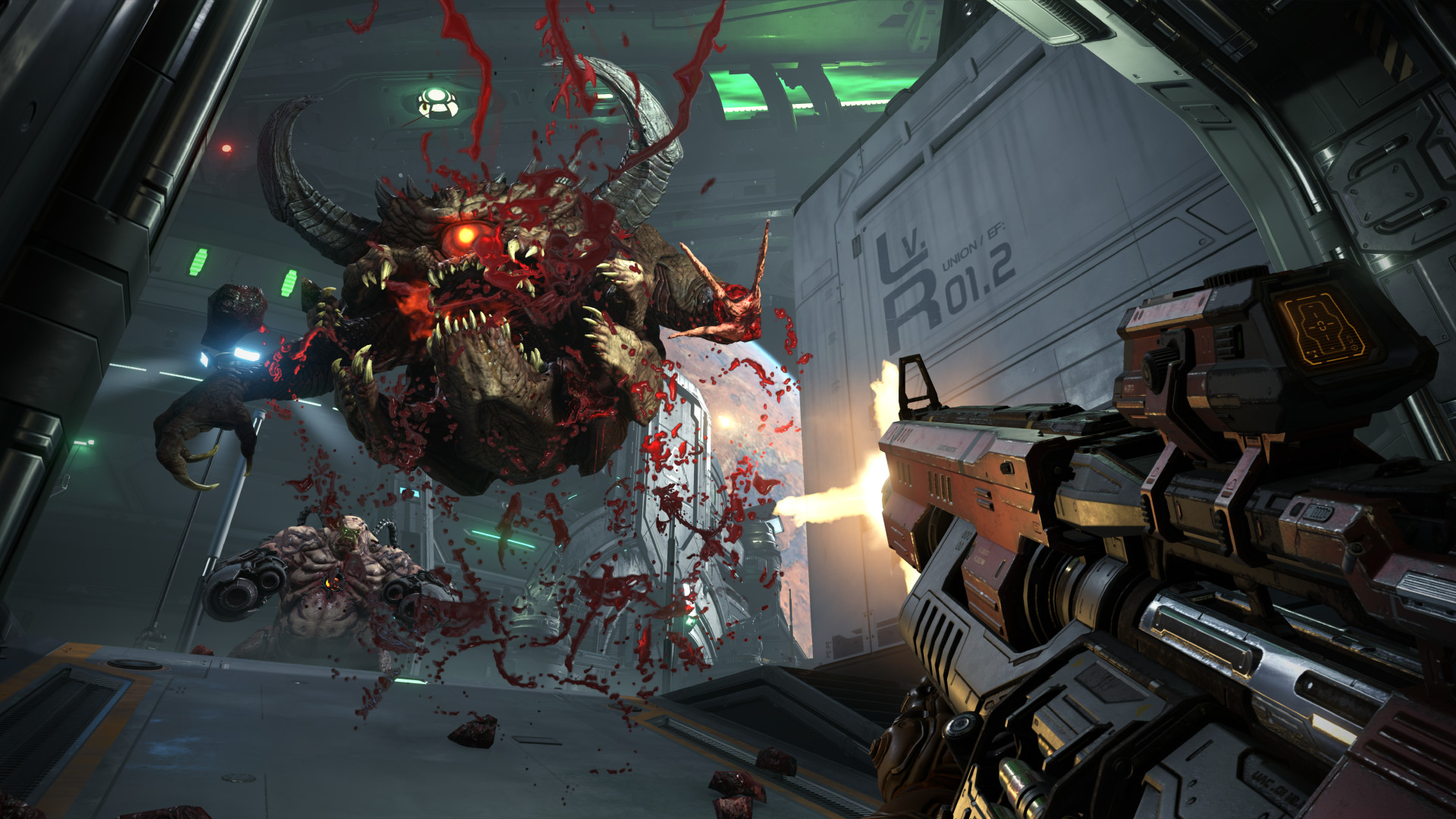
For example, the first time you are attacked in DOOM by two different demons from different sides. This is the mechanics of interacting with two mobs.
DOOM Eternal
Next time it is better to make them attack you not in a closed arena, but on an open horizontal level.
This will completely change the player’s feelings.
Delayed release
Reuse as a reference to the previous use. You used complex mechanics, it worked out for you. The player remembered her.
Next time you use it through many, many levels. At the same time, it is better to remind the player that he has already passed this, but in slightly different conditions.
This is normally treated, but it is better not to resort to such a practice often.
Level congestion
The concept
Level congestion refers to too many game elements, units, features, which all together lead to a loss of focus for the player.
When disappearing, collapsing, platforms falling on spikes, spinning things, spikes on walls, lasers, missiles, enemies from different sides appear on the screen at the same time — this is an overloaded level.
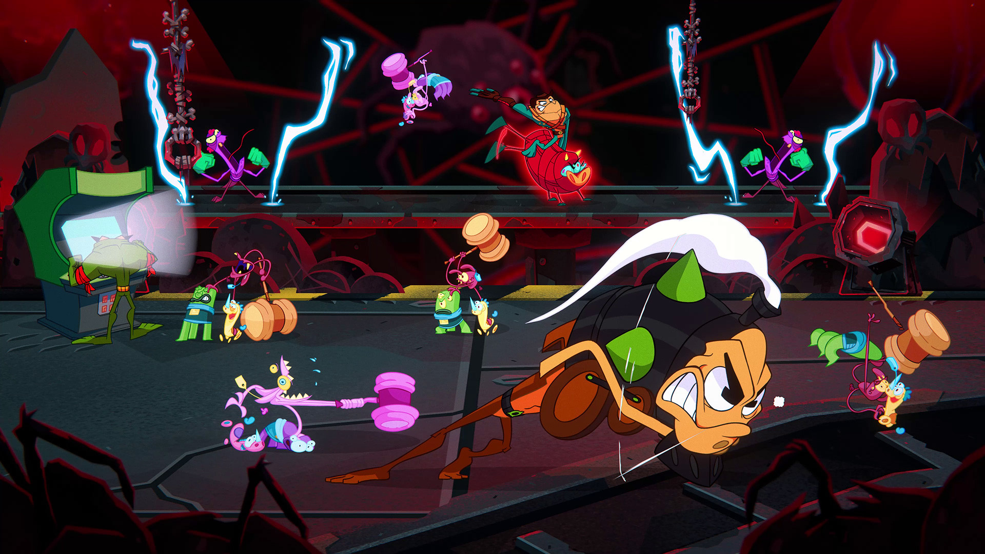
By the way, this is what the newly released Battletoads are often blamed for
At the same time, it can be quite easy to pass. But if there are too many game events, the player will not be able to keep track of everything at once. It is dangerous to use more than 2-3 mechanics on the screen at the same time: the player simply will not notice and will not understand how they are used.
Important: level congestion cannot be used positively.
Dynamics
The concept
Dynamics refers to the player’s flow as he passes the level. The dynamics of the game is not the pace, it is the game experience itself, embedded in the game cycle (korloop).
In a contemplative game, the whole gameplay may consist of walking through the forest and looking at the trees. It would seem, what does the dynamics have to do with it? But it here refers to how much time you need to look at the object in order for the trigger to work, at what speed the player moves.
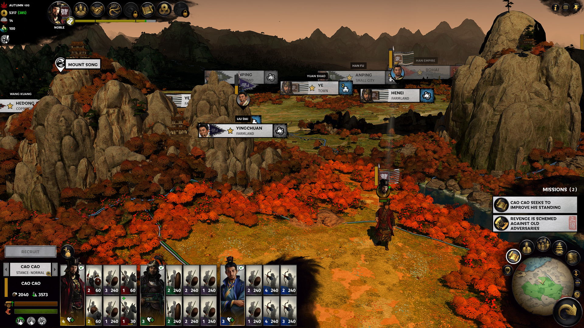
If we are talking about races, then the dynamics in them is the interaction of cars with local physics, if we are talking about strategies like Total War, then the nature of operating an army, how often it is necessary to pause the game, when it is necessary to accelerate and when to slow down the gameplay.
Total War: THREE KINGDOMS
Typical errors
Erratic pace
A similar error occurs if the mechanics of the game do not correlate with the mechanics of the levels.
A classic example of Daikatana. The game has a certain fast pace, similar to that found in classic shooters. At the same time, there are mechanics of allies whose death leads to a loss.
Controlling damage to allies in a classic shooter is very difficult, you need to play slowly, carefully. But the game itself assumes a different style of passing.
Violation of the game cycle
Most games have their own cycle, a set of basic repetitive actions that form the gameplay.
For the latter, DOOM is a chain of actions such as:
- shoot;
- kill enemies;
- get ammo from them;
- shoot (and continue on the list).
If you add or, conversely, remove something from the loop, it breaks. The game becomes unplayable.
Smooth dynamics
It’s bad if the game forces you to always play in the same rhythm (if there are no moments of rest or there is no increasing difficulty). In the absence of changes in the “amplitude”, the player will simply get bored quickly.
Violation of flow through deception
Do not make geometry that deceives the player. He can lose the rhythm, lose the flow.
An example that comes to mind is the last “Pestilence“. I came across a moment when I found a shortcut on the map, and then I found a fence there, through which it was impossible to pass.
Immersiveness and contextuality
They are often confused even by those who have worked in game development for a long time.
- Immersiveness focuses on the logic of building a level within the setting, it answers all questions about the functionality of the environment.
- Contextuality only creates a sense of logic, but more often — only context. At the same time, it allows you to use the mechanics more fully.
Examples:
- if there is a store in an immersive game, then there should be a counter, a cash register, a warehouse where some of the products are stored, everything that makes a store a store should be in it;
- in a contextual game, a store can be a conditional window that can even hang in the air.
Immersive sims are completely built on immersiveness. Any of them is distinguished by the construction of a level that answers all questions (who lived here, what he worked on, and so on).
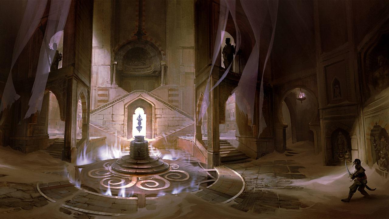
In a contextual game, this is secondary. A good example of a contextual game is Prince of Persia. The palace from the third part is absolutely non-functional, no one could live in it. But the player was told that this is a palace, and he believes in it. It has decorative and architectural elements of the palace — that’s enough.
Prince of Persia: The Forgotten Sands
***
The author will be glad to have questions and comments.
***
On September 16, the HSE Graduate School of Business Informatics will hold an online lecture evening on game design, and on September 24, the Open Day of the Game Project Management program will be held.
Is there any news? Share it with us, write to press@app2top.ru

