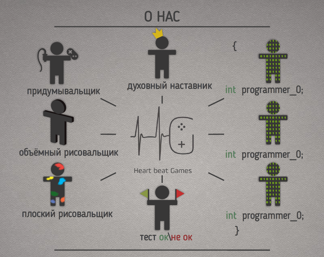
Within the framework of the GetIT game developers conference held in Ukraine the other day! The speaker Kirill Fialka from the Kharkiv Heart beat Games team spoke about the development of the visual style of the game project. Especially for App2Top.ru the studio has prepared a printed version of the report.
We are a small indie team of Heat beat Games. We love games, we play them and we make them. We try to combine mechanics and produce games that haven’t been there yet.
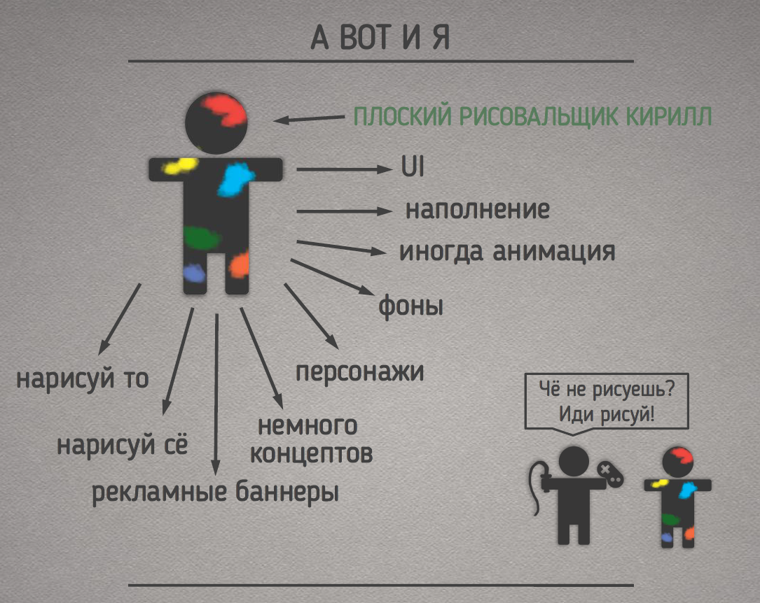
I, Kirill, am a flat draftsman, in fact, I do all the 2D art in the project: this and that, concepts, UI, sometimes animation, characters, backgrounds…
Concept
The production of the graphic component of most projects (after discussing the idea) begins with concepts. There are many ways to create concepts. Let’s look at some of them.
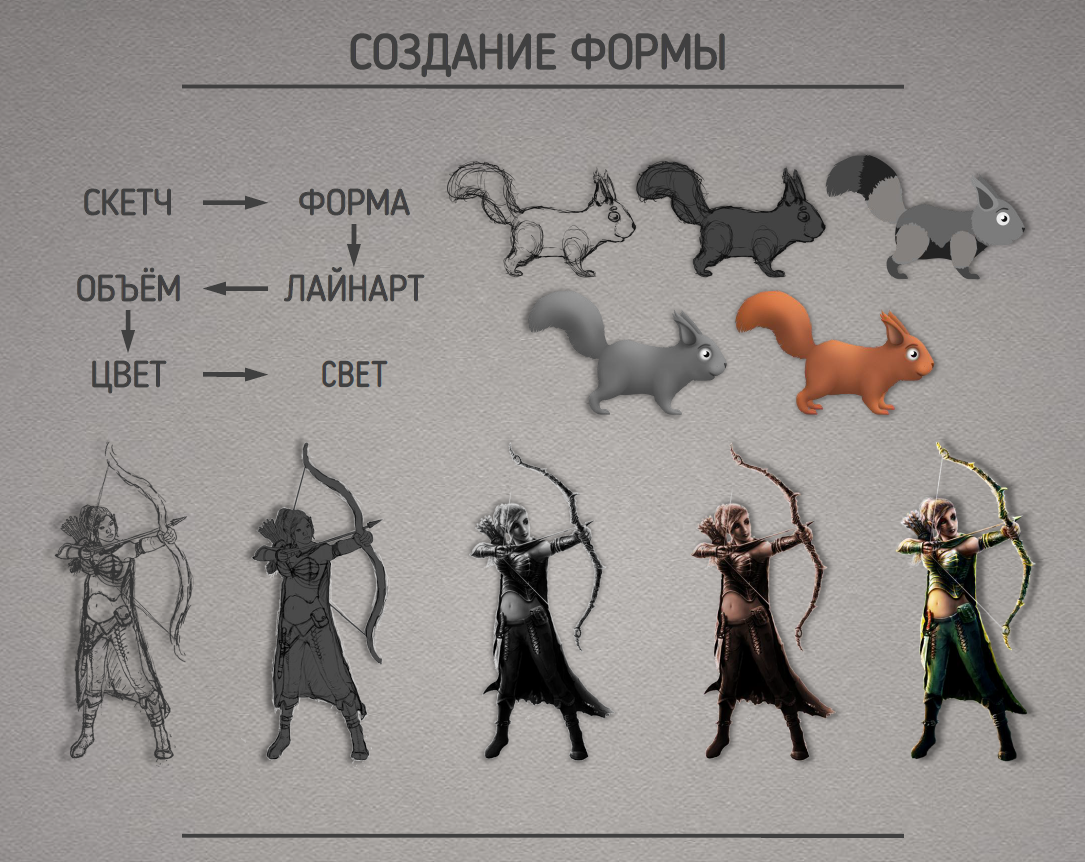
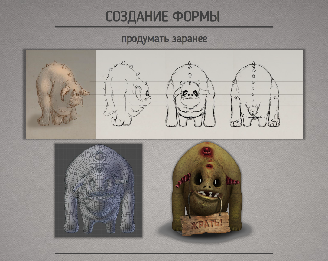
This is the method I mostly use. Initially, the shape of the object is created, then its detailing, volume elaboration, color selection and lighting. There are options with skipping certain stages or combining them, for example, to create a volume immediately with color
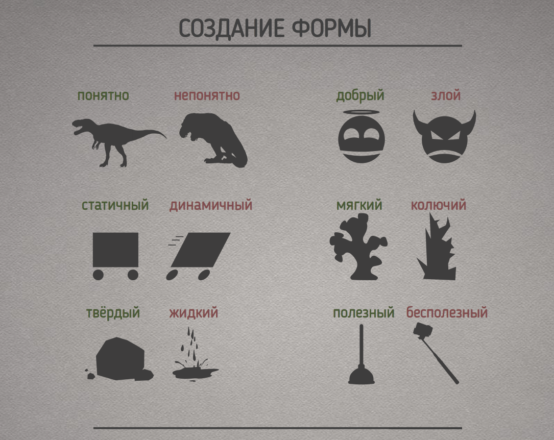
The shape of the object should be understandable, convey the nature, state of the object and its properties.
It should be taken into account in advance that not only you but also others may have to work with your concept further. Therefore, the more convenient the perspective and detail of the concept, the easier it will be in the future.

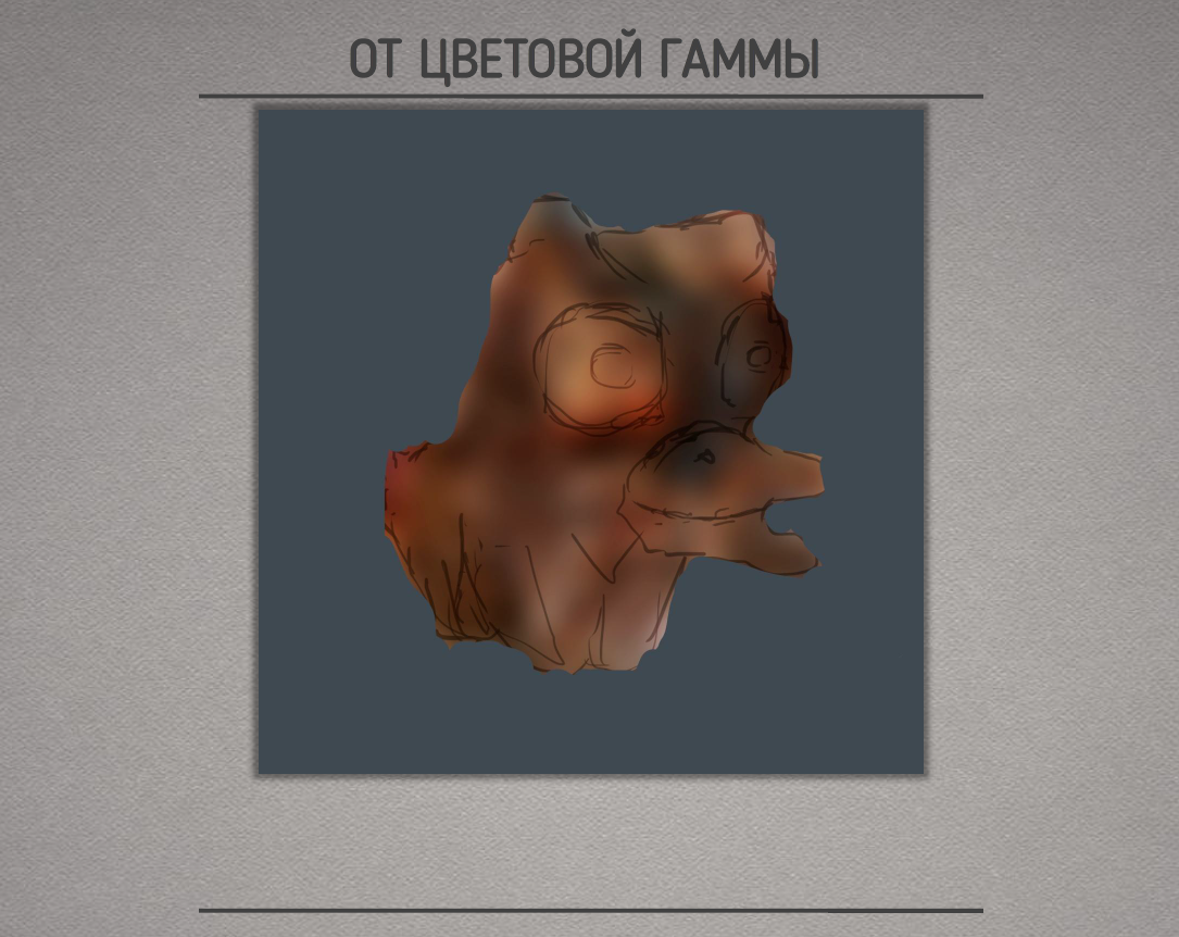
The second, frenzied, method is a “Concept from the color scheme”. We throw different pictures on the same field with different overlay modes, position and transparency.
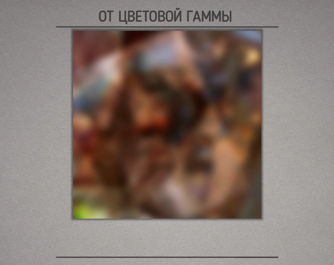
Blurring it all out… Some kind of Rorschach color spots are created. And then the creative process begins in the search for forms. Do you see something here?
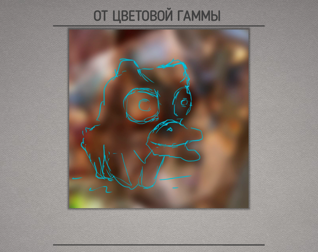
I saw IT.
Next, if necessary, cut off the unnecessary.
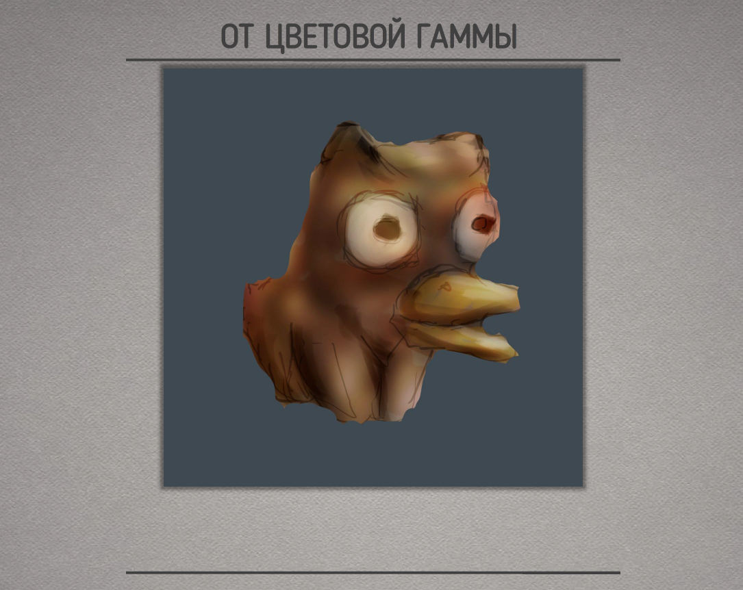
We detail and make small improvements. We scatter the main colors and light \ shadow.
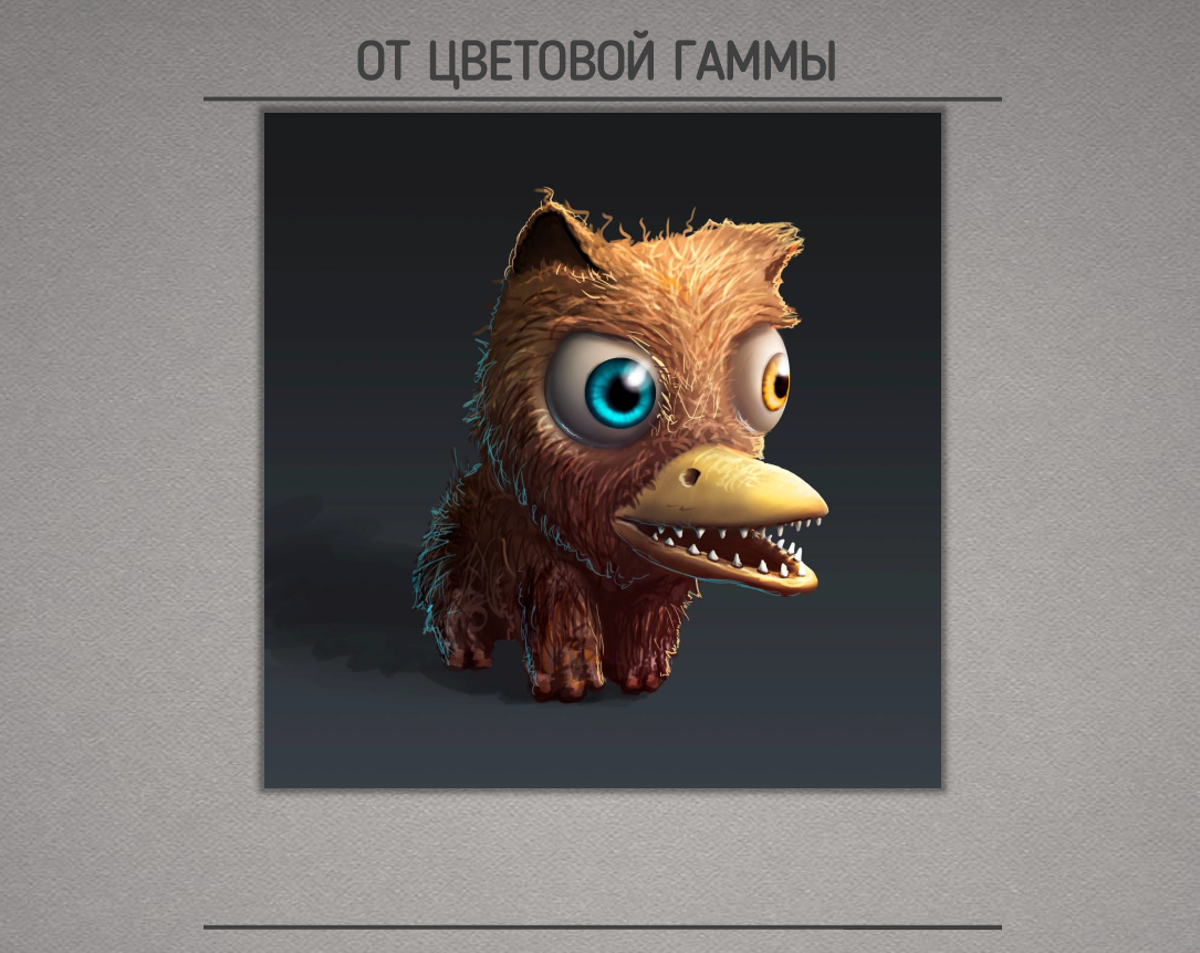
We are finalizing the details. It turned out to be such a mammoth-cat-platypus. The advantage of this method is that you can create the most incredible objects that would not come to mind in your right mind. Minus – if there is a specific task, for example a rhinoceros, it is difficult to see the necessary spot.
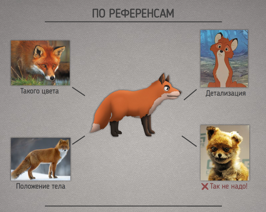
If your customer or game designer gives you accurate references, then the task with the concept is slightly simplified. You have specific points from which you need to start. It is important to indicate what not to do. In this case, we avoid phrases: “That’s not what I meant!”.
The choice of style
After creating a series of concepts, the team faces a clear visual representation of the future project. But now you need to choose the style of the game. And it can also be done in different ways.
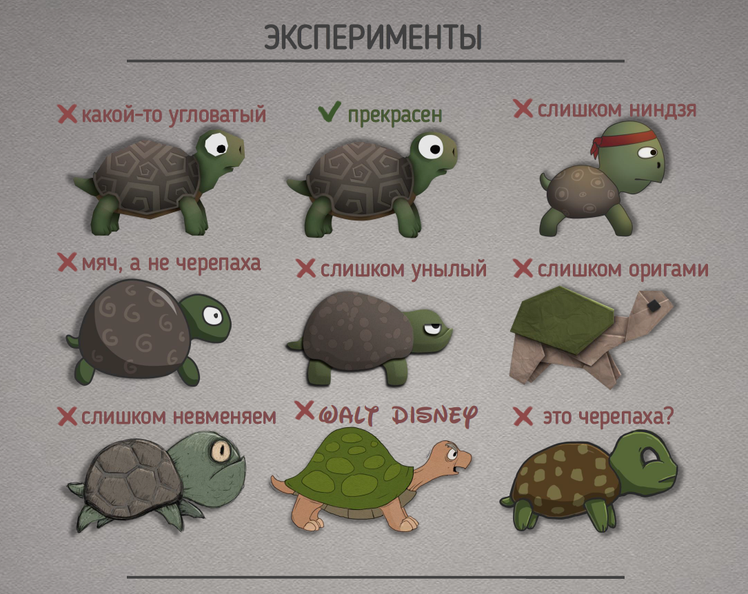
The most common and, in my opinion, the most correct way is to experiment. The advantages of this method: the ability to generate many options. The disadvantage is time, but it is usually justified. Then, according to certain criteria, we cut off the unnecessary and choose the best option.
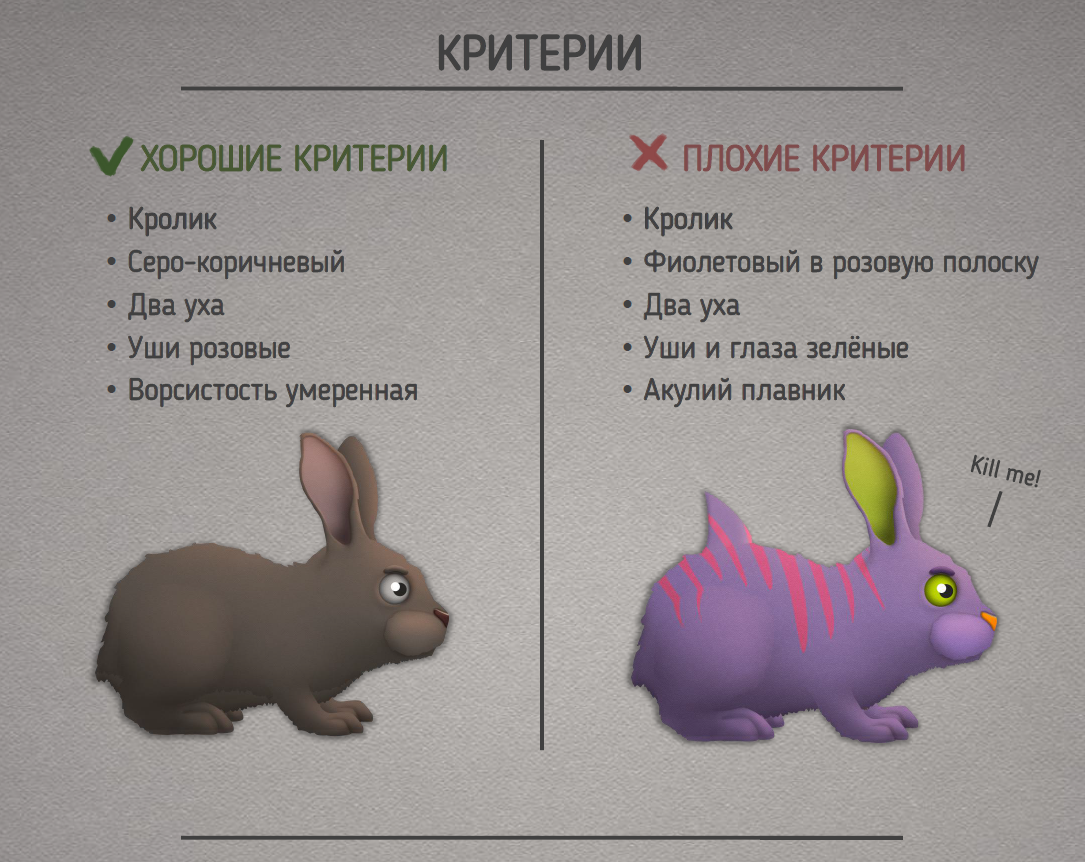
It happens that a game designer or a customer throws off a very specific list of criteria for stylistics. In this case, the task is simplified. Disadvantage: if the customer is drunk, has gone mad or does not know what he wants, trouble may happen. Although, if you have a game about the effects of narcotic substances, why not.
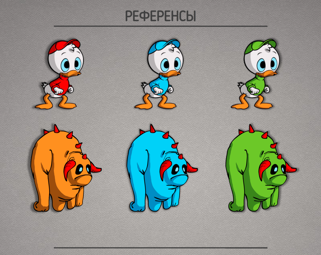
The easiest to implement, but the least creative approach is to copy or copy the style. It is better to use references in the search for details, but not in full copying.
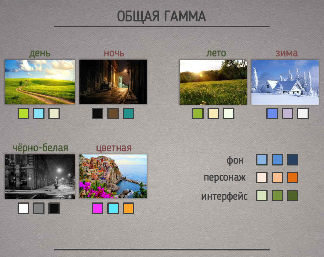
First you need to decide on the overall light range. This is a game in cold or warm shades, maybe it’s black and white, choose the place and time of action. All these factors will determine the overall color scheme.
Immediately scatter the approximate colors on the background objects, characters, interface, etc.
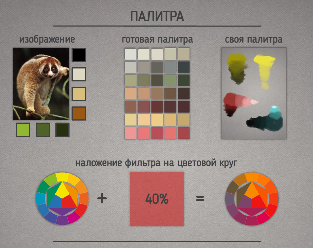
Prepare color palettes. Palettes can be selected in different ways. For example, colors from references. Or apply a filter on the color circle. You can also create your own palette. The main thing is to stick to the given direction.
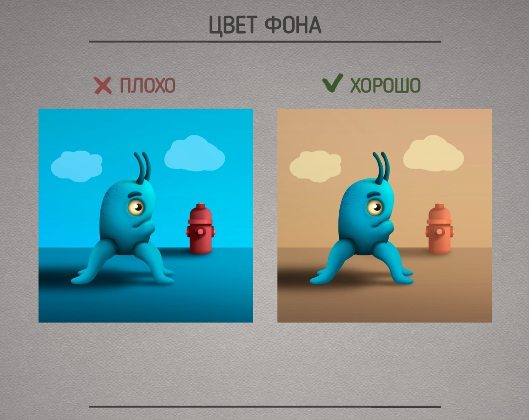
When choosing colors for the background, it should be remembered that the background should not distract, load and annoy the player. The number of colors on the background is limited.
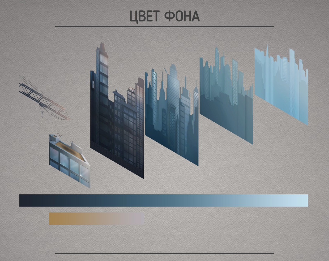
For greater comfort, at least the elementary laws of physics should be observed. Objects further away are lighter and less saturated.
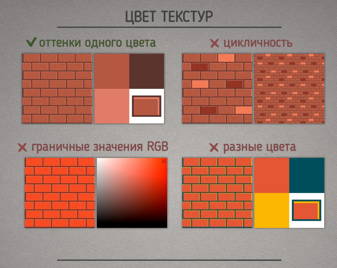
Textures should be composed of several shades of the same color. Do not use the maximum values of RGB channels, since when such a texture is illuminated, it will be excessively bright. Avoid eye-catching details to prevent cycling.
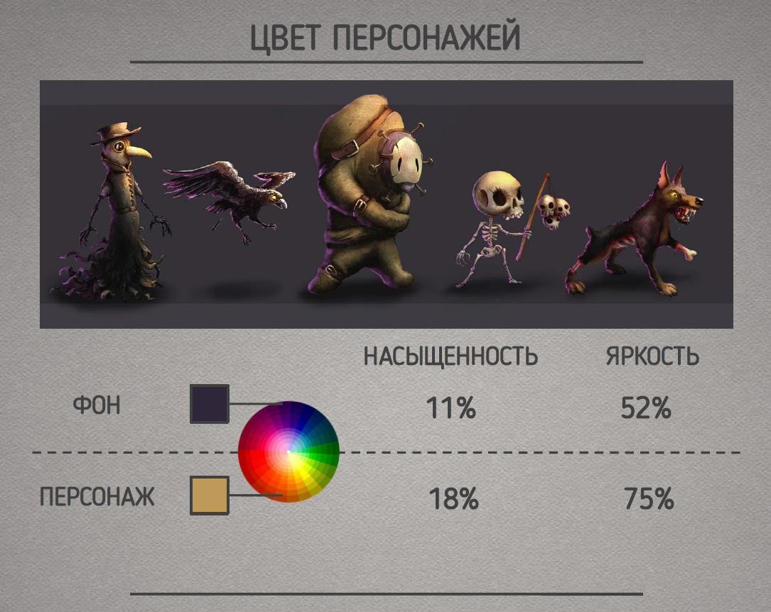
The character should stand out. Therefore, it is desirable that the colors of the character and the background are in opposite parts of the color circle. Usually the character’s colors are more saturated and bright. But the brightness of any color should not be more than 80%, as this will negatively affect the lighting.
The saturation of the character’s colors is usually less in the legs and more in the upper part (this is how the most important elements are emphasized).
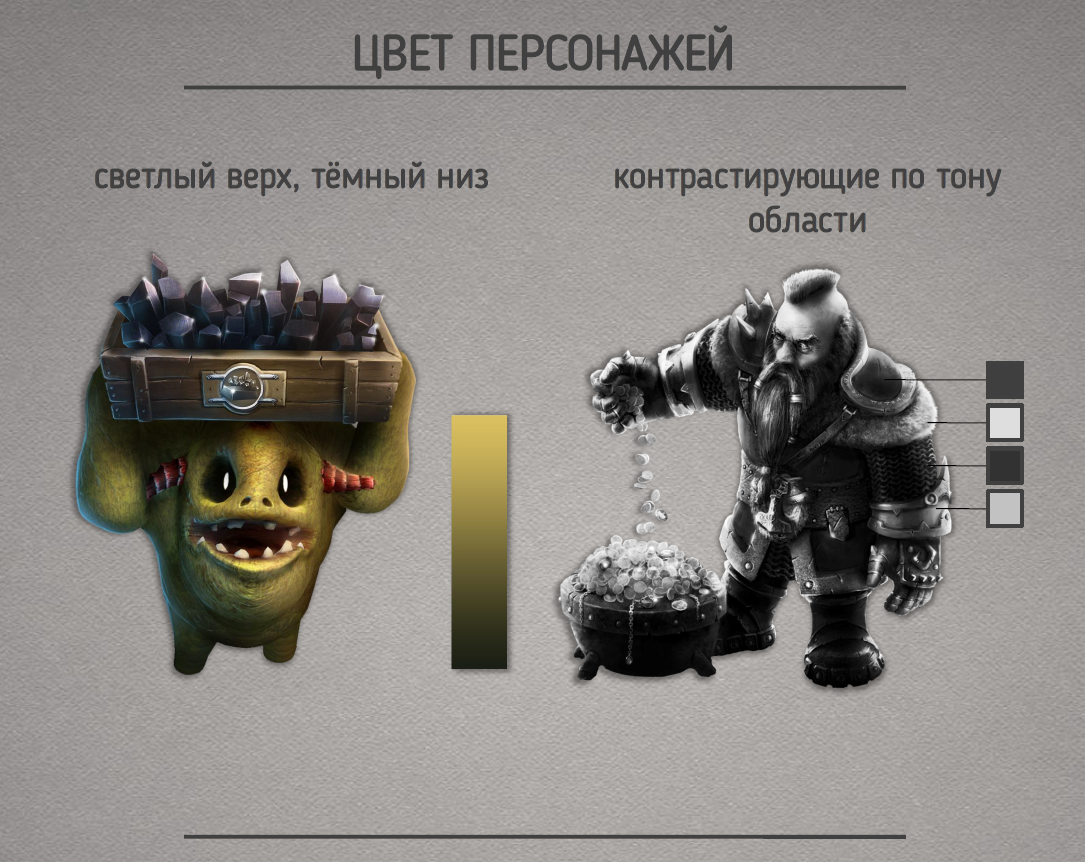
If the character is highly detailed, there should be contrasting areas in tone (to highlight different shapes).
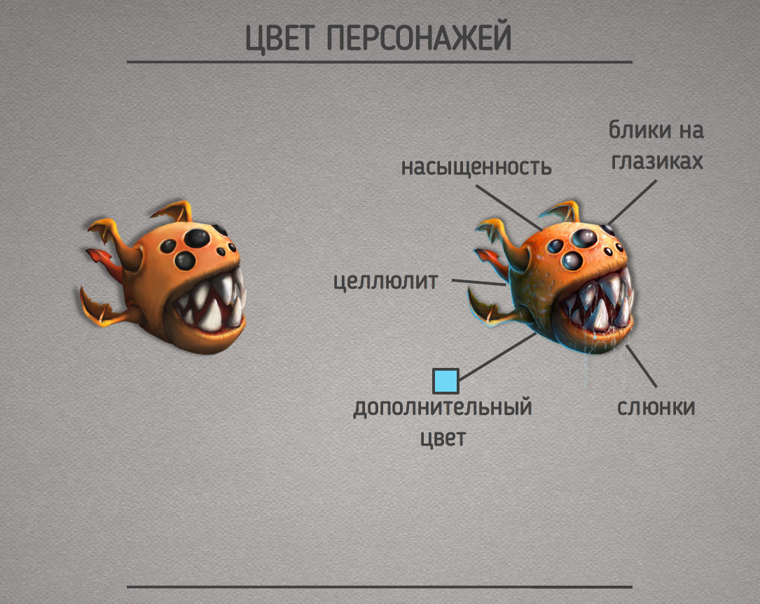
Avoid pure black and pure white – these colors are difficult to illuminate. Add additional (insignificant amount) colors and details, so the character will be more interesting, more colorful, cooler.
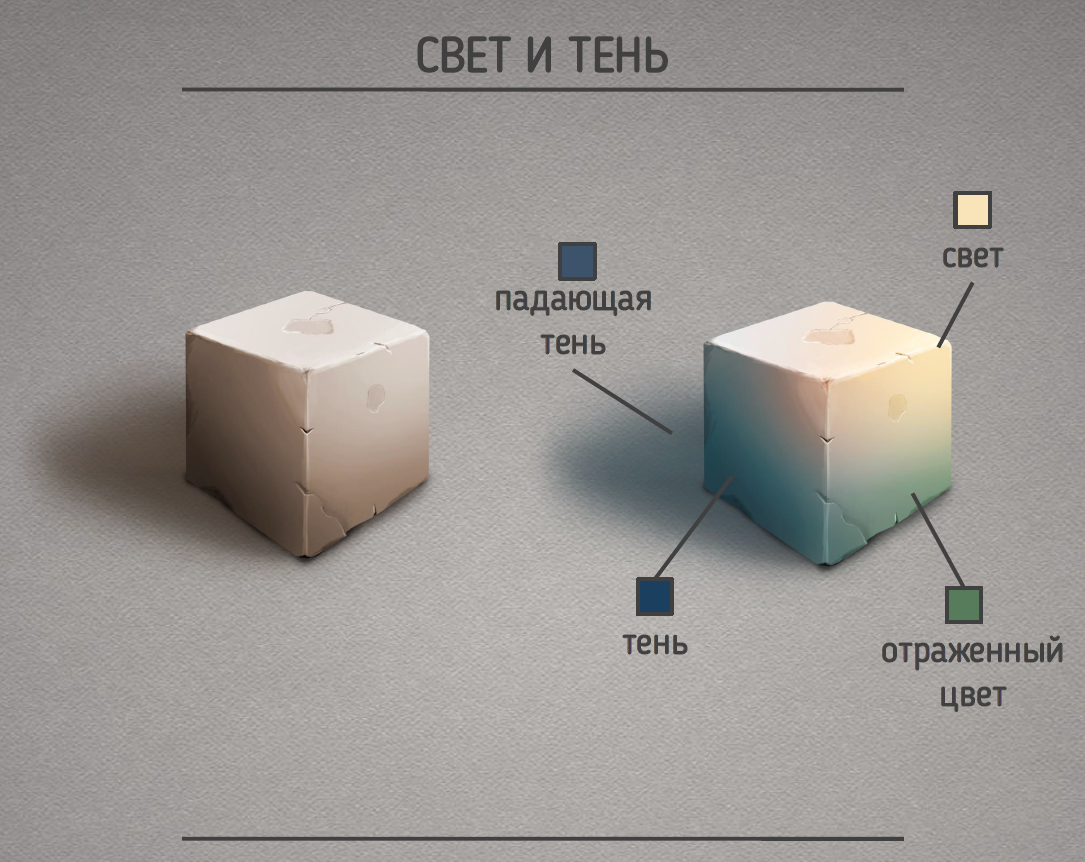
There are often problems with light and shadow. Many people think that the shadow is always black or gray, and the light is white, or only one shade. None of this is true. The surrounding world is also colored and discards its colors. The light sources are not white. Therefore, there are always minor shades in the shadows and in illuminated places.
Attention to detail
Special attention should be paid to the details of the objects of the game graphics. There are some features that are not inherent in classical painting and illustration.
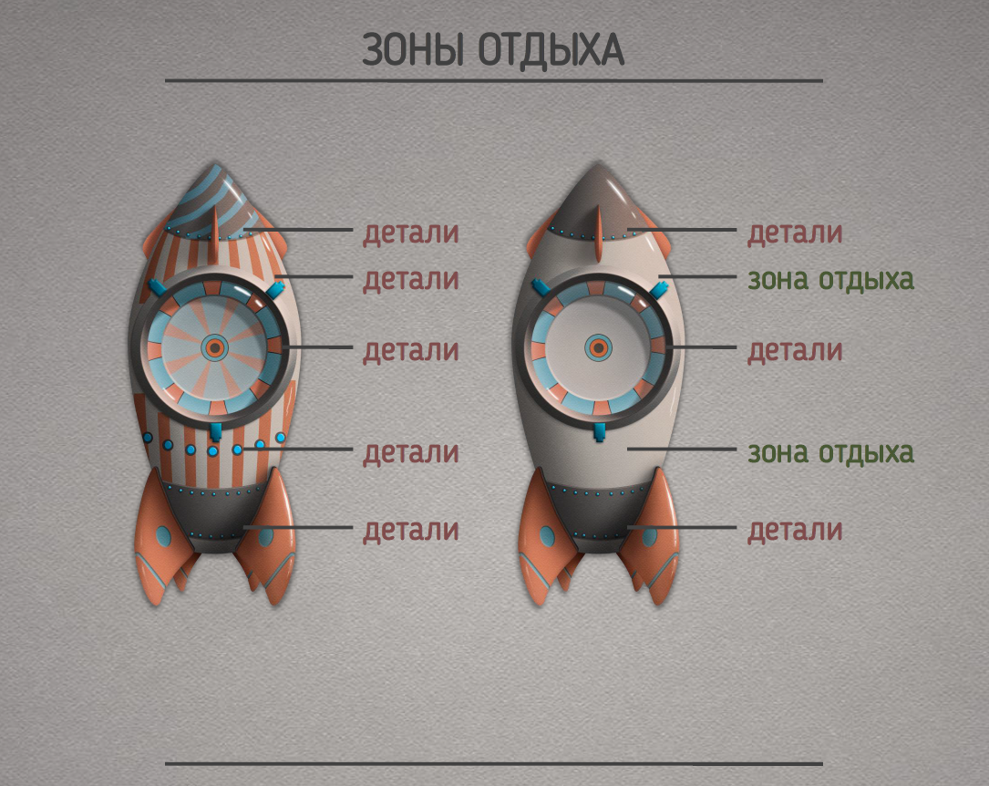
When detailing any object: character, background, weapon, interface, balance should be observed. The human eye cannot focus on a large number of details at the same time. Therefore, there should be areas with low detail (recreation areas).
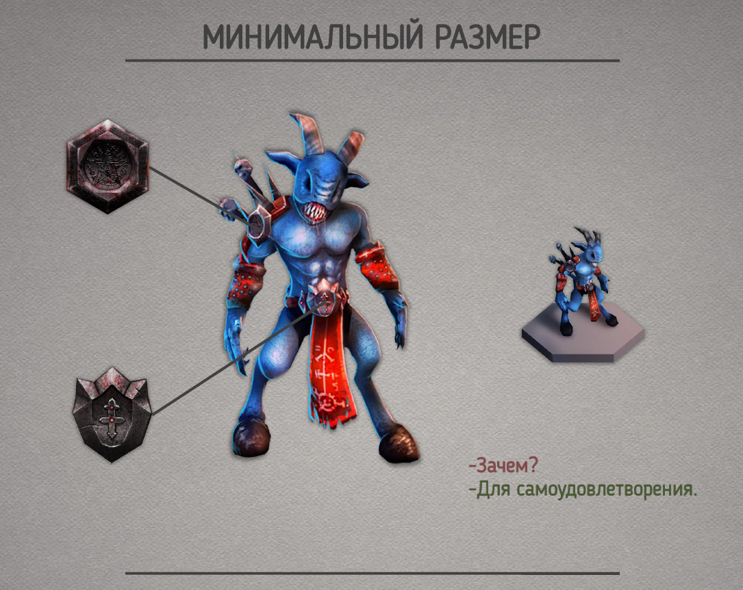
Do not detail to such small things that will not be visible in the game. They will only create noise, and rendering them will take precious time. Specify in advance the minimum size of the object visible on the camera.
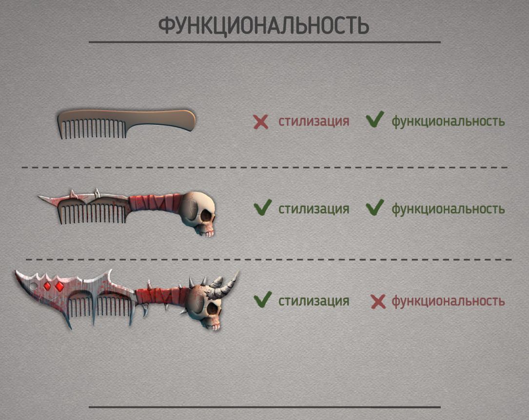
Keep a balance between detail and functionality. It is not necessary to add too many details to the object so that it does not lose its functional properties.
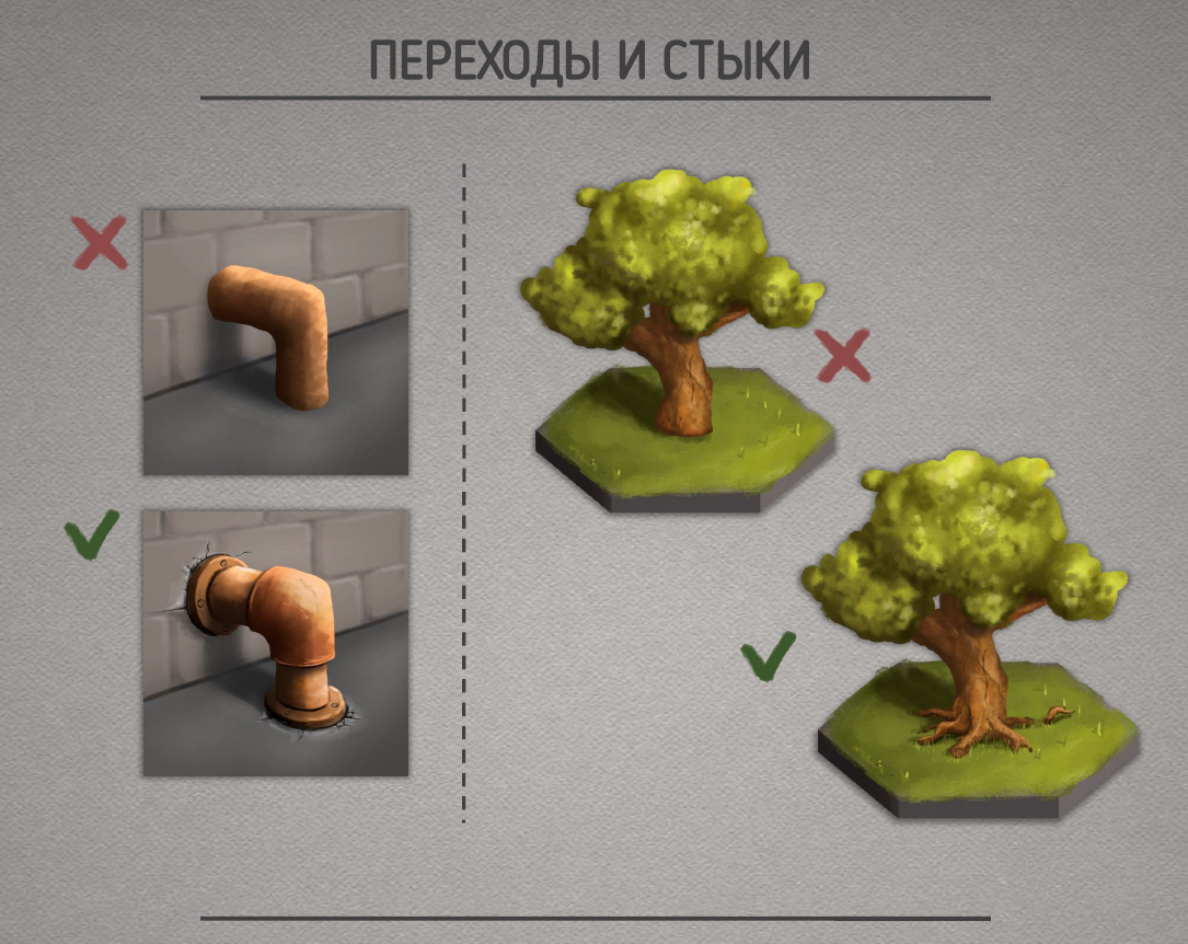
Objects going nowhere look unnatural. Therefore, there should be designated junction points on the border of the two objects. So the picture will look more natural and harmonious.
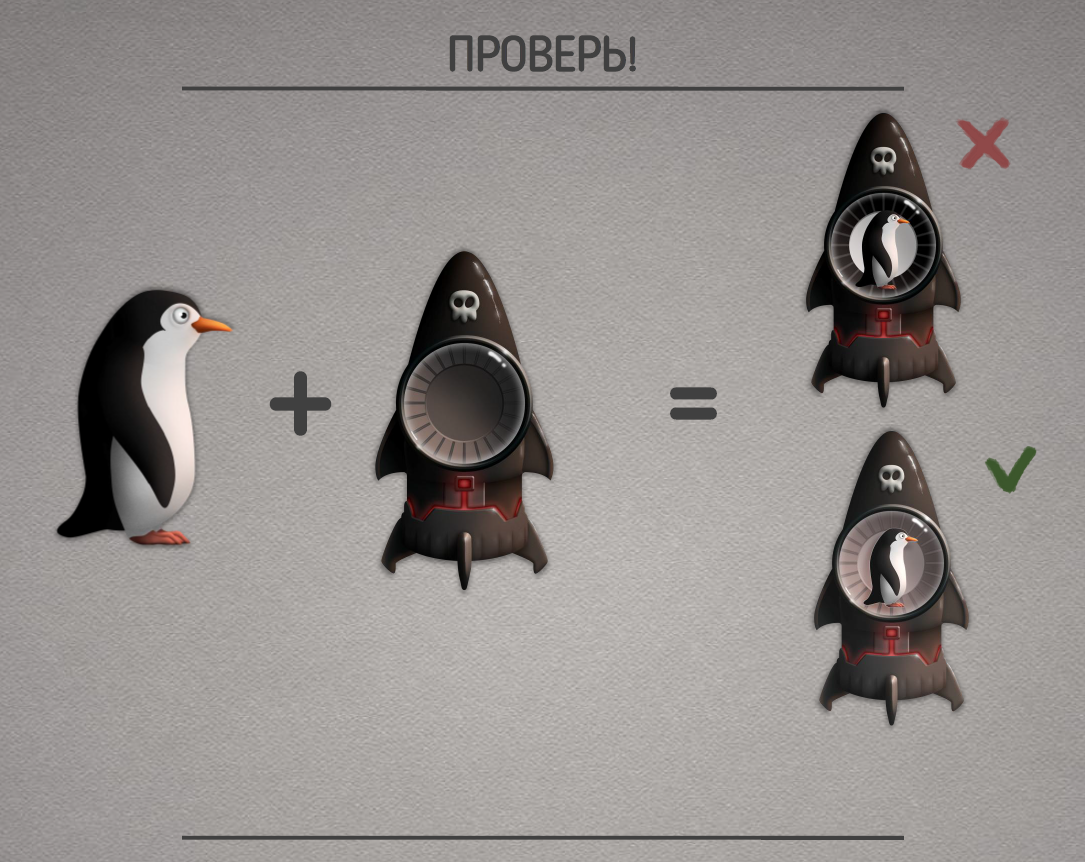
After creating all the objects, you should check their compatibility and immediately correct errors. To prevent such errors, it would be good to always keep other reference elements (landmarks) at hand.
Reuse, unification
Using the same resources, or resources with small changes, saves time and increases productivity.
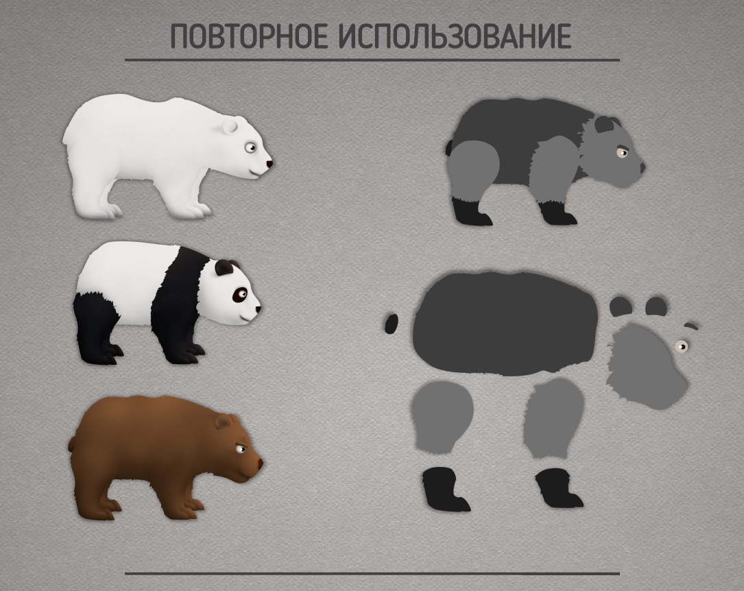
By making a small variety in the same “dummy”, you can get completely different assets. This will save time both when creating new elements and when animating them.
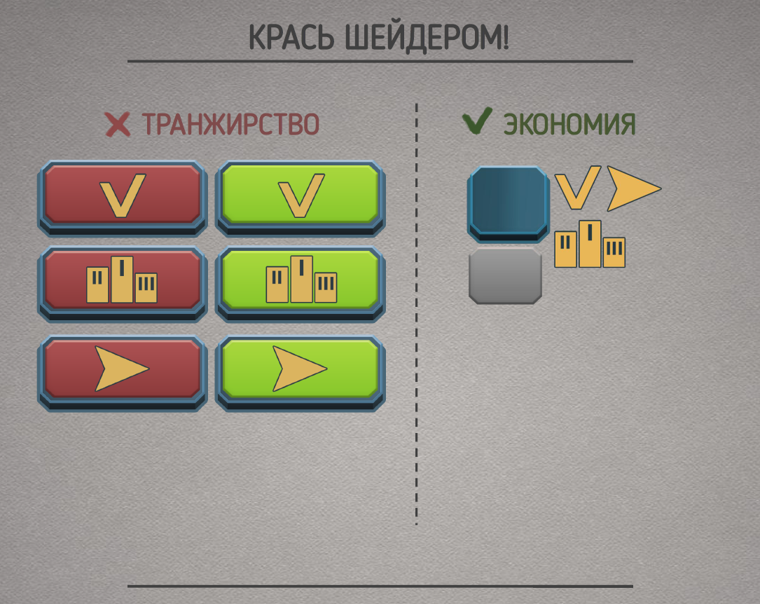
By creating conditions for the possibility of painting repeating elements with a shader and reducing all the “tile” elements, you can save a lot of space on the atlas.
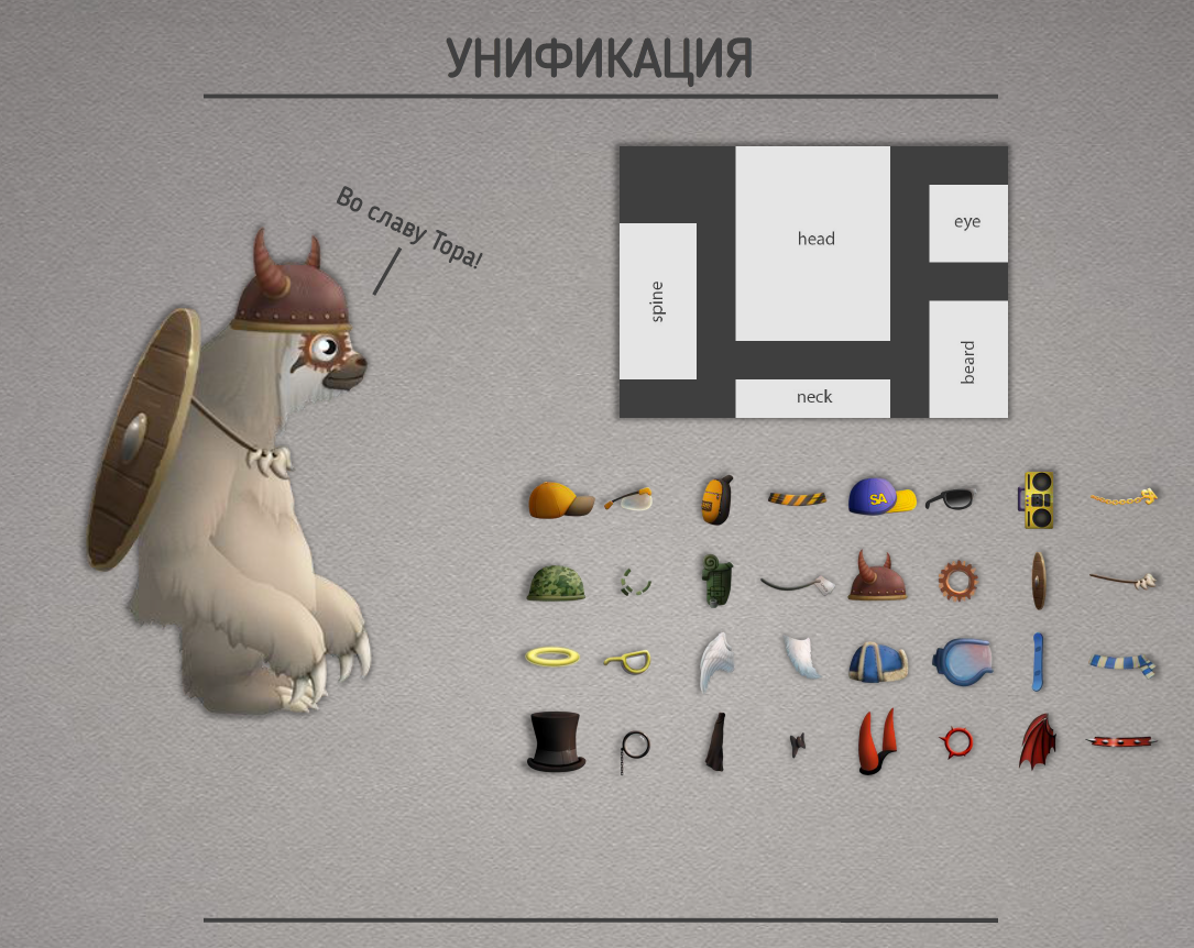
If you think through the blanks for objects in advance, then you can make an infinite number of them. So when embedded in the engine, much less effort will be spent if you create unique objects every time.
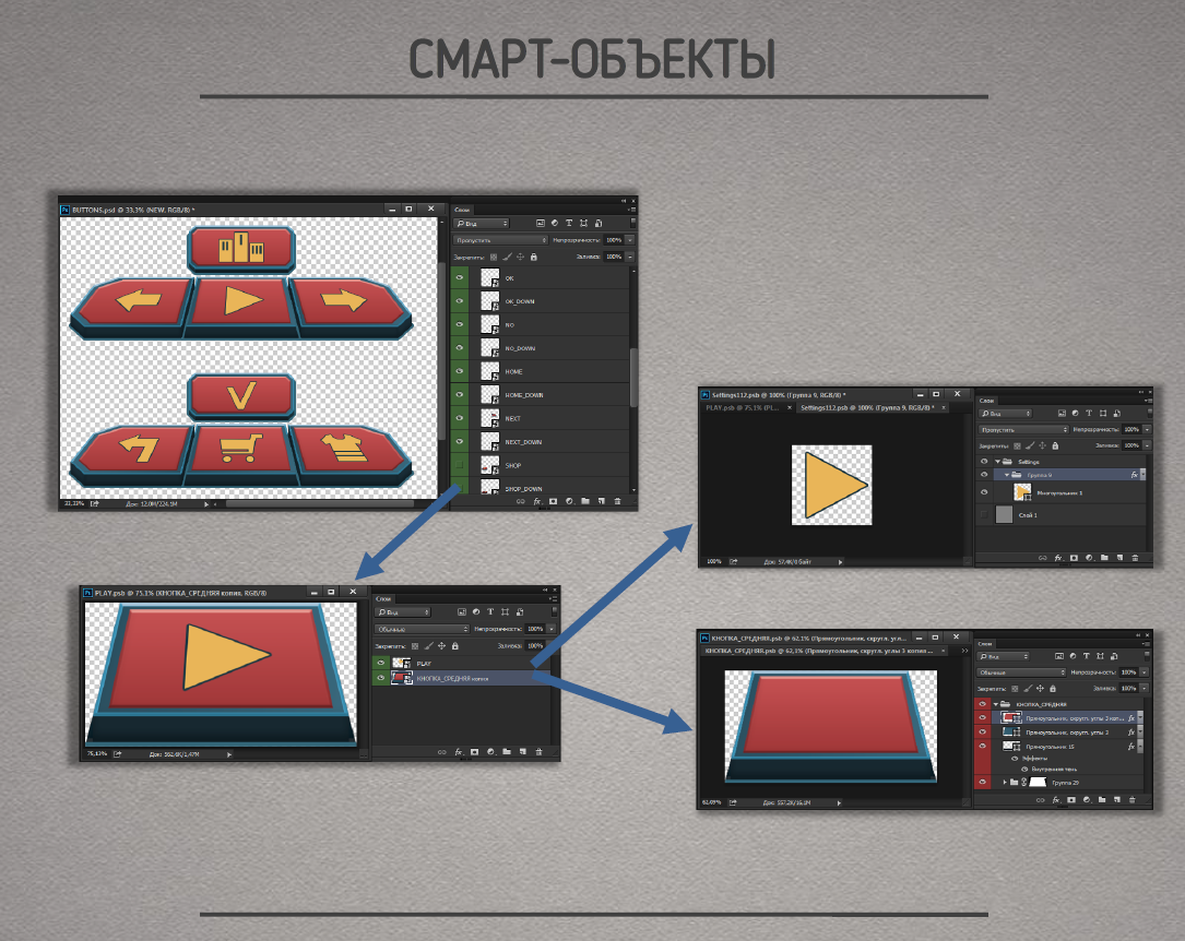
Using smart objects saves a lot of time and effort. A smart object is a container whose contents do not change when you edit it. By changing the perspective of the triangle, which is such a smart object, it is easy to further edit this triangle without losing its perspective in the final drawing.
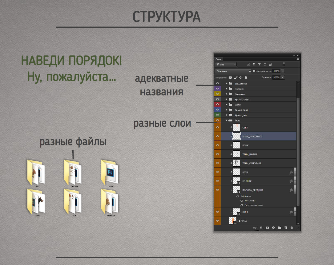
Put things in order. So it will be easier for other people to figure out what is going on in your files, and it will be easier for you to figure out in a few months, when you have already forgotten what you were doing and what the 123bbb98a layer is responsible for.
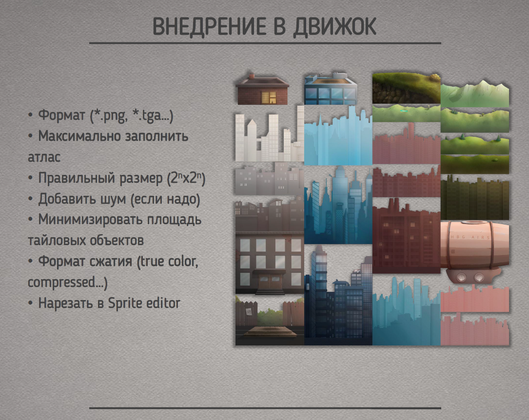
And so we have rendered all the content, but it doesn’t end there. Now it all needs to be animated or embedded in the engine. To do this, you need to: specify image formats, create atlases of the required sizes with the correct location of objects, if necessary, add noise to the atlas compression in the engine, minimize the area of tile objects on the atlas, etc.
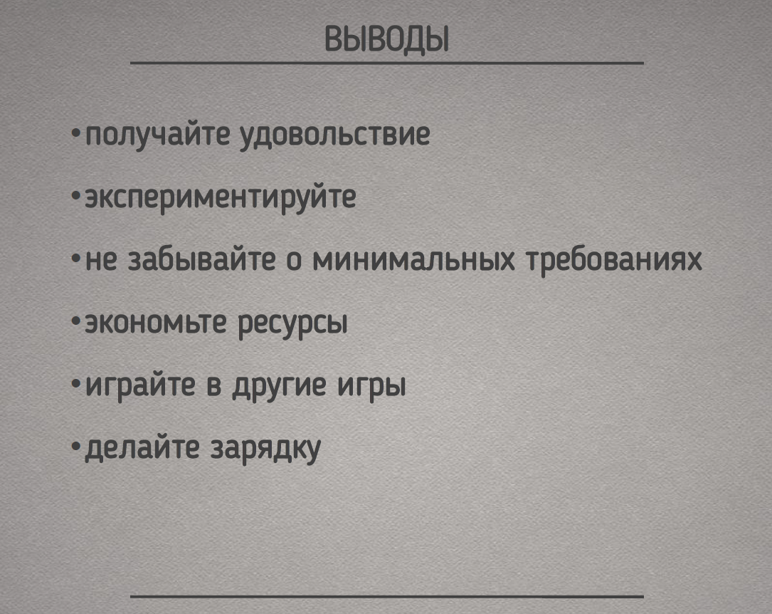
Always enjoy your work. If this is not the case, then perhaps you are busy with something wrong. Don’t be afraid to experiment. Read literature and develop. Save your strength and the strength of your employees. Have fun and take care of your health. Good luck in your work!
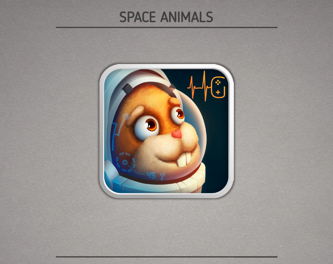
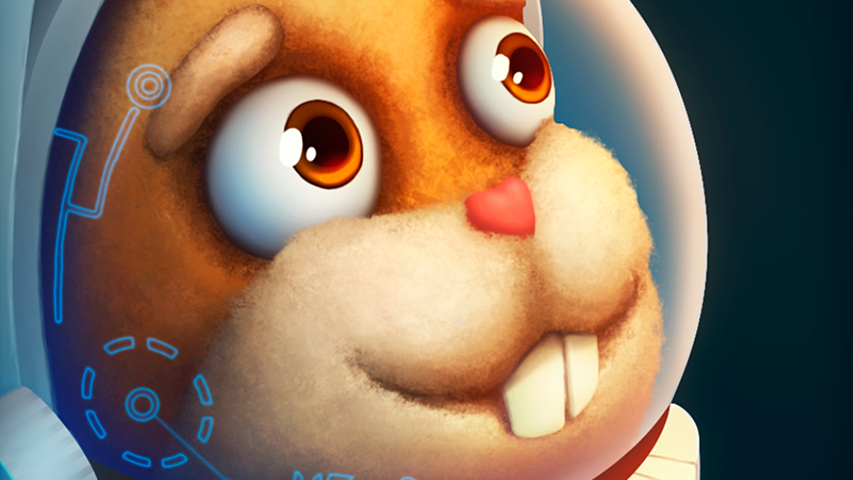
Most of the pictures from this report were taken from our new game Space Animals. The game is designed for a wide audience, but we paid more attention to the children’s audience. A game in the hybrid genre of clicker and runner about cool animals flying into space in search of adventure.
Write to us!
P.S. Our official website is under development and will be available from next week, but in the meantime, you can get to know us on social networks (for example, here or here).