Why in a recently released Steam game Firewatch game designers should pay attention to the in-game map, the editor of the publication Alex Wawro told in his post on Gamasutra, and we translated the material into Russian.

The other day, Campo Santo debuted the Firewatch game, the purpose of which is to capture at least partially the “beauty and loneliness” of the Wyoming wilderness in the era before smartphones.
I think everything worked out, and judging by the positive reviews, I’m not alone in my opinion. But although Campo Santo and the publisher of Panic were praised a lot this week for their work, no one seems to have noted the best part of the Firewatch design, in my opinion, the card.
This card, in my opinion, is a real decoration of the game, so I decided that it would be interesting to figure out what makes this card one of the best game cards.
Despite the fact that I am by no means a game designer and have never claimed this title, I am very interested in maps and map design. Which means I can try to highlight this small but essential part of the game design that would otherwise go unnoticed.
A real conversation about a virtual card
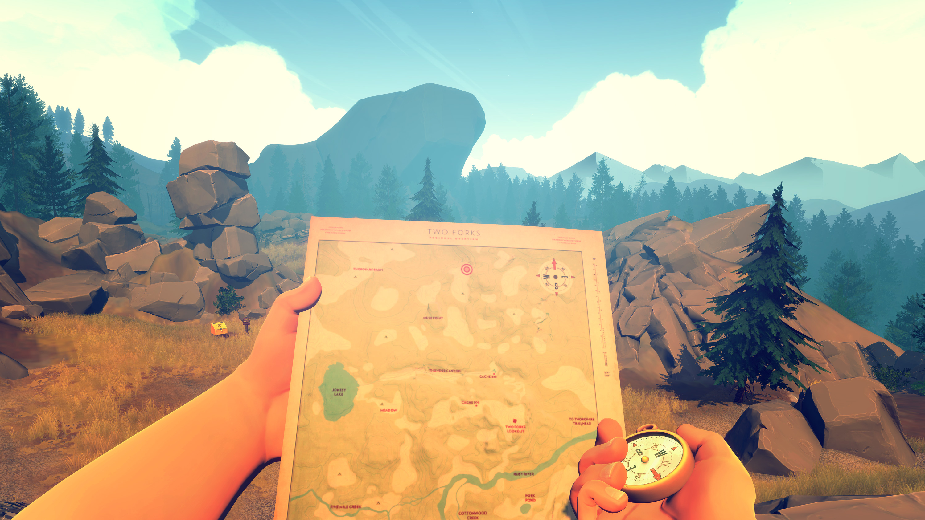
To begin with, the Firewatch card is not a menu or part of a HUD display. It was placed in the game world, and when the player opens the card, he sees the protagonist Henry’s big hand unfolding it with a pleasant rustle.
This is an old trick (if you played Far Cry 2 or Metro 2033, then imagine what I’m talking about), but it perfectly helps the player to immerse himself in the game world, because in the 80s people did not press a button on the screen, but studied a piece of paper.
Moreover, when Henry takes out the map, it is not so easy to read it – it was not easy for me, at least. It is a little far from the screen – so that the surrounding landscape is clearly visible, but most of the details are too blurry to understand what’s what.
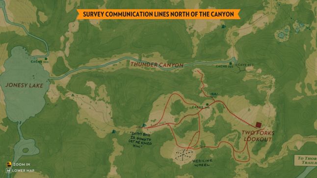
But at the same time, the player can press the button and zoom in on the card, and then it’s easy to imagine how Henry, a middle-aged man, brings the card to his nose and squints.
This image arises almost by itself, unconsciously. And he may make the viewer empathize. Not every player will begin to sympathize with Henry at such moments, as I did. But even a chance for such empathy would not have arisen if Firewatch had a regular (and convenient!) full-screen map/map in the corner of the screen.
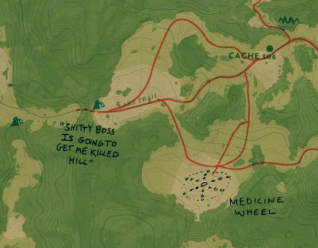
What notes the player will see on the map depends on how exactly he plays
Of course, spending time while developing a game to visualize something like this is not the best solution for most games.
Imagine what it would look like in Arkham Knight! Players would have to pull over to the side of the road so Batman could check the dotted line in his Gotham atlas (though, that’s a thought).
But Firewatch is a good example of how and where investments in such a feature can bring good dividends. In a nutshell, the map in the game visualizes the character of Henry in small, but very capacious strokes.
Throughout the game, the user makes decisions that help to establish who his or her Henry is. The comments that appear on the map correspond exactly to what decisions the player makes. For example, the notes on my map turned out to be simple and a little silly. But you can play Henry as a more witty character. Then the map will be littered with sarcastic notes.
Anyway, with the development of the game’s plot, the map in Firewatch undergoes changes and turns into a tool that, in fact, reflects the thoughts and feelings of the protagonist.
Great job, Henry.
This is a clever move to create and shape a character with the help of a game environment.
This point, I believe, many first-person game developers bypass. Perhaps, because it is (mistakenly) assumed that there is no better way to get to know a character and start empathizing with him than to look through his eyes and be responsible for his every action.
But, in fact, there is such a way. And Firewatch proves it. Moreover, I believe that this game is proof that the effort to implement such a seemingly insignificant detail of game design can be worth it. I passed the game in two steps. In the first session, I was constantly talking about this map.
There are, of course, many other worthwhile design solutions. And I’m sure many will appreciate them in the future. Most likely, they won’t even discuss the map. And that’s fine. Scribbles on an in-game object are not the most important tool of Firewatch storytelling (here, as often happens, a map is not a territory), but they give an unexpected and welcome picture of both Henry’s inner world and the remote areas of Wyoming in which he finds refuge from the outside world.
By the way, if you are playing Firewatch yourself, I advise you to open “Settings” and uncheck the option “Show location on map”. So it will be a little more difficult to navigate in the game, at least at the beginning, but I think it’s worth it, because it gives an incentive to study the terrain and learn to move, starting from ground landmarks.
A source: gamasutra.com


