In the new section, we look at the Dashy Crashy runner and two of its features that we really liked.

We have come up with a new category – “Details”. In it, we will briefly go through unexpected solutions that we liked in a particular game.
“Details” will debut with a discussion of two moments of the endless runner Dashy Crashy that we liked.
About the game
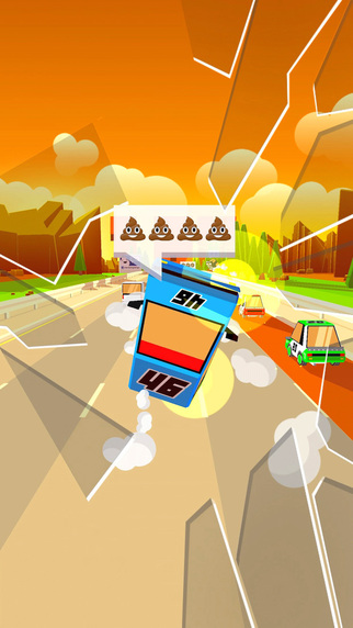
Dashy Crashy was released quite recently – on December 16. Its developers from the British studio Dumpling Design took as a basis a slightly modernized mechanics of a three-dimensional endless runner and added the familiar for the current indie bundle “visual style plus monetization of Crossy Road”.
We will not dwell on the latter in detail. Just recall that the commercial success of Crossy Road was the reason for the popularization of voxel graphics (or stylization for it) and soft monetization in minimalistic games.
As for the mechanics, then everything is a little less prosaic. Dashy Crashy is a runner about road traffic. The player controls the machine by moving it to one of the five rows. The main obstacles are other cars, which also constantly change the row. Before that, they always turn on the repeaters.
This is the whole gameplay.
What’s curious?
The two points I mentioned just above are:
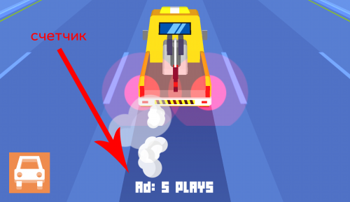
- a counter notifying how many attempts are left before the ad is shown
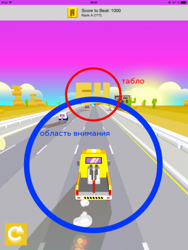
- integrated into the game stage scoreboard with points
Now let’s talk about them in a little more detail.
Counter
Before each attempt, Dashy Crashy informs the player at the bottom of the screen when the commercial will be shown. No unexpected pop-ups, no “damn, it’s advertising again.” The player is constantly aware of when to wait for the commercial break. This automatically reduces irritation when it appears.
It is strange that such a solution is not common. Unexpected aggressive advertising, as a rule, severely affects the image of the game in the eyes of users. Such an approach, on the contrary, partially solves the conflict situation.
Scoreboard
This is a less interesting solution, but it also seemed interesting to us. Usually in action games, the player is focused on the process itself. Shifting your gaze from the center of the screen to one of its corners is fraught with loss. In this case, the scoreboard with points is as close as possible to the player’s attention area. Moreover, it is visually successfully implemented.
In general, try the project, and also, if you notice anything else interesting in it, be sure to unsubscribe.
And, of course, we will be glad to hear from you about interesting details in other games. You can either write to me by email (alexander.semenov@app2top.ru ), or Ira (irina.smirnova@app2top.ru ).
You can download the iOS version of the game here. It hasn’t been released for Android yet.
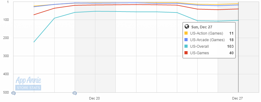
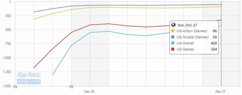
In the USA, the game shows, thanks to the feature, the highest indicators, both in downloads and at the box office.
Dashy Crashy’s position in the top of free apps in the American iPhone App StoreDashy Crashy’s position in the top box office apps in the American iPhone App Store.

