The graphic outsourcing company OWL Studio is analyzing errors in the interface of the Echo of Combats battler, which is still in development (the game of the Russian studio Mad Devices is now at the stage of a playable alpha).
From the issuing editor
Before giving the floor to Vera Velichko, the founder and director of OWL Studio, I want to tell you a little background of the material.
I met the authors of Echo of Combats at the last White Nights in Moscow. The project caused mixed feelings. I’m sure many people have experienced something similar when they saw the game in development and thought to themselves: this is great, but this element is completely superfluous, and in general it is customary to do something else.
Unfortunately, I meet with this often. I don’t like to give advice, and I hardly have the right. It’s quite another matter if an expert in a certain niche does it. This is how the idea of detailed material was born, in which specialists show the young team obvious problems (and offer solutions) of one or another aspect of the game.
The Mad Devices team was not against such an experiment, and OWL Studio expressed its readiness to disassemble the Echo of Combats UI in detail.

Vera Velichko
The main thing is compliance with the functionality
The Echo of Combats development team boldly agreed to provide their game for the analysis of the graphic component. Using her example, I will consider several main points that game developers face when working with art content.
First of all, it should be noted the high level of drawing. The graphics are pleasant, stylish, well-drawn.
And then I have to say that graphics are not the main thing in games. The most important thing is that it corresponds to its function.
The gameplay assumes certain values and hierarchy of objects, the order of their perception, the functions inherent in each object. And the first task of the artist is to put into the background everything that is not directly related to the gameplay, and at the same time bring forward what matters. In other words, the artist must arrange the points of attention exactly in the order in which the viewer should perceive the information.
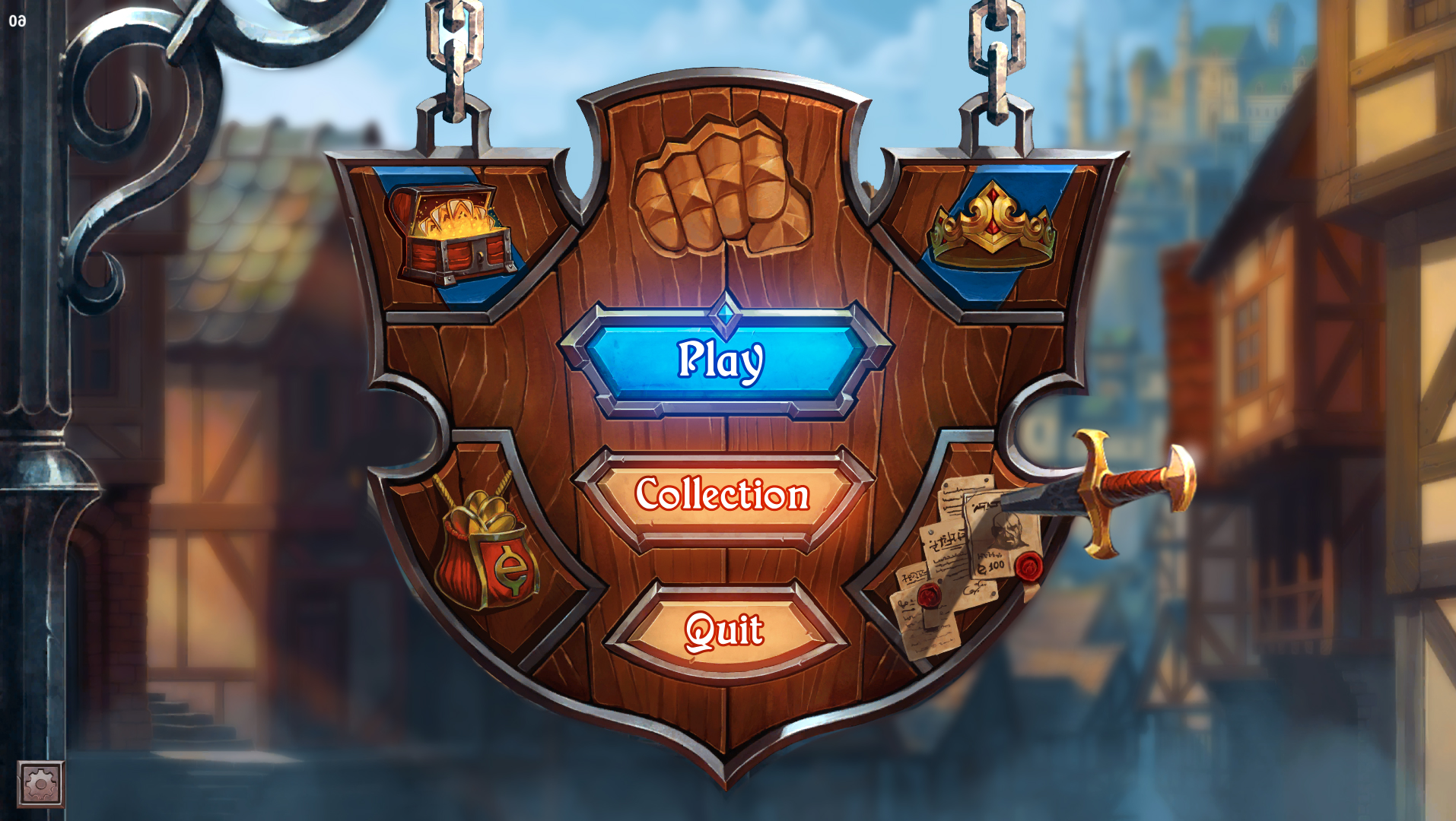
Analysis of the start menu
Let’s look at the start menu of the game from this point of view.

Start menu Echo of Combats (original)
In general, it is not bad, it makes a pleasant impression. The detail in some places is too small, as, for example, in the area of the dagger with papers, but it is quite easy to correct and in this case it is not critical.
The central problem of the menu is the blurring of the player’s attention. The bright Play button tries to hold it, but does not cope with its role. Too much the same contrast, detail and clarity across the entire surface of the screen, it’s like a crowd of reporters simultaneously asking questions.
For the solution, I propose to “distribute the crowd”. We will defocus the background, bring the menu background, give emphasis to the buttons.
Start menu Echo of Combats (fast recycling)
As you can see, I have also expanded the composition from left to right. This is also important: the direction of perception corresponds to the direction of reading. And for the European/American viewer, the location of the pillar on the left will be perceived as an organic design element that opens the composition and “accompanies” the viewer to the menu. On the contrary, if the pillar is on the right, then the gaze constantly “rests”, does not have the opportunity to “get out” of the composition, there is a feeling of discomfort.
However, the main difference between the first version of the screen and the second is the processing of accents.
We will return to this topic on the cor-mechanics (combat) screen, but for now let’s take a look at the interface.
Three main interface requirements
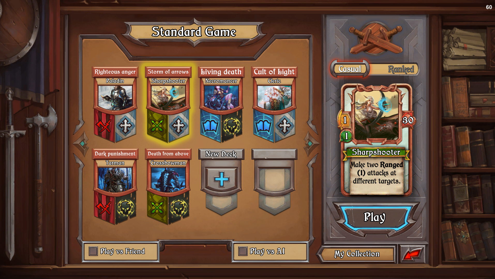
Echo of Combats Interface (original)
As before, the rendering quality is good, the backdrop looks especially great: bookshelves, weapons. However, if we touch upon the issues of UX design, then there is something else to think about.
Usability issues can be reduced to two categories: functions and visual.
The functions of the buttons, their number on the screen, their location and convenience — this part of usability is directly related to game design, and we will omit it in this analysis.
Let’s talk about the second part — visual design. It is the right visual that is responsible for the ease and intuitiveness of reading.
Let’s try to reduce all the variety of possible comments to a few basic rules that will be valid for any design and any interface.
There are three main requirements for the interface from a visual point of view:
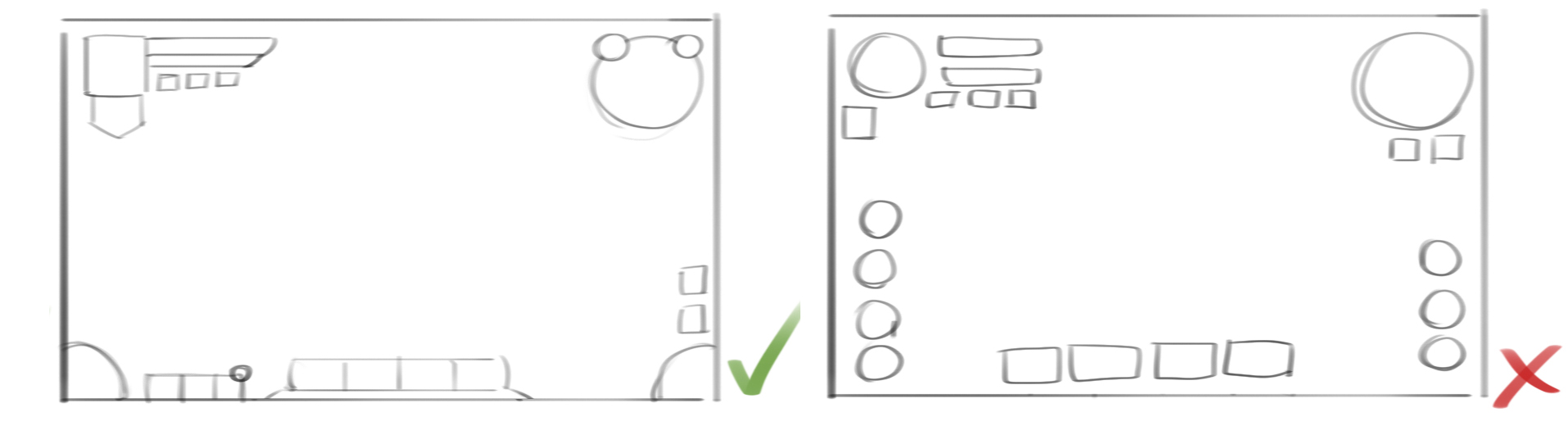
1. Interface objects should form a “puzzle” relative to the screen and each other.
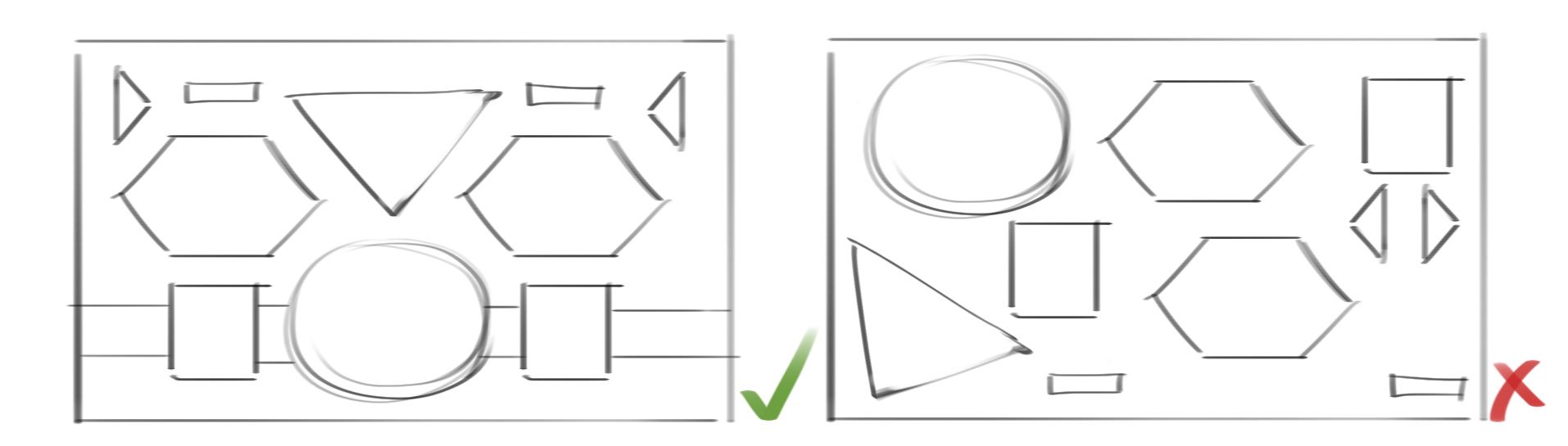
All elements and their forms should be sorythmic to each other, conditioned by each other. This creates a visual order and allows the user to easily move attention between groups of objects.
Also, certain lines, axes of symmetry and guides should be traced in the composition. If we do not observe this order, it becomes much more difficult to navigate.
Try to move the focus point from object to object, as if trying to find the right one, on the left and on the right pictures.
The left picture is very easy to remember, like a map, and after looking at it a couple of times, we already remember where an object is. The right one, let’s say, requires more effort.
Our perception features are such that any visually ordered objects are easier for us to perceive and remember than randomly arranged ones.
2. Visual groups should correspond to semantic ones.

A visual group is defined by the space between objects. A decrease in the space between objects leads to their visual unification in perception, an increase leads to separation.
The left group is organized correctly: we have a field that unites the group equally (the distance from the edge of all objects to the edge of the field is the same), we have some previous object (probably collateral), and we have a group of three equivalent objects.
In the second and third cases, a strange thing begins to happen: the header is grouped with one of the objects, and the other two are “torn off”. The title and the last object suddenly begin to group with the field.
Of course, the viewer groups objects not only visually, but also in meaning. If he knows that the unifying field is the background of the window, the upper element is the title, and the three lower ones are buttons of equivalent actions, he will group this information for himself that way. That’s just the interface will interfere with it.
Let’s remember one old thing: try to correctly name all the colors in this picture.
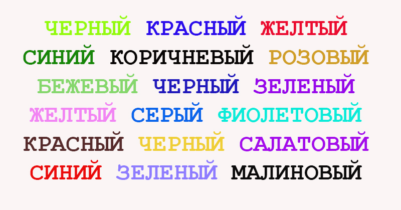
We get two conflicting values and have to spend some time to cope with the task.
Do you know what the biggest ambush for developers is? It’s not that hard to get used to. Practice for a day and you will easily name the right color, regardless of what word is written.
Whatever pirouette the developer has committed in his project, its meaning will always be obvious to him. And such “small” things as distances and the composition of elements simply slip out of perception without proper training.
The problem is that there are thousands of projects on the market today. And we are fighting for a fraction of a second of users’ attention. If the user spent them to understand, and not to have fun — no idea and no art will make our game better than the one in which everything is simpler and clearer.
3. Space saving (ergonomics)
Everything is simple here: the less space we take up with elements, the more it will remain for the game. And here the two previous rules work: “puzzleness” and correct visual groups of objects.
The ability to save space distinguishes an experienced UI/UX specialist from an artist who had to draw interfaces for the first time. The first one immediately divides the field into information zones and embeds elements there with bricks, looking for common forms for them. The second one usually draws the elements one by one, and then tries to dock them, which inevitably leads to the fact that some of the details cannot be inserted in any way, because ergonomics was not taken into account at the concept stage. And now all subsequent actions do not lead to a completely positive result.
Questions to the start menu Echo of Combats
On this screen, you can see a lot of such small moments: the characters are “grouped” to the upper edge of the field instead of being in the center, the title does not fit into the space around it, unexpected gaps, shifts or empty spaces come out somewhere.
This cannot be called a serious problem. All this is ruled by little blood. But everything is more complicated on the battle screen.
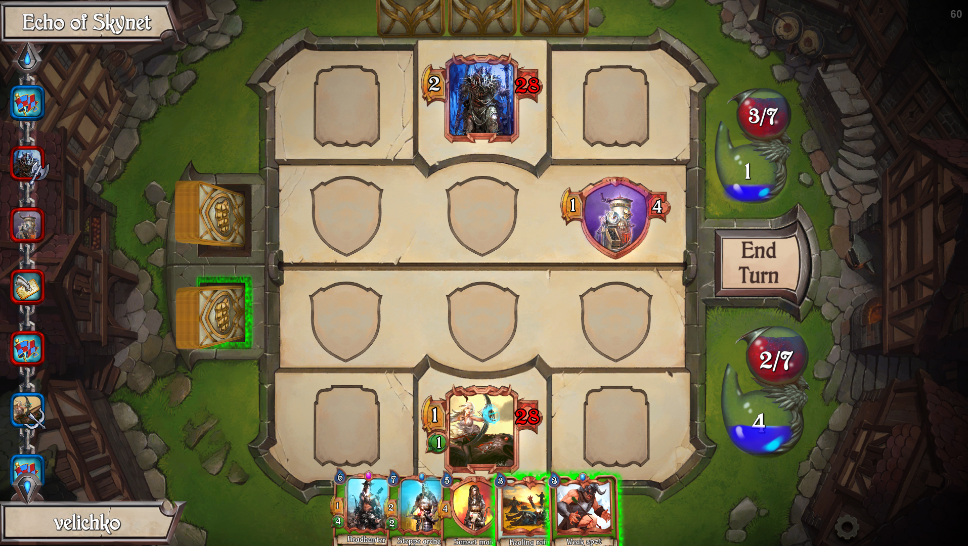
Analysis of the battle screen and map design

Echo of Combats Battle Screen (original)
Here we see an uneven situation: there is a lot of empty space at some points of the screen, and in others the elements “sit” on top of each other, trying to fit in a very small space.
However, if we take the source data as a constant, this story cannot be avoided. If the screen must be horizontal, the field on it must be square, the cards on the field must be exactly this shape (which is obviously due to game design) and so on, then the artist has the right to say: “I did everything I could in this situation.”
But we want everything to be done well and competently, right? To do this, before starting work on the screen, the composition should be designed. And at this stage, the artist should be able to change the situation as he sees fit, provided (!) preserving the functionality and the order of its perception.
Let’s remember how it was done in mobile Hearthstone — they did not try to fit the PC screen into the mobile version, the screen was very significantly turned over in terms of ergonomics.
The battle screen of the mobile version of Hearthstone
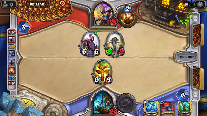
Yes, since we’re talking about him, let’s compare the screen of our game with that Hearthstone (sorry, guys, for such a treacherous move, but who else can we learn from, if not from the best).
The playing field in Hearthstone is slightly desaturated even in relation to the images of the heroes. And we clearly see all the information that is important to us: maps, mana, parameter values, etc.
Hearthstone Battle Screen
Let’s also try to slightly mute the playing field for the project being analyzed, to give emphasis to active elements.
Echo of Combats battle Screen (with muted background)
That’s a completely different story. The order of perception begins to build up, and we first notice important objects. However, this story will not completely solve the situation: in addition to the economics of the field, the design of maps is also of great importance.

Map Design Comparison Echo of Combats and Hearthstone
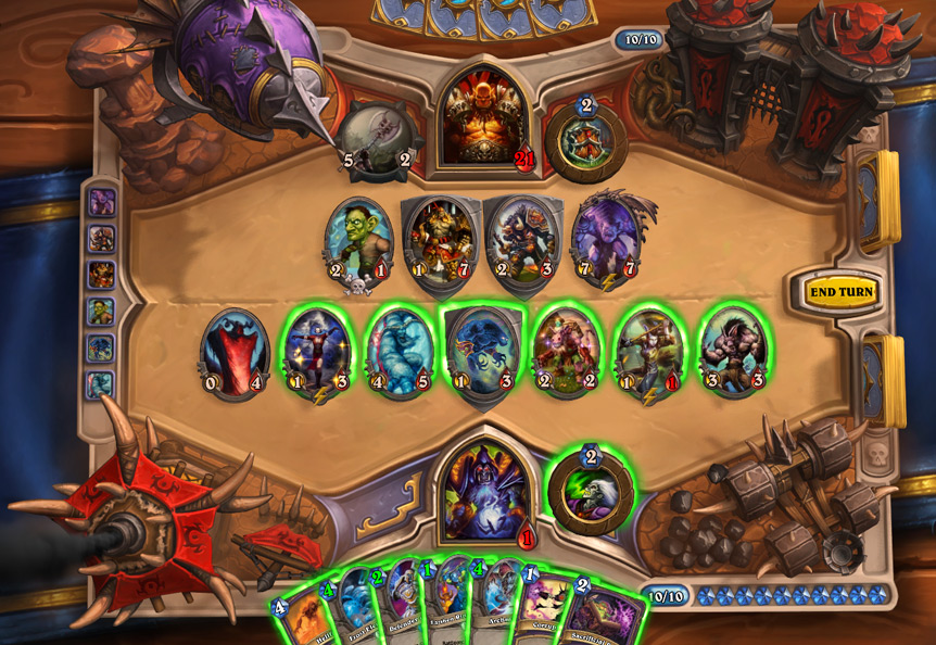
Let’s compare the sizes of the map parameter values. The numbers on the right are really huge, without any pity for the subtle mental organization of the artist (from an artistic point of view, I would never stick such an impudent six on my beloved card), but they are read instantly, whether the card is on the field or in my hand.
In the Blizzard game, the symbols under the numbers are also very simple and clear: a sword for an attack, a drop of blood for life, a crystal for mana. At the same time, it is not so easy to understand the left card: the sword and the heart are not read immediately, and I have not yet decided on the assumptions about the green object that it can be.
And the last thing is fonts. The smaller the font, the less accidents there should be in it — all sorts of serifs, prettiness and curves. A small letter should strive to the maximum to its own grapheme — the simplest geometric outline. Then the inscription will remain readable.
Everything discussed in this article concerns primarily the psychology of visual perception. The more the artist pays attention to this issue, the more functional his graphics will be.
You can delve into this topic endlessly, discovering new opportunities with each new level. After all, even psychologists don’t know everything yet. But to begin with, it’s enough for us not to forget about the three principles mentioned: visual order, correct accents and saving space. And then everything we do (not only interfaces, but also any playing fields, spaces and objects), we will be able to adapt for the viewer’s perception — and win those very few seconds.
If you are ready to disassemble other people’s projects or want to disassemble yours — write to alexander.semenov@app2top.ru with the theme “Working on bugs”.