Art Director of Playgendary Alexander Danilov shared with App2Top.ru your opinion about the features of UI development for mobile games.
 Alexander Danilov
HUD and UI in games are often given a secondary role. However, it is from the interface that the user’s relationship with the game begins, the interface creates the first impression of it and determines what the user’s interaction experience with its elements will be.
It is worth considering what the UI will be already at the stage of developing game mechanics. It depends on the game designer what the interface will be, how to adjust it to the gameplay and dynamics of the game.
Simplification
The UI should help the user to enter the game and at the same time not complicate the gameplay. This is especially important for casual and hyper-casual games. The user has no time to understand the management, because the interface of such games should be as simple as possible.
To make the interface better, you should leave on the HUD screen only what directly affects the gameplay, get rid of the text and additional elements, find a visual solution so that any user intuitively understands what needs to be done.
Another way to simplify the UI is to replace the status indicators with visual effects. For example, in some mobile shooters or platformers, the HUD does not include a health scale and a small amount of it is displayed by reddening the screen.
Note
An important function of the UI is to give feedback to the user about his actions in the game. In pursuit of maximum simplification, you can hide important information for the player. For example, in our Kick The Buddy game, we used a simplified UI to immerse the user deeper into the gameplay. In the sequel to Kick The Buddy: Forever, we brought a progress bar to the screen and immediately saw a positive effect on retention. What conclusion have we drawn from this? That even in a game designed for a casual player, it is important for the user to see the goal and progress.
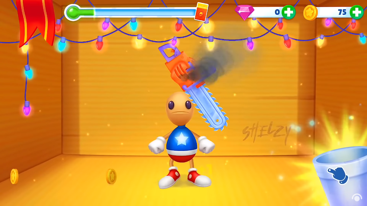
Kick The Buddy: Forever
Zero interface
Zero UI implies the user’s instant entry into the game: he launches it for the first time and intuitively understands how to play.
In its purest form, zero interfaces are found in sports simulators for Wii. The player puts on gloves with controllers and guesses that he needs to swing to make a punch in the boxing simulator.
In mobile games, a zero interface is still a rarity. It is used in hyper-casual games, shooters, but only in conjunction with the tutorial. Without training, an inexperienced player will not immediately understand the game mechanics. Even a football fan in a mobile football simulator will still have to explain how to hit the ball or pass, because the mechanics may not be obvious to him. Nevertheless, in any game, you need to strive for intuitive entry into the gameplay and, if possible, get rid of learning where you can do without it.
Note
A partial null interface can be introduced even into a complex game: add a button to disable the UI, as implemented in the third “Witcher”. This simultaneously enhances the immersion effect and leaves the player with the opportunity, if necessary, to turn on the UI and use the terrain map, compass.
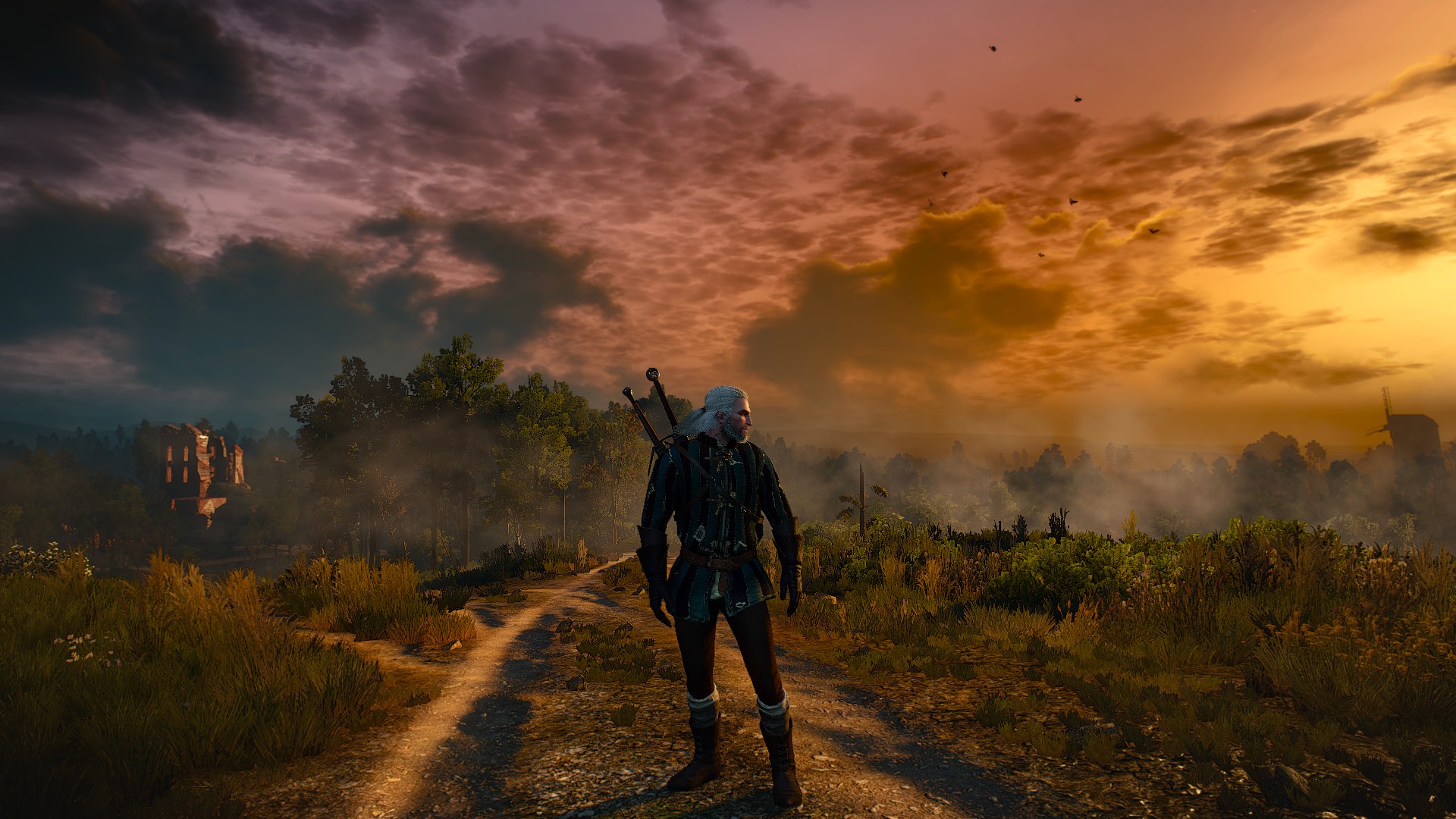
“The Witcher 3: Wild Hunt”
Integrated UI
In the integrated interface, all elements (from the health scale to the loading window) are inscribed in the game setting and become objects of the game world. A vivid example is the game Dead Space. In it, status sensors are attached to the main character’s spacesuit, and on the space station (the main location) there are panels with loading windows and character characteristics.
To integrate the UI into the setting, its elements must be intuitive and correspond to images from real life. In card games and casinos, the interface is organically integrated into the setting, since cards and roulettes were simply transferred from reality to the game, without changing anything.
In games of other genres, interface elements are placed in the setting not directly, but using images from life. For example, the character selection panel is presented in the form of an arena with heroes, an option for changing a costume is a wardrobe. We implemented something similar in the game Kick The Buddy: Forever — a red ribbon hangs from the top of the screen, which you need to pull to open additional settings, in the lower corner there is an urn where the player throws used items and weapons.
Note
The user interface should fit seamlessly into a certain setting. In Dead Space, the game takes place in the future, and the user believes that in 500 years such technologies will be used. If the developers tried to do the same in a game about the present, it would look artificial. In this case, it would be more logical to follow the native UI of modern systems, as in current devices.
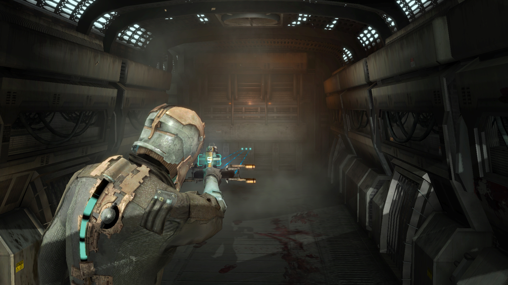
Dead Space
A guide to user habits
There are well-established rules for designing interfaces for each genre of mobile games. They are not changed so that users familiar with the genre can enter the game faster without understanding the management.
So, in our Partymasters game, we recreated the interface familiar to mobile clickers. With a lower tab, the value of the game currency at the top of the screen, a pair of side buttons and a free center. We also used well—established colors: green — for the Play button, yellow — for discount offers, red – for displaying important messages and new content.

Partymasters
Note
The past gaming experience of users imposes restrictions on the developer. And radically changing the UI, creating, for example, the second game of the series, is a big risk. Because the users who played the first part remember what the interface was like and got used to it. In the new interface, players will have to deal with other scenarios and the location of buttons. It is important to use the user-friendly interface for mobile games: players already spend a little time in the game (according to the statistics of our games, on average 10 minutes per game session). Therefore, you should not force them to spend these minutes diving and studying the settings.
An established user experience can be a problem not only for a franchise, but also for an entire genre. For example, mobile strategies. Users are used to having a lot of icons in the HUD of these games that you can click on to view additional information. Because of this, strategies always have detailed tutorials that teach players how to use a complex interface.
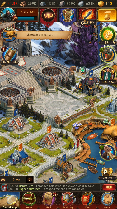
Vikings: War of Clans
Live interface
A modern UI should be plastic and lively. Games where the interface is created only to perform its basic functions immediately lose a large share of attractiveness for the player.
Each important element of the interface signals itself and attracts with the help of color, size, animation. It is important that the effects used do not irritate the player and do not drag all his attention to himself.
In the Partymasters game, a cat sits on the VIP Offers button, which attracts her to click.
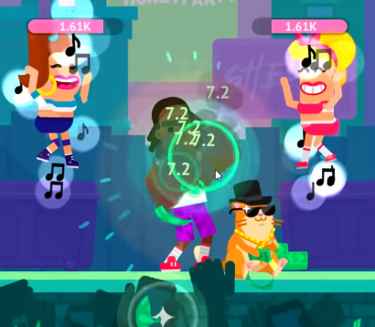
Partymasters
A good interface helps the player and guides him: when the user gets points, the character settings are highlighted in case he decides to upgrade it. To create such a responsive UI, game designers prescribe possible behavior scenarios in advance.
Note
More and more products with identical functionality are appearing on the market, and UI design can become a competitive advantage. From two identical games, the user will choose the one where the interface is more convenient and responsive.
***
UI design today is not only an interface, but also the impression it makes on the player. A good UI fascinates — buttons are pressed pleasantly, icons appear beautifully. It surprises and literally reads the user’s thoughts, predicts what he wants to do in the game, and shows the shortest path to the goal. Such small details help to create a game that users like and want to return to.