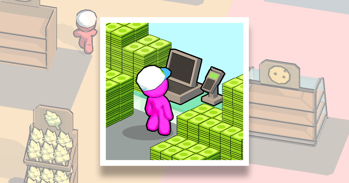
Sergey Martinkevich, Publishing Lead at Azur Games, told about successful game design solutions in the idle arcade My Mini Mart, which collected more than 70 million downloads last year.
The column is based on Sergey’s speech at the joint meetup of Azur Games and Google Ads, which took place in early spring and was dedicated to the development and monetization of hyper-casual games.
Sergey Martinkevich
In this material, I want to decompose a trending hyper-casual title into its components. Using his example, I want to show how to deliver content correctly, as well as build the initial game flow and progression.
The fact is that these three points are problematic places for a lot of projects. I constantly see developers around the world making the same mistakes over and over again.
I think this happens because rarely anyone studies the device of successful games in great detail, and this is almost the only way to understand how everything should work.
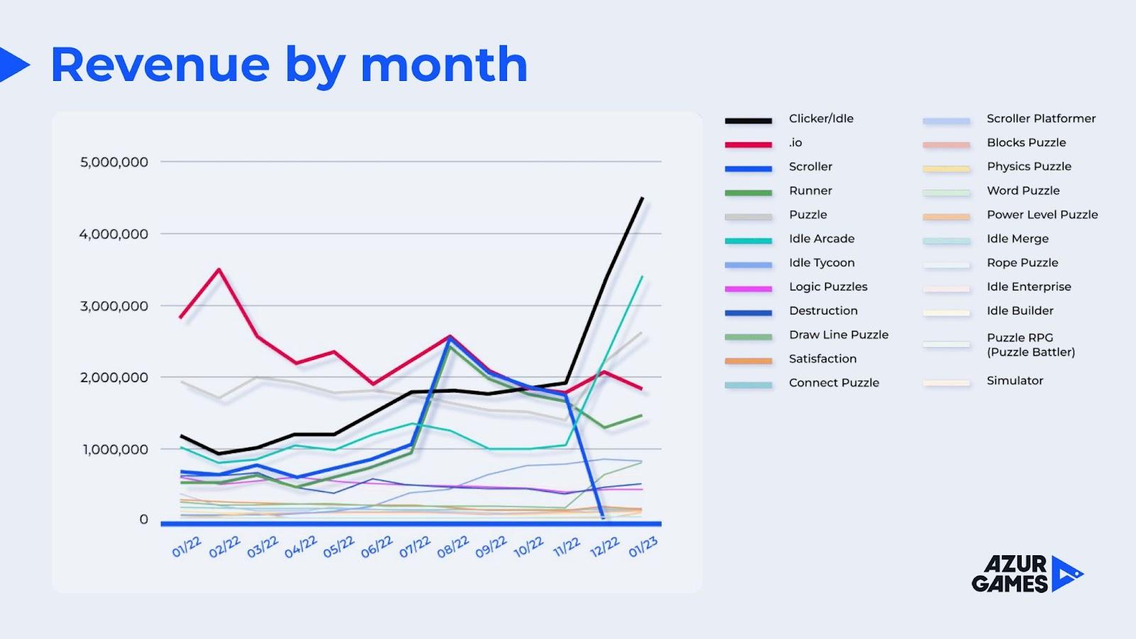
We will disassemble the idle arcade. Now this genre is being very well monetized.
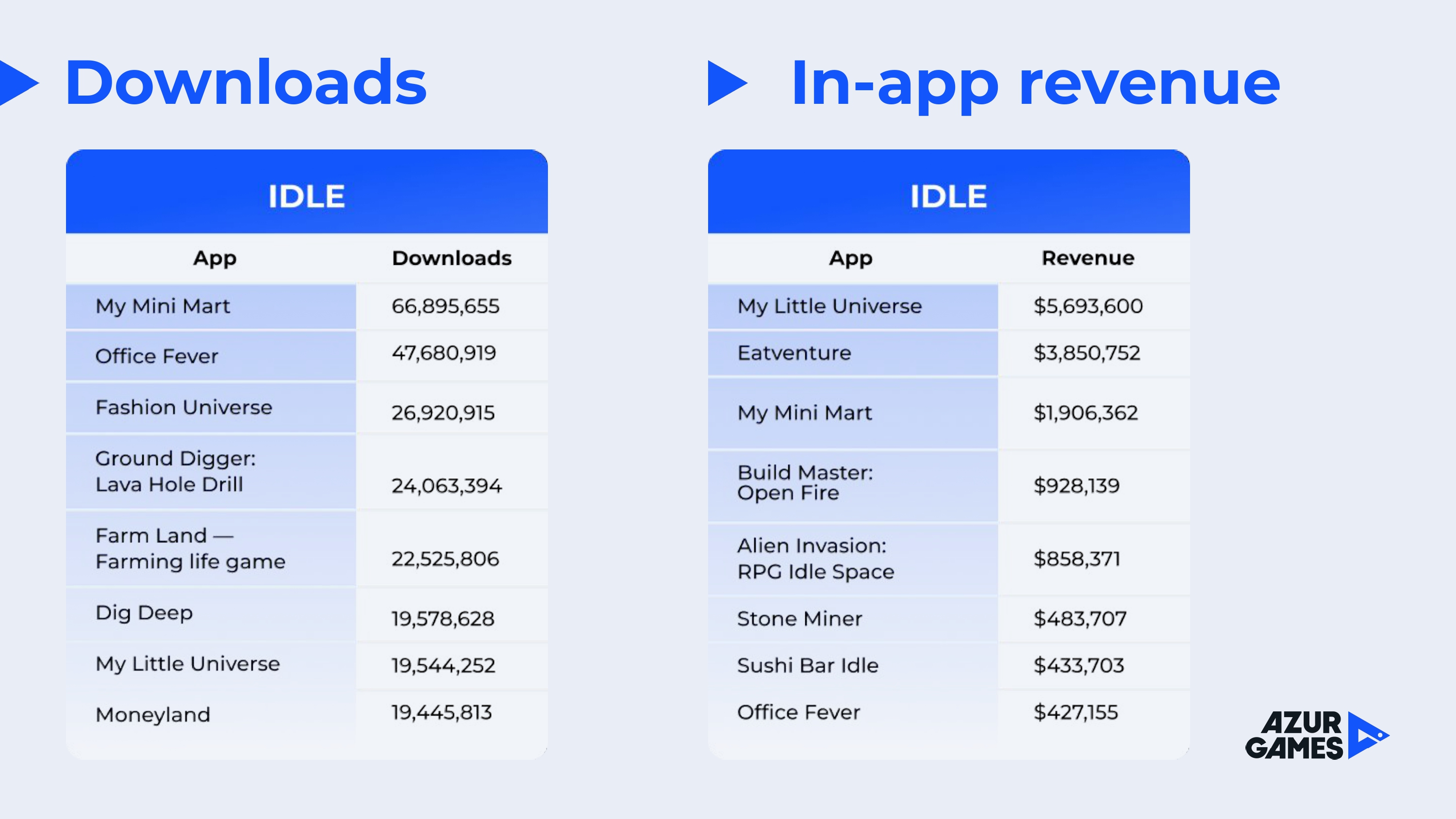
As a case study, let’s take My Mini Mart from Supersonic Studios — the most successful idle arcade game of last year in terms of the number of installations.
My Little Universe also has a great production and it earned even more, but when creating My Mini Mart, a couple of times they resorted to non-obvious game design solutions that are worth paying attention to.
The project was released at the end of 2021, but its success came in 2022.
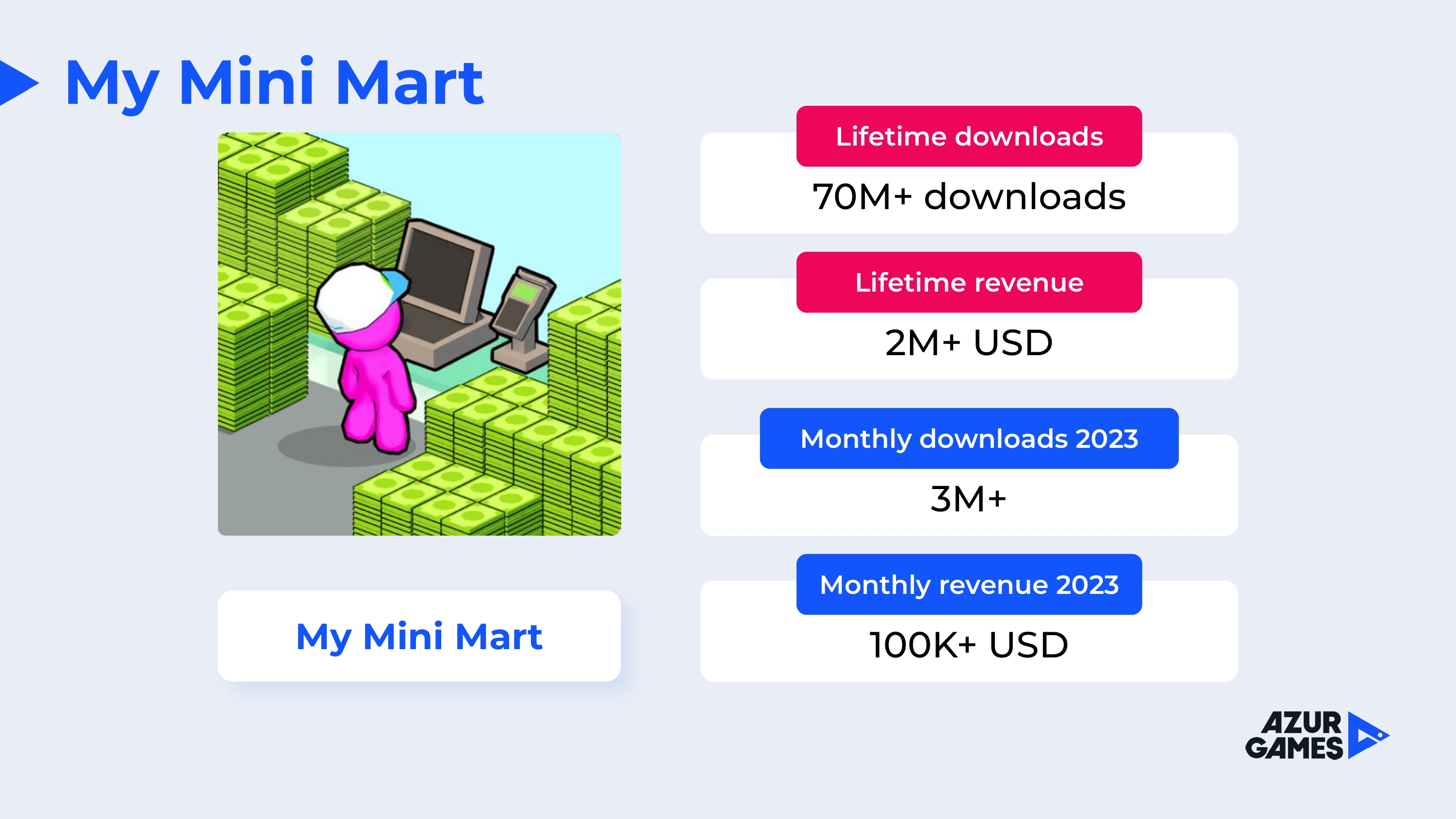
At the moment, the game has more than 70 million downloads, and revenue for the entire period of operation is more than $ 2 million, which is solid for a hyper-casual game. At the beginning of 2023, monthly downloads of the title were about 3 million, and revenue was over $ 100 thousand per month.
The game is a simulator of a store where the player is responsible not only for selling products and putting them on the shelves, but also for growing vegetables in the beds, rolling tomato paste, feeding laying hens and so on.
The player starts with a small empty stall, in which he is forced to run independently from a bush with tomatoes to the cash register. At the later stages of the game, the user has at his disposal a full-fledged automated hypermarket with its own cow and pizza oven.
The core mechanics looks like this: the player collects the generated products, places them on the shelves, then visitors come, pick up the products, approach the checkout and leave the money that the player spends on buying new product generators.
Since this is an idler, over time, the player puts automatic dummies on a number of functions, thereby removing the need to be responsible for all processes independently.
Let’s move on to decomposition.
My Mini Mart is a game about resource management. If so, then the development team had to involve the user through the cycle, explain the flow and immerse them in it. And she coped with it perfectly.
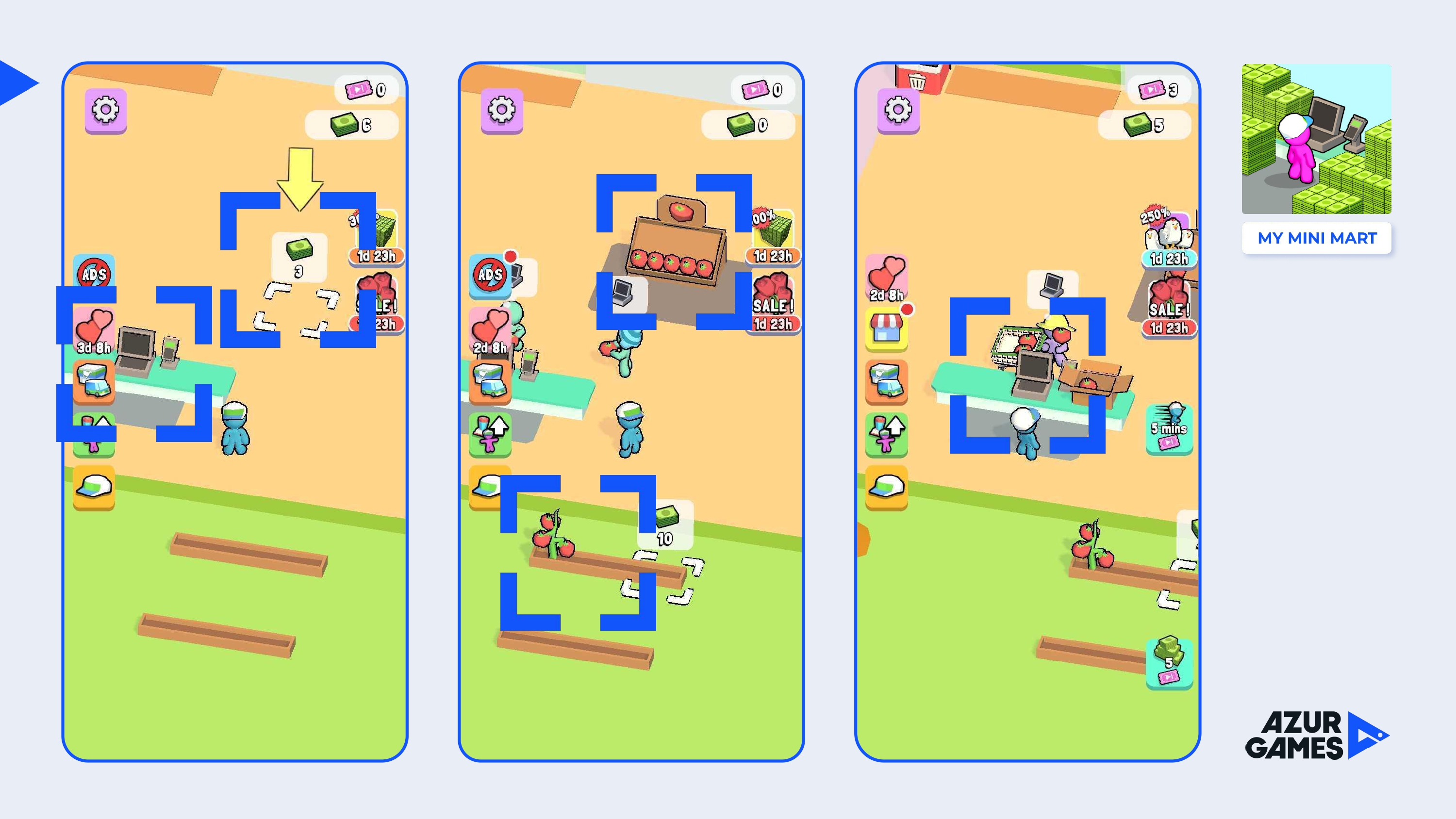
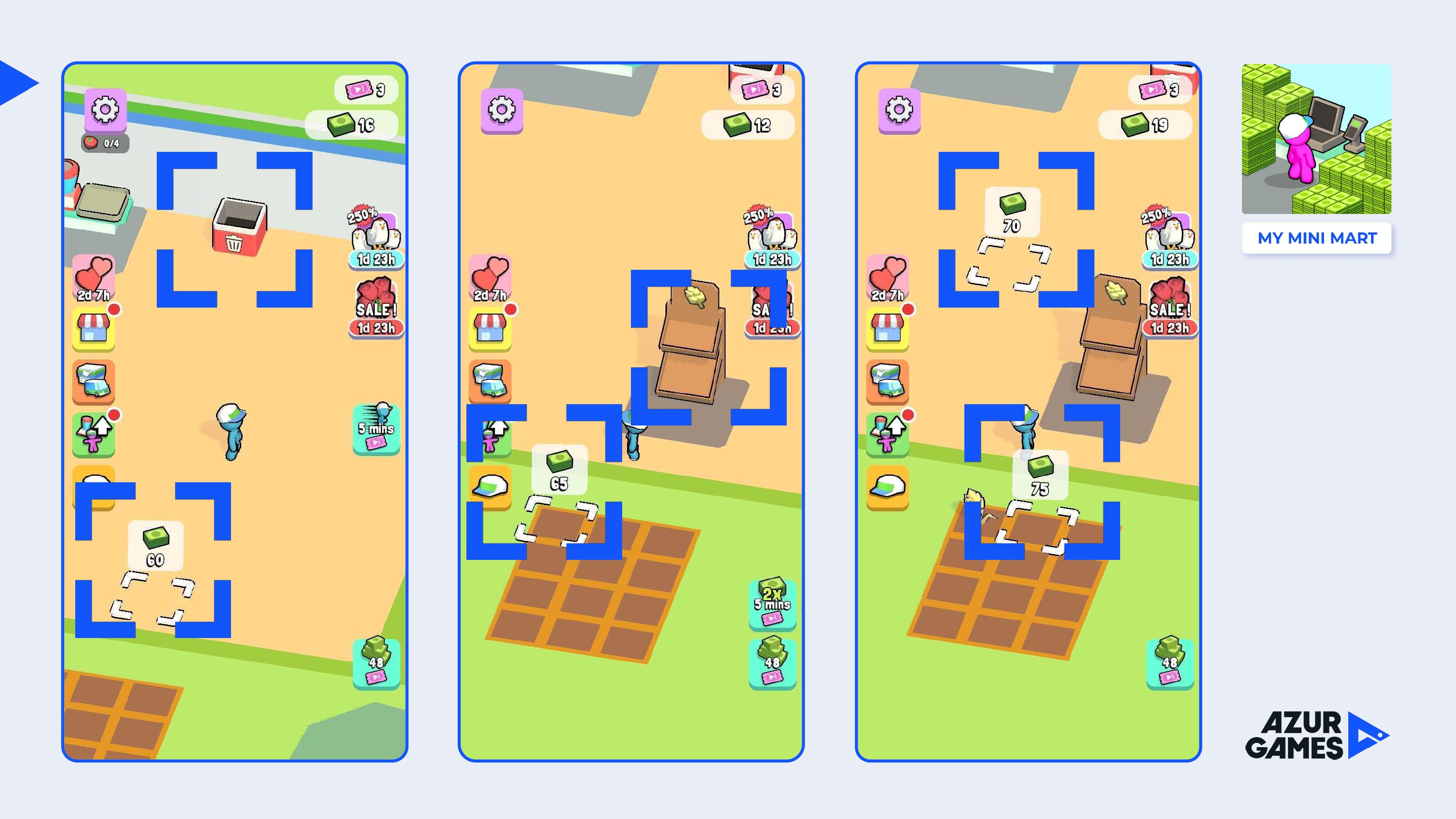
The tutorial is devoid of text. As part of the first cycle, the player is guided by arrows. They essentially explain where to put the character for further progress.
In the first seconds, the player is given to collect money and as a task they are asked to spend it on a cash register, a counter for tomatoes and seedlings. That is, it is immediately explained to the player what resources are spent on in the game, and at the same time they introduce him to the functionality.
The order of what the user is given to buy in the first seconds plays an important role. It may seem counterintuitive that the user first opens the cash register, then the counter and only then the source of the resource — seedlings.
But this is a great solution, because the player immediately sets a goal. I usually see the exact opposite situation in prototypes. Developers first open the player a source of resources to collect them, and only then a place where they will be useful.
What is very important at the start — the player does not spend more than two seconds moving within the first cycle. It is a very common mistake when a developer forces a user to run for five or more seconds somewhere far from the first points of interest. As a result, the game about resource management becomes like a running simulator.
The second key point is animations. All aspects of the game are animated: how tomatoes are collected, how they are put in boxes, and how the boxes are packed. It’s all nice to look at. So the routine itself turns into a pleasure. Partly because of this, My Mini Mart can even be attributed to meditation games. Often in games, the collection of resources or soft currency is done without any animations at all. Because of this, the player may not only become bored, but in general it may not be clear what is happening. There is no such thing in My Mini Mart.
Intermediate conclusions: do not force the player to run somewhere for a long time during the first cycle and try to animate every aspect of the gameplay.
So, using the arrows (in fact, this is the whole tutorial) for the first 20-30 seconds, the player goes through the first cycle. At the same time, after the tutorial, the player immediately understands what the game wants from him next (to buy more seedlings). Each next task in the game is highlighted with a price tag.
Yes, when an event occurs in the game (the exit of a new employee, the robbery of a cash register, the arrival of a wholesaler), the camera points to it.
The function with focus is also relevant when it comes to a small game location (as at the very beginning of My Mini Mart). It’s not always possible to notice something on a small screen overloaded with animated objects.
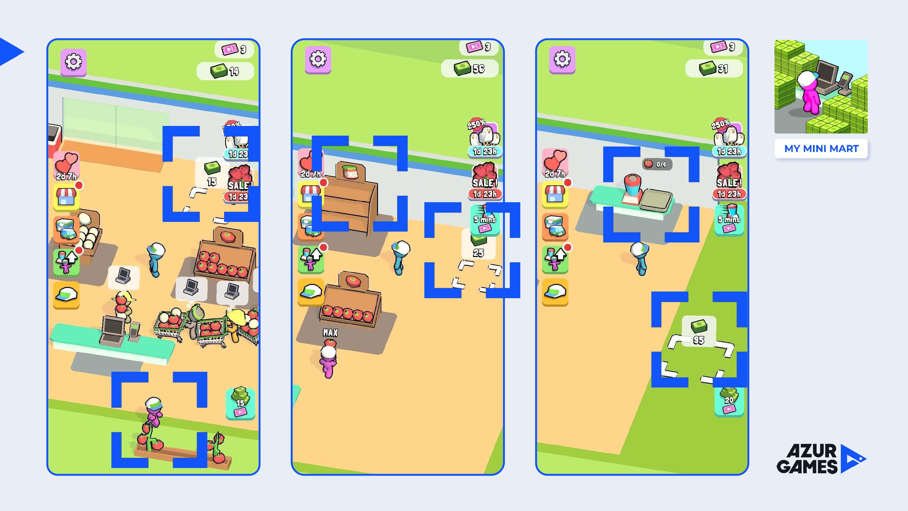
After the bed, a new spot appears, and this is a counter for chicken eggs.
But the player does not have chicken eggs yet, as it was with tomatoes at the very beginning. What does it mean? This means that the developer forces the entire previous cycle to be played again, without providing new content to buy a chicken coop. This is a great solution.
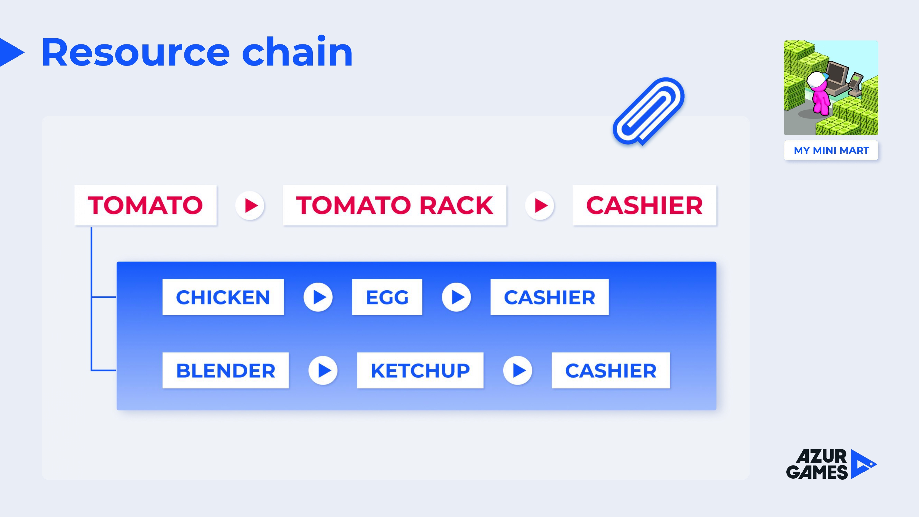
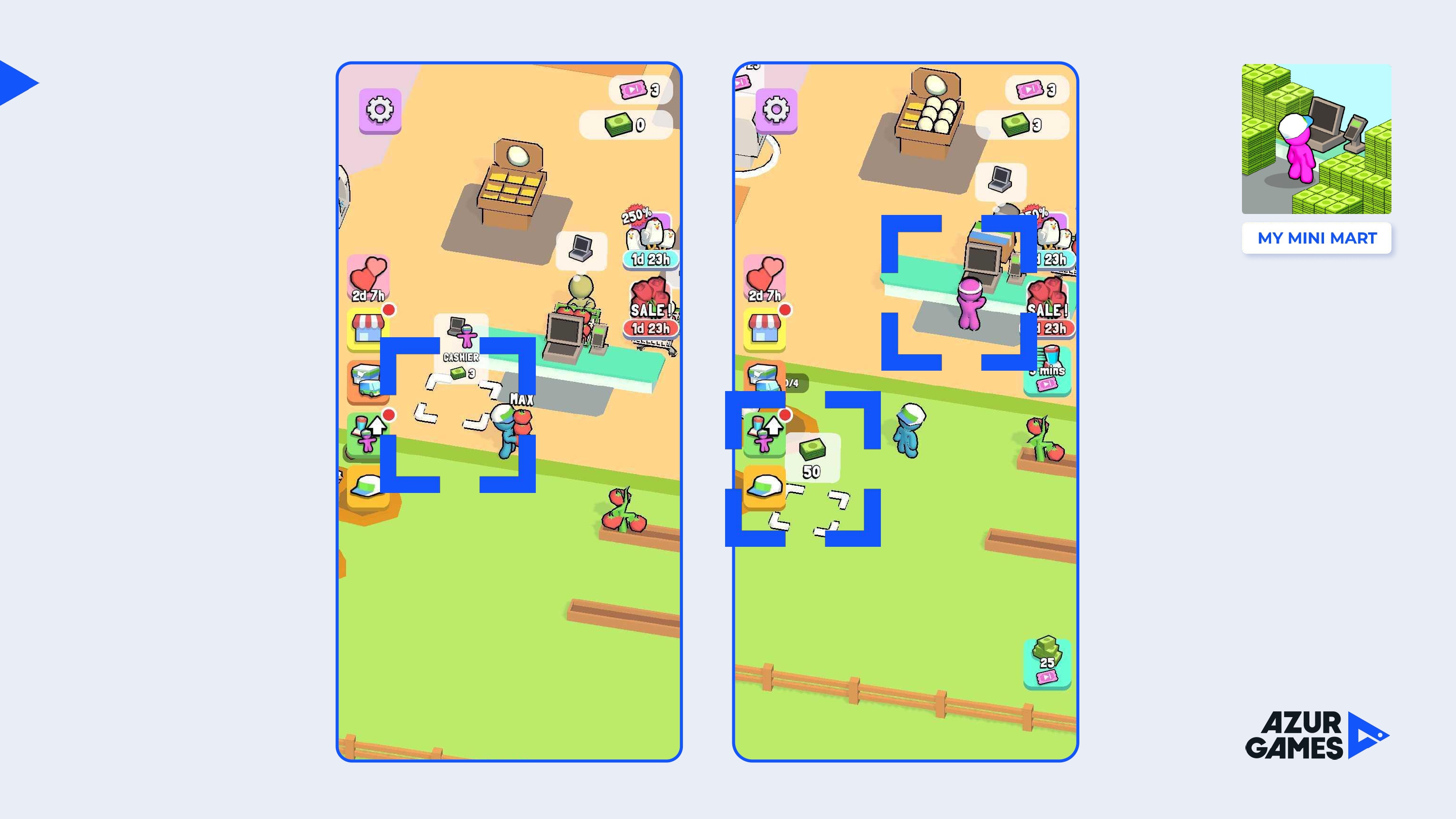
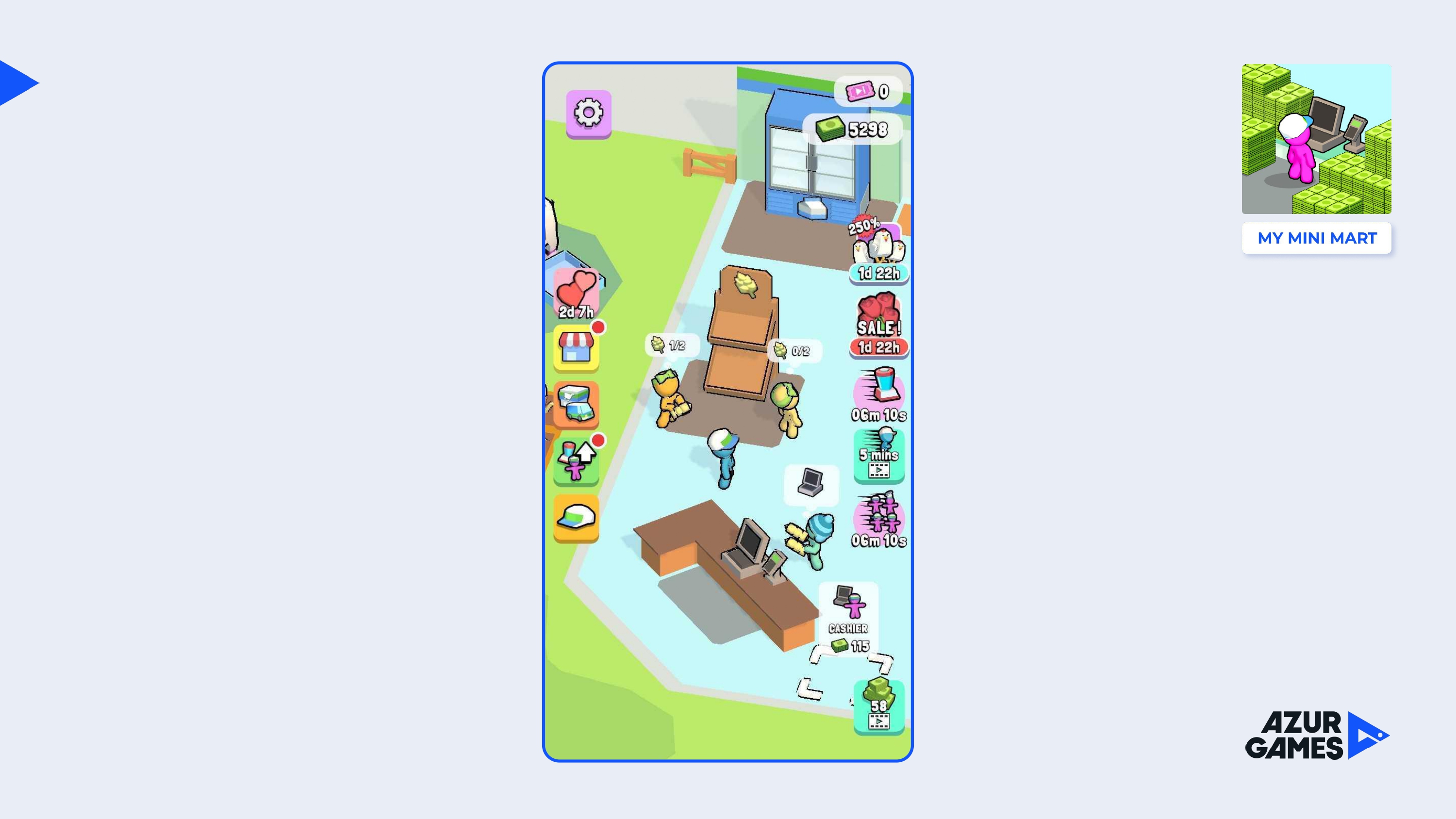
As soon as he opens the chicken coop, the production chain becomes longer. To get eggs, the player must feed tomatoes to the chicken (not very logical, but funny). Eggs are placed on a special counter, from which customers take it, take it to the cash register, after which the player collects tomatoes, carries it to the chicken… Etc.
I liked the approach in which the developer motivates users to continue playing without even providing any new content. And it’s not boring.
Also, after opening each spot, the game shows that there is another new place. Every time the user gets motivated to research.
Then the game offers to automate part of the processes: hire a merchandiser who will help with the display of goods on display.
Hiring allows you to slightly reduce the pace of the game, relieve stress from the user, who by this point begins not to have time to serve the queue of customers on time.
Then again you need to earn a large sum to open another showcase. The game is again forced to play the two previous cycles. At the same time, the player is motivated, he understands that there will be something interesting next, he is ready to explore. He collects the amount, opens a rack for tomato paste, then opens a blender to create it. So the production chain of resources becomes even more complex. This is not often found in hypercausal titles.
Moreover, the player now constantly has a choice: send tomatoes to their own showcase, feed them to a chicken or make a jar of tomato paste out of them.
Now there are longer production chains in the game.
The main thing is that such chains are not too complicated and boring. Three products in the chain are enough: it’s not boring, and you won’t get confused.
Back to flow. After the blender, a new expensive option appears — the cashier. Now the player is not needed at the checkout when working with customers. Part of the work is being automated again. The player may be more focused on resource management.
After opening the cashier, the first dilemma appears. You can either open another chicken coop, or start saving for the expansion of the store area. That is, either existing production chains can be strengthened, or research can be done.
In the end, the player still opens a new playground, where he sees a new element — a garbage can.
The trash can allows you to throw away unnecessary resources.
Some developers are wrong when they give a trash can from the very beginning of the game. This only adds noise to the screen. At the beginning of the game there are no dilemmas, problems or situations with unnecessary resources. Moreover, a garbage can — that is, a situation when you need to throw something away – is not the most pleasant gameplay experience. But in My Mini Mart, it appears for free along with a new location and just at the moment when it becomes necessary.
In addition to the trash can, a new spot appears — this is another showcase, but this time not related to tomatoes. The player understands that, perhaps, it will be a new chain, the same long, but most likely unrelated to the previous resources. So the game motivates you to go through the previous cycles again in order to open a new resource and launch a new chain. As a result, the user will build two or three more resource chains within these locations.
After a while, it becomes possible to raise enough money and move to a new site. This can happen in 30-40 minutes of the game (it strongly depends on whether the player spent real money to speed up or watched ads). But in any case, the new market is a medium—term, not a short-term goal.
A new market means that you can start anew, where there will be both old chains and new ones. This approach to game design again allows you to save content. It’s about continuing to give a pleasant gaming experience without offering new content (or offering little).
But this does not mean that there is not enough content in the game. Another thing is more important — it is dosed, which allows the game to motivate players to explore, to uncover more and more new production chains.
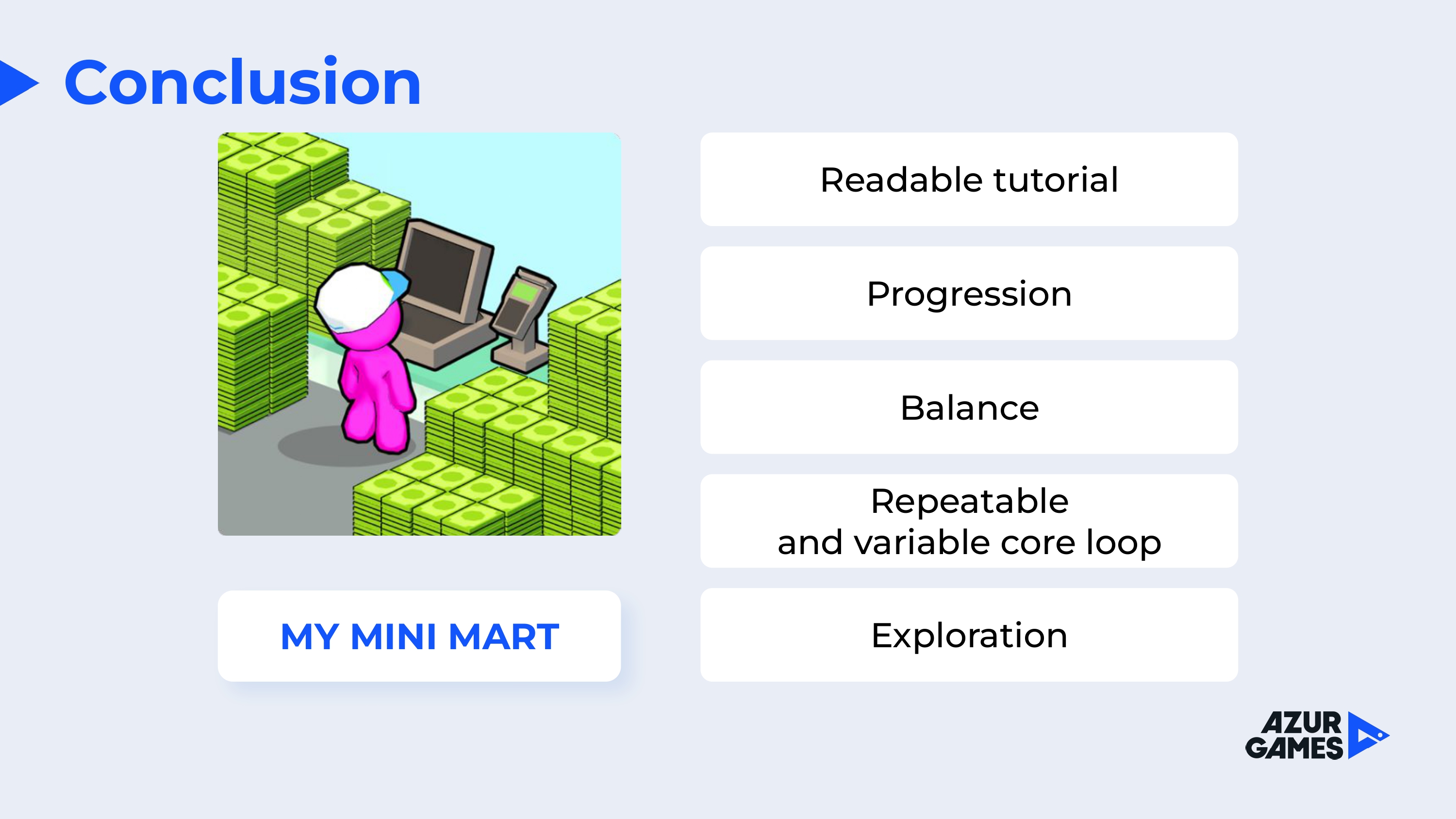
Let’s summarize briefly: the game has a clear tutorial, a replayable loop, a good balance, plus it constantly gives a sense of progress and research.
Let’s move on to monetization.
As in any hyper-casual game, My Mini Mart has a full-screen advertisement that is activated up to several times per minute (unlike hyper-casual games with a short session, videos do not appear here between levels/attempts, but right during the gameplay). It is disabled by a separate IAP.
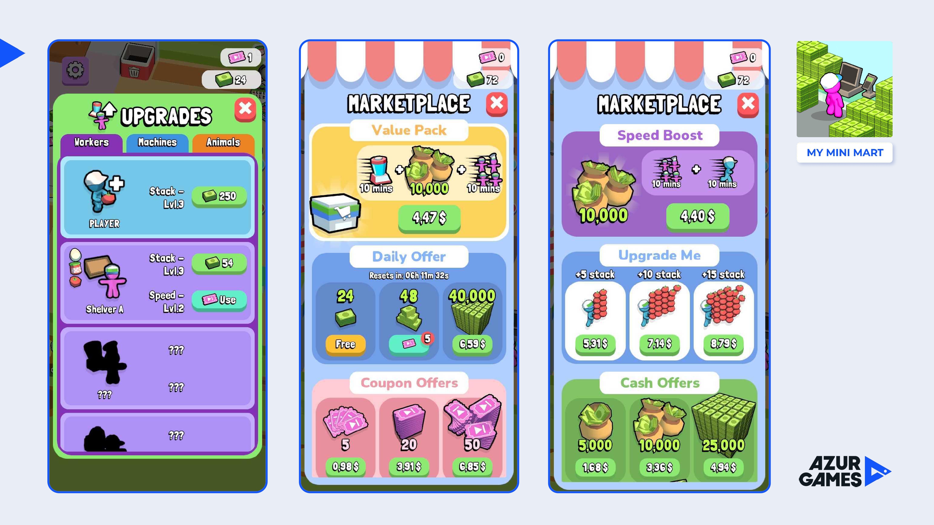
In addition, it is possible to buy hard currency in the game, which is spent on upgrades, temporary boosters and simply on soft currency, which can be spent directly to accelerate progress.
With their use, the game becomes much more comfortable, so we can talk about their real value for the player, which can motivate to buy.
***
This is about how successful games can be decomposed. Such work always allows you to better understand why a particular project has achieved high results. This can also help in your own development.

