Igor Klyukin, Pixonic‘s executive director, shared his experience working on the logo for War Robots on his Facebook page. App2Top.ru publishes a post on its pages with the permission of the author.
While working on the task of developing a new logo for War Robots, I once again became convinced that in any business there are a lot of little things invisible from the outside, the knowledge of which distinguishes an amateur from a professional and can be comprehended for a lifetime. I want to share my small, but no less interesting experience with logos for me.
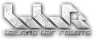
From changing the logo, we wanted to achieve better readability so that the user could find the game by the logo located in the corner of the video broadcast of the esports match. The previous WWR logo did not meet such requirements.
After we received several variants of the new logo, I hung up. I didn’t like them, although they satisfied our TK and looked like a logo.
A large symbol at the top and a more readable font at the bottom – such variants of new logos were offered, and this is exactly what our current WWR logo looked like, shown to the performer. The symbols were abstract and clearly readable, stylish and not very. None came up. Readability was present, but something was missing. It took me some time to formulate a correct feedback or understand an error in the statement of the TOR.
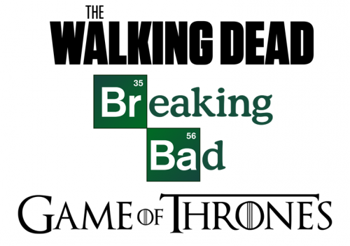
In the evening, when choosing a series to turn off the brain for the next 40 minutes, I noticed that the “logos” of the series are stylized names of the series: The Walking Dead, Game of Thrones, Breaking Bad. No symbols on top of the name! The symbols are characteristic of company logos, product logos use their own name. The whole problem was related to the lack of a correct reference!
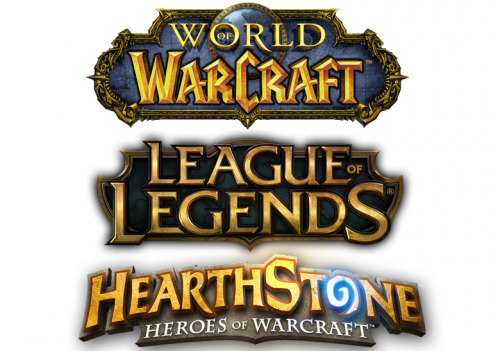
After understanding such a simple truth, things got easier. Logos of games, as well as TV series, followed the rule “name = logo”: World of Warcraft, League of Legends, Hearthstone. Only these names were written in a special font and were located on an epic substrate and … the games, rather, belong to the fantasy genre. Let’s move on!
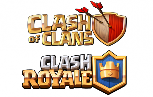
Mobile Clash of Clans and Clash Royale do not use any substrates, these are three-dimensional letters and some kind of “physical” attribute on the side (not on top!). It’s already more interesting, I paid attention, but we don’t fit, we need more data!
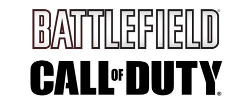
Shooters and futuristic setting, watch the games: BATTLEFIELD, CALL OF DUTY. A simple “flat” font, without underlays, symbols or attributes. Interesting!
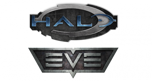
Halo and EVE – the letters are partly symbols. Stylish!
Now I understand. Initially, logos were considered more suitable for companies, hence the problem arose. The logo is there, the name is readable, but you subconsciously realize that it does not fit. Now there was an awareness of why. And with understanding, it became easier to adjust the TK:
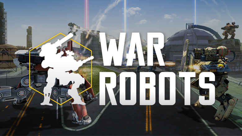
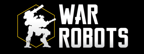
We take a relatively simple font; there are no substrates, as for “fantasy”, it is not necessary to attach a strong and “casual” volume to the letters. But making symbols just text is a risky activity. Some eye-catcher is needed, but we just come back to the question – what kind of symbolism? Abstraction is not needed, the idea arose to use the canonical silhouette (minimalistic!) of our robot “Knight” in yellow hex. There is also visually embedded information about what the game is about, and there is something to consider with the eye.
I didn’t watch the series then, in my opinion…