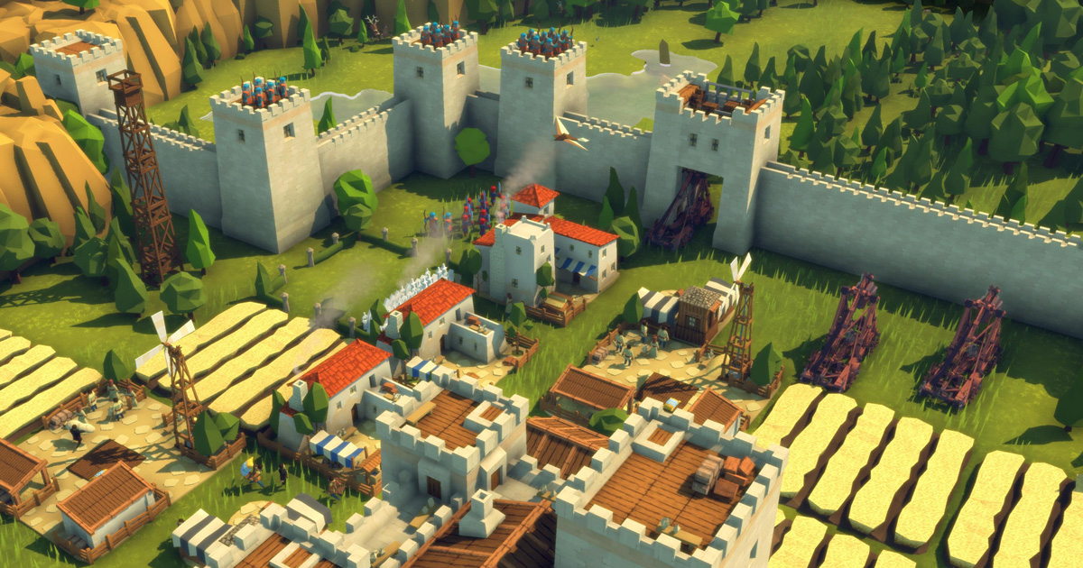
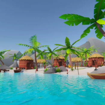
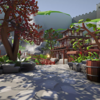
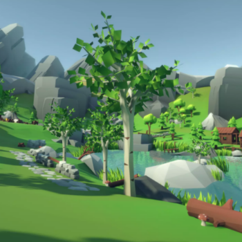
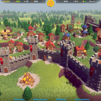
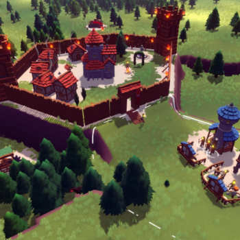
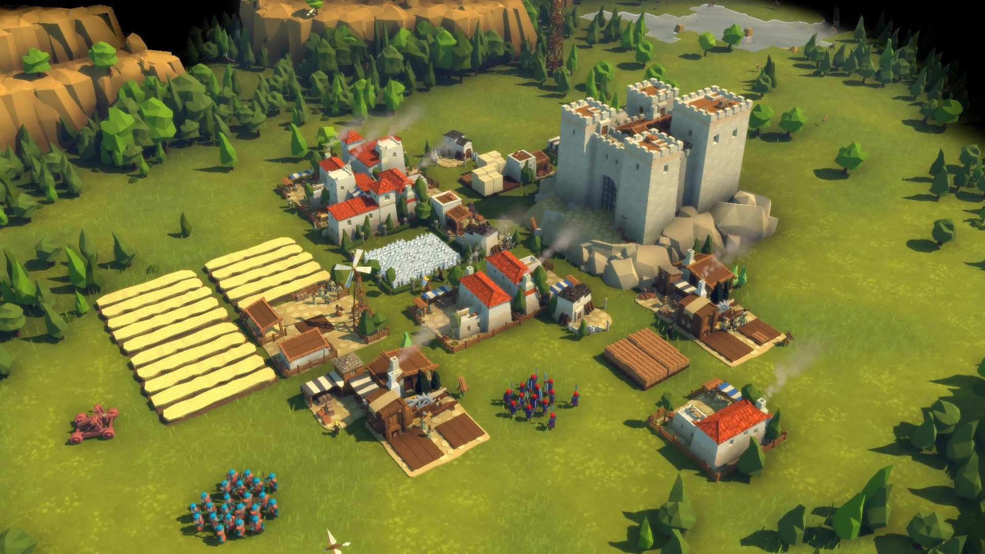
Why Diplomacy is Not an Option is made in a low-poly style and what principles they tried to adhere to when working on graphics, — Alexander Maslyukov, the leading artist of Door 407, told at the Talents In Games Conference.
Diplomacy is Not an Option
Why was the loupoli style chosen?
The main backbone of the team that created Diplomacy is Not an Option for a long time consisted of only three people. Of these, only one employee, who was then working part—time, was responsible for the graphics 70% of the development time,” Maslyukov shared.
With such limited resources, it was immediately clear to the team that the graphics in the game could not be too complex and detailed. In addition, they believed that the approach to the visual style should be determined by the gameplay, and not vice versa.
Diplomacy is Not an Option is a real—time strategy game (RTS) in which the player builds a castle and defends against numerous enemy armies. Here, the readability of what is happening on the screen should be in the first place. It is important for the player to quickly understand the disposition of troops, the level of buildings built, and much more.
Excessive detail in such projects, on the contrary, is harmful. As for loupoli, this approach is ideal for strategies. When using it, the readability of objects, as a rule, remains at a high level.
What is loupoli like
Loupoli can be different. You can’t just say “we’re making loupoli” and get down to business. To begin with, it is necessary to determine the approach within the framework of the chosen visual style, to find one that correlates with the additional tasks assigned to the project.
The Door 407 team initially wanted the graphics of the game not to become outdated over time (4 years were laid for development), not to depend on the fashion for certain trends, it would be visually recognizable and, yes, with all this, it would remain executed in a low-poly manner.
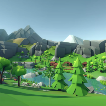
Loopoli is usually understood as graphics, where a low-polygonal grid is used in objects. Classic loupoli is like chopped objects without any textures. Instead of them, almost exclusively — color fill.
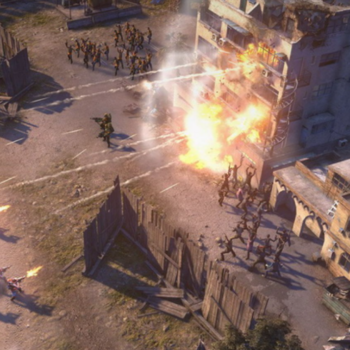
Classic loupoli
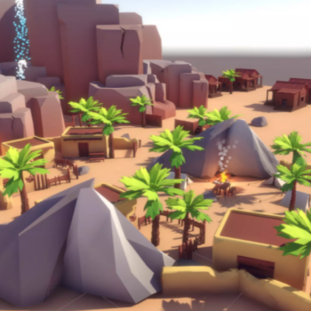
Maslyukov also highlights such an approach as “loopoli with pluses”. Its key difference is a much higher density of parts. The polygonage of objects continues to remain small, but thanks to the use of a large number of primitives and simple textures for detailing objects, the picture changes significantly.
Loupoli with advantages
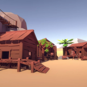
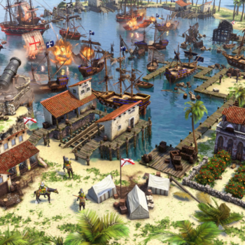
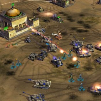
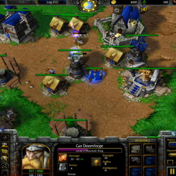
Alexander considers the most common approach to graphics in strategies to be high-poly stylistics with low polygonage. Simple models with grid constraints are still used here. However, the objects look very detailed, because this approach uses complex, detailed textures.
Highpoli-stylistics with low polygonage
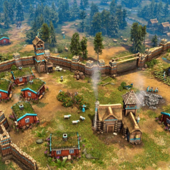
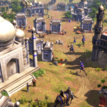
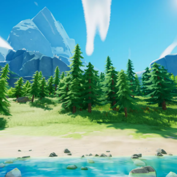
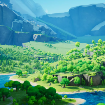
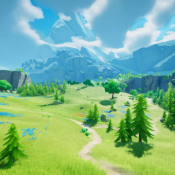
Also today, the loupoli style has become widespread, which in fact is not. We are talking about an approach when using models with a dense grid, but without complex textures. Alexander calls this approach midpoli with loupoli-style.
Midpoli with loupoli-style
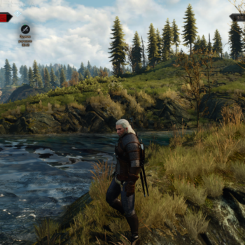
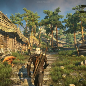
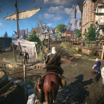
The style is really at first glance very reminiscent of loupoli. However, Alexander points out that, in fact, the grid of objects in the presented scenes is hardly inferior in density to the grid of objects in The Witcher 3. The key difference is textures.
The Witcher 3
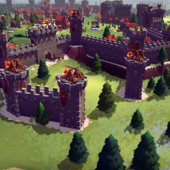
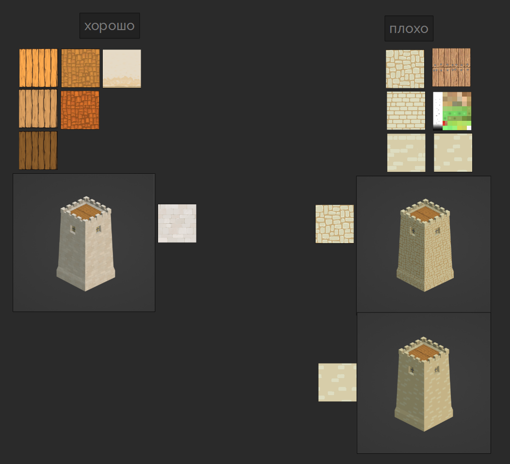
Going over various approaches to graphics, the Door 407 team eventually settled on where a low-density grid and simple textures are used.
“We have developed for ourselves an option where the loopoli grid comes with a slight refinement of the texture. Thanks to this, the game became similar to classic strategies, but it did not require a lot of time to create prototypes by just one person,” says Alexander.
Sources of inspiration and references
Recognition was also important for the game. The project had to stand out, including at the level of approach to the color palette.
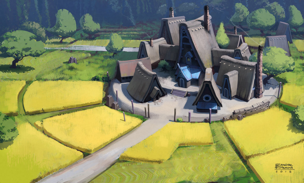
When working with color, the works of the artist Andre Mealha were chosen as a reference.
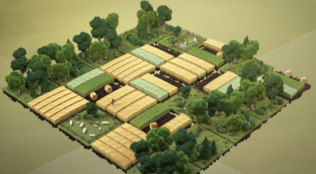
Also, Alexander, working on graphics, was inspired by the palette and approach to graphics of Uli Henrik Streckenbach and Ronny Schmidt, who were responsible for the design of objects in the video Let’s Talk About Soil.
Diplomacy is Not an Option achieved visual recognition not only with the help of tools and approaches to graphics, but also thanks to the architectural style chosen for game buildings.
In the game, buildings are divided into two types — civil and military buildings.
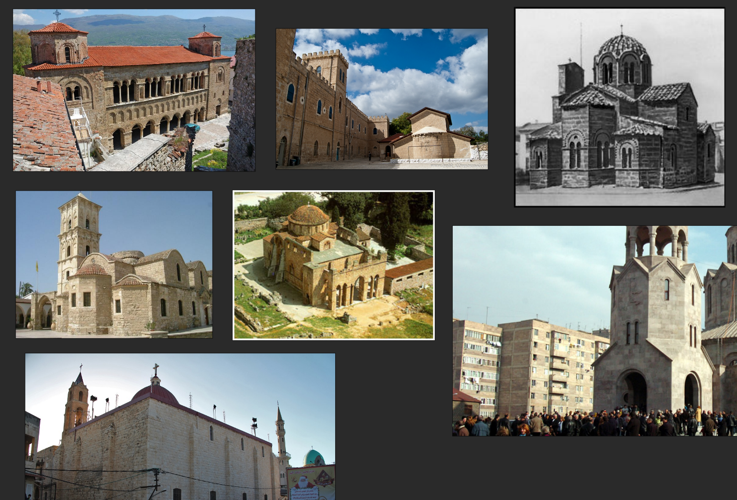
For the former, the architectural style of Byzantine and Roman buildings of the 12th and 13th centuries was chosen as a reference.
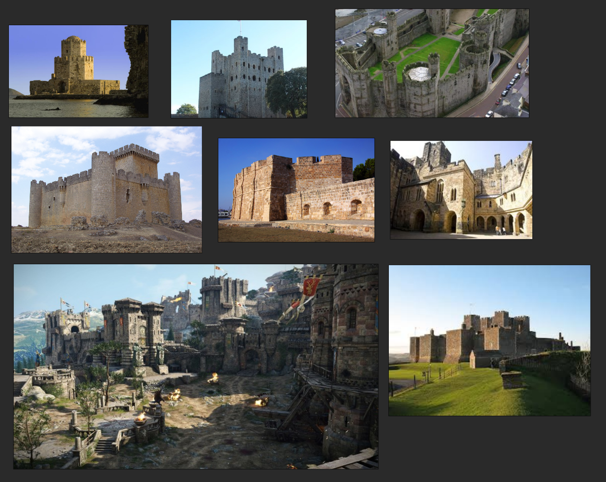
As for military structures, they focused more on the visual style of the Spanish fortifications of the 11th-12th centuries.
Principles of working on graphics
So, the Door 407 team decided on an approach in which game objects have a loopoli grid and the simplest possible texture.
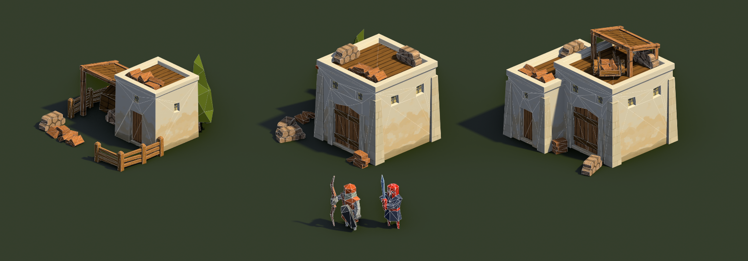
However, the developers did not want the picture to look poor or faded. Therefore, they came up with the idea of detailing objects by reusing simple elements. Also, to bring additional gloss, we decided to pay special attention to lighting.
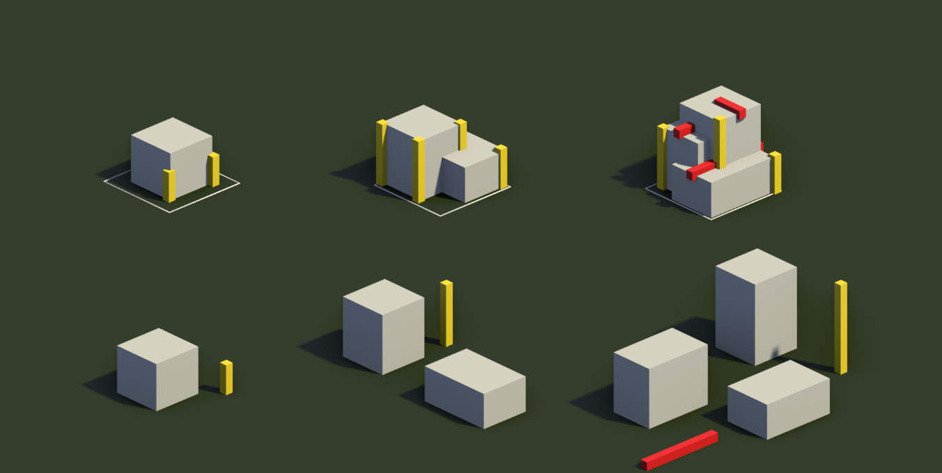
When detailing an object, there is a risk that it will become less readable. The problem will get worse if there are several such objects — each with different functionality — on the screen. The player will not be able to navigate comfortably in what is happening.
To avoid this, developers:
- we made buildings of different types as different from each other as possible;
- with the growth of the level of construction, a) a coefficient X was laid for each type, by which the building increases from level to level, b) objects were added that were not previously present in it or present in a not so noticeable amount;
- we tracked the scale for all objects, preserving the integrity of the image.
Thanks to this, the developers have ensured that the user always catches the difference between the same objects of different levels.
In addition, Alexander noted that as the development progressed, the approach to working on textures changed a lot.
Initially, they were bright, focusing attention on themselves. This had a negative effect on how objects are read. Therefore, the textures were made as muted as possible.
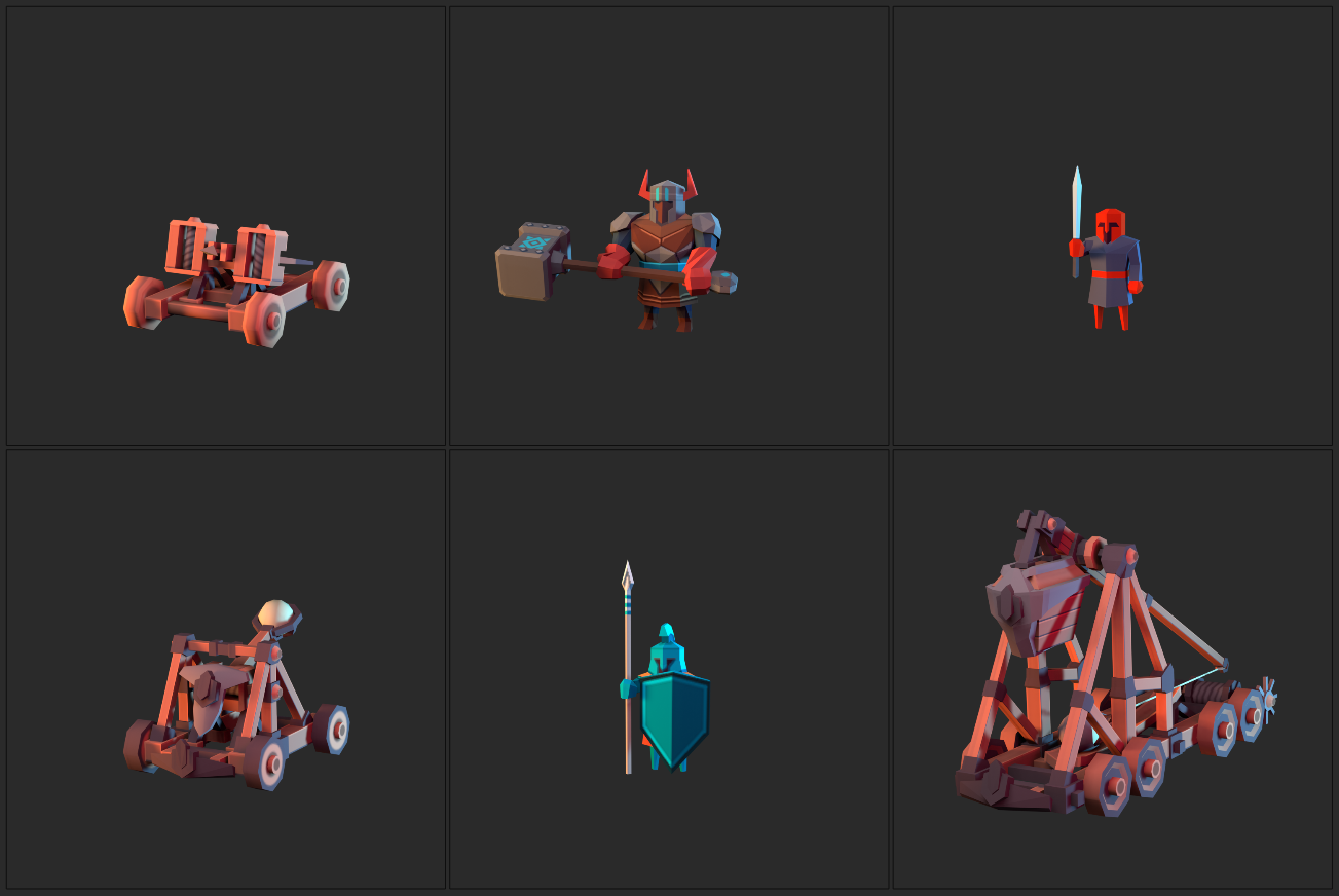
When working on units from textures in general turned out to be. They would have stopped being read. Their detailing went due to an increase in the density of the grid.
Here, by the way, Door 407 followed the following rule formulated for itself: the smaller the object, the more detailed it is, the denser its grid. The opposite is also true.
In conclusion, Alexander stressed that when developing a game, the gameplay is determined by art. Otherwise, you should not work.
***
On the eve of the report, it became known that Diplomacy is Not an Option entered the top 20 of the highest-grossing Steam new products for February. Recall that in the first six days of sales, the game earned more than $ 1 million.

