Creating user interfaces is one of the most important tasks in game development. Evgeny Lazebny, designer, developer and director of Tapteek, spoke about this process based on his experience and gave some practical advice.Evgeny Lazebny

When we talk about the user interface, we mean much more than just beautiful screens with cute buttons.
The process of creating an interface for the game can be divided into two parts:
- UX Design — how the user interacts with the interface;UI Design or GUI Design is the visual component, the most beautiful pictures and buttons.
- UX Design
To understand in which direction to move, first you need to structure all thoughts about the project.
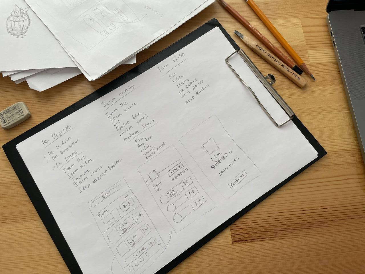
At this stage, enough paper and pencil.
It is necessary to write out all the key interface elements that should be in the game and that will affect the gameplay. Then you should break them into the intended screens: menu, setup, pause, store, screen during the game.
These will be very generalized groups to create visible logic with their help. As a result, you should get some kind of map or tree. Over time, it can be refined, modified and improved.
Then you can proceed to the first sketches of the interface (also on paper) to arrange all the elements inside the screens we need. Sketches on paper allow us to quickly work out different options and combinations in an attempt to find the most suitable one.

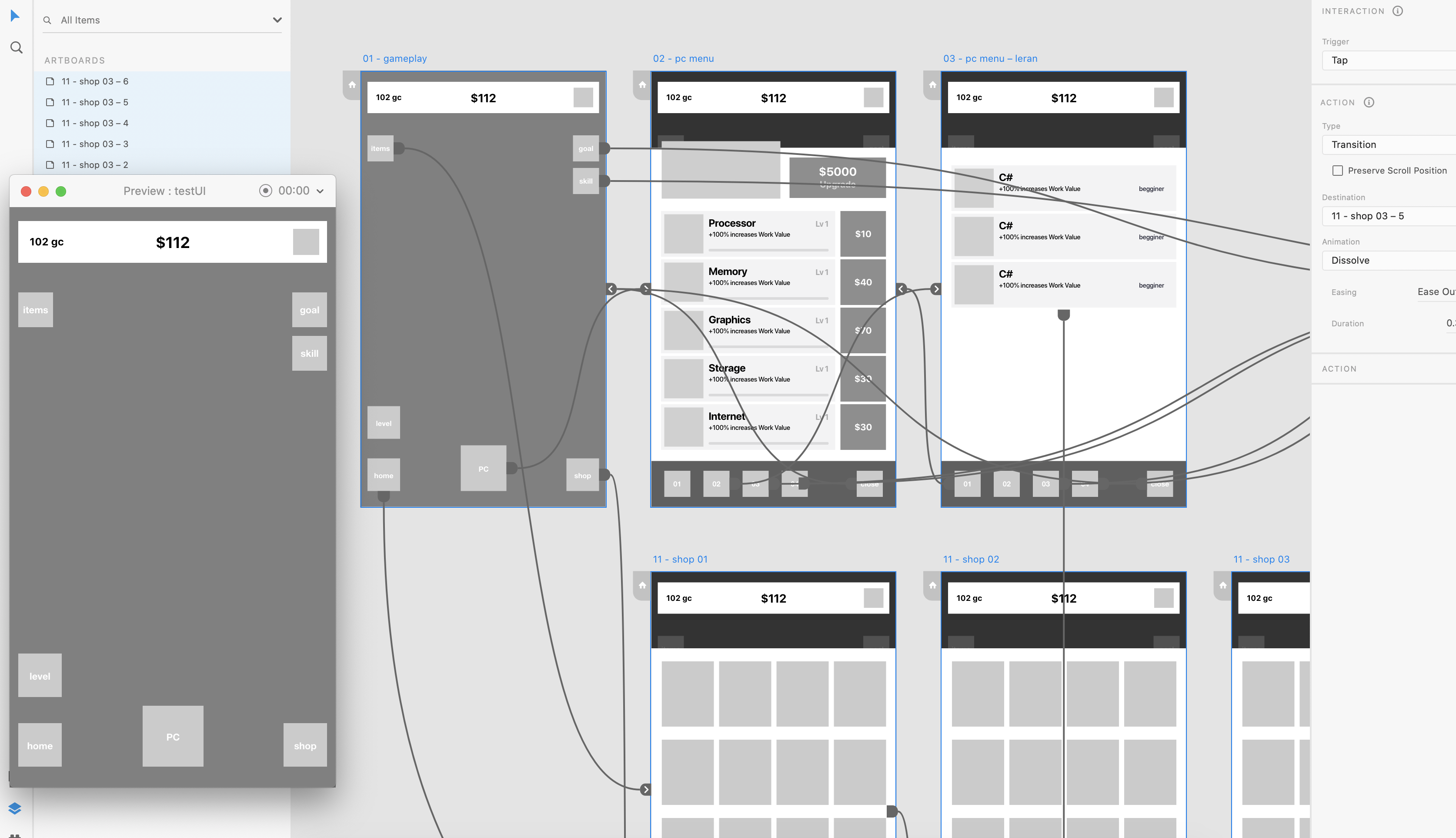
PrototypeNext, we can move on to an application that will allow us to arrange all our developments into a clear prototype of simple gray blocks.
I prefer to use Adobe XD, but any of its analogues like Figma, Sketch, InVision and others will do.
The beauty of such editors is that, in addition to simple sketches, you can assemble interactive prototypes in them, create connections between objects and windows, and then test them there. This will allow you to see a lot of problems at the initial stage and quickly fix them.

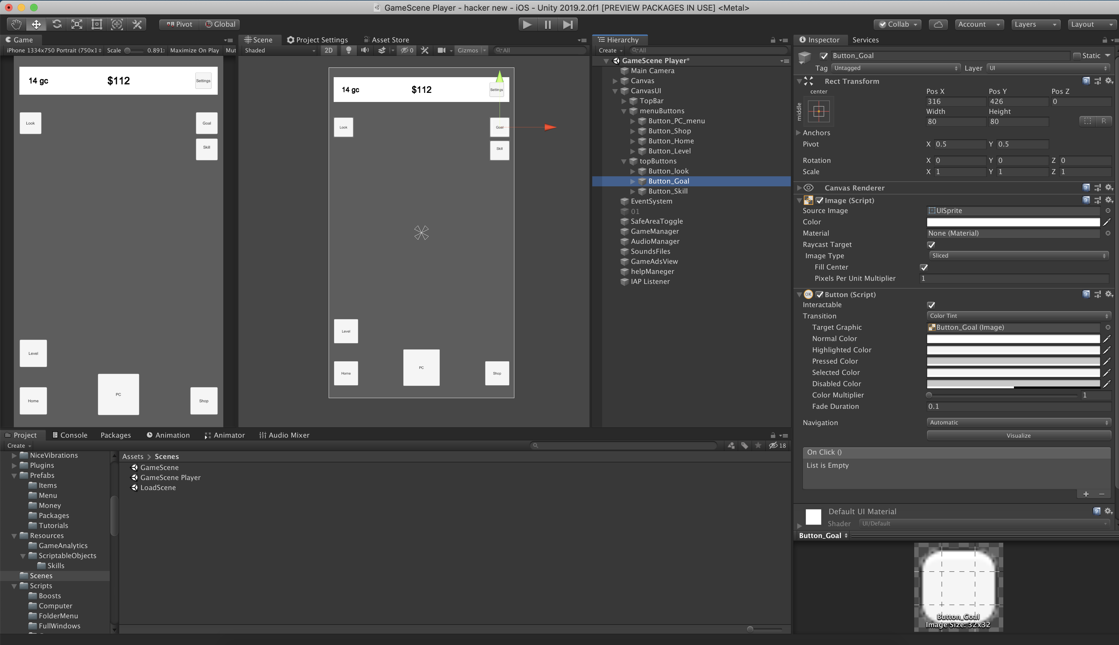
Prototype of the interface in UnityAfter we are done with the design, I move on to assembling a prototype interface in a game engine on a real project.
This stage allows me to check my developments already directly in the game itself and, probably, identify problems that I missed earlier.
In my projects, I use the Unity engine and its standard UI components. I keep buttons and other parts of the interface as prefabs. This will allow in the future, when I add graphics, not to rebuild the interface again, but simply to modify the existing working version quite quickly.

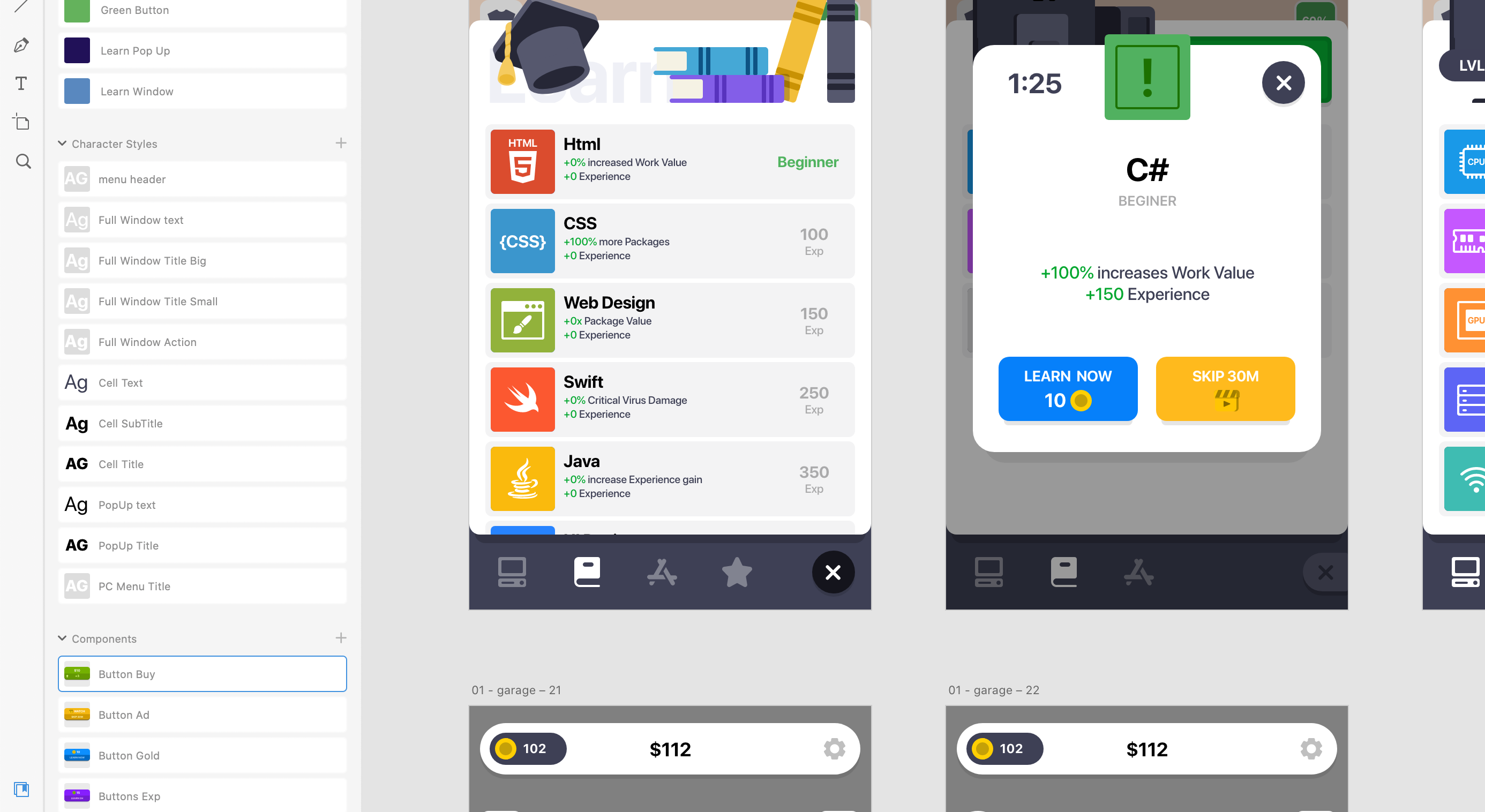
UI DesignI also work on the visual part of the interface in Adobe Xd, drawing directly on top of the prototype blocks.
It is necessary to carefully work out the entire visual style, all the states of various windows, buttons and icons.
In order not to build a separate UI kit, where it is necessary to reflect all the components, font styles and colors, I prefer to add the final version of the elements to the library in Adobe Xd. This greatly facilitates and speeds up the process.
Then I build a separate artboard from this library to export to Unity as an atlas of sprites.
For better optimization, the size of the artboard must be set to a resolution of 512×512, 1024×1204 or 2048×2048. If there are too many elements, it is better to use several small artboards than one large one. So the final size in Unity will be much smaller.

Exporting Sprites to UnityI save the finished artboards in PNG and transfer them to Unity.
There I cut the picture into sprites. Unfortunately, each of the window elements and buttons that you are going to pull must be imported separately.
When I’m done with the import, I look through the prefabs that are already ready and replace the sprites with new ones. Then I walk through the almost finished interface, add new graphics where necessary, and edit elements from prefabs if necessary.
And in the end I enjoy the result.

Some tips for creating interfacesWhen designing an interface, it is very important to keep in mind the overall style of both the interface and the game, and not go beyond it.
- This may turn out to be much more difficult than it seems.The interface should be clean and understandable.
- You can’t overload it with extra buttons and elements. If possible, it is better to group the excess in separate components.Try to place accents correctly.
- If you want the player to click on a certain button instead of the other suggested ones, it should be made brighter and lighter, and the rest darker and dirtier. Guide the player, control his emotions.Don’t make the text too small.
- Even with excellent eyesight, when you have to look at what you have written, it becomes not very pleasant to play. Moreover, small text is poorly perceived on a subconscious level, and we often just skip it.
