Game designer Ethan Levy told the resource Pocketgamer.biz about what mistakes, in his opinion, were made in the recently released Midnight Star game at the monetization stage. We have translated the text and are sharing it with you.
Midnight Star from Industrial Toy was first announced almost three years ago. It was presented as an attempt by major industry players to finally make a sane shareware shooter for mobile devices.
From the very beginning, the project managed to get an impressive development team, which included Alex Seropian, the former head of Bungie. It was assumed that for the mobile FPS genre, the title would become what Halo once became for console first-person shooters. In addition, the developers were eager to make the right shareware game:
“Industrial Toys wants to attract users who will stay engaged for a long time, and not those fools who spend 30 bucks on a diamond hammer for a quick win – and then never come back.”
If you’ve read what I’m writing about game monetization, you know that monetization starts at the UI/UX level. The desire to spend money for the player should be a natural continuation of the fan factor of the game, and a thoughtful UI should allow you to make a purchase so that it is convenient for the player.
With that said, here are the five monetization mistakes made in Midnight Star:
1. Hidden timers
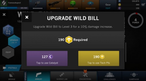
As is often the case in shareware games, upgrading to Midnight Star costs time and money. You can either spend technical points (soft currency) or apply a catalyst (hard currency).
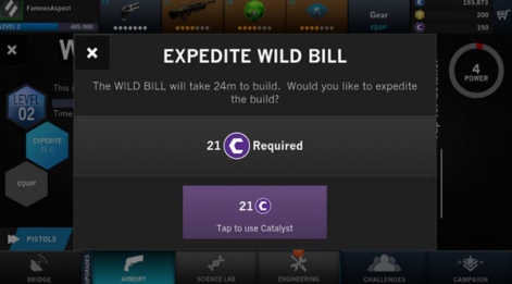
Only after the player chooses an upgrade using soft currency, they show him how long it will take and ask if he wants to skip the stage at the expense of hard currency.
The player concludes that the catalyst is needed in order to skip the timer – although he cannot be sure of this until he has made a purchase. Whatever it was, it is more correct to provide the user with all the necessary information in advance, rather than surprise him with a timer that jumped out of nowhere.
The hidden timer is exactly the kind of frituplay that hardcore players hate, who downloaded Midnight Star for themselves in the hope that it will be a new Halo for mobile.
2. Draining the soft currency in the middle of the level
The levels in Midnight Star are quite long for a mobile game. It took me eight to thirteen minutes to complete the level.
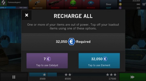
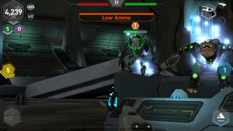
Every couple of minutes, the levels were interrupted by checkpoints. At first glance, it seemed that Midnight Star does not merge soft currency. And then I suddenly got stuck in the middle of the level, and an inscription appeared at the top of the screen: I was offered to replenish ammunition either by spending energy (soft currency), or with the help of a catalyst. That’s how I realized that there is a drain of soft currency in the game.
I have nothing against draining the currency. However, doing this six minutes after the start of the 12-minute level is not divine. Instead of separating monetization from gameplay, the creators of the game disrupt the smooth flow of the gameplay with a pop-up sign that requires the player to spend soft or hard currency.
I’m sure players would prefer an honest demand to spend soft currency before starting a level.
3. Sale of first aid kits
As you probably already understood, the main “trick” of the game is to hide monetization and surprise the player with it at the right moment.
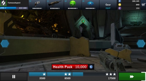
Not only is the user periodically forced to spend game currency on energy, checkpoints in the middle of the level also offer to replenish health for soft currency. Unlike draining energy, these specific proposals are appropriate. However, the UI in this case only confuses everything.
When the game first offered me to buy a first aid kit, I thought, “How do I know if I need to replenish my health if my health measure is hidden?”.
Only after carefully studying the UI did I realize that the red yardstick under the text shows my current health level. I expected that my health level would be reflected in the same way as throughout the game – namely, a red yardstick, the level in which decreases from left to right.
Instead of showing this UI element on the checkpoint screen, the game shows it with a red measure at the bottom of the screen, which decreases from right to left. Yes, this is not a particularly significant problem, but it still confuses, especially when such a measurement appears on the screen next to the countdown timer.
It would be easy to fix this by showing the health points sale screen and the health indicator familiar to the user at the same time.
4. Aggressive purchase offers
Another way that the game can make the user believe that he sees it primarily as a wallet on legs, and not a player, is too aggressive purchase offers.
I believe that the purchase offers needed to be built into the existing UI. The player would get important information from them instead of freaking out that pop-ups block his view.
Every time I started a game session, it seemed to me that the game was literally begging me for money with an outstretched hand. I have a hypothesis that the system of pop-up advertisements was built in later: it seemed to the creators of the game that the players were not spending enough on the upgrade.
Instead, it was necessary to simply embed the widget with the recommended upgrade into the interface before or after the level and accompany it with all the necessary information.
5. Sale of hard currency
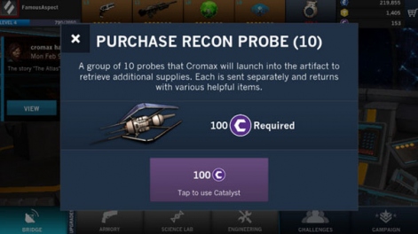
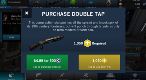
In most shareware games, the sale of currency is built in where the player tries to buy something that costs more money in hard currency than he currently has. In Midnight Star, in such cases, the catalyst application button turns into a hard currency purchase button.
I think it’s repulsive for two reasons at once.
Firstly, the cost of the item is not visible. Perhaps the player is close to earning the required catalyst, and it would be more correct to grind to get it – rather than spend your money on it.
Secondly, the default dialog box offers the user the smallest currency pack to choose from. If the player has decided to spend money, why not also offer such a pack, where for a little more money the player can get much more hard currency.
At the very least, the purchase button should display the price of the item. And even so – I would still prefer that the gameplay is not interrupted in this way, and the player would not be forced to buy currency.
Conclusion
By themselves, all the problems described above are relatively small. However, if you put them together, it becomes obvious that the monetization system in Midnight Star sees the player in a very specific way. As a source of profit.
My favorite monetizer’s mantra is: “players are not wallets.”
Despite the fact that the Industrial Toys team has been spreading a lot about the fact that they will primarily think about long-term user retention, and not about monetization, the game speaks for itself. I believe that in order for words not to diverge from deeds, they still need to make a number of changes to the monetization process.
Ethan Levy is a game monetization consultant. He specializes in shareware games for PC, consoles, browsers and mobile devices. He is a game designer with 12 years of experience, who has more than 50 successfully launched projects on his account. Worked at Pandemic Studios, EA, BioWare and Playfirst.
Other materials on the topic:


