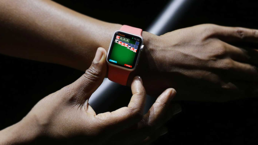
MobilityWare debuted on iOS seven years ago with the game Solitare. The studio created the same game for the Apple Watch. Yabloko did not accept it for publication. The project had to be redone, and as a result of the work, these tips appeared from the game designers of the studio.
Image Source – MobilityWare website1. The project must be complete
Game designers are ambitious by nature, according to MobilityWare. It is very difficult to stop at 5 levels when you can do 55. But in the case of the Apple Watch, the format imposes strict restrictions. Everything is subject to them, from the length of game sessions and level design to mechanics. It is this set of limitations (along with the advantages of the plafthorm) that must be constantly kept in mind.
2. Simple screen
When you have a 38 mm wide screen in front of you, it’s great to use every pixel. But this is exactly what should be avoided. The objects on the screen should be placed freely – so that the user does not strain his eyes in an attempt to see them.
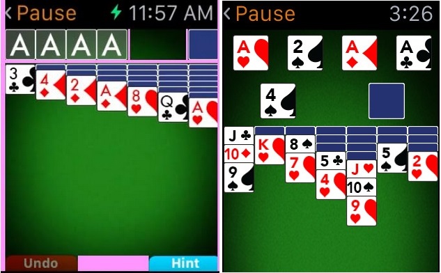
The edges of the Apple Watch screen are slightly beveled. It is better not to place important elements there, because it is difficult for the player to hit them. In the case of the Solitare project, this means that we had to abandon the traditional layout of cards and create a special layout for smart watches.
On the  left – the rejected version (the areas with which problems have arisen are highlighted in pink), on the right – the accepted one
3. Management – the simpler, the better
MobilityWare game designers have studied smartwatch games that Apple has already approved, and made one interesting conclusion. In order for the project to be in the store, the control buttons in it must be arranged in the form of a cross. Or it should be carried out by a simple click and/or swipe.
4. Set the rules – and follow them
While working on the first project for Apple Watch, MobilityWare studio defined a number of rules for itself. This helped speed up the development process of other games. If you follow these rules, then the game can be accepted into the store from the first time, – the game designers of the studio believe.
Here they are:
- the project should provide the player with a positive gaming experience – in a short time;
- management needs to be made simple, but accurate;
- avoid text. To convey information, use color, image, or animation.
- and, most importantly, your game should be fun to play – on this particular platform.
A source: http://venturebeat.com

