French artist and game designer Nathan Lovato told us exactly how to improve the graphics of the game. We have translated the text and are sharing it with you.
Concept art for the game Guild Wars 2
We tend to judge a book by its cover. It takes us a split second to figure out how to treat the appearance of a website, game or application, positively or negatively. Creating an attractive and functional design at the same time is not easy. When someone gets acquainted with your game, the first impression always depends on the art. Most likely, the first thing he will appreciate the picture. It doesn’t matter if it will be in the form of a screenshot, a video or a gameplay video.
So if you’ve ever wondered why studios spend so much money on quality art, then here’s the answer.
But what exactly are we talking about? The right picture is more than just high-quality graphics. It simultaneously attracts externally and has a certain function. In practice, the aesthetics of the game should meet both the general principles of design and your general game style. In other words, to combine everything that can enhance the attractiveness of the visual component of the game.
There are many aspects of game art that we, as artists, must take into account. In order to make the design holistic at the same time and provide players with a pleasant gaming experience, we must:
- create powerful compositional centers that will direct the player’s gaze in the right direction;
- come up with attractive color combinations and shapes for assets;
- make sure that everything is selected correctly, based on user feedback, analytics and A/B tests.
How to implement it all? In this article I want to share some tips that will help improve the visual component of the game. This information, among other things, is useful to anyone who wants to understand what his artists are doing and how to establish a dialogue with them.
1. Composition
The power of any artwork comes down to a deep understanding of the visual design language. On the one hand, the image consists of visual elements, and this is the same dictionary. It includes colors, shapes, shadows… On the other hand, there are design principles. They are akin to the rules of grammar. They allow you to combine elements into a harmonious composition.
Thus, in order to create a powerful composition, it is necessary to rely on the principles of design.
There are six of them:
- scale and proportion;
- repetition and contrast;
- balance;
- accent;
- hierarchy;
- and harmony or unity.
All of them need to be studied. Each of these principles makes it possible to analyze the project in parts – and improve it. CtrlPaint discusses these principles in detail in a 7-episode tutorial.
Layouts
In this part, we will focus on how to create a balanced layout. Usually layouts are associated with web design and interfaces. But this concept is applied in all artistic spheres.
Layout is a composition of graphic elements. These are, for example, GIU games. In the animation industry, layout artists determine the position, scale and proportions of each element in the frame. Layout is the foundation of the composition, to which lighting and color will be added later.
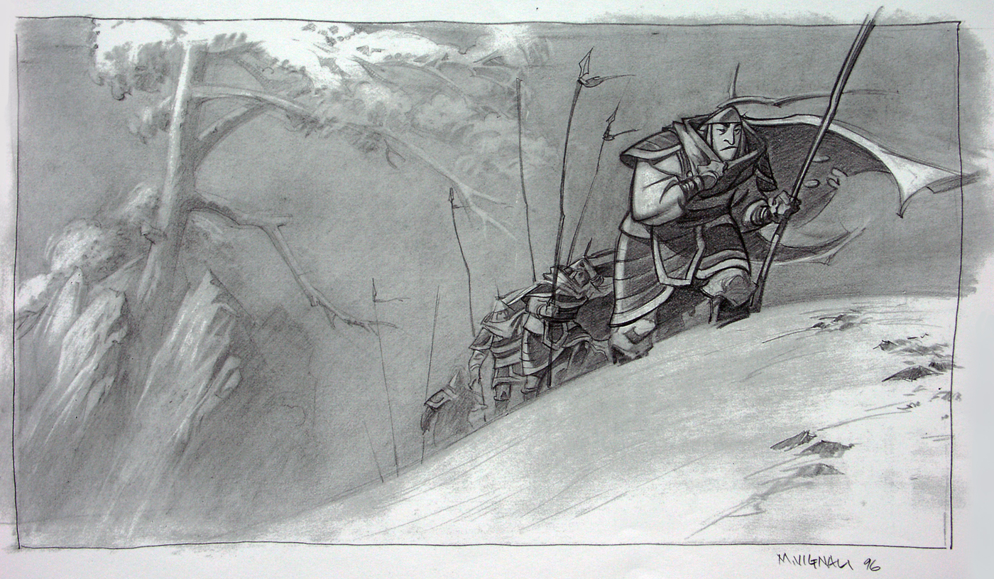
Layout for the Disney cartoon “Mulan”
A properly constructed composition leads the observer’s gaze from element to element. It creates a road that the player will follow, builds a hierarchy among the various elements. Each graphic detail of the game has its own visual “weight”. This weight depends on how the part is positioned on the screen, on its size, contrast and degree of illumination. Simplifying, large, bright or saturated in color objects are “heavy”. They contrast with the surroundings and attract the eye.
In order for the elements of the composition to be read, they must be correctly positioned relative to each other. I want to emphasize that leaving free space around and inside the details is useful not only for level design, but also in creating the UI and even in writing the script. The game button in the center of the screen is like a royal throne in the middle of the hall: the way it is located indicates how important it is. He attracts attention to himself.
The player wants to track the characteristics of the game and interact with UI elements. Therefore, the interfaces are often clear, contrasting, bright and placed at the top of the map. GUIs are usually drawn so that they are positioned as if “on top” of the screen to separate them from the rest of the game world.
You can do the same with key gameplay elements: if you leave a little space around them and their surroundings, they will stand out.
Depth
There is another characteristic of the image that allows you to build a hierarchy between graphic elements. This is depth. In order for the player to get an idea of the scale of objects in the game world, we can vary the size and proportions of visual elements among themselves.Depth is both based on and influenced by the basic principles of design. It creates a contrast between the foreground and the background.
Image depth is achieved in two ways: by superimposing images on top of each other and by lighting.
The first way is the most obvious. If you put one image on top of another, the top one will seem closer to the viewer. For example, it seems to us that the UI is located on top of the screen because it is placed on top of the game world, in a separate layer. With the help of a glowing outline in games such as Witcher 3, a contrast between interactive elements and the background is achieved.
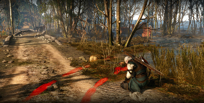
Screenshot from the game Witcher 3
The second method requires a certain understanding of how light interacts with space. On their way, the rays of light meet dust particles that disperse them. The greater the distance, the more they disperse. And the more their color changes. When we look at hills or mountains from afar, they seem gray. Their color is not as bright as that of objects near us. By analyzing such effects and reproducing them in graphics, we create a space in the game world.
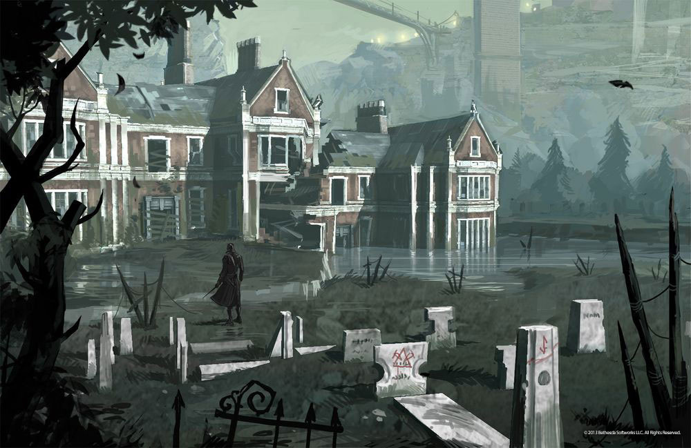
Concept art for the game Dishonored. Vapors scatter the rays of light, so the background is blurred
2. Attractiveness
Color, light and shape are the three components that define the visual style of the project. It is the unique style that helps the game stand out. Bright and eye-pleasing graphics are the basis of attractiveness, this common concept in the world of animation.
Attractiveness is what creates a connection between the viewer and the object of observation. It doesn’t matter who its bearer is, a charismatic character or a stunning landscape. It requires the application of design principles and at the same time a certain artistic experience. This is one of the goals of the artists on the project: to create a solution that will resonate with the players.

Character concept for the cartoon “Volt”
However, attractiveness does not necessarily require detail. The visual component of the game can remain strict and simple – and still attract players. There are many examples of mobile games in this style.
However, even simple solutions take time. And in order for the game world to be also attractive, experience is required. There are two elements that you need to pay special attention to in order to create attractive art. It’s a silhouette. You can add more lighting here, but this concept does not apply to all games. If you have a flat design or a very simple village-shading, then there is not much to turn around with lighting.
A shadow
The silhouette can both create a composition and destroy it. When I was studying animation, my classmates and I often repeated one quick, but not so simple exercise. It was necessary to draw a character who performed a certain action or expressed an emotion. But at the same time it was necessary to draw only his silhouette. And in the end, the viewer had to say what was happening to the character. I have often failed!
The fact is that if the silhouette is not readable, then the image in color will be unsuccessful. I know from experience that an expressive silhouette is very important. If the characteristics of an object are not intuitively clear from its silhouette, then it will not “hook” you.
When we move around the game world, we meet a lot of objects, monsters and characters. Friend or foe? An interactive item or just part of the background? The drawing should answer these questions without further explanation. Our brain processes everything we see or feel with great speed. We evaluate objects and react to them without realizing it. And silhouettes play a huge role in this.
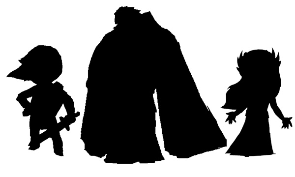
Do you recognize Link, Zelda, and Ganondorf? You can experiment: take the silhouette of a character, weapon or building from a Disney cartoon and try to guess again. By the silhouette of the sword, you will recognize the sword in any case. It is sharp on the side of the blade, and the hilt is usually rounded. We instinctively understand that sharp and prickly means danger. Again, round or fluffy animals seem nice and friendly to us.
In order for the silhouette to be read, you need to leave a place around it, you need a negative space between the limbs of the character and the body. We have already talked about this in the first part of the article. It is very important to surround the key elements of the composition with space so that they are readable. The same principles apply when it comes to individual objects or characters. Link’s silhouette is a great example of this.
“Live” colors
When it is necessary to evoke a certain emotion with the help of expression, colors are the most effective tool. We rate bright and saturated colors as “lively”. Colors really live. They animate the images. James Gurney devotes most of his own book Guide for the Realist Painter to color. And there is a reason for that. A single spot of color in a monochrome image gives the same effect as a pinch of salt or spices in food. It enhances the impression of the image.
Color perception is subjective, so there is no one general formula that needs to be followed to create an attractive color scheme. I can only set the direction and give references to help you find your own palette.
The game world filled with rich, bright colors will appeal to the widest audience. Such colors look joyful, positive and full of life. Therefore, many creators of casual games choose a rich color palette. Pastel colors are more blurry and give a melancholic mood. They seem light and soft and are suitable for games with an “unearthly” world, such as Monument Valley, for example.
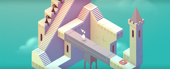
Screenshot from Monument Valley
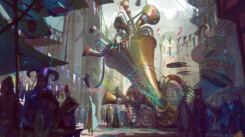
Realistic color palettes, diluted with bursts of bright colors, also attract the eye. A great example is the concept art for Guild Wars 2. Their color scheme is balanced, but at the same time full of life. It is very contrasting, with its help it is easy for the artist to tell the story of the place. Mirror’s Edge uses bright colors to guide the player through particularly confusing levels. And in this case, the colors are needed in order to show the player the way.
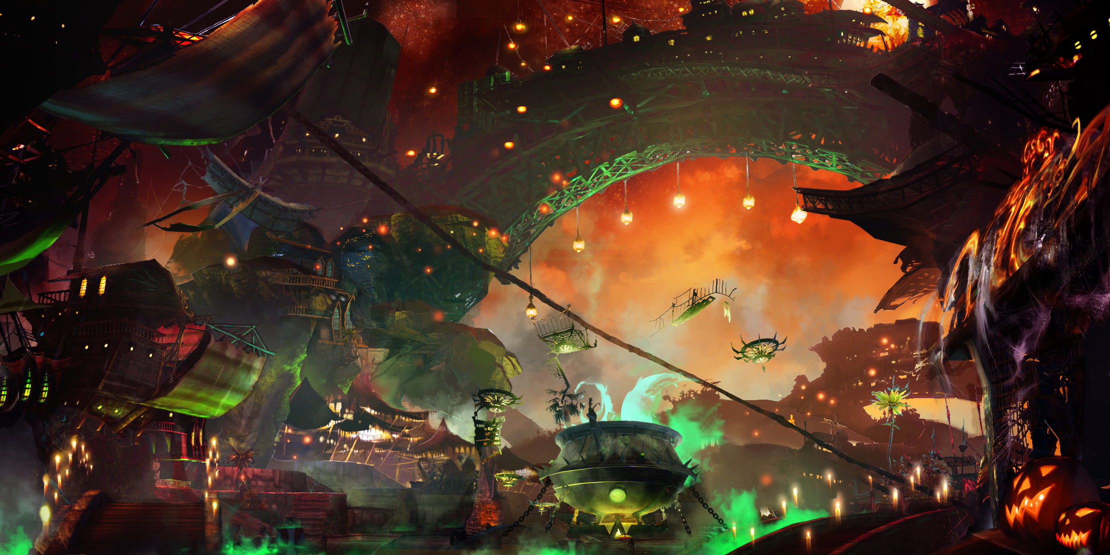
Concept art for Guild Wars 2
In general, to understand the color palette and silhouettes, it is necessary to analyze how they are treated in games and works of art. And observe how they manifest themselves in nature.
Now let’s talk about the most important point. It must be taken into account if you are going to achieve something and improve the skill. This aspect is very often overlooked by novice artists. I’m talking about feedback.
3. Constructive criticism
“It’s fine, it’s just fine.” It’s always nice to receive such feedback! You feel flattered. Sometimes such feedback is the truth. Maybe you really outdid yourself this particular time. But only constructive here and does not smell. From such a review, it is not clear what is good and why. And that this time failed. Maybe it wouldn’t hurt to fix and improve some points (or even the whole picture).
Constructive criticism notes the strengths and disadvantages of art. A good critic can even give advice that will help correct the shortcomings. However, such a detailed feedback is very rare. If you are lucky and you have a cool artist as a friend, then he will give such a detailed feedback. Or you can get it at work. To write a detailed review, you need to spend a lot of time. And the masters of their craft are usually very busy.
Meanwhile, we need a fresh look from the outside, if only to make sure that we are moving in the right direction. And not only from friends. It is necessary to know how players react to art. Such feedback can be obtained through testing and game analytics.
A/B testing
We are going to use a method called A/B testing. To do this, we will take interactive assets in the game and measure CTR indicators. Then we will replace the graphic elements and track the CTR again. And then compare the two results. Were people more willing to click on the pictures for the first or second time?
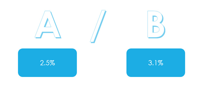
Web designers constantly use A/B testing. It helps a lot to figure out which interface and UX design users like best. In case you are trying to increase engagement through interaction with graphic elements, A/B tests will also be very useful.
In addition, with their help, it will be possible to track whether players are more willing to go to the menu and pass the levels more successfully after you have made changes. The way game assets are designed can help or, conversely, hinder users. For example, buttons are pressed more often if they look “thick”. If it looks like they need to be pressed. This rule is especially relevant for mobile devices.
Conclusions
The topics we have covered are very extensive, and this particular article is unlikely to reveal even part of them. A lot of interesting things on the topic can be found on the website of Metta Kohr about design and digital art.
In general, these three steps will help to improve the project schedule:
- work on the composition first. It will create a solid foundation for your art;
- work on the attractiveness of the image. Clear silhouettes and rich colors will help you here;
- to make sure that everything was done correctly, refer to A/B testing and analytics.
Source: http://blog .gameanalytics.com
You will be able to learn about the latest trends in the gaming industry first-hand, personally meet and discuss working issues with leading companies in the game development and publishing market at White Nights Moscow 2015, which will be held on October 13-14.