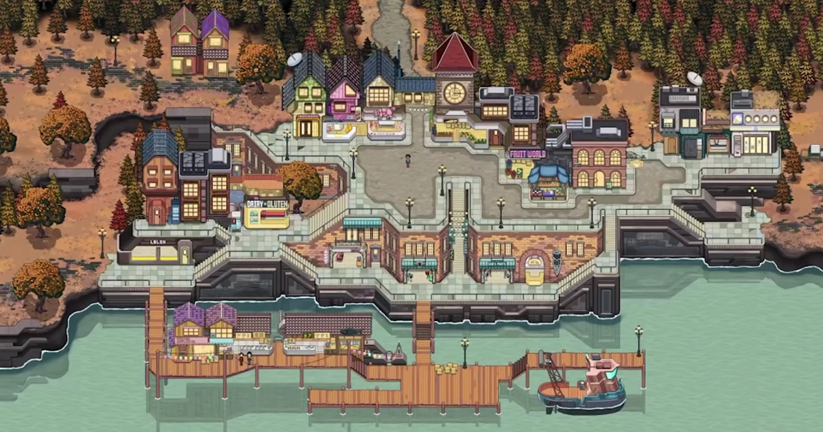
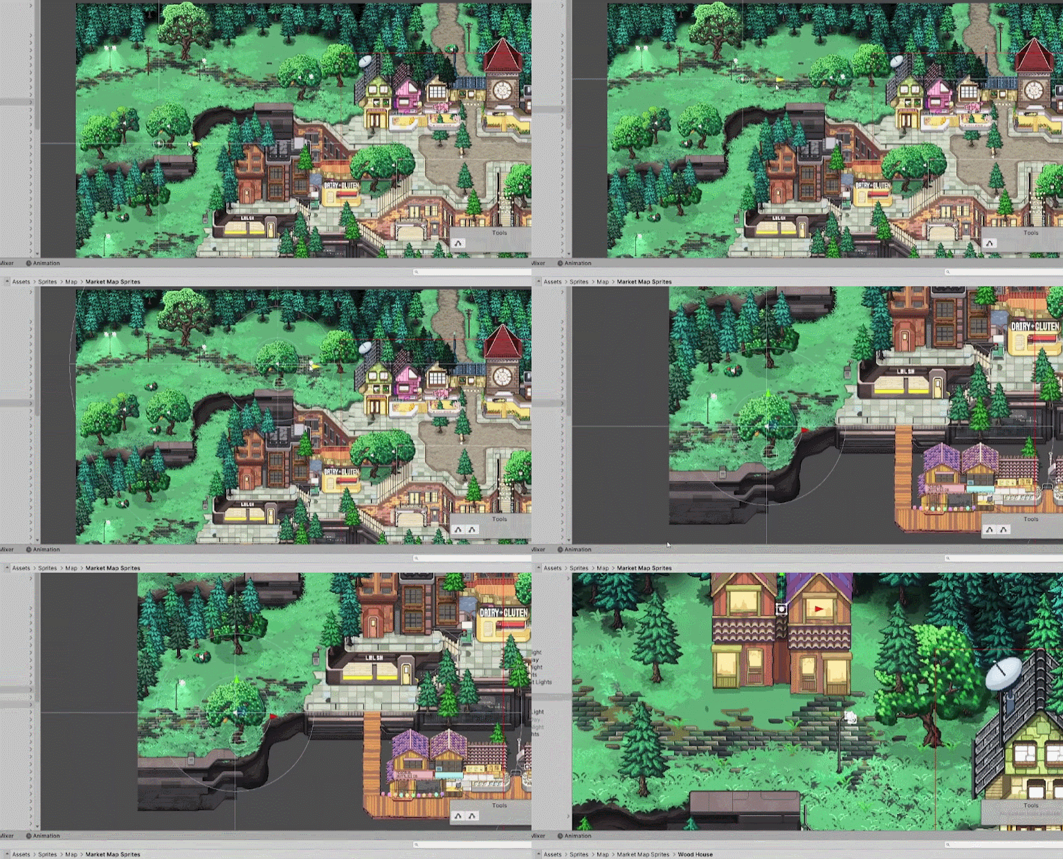
Architectural designer Pixel Architect showed how to design a city in the style of pixel art using the example of his game Chef RPG. He spoke in detail about the basic rules for designing a map for projects with a top view, and also demonstrated all the stages of work on the city.
Noah (real name Pixel Architect) posted a video on his YouTube channel a year ago. However, last week he caused a new wave of discussions after a post on Reddit. We have chosen the main thing from this video.
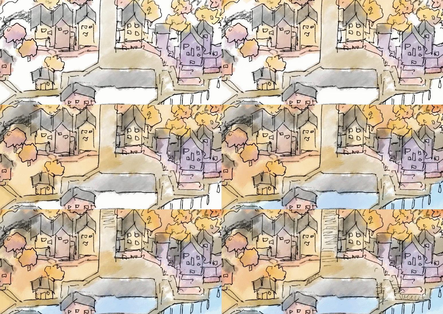
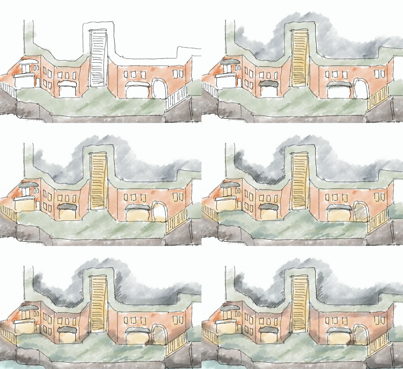
It all starts with a sketch
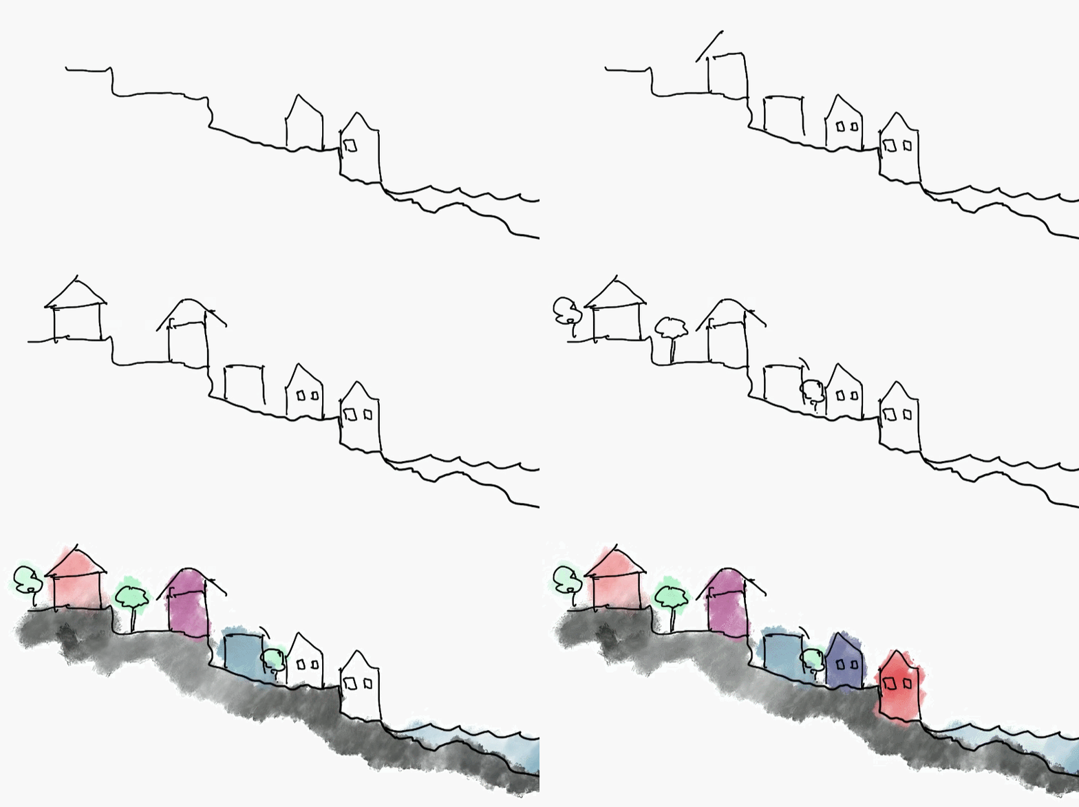
According to Noah, the sketch helps him find the right ideas for the project. At the same time, it does not matter what kind of sketch it will be — the main thing is to draw at least something.
For Chef RPG, he wanted to design a multi-level city by the sea, surrounded by a forest at the back. According to the idea, there should be a lot of paths and paths that lead the player to various activities and shops.
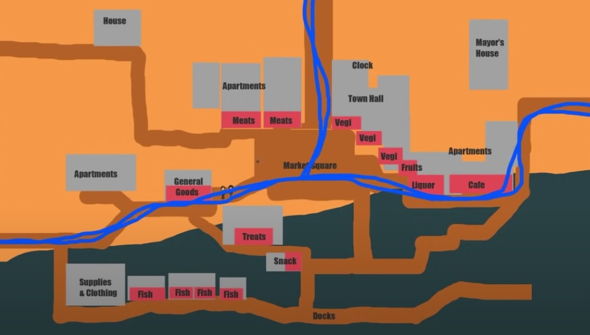
Based on this sketch, Noah began to think through the main routes that will be available to the player, as well as the location and purpose of specific buildings.
According to him, it is important to determine the central road, which should be wide enough and clearly visible to the player. In the case of Chef RPG, it will run through the city center through the market square. From there it will also be possible to go to other parts of the map.
In a real city, as a rule, it is not worth creating a dead end on a public road, unless there is an attraction at its end. The same rules apply here. I've played a lot of games where there were a lot of dead ends on the levels, often for no reason at all. Usually it kills the fan and the sense of freedom. Chef RPG creator
City Design Rules for a 2D game
Noah notes that important buildings should be located “facing” the pedestrian zone. In cities, people most often gather on the streets where shops and other activities are located.
Streets located opposite empty facades, on the contrary, are not popular. The same applies to huge areas where there are no points of interest.
When designing a seaside town, it is important to link together all the shops and activities that relate to the game and with which you can interact. According to Noah, this will enhance immersion and make the city more lively.
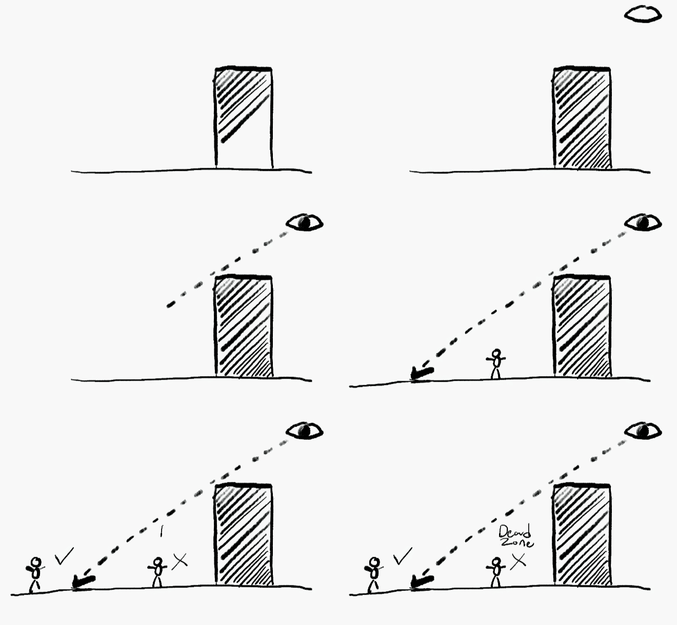
Another important point is to design a city, taking into account all the limitations of a 2D game with a top view. The player can only look at all objects from one angle, so he does not see the backs of the objects.
This leads to the following problem — dead zones. If the character goes behind a building, it will no longer be displayed on the screen.
In some games, objects in this case become transparent, showing the player. However, Noah believes that this is not the best solution. Firstly, such a technique will look bad in the case of large objects. Secondly, there will still be zones behind the buildings that are not used in the game in any way.
Therefore, Noah decided to design the city in such a way as to minimize the number of dead zones. There are several ways to do this:
- raise the landscape behind the object to create the effect of verticality and get rid of the dead zone;
- place a number of low objects (for example, trees) behind a large object so that the character does not disappear completely behind a tall building;
- “embed” the building into the ground to give the map verticality and make the location of objects more diverse.
Three ways to get rid of dead zones
When creating Chef RPG, Noah decided to go the following way: build a city on the hills so that it gets higher as it approaches the top of the map. This is an old technique in level design, which was used in the first games of the Pokémon and Final Fantasy series.
Creating buildings
Chef RPG takes place in a fantasy world of the near future. Therefore, when choosing the design of buildings, Noah was inspired by old and modern architecture to show how elements of technology penetrate the countryside.
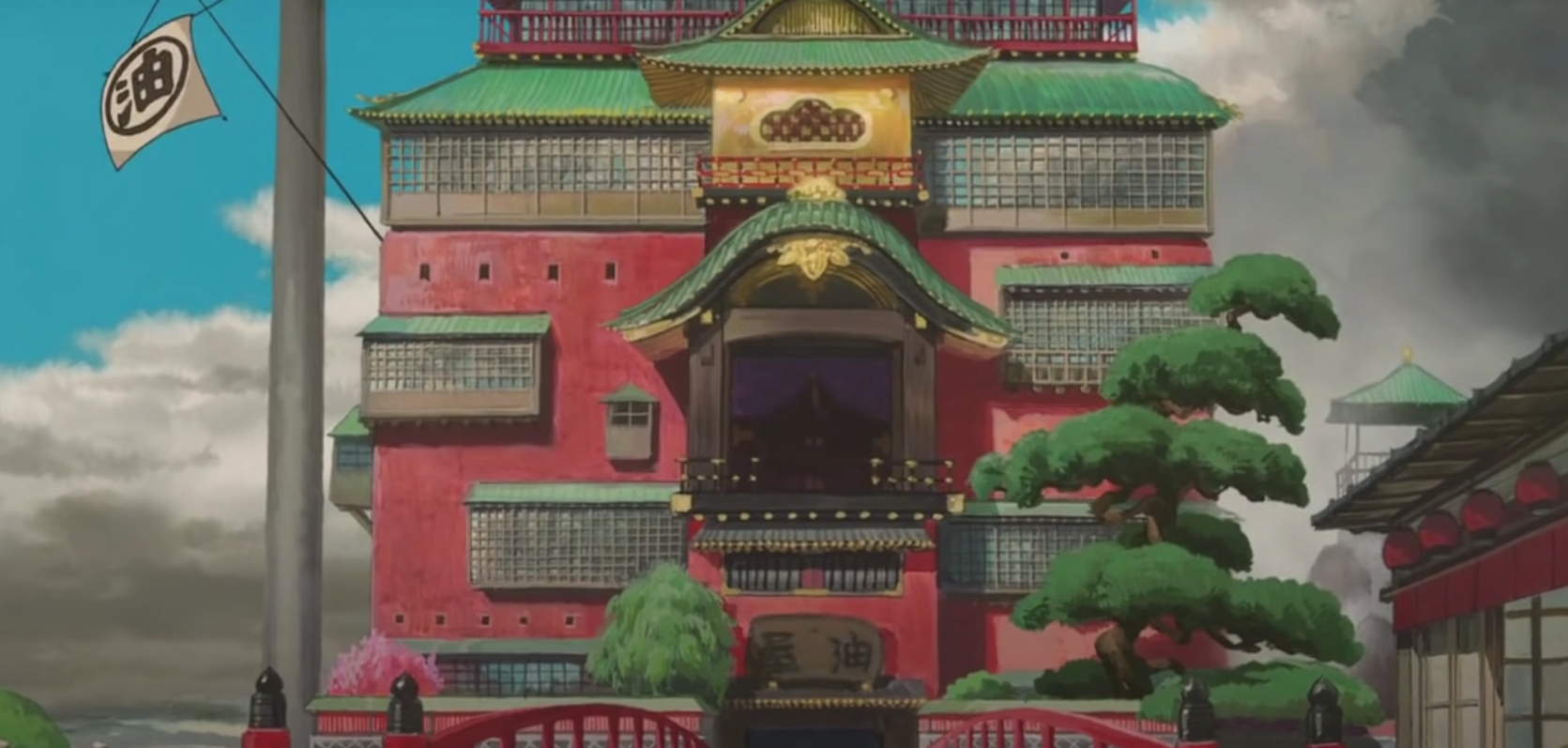
According to the idea, the appearance of the city will be a mixture of European and Japanese architecture. As a source of inspiration, Noah pointed out the works of Studio Ghibli. Only instead of steampunk, he decided to add elements of cyberpunk.
Bathhouse from the cartoon “Carried away by ghosts”
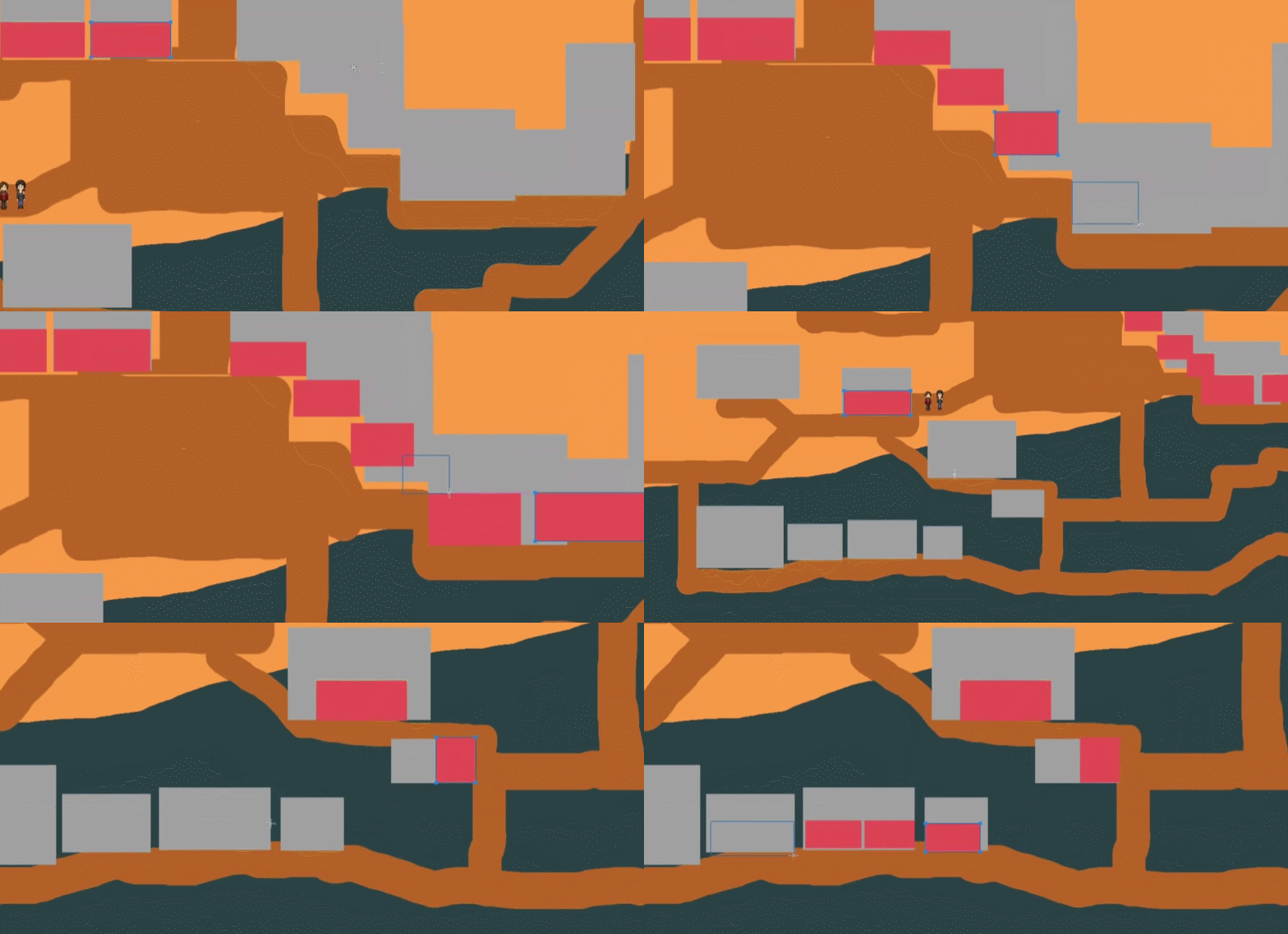
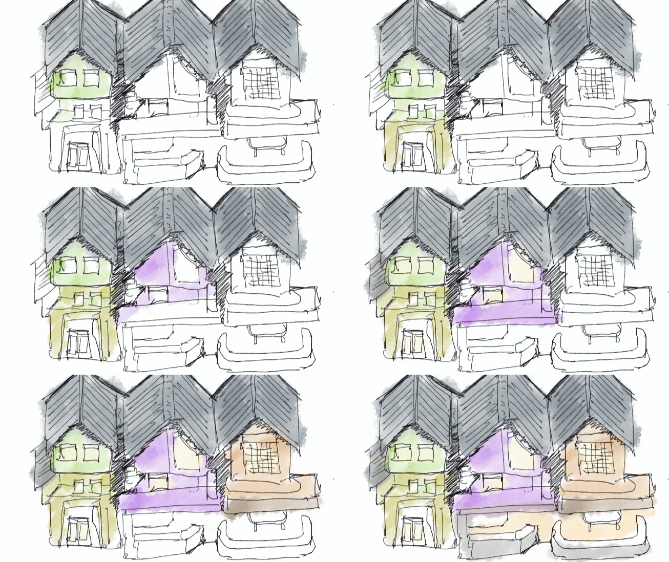
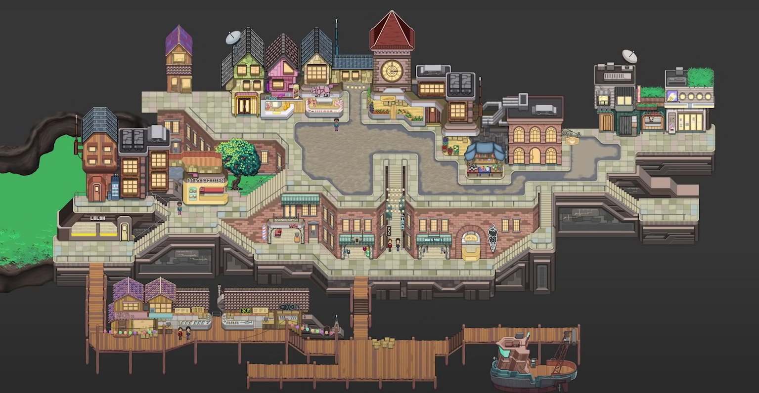
When creating the market, the developer decided to limit himself to two-three-storey buildings. Shops will be located below, and people will live on the upper floors. Since it is a small suburban city, it makes no sense to design tall buildings.
Noah also decided to make most of the shops open so that the player could interact with NPCs right on the street. This will eliminate the need to design additional rooms and reduce the number of loading screens.
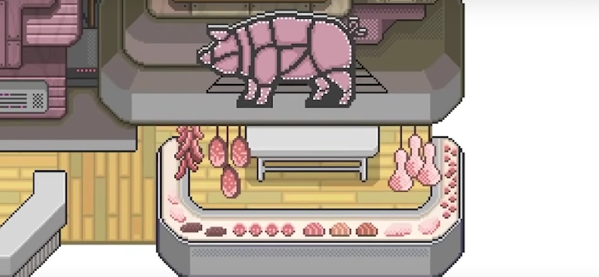
To “enliven” these buildings, Noah decided to add as many details as possible. For example, in a butcher shop, you can see products both on the counter and above it.
On the right side of the market square there is a clock tower and a tavern where the player can interact with various NPCs. Using the example of this site, Noah spoke about the importance of creating disorder and naturalness.
The sterility of the card is the biggest mistake that can be made. To avoid this, Noah made the sidewalks more voluminous, and some objects more worn and dirty. Thus, the site of the city began to look more natural.
After the upper section, Noah moved on to creating the central part of the map. It should connect the market and the city square. According to the idea, there are apartments and a store where you can buy various goods.
As in the case of the market, there are commercial premises and activity points on the lower level, and apartments on the upper ones.
One of the problems in the design was the question of the number of doors. According to Noah, there should be no artificial obstacles in an open—world game — especially in a 2D RPG. Therefore, it was necessary to take into account in advance that each painted door in the finished game would be interactive.
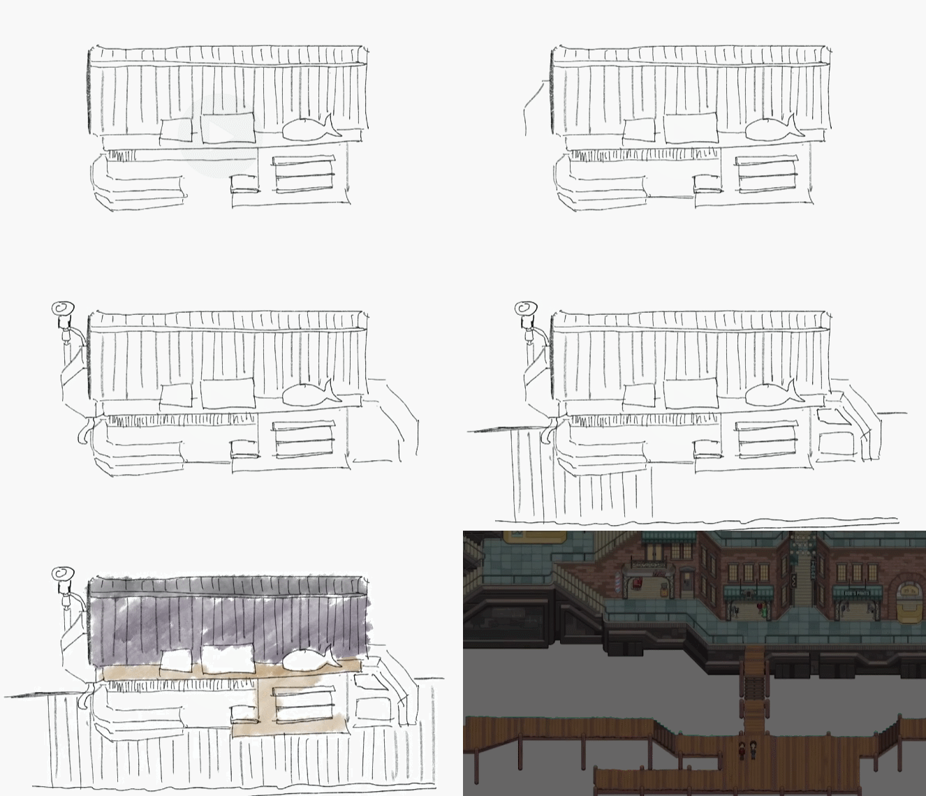
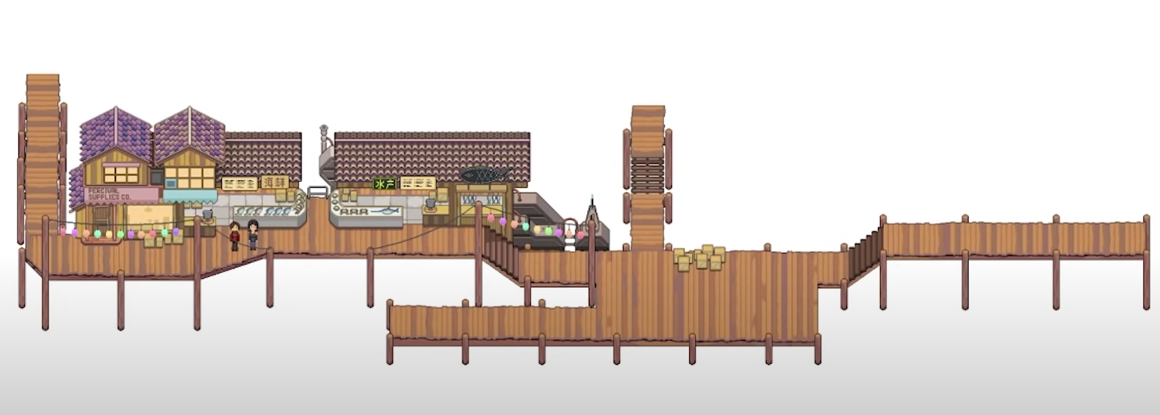
After that, Noah began to create a port area where the fish market is located. He didn’t want to make this zone too big so as not to stretch the gameplay. Therefore, it was decided to focus only on a couple of buildings.
Noah noted that these structures should be made of wood. The boards of the pier on which they are located simply would not withstand heavy metal structures.
The developer drew signs in advance, and also made sketches of light bulbs and other light sources that could illuminate the fish market at night.
Final result
As a result, Noah created and put together a port city project, clearly dividing it into several important zones. Now it remains to add the finishing touches.
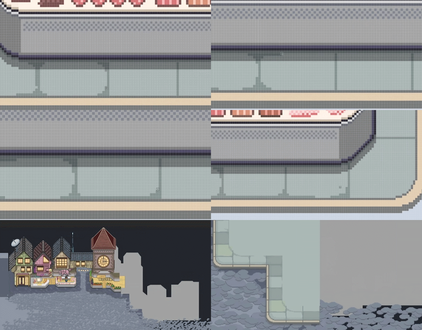
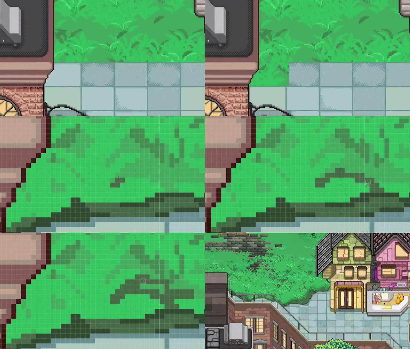
The developer decided to make the transition between vegetation and sidewalks smoother. He wanted to create the effect of nature, which gradually makes its way into the urban environment, as in post-apocalyptic films.
To do this, Noah shifted the grass onto the roads and smoothed out the right angles that originally separated these zones.
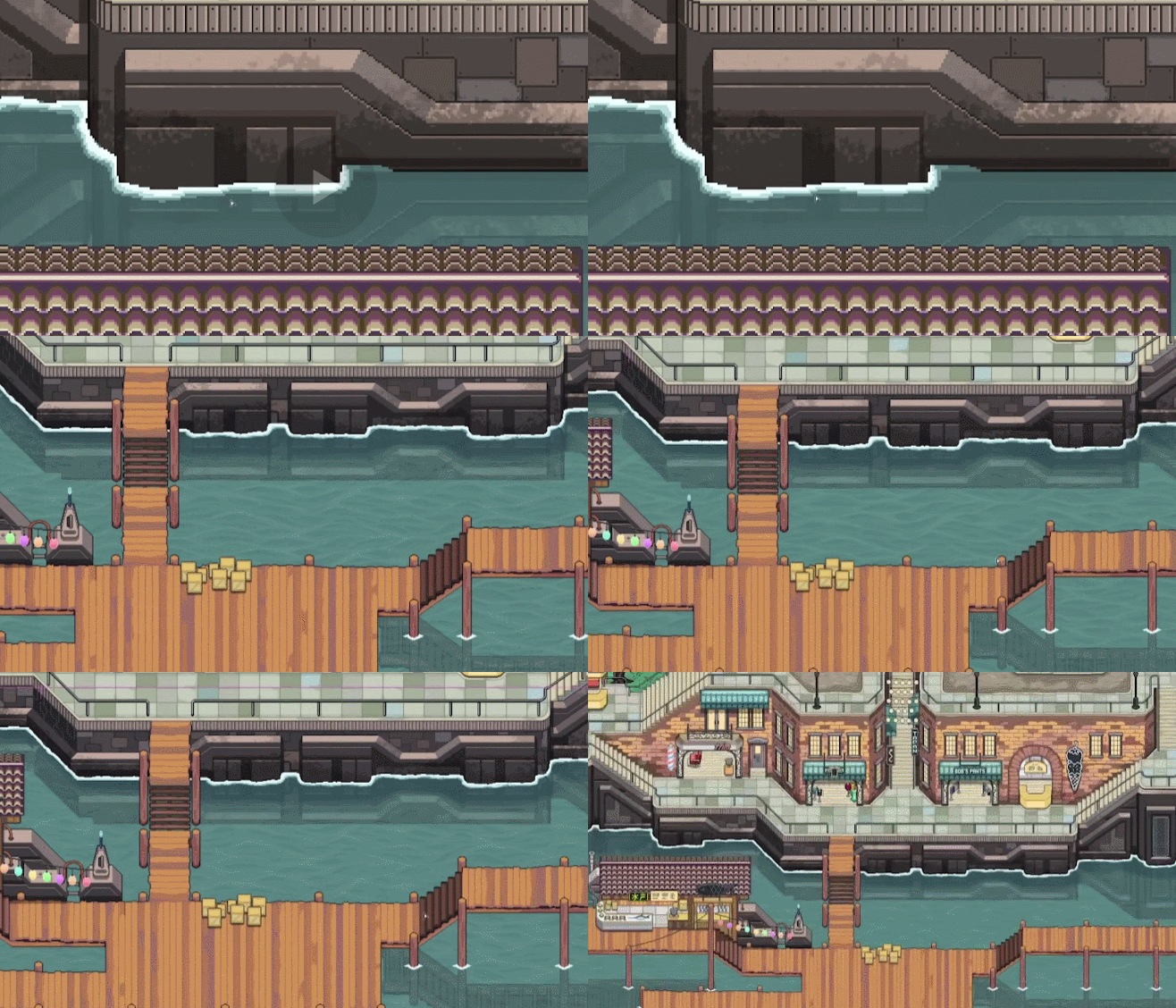
Another important detail is water. Despite the 2D and top view, it should look voluminous and natural. To do this, he highlighted in white the borders where water comes into contact with objects.
The developer also added textures for reflections and prepared the basis for surface animation in the future.
After that, Noah exported all the elements to Unity. He added pre-created trees to the map, for which he wrote scripts for changing the seasons. Thus, they will change their appearance depending on the season.
Noah also placed special points around the city so that the character could not walk up buildings and go outside the map.
Chef RPG is scheduled to be released on Steam in the third quarter of 2023. On his channel, Pixel Architect also shares various diaries and talks about different stages of work on the project.

