Mateusz Piaskiewicz is a landscape architect and game designer. He told in his blog what composition laws you need to know in order to create beautiful game levels. We retell its text in a thesis.
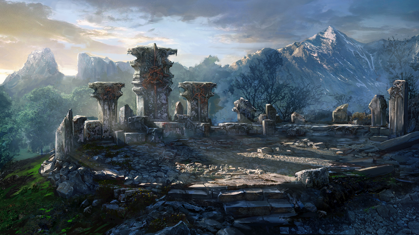
Concept art for The Witcher 3: Wild hunt
Basic concepts
Composition in relation to level design is how the level elements are positioned relative to each other. The harmonious composition allows the player’s gaze to glide through the level as intended by the author. To create a balanced scene, the level designer uses color, shape, and lighting brightness. In other words, it highlights the important and takes the minor details into the background.
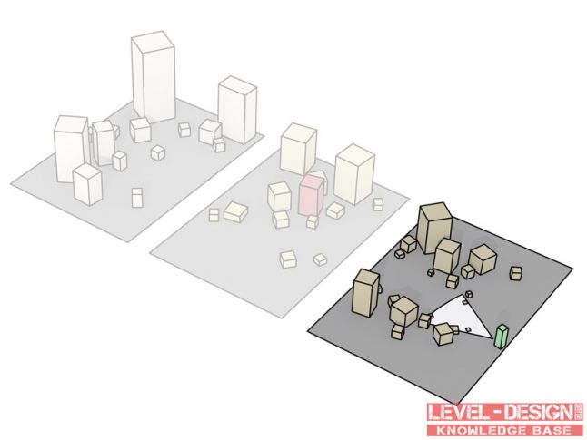
Composition Layers
The composition is divided into three parts: foreground, center and background. If desired, you can add a staff here [images of people, animals, vehicles necessary to show the scale of the environment – approx. editorial offices].
Foreground
The layer closest to the observer. Creates a frame for the center of the composition – the dominant – and focuses the player’s attention on it. The foreground elements should be logically connected to the rest of the composition.
If the foreground is darkened, it creates a sense of space. Often, only silhouettes of objects are shown in the foreground: the fewer details and colors, the better [here and further, the dominant in the image is highlighted in red, – approx. editorial offices].
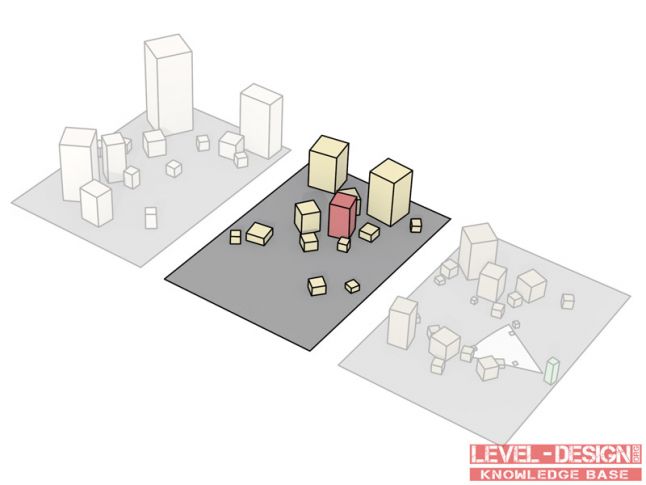
Composition Center
The center of the composition is the layer or layers on which the focal point of the composition, the dominant, is located. It is necessary that it stands out among the other elements, but at the same time it is connected with them. The dominant is highlighted with light, color, and placed in an advantageous position in relation to the observer.
Several dominants can be placed in the center of the composition at once. In this case, contrast is necessary. For example, imagine a level with the conditional name “Fountain in the square and a broken tank”. There will be two dominants – a fountain and a tank, and they will be in sharp contrast to each other.
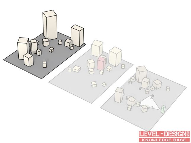
Background
These are the layers that complement the composition. The background is necessary in order to create depth, to designate the space in which the dominant is located. The objects in the background are not detailed, which helps the observer’s gaze stay in the center of the composition. The background is characterized by a calm, muted palette, softened lines.
Staff
An additional layer with which the dominant scale is transmitted. For example, people or animals are placed on it. The directions of the views or poses of the figures are a powerful tool. It draws attention to the compositional center of the stage.
A scene from Half-Life 2: Episode 2. The figure of Alix determines the proportions of the scene and sets the direction of the viewer’s gaze
Monitoring parameters
Angle of view
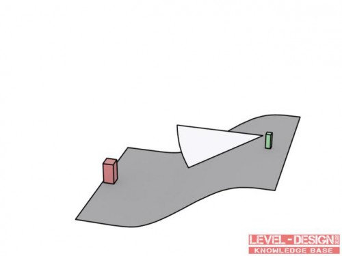
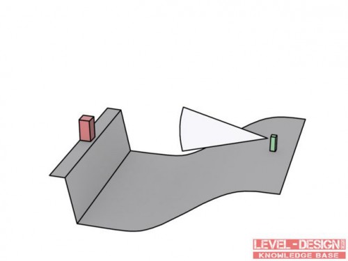
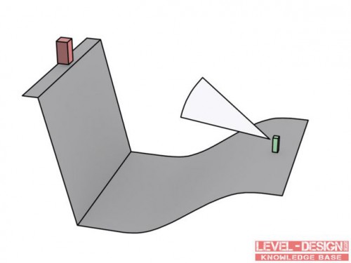
The angle of view determines exactly how the player sees the dominant.
Low angle of view
The dominant is visible from above. The image has depth and perspective. From this angle, the player has a good overview of all layers of the composition. Therefore, such an angle can be used to give the user the opportunity to plan a tactic or route.
Flat angle
The dominant is visible from ground level. The scene can become flat and boring. This angle is used in scenes with an active dominant.
High angle
The view of the center opens from below. He dominates the composition. Gives the player a feeling of insignificance compared to the compositional center.
Arrangement of composition elements
The way the dominant is positioned has a serious impact on the perception of the scene.
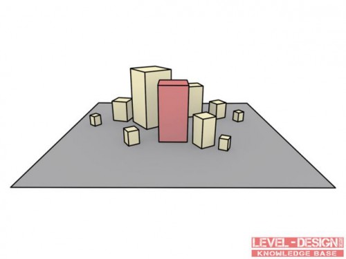
Static (symmetrical) composition
The dominant is located in the center of the stage, surrounded by other objects. The composition looks “synthetic”, simple. This arrangement is used to pay attention to the details of the architecture, for example.
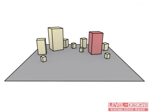
Dynamic (asymmetric) composition
The dominant is located to the side of the center of the stage. Such a composition is used to simulate natural landscapes.
Balance
The elements of the composition should be balanced relative to each other. To do this, it is necessary to understand the visual “weight” of each object, that is, color saturation, size and detail.
In order to understand which object is “heavier”, you need to compare it with other elements of the composition. “Heavy” objects are large, detailed, dark, contrasting, intensely colored. “Light” – small, light, pastel colors, non-contrasting.
The dominant should be the “heaviest” part of the composition. It should be balanced by “light” elements.
Details
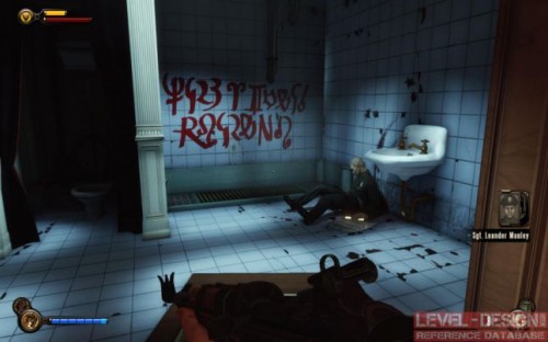
They are used to attract additional attention to the dominant. Detailed points will attract the observer’s attention – simply because there will be something to look at. Details are not only objects, the saturated texture of an object, for example, can act as such.
In this scene from Bioshock: Infinite, the details – the text and the figure of a man – are used to attract the player
Lines
The elements of the composition can create lines that will direct the player’s gaze. They come in two types:
Visible lines – that is, those that are created by the corners of the composition
Virtual lines are those that our imagination “draws”, for example, the direction of a person’s gaze on the staff.
Horizontal lines
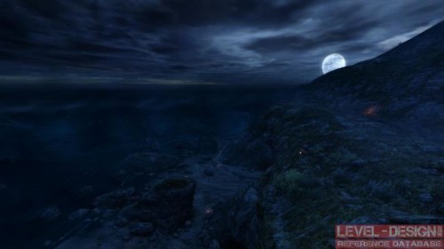
They add depth to the scene, expand it. They create a static, calm impression. Avoid a lot of horizontal lines when working on the foreground or dominant. Even if the scene is a parking lot, try to break the horizontal lines with cars and objects.
The horizontal lines in this scene from Dear Esther give a sense of calm
Vertical lines
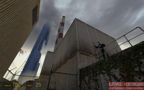
They are used to emphasize the power and strength of the composition. They are resorted to to impress the player.
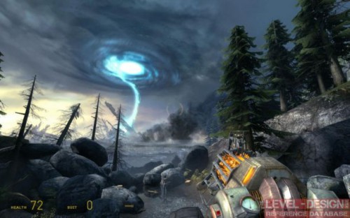
Vertical lines in the screenshot from Half-Life 2
Curved lines
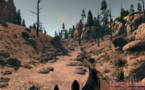
These are lines in the shape of the letter S. Give a feeling of softness. They are used in natural landscapes.
The path in the scene from the game Call of Juarez: Bound in Blood is curved in the shape of S
Angular lines
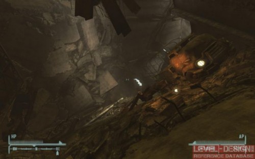
Give the scene dynamism.
Angular lines in a scene from Fallout: New Vegas
Colour
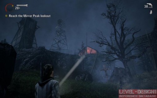
One of the most powerful expressive tools of a level designer. Color accents will help the player navigate the scene. When adding them, it is important to make sure that they do not get out of the overall color scheme of the game.
The color of the barn does not argue with the color of the scene, but nevertheless distinguishes it from the surrounding. Alan Wake Game
Lighting
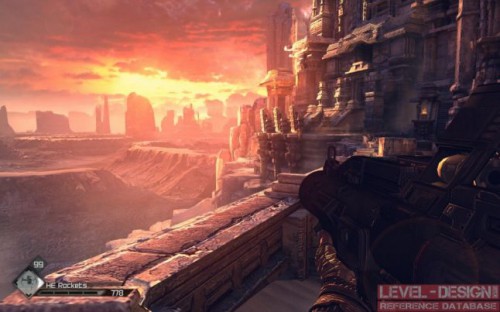
The contrast between the illuminated and darkened part of the scene creates a mood, gives the composition depth. A low-contrast scene looks flat and boring. Light spots are used to emphasize the necessary elements of the composition. The most significant objects should be well lit: players, as a rule, do not like to look into dark corners.
The difference in lighting highlights the depth of the scene. Rage Game
Hints:
- each layer of the composition should be harmoniously arranged;
- the foreground can smoothly transition to other layers (for example, you can arrange trees throughout the scene);
- if the dominant is above the eye level of the observer, you can bring him to her with the help of vertical ladders. Going up the stairs, the player will look up and see the composition center;
- a good composition needs space. If the buildings, for example, are too close to each other, then it will not be possible to build the most advantageous point of view;
- use no more than one theme in each composition. Don’t tell multiple stories at once;
- the dominant should be intense in color, it needs to be properly illuminated and decorated. Avoid unnecessary details in the foreground and background;
- too weak a dominant or too chaotic a composition will not hold the player’s attention;
- do not spray the player’s attention. Make sure that after each fight he has time to rest and enjoy the view;
- the composition may not fit entirely in the player’s field of view. It is ok. Make sure that the dominant is not hiding behind a corner or behind a large object.
A source: http://www.gamasutra.com
Other materials on the topic:

