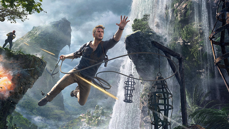
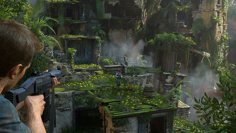
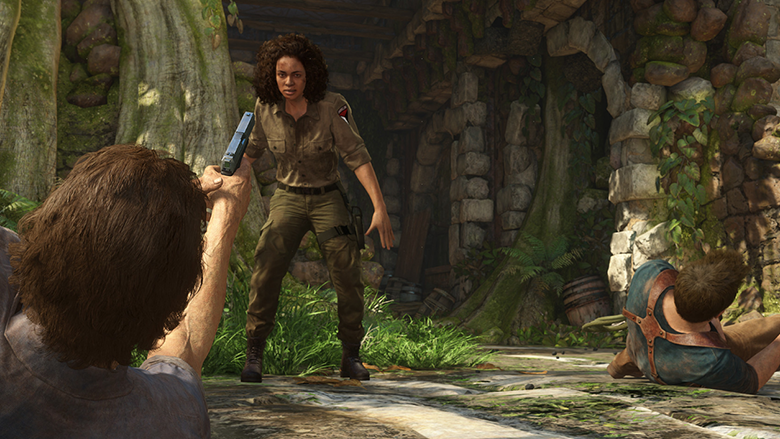
Martin Teichmann, an artist for creating a game environment from Naughty Dog, talked about the principles of creating locations with Kirill Tokarev, editor-in-chief of the resource 80.lv . Translated the interview, we share.
Hi! Please tell me about yourself.
Martin Teichman
I am a game environment artist from Germany, in Naughty Dog since 2015.
The last project I worked on was Uncharted 4. I started my career around 2007 with small studios. In 2010, I was lucky enough to get into the German company Crytek, where I worked on Crysis 2 and Crysis 3. A little later I was invited to London, to the Rocksteady studio. There I worked on Batman: Arkham Knight for more than two years.
You’ve been drawing a game environment for quite some time. What, in your opinion, is the main task of an artist to create an environment?
The main task is to draw beautiful art, fill the scene with content, make it understandable for the player. These are self-evident things. But there is something else. As an environment artist, you are also responsible for game mechanics. For example, for collisions. It is necessary to prepare all the technical components of the scene so that the player can pass the level without problems – even if he has to sacrifice beautiful art in the end.
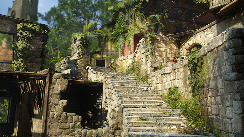
It is important that the location tells a story. Of course, color and composition play a key role in creating a good scene. In addition, I like when there are small plots inside the scene. Who lived here? What is this location? Maybe just before you entered the room, someone came out of there? Why did he come out? Will he come back? These are about the questions I ask myself, and then I add little things and details so that the player feels the atmosphere of the scene.
How do you manage to turn simple obstacles into a full-fledged part of the game world? How does the process work?
The first step always involves finding references and creating concept art. I usually start modeling by collecting refs or studying those given by the art director. Then I study the obstacle map that I received from the design team. They create a game space before the level gets into the hands of the artists. The work on the game environment itself is quite uncomplicated. I go from large forms to small ones. I bring one or two areas to an almost ready state – so I have an example of what the level will look like when I finish. In general, there are a lot of iterations and work with feedback. Game designers are constantly changing the gameplay, I get feedback from colleagues, leads and managers. The concept team plays a very important role. They help at the stage of creating art, make an overlay (a process during which a corrected version is drawn on top of the finished art, and then given to the artist for revision. Simply put, visual criticism, – approx. editors), share ideas, and also make sure that we all adhere to a common style.
Your works look very interesting – and I want to study them. How do you keep this feeling in ready-made locations? Is there any special technique for testing a finished scene? At what point do you realize that it turned out to be quite interesting and attractive?
In my opinion – and here any artist will agree with me – a scene is never good enough or even just finished. But the release date dictates its own time frame. Usually I work on a level like this – I assemble it in stages, add details, check that all the tails are picked up. If I don’t do this, then there is a chance that some areas will fall short in quality. To appreciate the whole picture, I usually literally take a step back, or squint to understand how the whole scene looks. Another good help is a reduced image. If the miniature version looks fine, then the whole scene usually looks good too. It’s easy to get carried away with working out the details and forget about the big picture.
Color and light are always key elements in any scene. How do you use them? What function do they have in creating a game environment?
Most companies have individual lighting artists. They specialize only in creating lighting in the game. This is a very important part in creating art, so important that a special team is allocated for it. Poor lighting can ruin even the most beautiful art. And the right light will pull out the most mediocre scene. It is important to remember that good lighting, along with art, works on the main gameplay. For example, I like to experiment with shadows to create an atmospheric scene. I also try to emphasize individual shapes and details with the help of light. It all comes down to what kind of mood you create in your scene.
Can you tell me how to make the scene understandable? How do you make the location “transparent” for the player? How, for example, to understand that you can climb up this wall, and hide in this place?
Very powerful tools guiding the player are color and light. It doesn’t cost anything to get carried away with detailing and lose sight of the overall picture. For example, it is very important to visually separate the floor and walls so that the player can easily navigate the location. More game elements should be visible even from afar. Here color marking comes to the rescue. In Uncharted 4, we had a rule that the surfaces on which you can climb were always marked with white so that the player could understand where to go. That is, consistency is our everything. Ideally, you need to create a set of rules that the player will learn and follow throughout the game. Sometimes it can be difficult, because such rules may go against your artistic vision, but playability should still come first.
How do you optimize the process? How is it possible to create such complex scenes with a huge number of beautiful assets, and at the same time relatively little CPU load? Maybe there are some clever ways how to reuse textures, assets, vegetation and everything like that?
I try to work with the same set of assets at all levels. It’s easy to cram everything cute that you could find into one level. And completely ignore the fact that all these objects consume RAM. But in fact, it’s more like you just feel what you can afford and what you can’t. You can add more objects to some levels than others. It all depends on how well the streaming download works in the locations you are working on. Here you always have to look for a middle ground. If there are too many draw calls in the scene, then you can combine the geometry. But then there will be a problem with the calculation of polygons, since we will no longer have the opportunity to resort to LOD-rendering (LOD – Level Of Detail is an optimization method that uses several meshes for each object, – approx. editorial offices). If we talk about optimization, then the main rule that I follow is “Will this detail add expressiveness?”. I try to use geometry and assets with great care. And here, for example, interesting silhouettes work very well. In certain cases, they help to reduce the drawing distance. But here again we have to find a balance between visual expressiveness and frame rate.
Source: 80.lv
Translated by Irina Smirnova


