Mark Brown, the author of the Game Maker’s Toolkit project, has launched a series of video tutorials for designers who want to make their games more accessible to people with disabilities. Mark’s first video is dedicated to people with hearing impairments and how to make high-quality subtitles.
Subtitles are comfortable to play not only for the deaf – for example, according to Ubisoft statistics, 60% of players in Assassin’s Creed: Origins play with subtitles enabled. And although this option is often present in games, the quality of the subtitles display often leaves much to be desired.

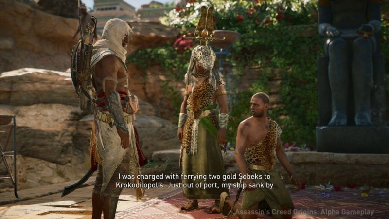
The characters in Assassin’s Creed: Origins speak with a pronounced accent, so many players may need subtitles.
Small and poorly readable font are found in games here and there, negating all the benefits of this option. In addition, usually only direct speech is reflected in subtitles, and if several characters participate in a scene, it is not always clear who it belongs to.
A few “golden rules” for creating good subtitles:
- Subtitles should be large, and even better if players can choose the size of subtitles themselves. Developers very often sacrifice the size of subtitles in order not to interfere with the user’s immersion in the game, but they forget that at this moment it would be much more comfortable for the user to read the text with convenience.
- The font of the subtitles should be simple. The task is to make the text as easy to read as possible. You should not be proud of an elegantly stylized, but unreadable font.
- Subtitles should contrast with the background. The most convenient subtitles are white with a black outline or a translucent background box.
- Subtitles should be kept short. Use the experience of cinema: the recommendations for subtitles on BBC and Netflix say that it is permissible to use a maximum of two lines for one title, each with no more than 37-42 characters.

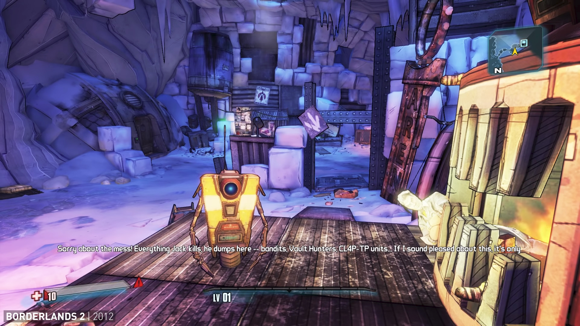
Borderlands 2 is an example of blatantly bad subtitles
- The subtitle should be divided into two lines in logical places. For example, after punctuation marks, before conjunctions and prepositions.
- Subtitles should stay on the screen long enough. At least as much as the characters say, but in the case of rapid speech – longer. The BBC recommends 0.3 seconds per word.
- The transition to a new title should be noticeable. Between the departure of the old and the appearance of a new title, it is advisable to make a short pause so that the player notices this.
- Subtitles should indicate which of the characters is speaking. For example, a character’s name can be given at the beginning of the title, or phrases can be colored in different colors for different speakers.

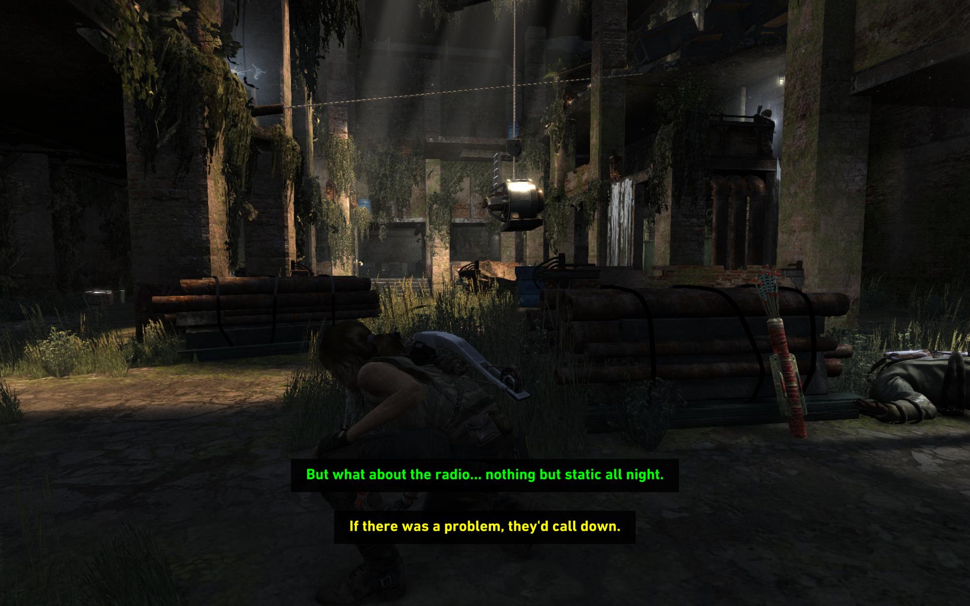
Multi-colored subtitles are used, for example, in Rise of the Tomb Raider
- Subtitles should reflect all dialogs. That is, not only for cut scenes, but also for any speech that sounds during the game.
- It is better to include not only speech in subtitles, but also a description of sounds. This allows hard-of-hearing players to understand what is happening around their hero – for example, he hears shooting or an explosion. This is how subtitles are made in Half-Life 2. In Minecraft, subtitles even indicate which side the sound is heard from, and in Fortnite Mobile there are special icons for this.
- If your game has puzzles related to sounds/music, make some kind of visual to these sounds so that hearing-impaired people can solve these puzzles.
- Give players a lot of options for volume and subtitles so they can choose how they feel comfortable playing.
Mark’s full video:
Source: Game Maker’s Toolkit
