Mark Brown, an indie developer and editor of the Pocket Gamer resource, told about why, in relation to game design, less is better, as part of the Game Maker’s Toolkit video cycle. With the author’s permission, we have prepared a text version of the material in Russian. We share.
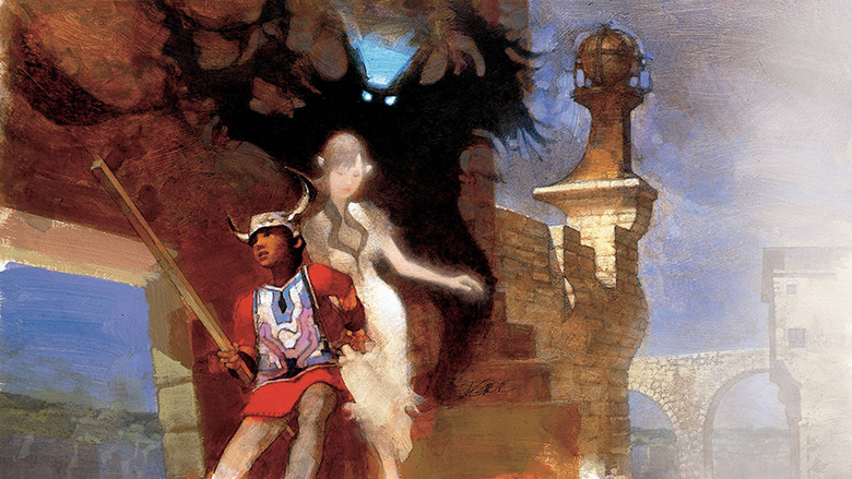
Fan art for the Ico game
Many games have become a source of inspiration for game designers. But few games have influenced the industry as much as the low-key and beautiful, iconic and classic Ico.
Ico, according to many developers, played a huge role in the creation of Papo & To, Brothers, Journey and the upcoming Rime. If we take less obvious examples, these are The Last of Us, Prince of Persia and even Halo 4. The creator of Dark Souls Hidetaka Miyazaki admitted: the game “opened his eyes to the possibilities of the gaming environment.”
So what is it about this low-key game that has influenced game designers so much? And why did such a calm and simple project generate such a powerful response?
The game tells about a boy and a girl. You control the boy, Ico, and help the girl, Yorda, escape from the castle. And along the way you solve puzzles and fight with swords or sticks with shadow monsters. That’s all.
Even from a modern point of view, the game looks very minimalistic. And at the time of the PlayStation 2, no one had ever heard of such a deliberately simple design. Games like Limbo or Proteus didn’t exist then.
Ico
The defiant simplicity of the game, of course, is not accidental. The Ico designer Fumito Ueda relied on a method that he later called “negative design” (design by subtraction). In the early stages of development, when it was still assumed that the game would be released on PlayStation 1, the Ico had a complex action game, many different characters to choose from and several locations — a village, a dense forest and an uninhabited island. They got rid of all this. And not for financial or technical reasons, but to expose the very essence of the game — and mercilessly destroy everything that does not emphasize this essence.
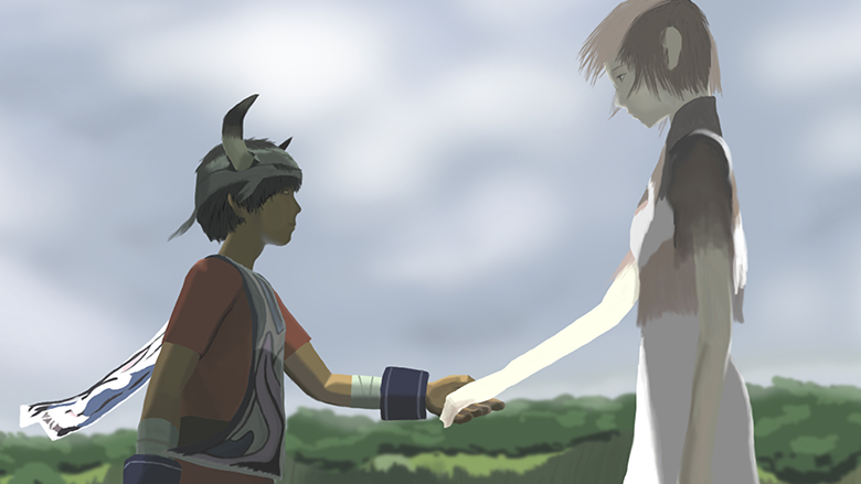
The point, of course, is the special connection between Ico and Yorda. In friendship. In helping someone who is in trouble. For example, there is a moment in the game when you need to hold the button to hold hands with a character.
And each component of the Ico only supports the main idea.
Take puzzles: the first part of the task is usually to get somewhere yourself. And the second, and almost the biggest, is to figure out how to lead Yorda.
Iko can’t die in battle. If he loses the battle, Yorda will be taken away by shadow monsters. The safety of Ico is not particularly important, but the safety of Yorda is the opposite. And since the story is not about Ico, the character will not upgrade, and he does not have cool combos. He just waves his stick back and forth in the vague hope that it will help to win.
Ico
Yorda is needed to open doors — this technique is found in many games with minor characters. But Yorda also helps to save the game. To do this, you need to simultaneously seat both characters on a stone bench. So when Yorda is not around for a long time, the player has a hard time. Very uncomfortable.
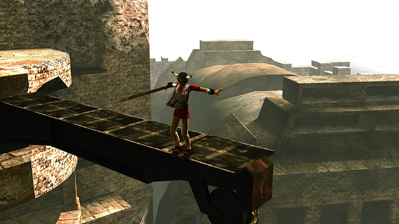
In addition, Ueda tried to emphasize those aspects that make the player believe in the game world. The project team built a castle — with complex architecture, riddled with secret passages, just like a real one. And also made the animation of the characters as realistic and expressive as possible at the same time. The inspiration was Ueda’s favorite games — Another World, Flashback and the very first Prince of Persia. (Yes, Prince of Persia inspired the creators of the Ico, and then she inspired the authors of Prince of Persia. Games are weird).
Plus, the team tried to remove everything that could prevent you from immersing yourself in the world of the game and remind you that Ico is just a character. There is no measure of health, no stationary NPCs with stupid monologues, often there is not even background music. In the dry balance, only an unusual game about something elusive. And nothing superfluous.
I think that’s why the project caused such a resonance.
This, of course, does not mean that all games should be as simple and minimalistic.
Ico
Fighting in Ico is too simple and gets boring quickly. Even Ueda himself admits that he may have slightly overdone his desire to simplify the design as much as possible. His next project, Shadow of the Colossus, has a lot more elements and mechanics. And there are health measures and voiceover music. But, interestingly, it is also an action game without enemies in the traditional sense of the word. Because what’s the point of ordinary enemies if the essence of the game is better revealed in battles with giant bosses.
My point is that in times of hypernaturalistic design, when every game necessarily has an arsenal of a dozen guns, a crafting system, hundreds of side missions, it makes sense to try to remove unnecessary. Something that distracts from the main idea or mechanics.
What, does Assassin’s Creed really need a tower defense? Did Tony Hawk’s Pro Skater benefit so much from the fact that drift was added there?
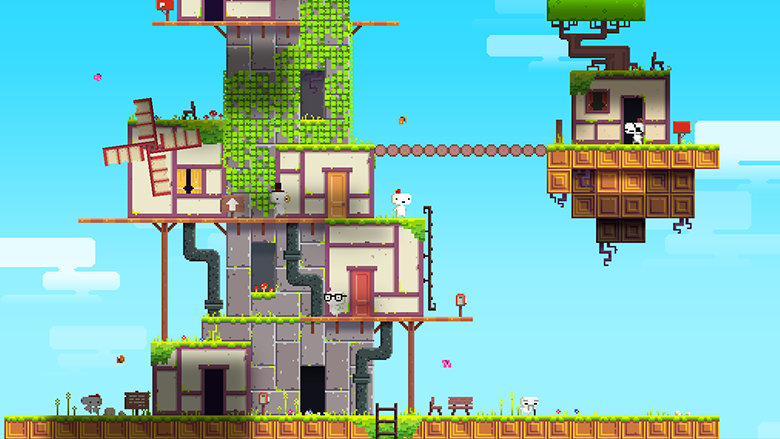
An example of a successful application of a negative design is Fez. The creator of the project, Phil Fish, in his interview with Gamasutra, said that initially the game had measures of life in the form of a heart. And the heart containers that filled this measure. And more puzzles about weight redistribution. But he decided to abandon them: they did not support the basic mechanics — the rotation of space, and the main idea — that everything can be viewed from different points of view.
Ueda’s concept, says Fish, “inspired to cut the excess mercilessly. And every time I did it, the game got better — stronger, more solid.”
Fez
Fish advises other developers to “critically and closely examine their project and ask themselves — what is really important? What really has to do with the essence of the game?”
It’s very easy to add features that kind of look cool, increase the length of the game or add an item to the description on Steam. But all of them actually only deprive the main idea of clarity. They interfere with conveying the essence to the player. Speak out. To be remembered.
Source: Game Maker’s Toolkit
Translated by Irina Smirnova


